
Waterfall Chart+
Multiple Server Discount
| Servers | Discount |
|---|---|
| 2 + | 10% off |
| 5 + | 20% off |
| 10 + | 30% off |
| 20 + | 40% off |
| 40 + | 50% off |
Installation Requirements
PI Vision 2021 (or newer) & PI Web API
Licensing
Perpetual License for 1 PI Vision Server. One year of updates included.
Product details
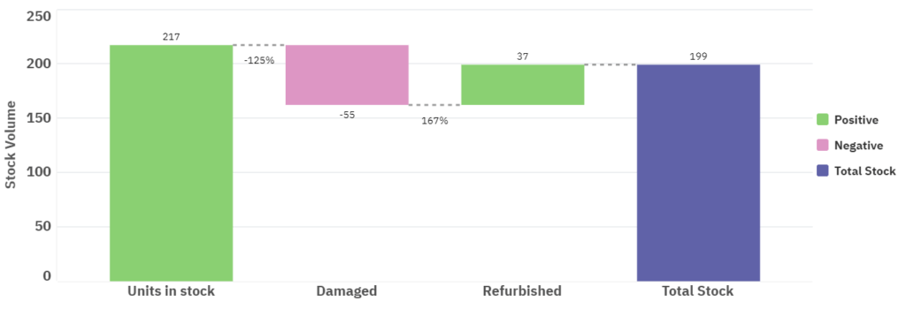
The PI Vision Custom Symbol Waterfall Chart+ allows you to create waterfall charts. A Waterfall chart is a data visualization that helps you see what caused a metric to change over time. It displays the initial value of the metric, what changed it and the final value, such as managing inventory over time. It is part of the Vision Library+ symbol package.
The beginning and end values in the chart are shown as columns, and the data points in between are displayed as free-floating steps or blocks. Because of its simple, visual layout, it’s easier to quickly analyse complex data. So guided analytics users get instant insights into what changed and when.
Many finance teams are familiar with the Waterfall chart, but this dataviz is becoming popular across other departments and industries, including Manufacturing, Healthcare and Banking and Finance.
What are the common Waterfall chart use cases in PI Vision?
- Track equipment effectiveness and availability
With Waterfall Chart+, visualizing your asset's availability is a breeze. It's a great way to get more insight on your equipment's effectiveness.
Metrics could include:
✔ Production Line Effectiveness
✔ Asset Availability


- Root cause analysis
Waterfall charts are common in executive dashboards to show the cause of something, where things went wrong or where diversions occurred. A great way to show strategic highlights to those looking for immediate insights.
Metrics could include:
✔ Healthcare: patient days by nursing unit
✔ Retail: inventory balances over time
- Managing stock and inventory
The production team can maintain the right stock or inventory levels for profitability by analysing how the levels change over time.
One metric they use often is:
✔ Inventory over time
Managing inventory at a glance with Waterfall Chart+

- HR planning
HR managers can analyse how the number of employees changes over time, to optimise the hiring process and make sure the business’ needs are met.
They could measure:
✔ Employee growth over time
Tracking employee growth numbers over time with Waterfall Chart+
What is Waterfall Chart+ for PI Vision?
Waterfall Chart+ is a highly cutomizeanble Waterfall chart for PI Vision. This chartshows immediately what’s pushing up or pulling down a metric. Plus, it can uncover the root cause of your business questions quickly and easily.
Features to look out for:
- High level of customization: select the colors your business uses for visualizations and reports, add or remove titles, change the thickness of connectors and much more.
- In-depth root cause analysis: you can create a ‘measure-driven’ waterfall using more than one measure. And get clear visual insight into what affected a metric’s total the most.
Empower all users to confidently visualize how totals change over time and support their daily data-driven decisions.
Demo
Questions?
Click the button below to get in contact, or simply email us at contact@software-athlete.com. We would love to help you.


