


PI Vision Custom Symbol • Vision Library+
Multi-Dimensional Insights with Event Analytics Pivot+
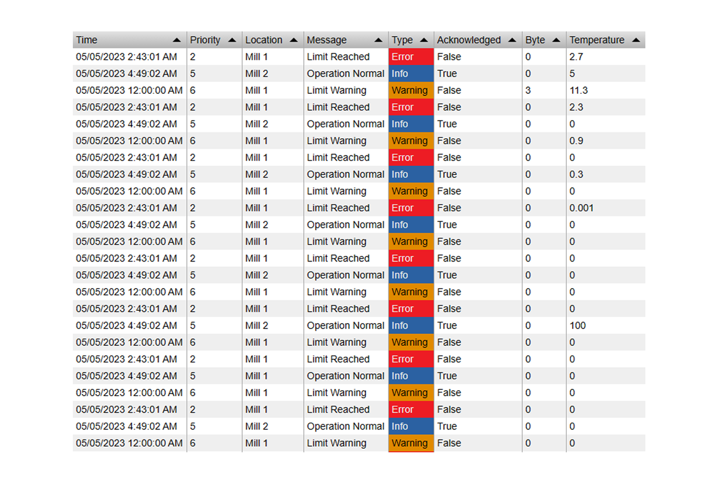
Stop exporting your Event Frames to Excel just to create a pivot table. Event Analytics Pivot+ is a powerful data grid that lets you cross-reference, aggregate, and summarize your batch and downtime data natively inside AVEVA PI Vision. Slice and dice your operational metrics in seconds.
Slice, Dice, and Summarize Your Event Data
Powerful Aggregation
- Dynamic Calculations: Apply math to your event attributes on the fly. Calculate the Sum, Average, Count, Minimum, and Maximum for any numeric column.
- Time-Aware Metrics: Automatically format time-based calculations, turning raw event durations into readable timespans (e.g., hours, minutes).
- Grand Totals: Automatically generate row and column grand totals to get the absolute big picture of your production losses or batch yields.
Interactive Data Navigation
- Multi-Level Grouping: Group your data by multiple event attributes (Series) to create complex, multi-dimensional tables.
- Expand & Collapse: Keep your dashboards clean. Start with a high-level summary and let users click to expand parent rows to see the nested sub-categories.
- Master Filter Controller: Just like our KPI+ symbol, clicking a row in the Pivot table instantly cross-filters the other Event Analytics charts on your display.
Advanced Filtering & Styling
- Top / Bottom N: Filter out the noise. Automatically rank and display only your top bad actors, grouping all remaining data into an "Others" row.
- Multistate Formatting: Apply conditional coloring to specific cells. Highlight high-duration downtime in red or above-average batch yields in green.
- Total Customization: Adjust column widths, typography, background colors, and border styles to match your corporate reporting standards.
From Raw Events to Executive Reports
Downtime Root Cause Analysis
Matrix your event data by crossing 'Asset' rows with 'Reason Code' columns. Instantly see the Total Duration of every failure type across your entire plant floor.
Batch & Production Reporting
Summarize complex batch processes. Create a pivot table showing the Average Cycle Time and Total Material Consumed, grouped by Product Grade and Recipe.
Shift Handover Summaries
Group production events by Shift and Crew to compare performance side-by-side. Calculate total yields and incident counts to see which team is hitting their targets.
OEE & Loss Deployment
Break down your Overall Equipment Effectiveness losses. Expand rows to see exactly how much tonnage was lost due to planned maintenance vs. unplanned breakdowns.
Interactive Data Grids in PI Vision

Pivot Table Root Cause Analysis
Cross-reference your equipment with downtime reason codes. In seconds, you can calculate the Sum or Average duration of failures to instantly spot your biggest operational bottlenecks.

Interactive Expand & Collapse
Navigate complex event hierarchies effortlessly. Start with a high-level summary (e.g., Production Line) and expand the nodes to reveal the specific batch or root cause details nested beneath it.

Focus on Top N Bad Actors
Don't get overwhelmed by massive datasets. Use the built-in Top N feature to display only your top 5 worst-performing assets or most frequent events, intelligently grouping the rest into an 'Others' row.

Highly Customizable Styling
Tailor the pivot table to fit your dashboard perfectly. Customize column widths, typography, cell background colors, and apply Multistate alerts so out-of-spec data jumps off the screen.

Questions?
Click the button below to get in contact, or simply email us at contact@software-athlete.com. We would love to help you.