Box Plot+ for AVEVA PI Vision

PI Vision box plot for spread, quartiles and outliers

Compare how process values spread, hour by hour or tag by tag. Box Plot+ draws the median, quartiles, whiskers and outliers right on the PI Vision display.

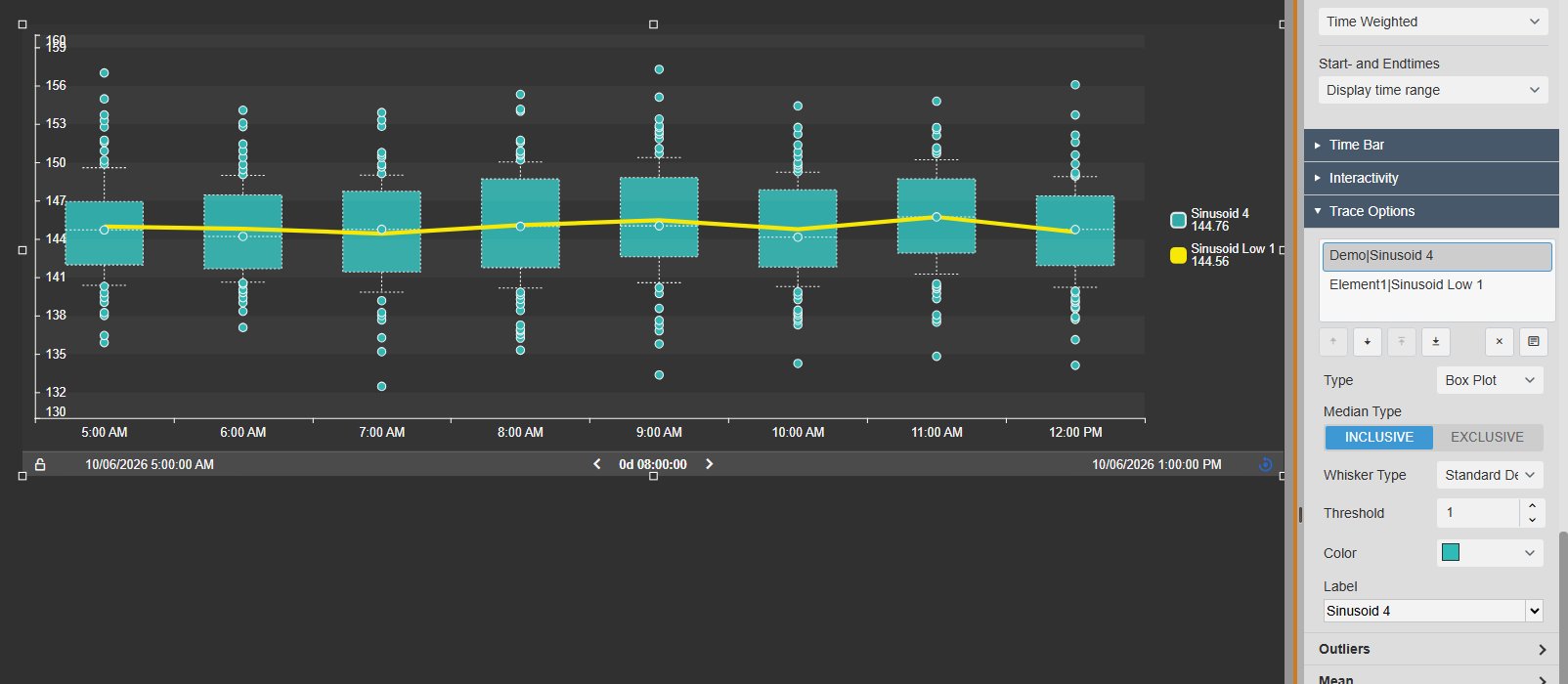
Box Plot+ in PI Vision showing hourly box plots with outliers and a yellow average line, next to the Trace Options settings for trace type, median type and whisker type
Box Plot+ v2.0 in PI Vision with its configuration pane. Demo data. Select the image to enlarge.

Box-and-whisker statistics for PI data

An average hides how much a process varies. Box Plot+ shows the whole spread of each period, so unusual hours and drifting values stand out.

Median, quartiles, whiskers and outliers

Each box summarises one period: where most values lie, where the middle is, and which readings fall outside.

  • Box from the first to the third quartile, with the median line.
  • Mean marker and outlier dots, with their own size and shape.
  • Whiskers at min/max, 1.5 × IQR, a number of standard deviations or custom percentiles.
  • Inclusive or exclusive quartile calculation. Hover a box to read its statistics.
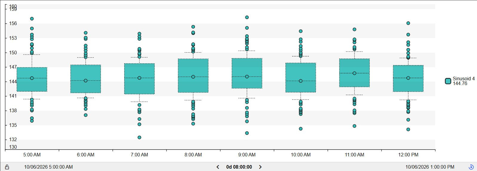
Box Plot+ in the Light theme with one box per hour, mean markers and outlier dots above and below the whiskers
One box per hour with mean markers and outliers, Light theme. Demo data. Select the image to enlarge.

Compare distributions over time and across tags

Group values by hour, shift or day to see how the spread changes, or put several tags, units or lines next to each other.

One box per hour, shift or day

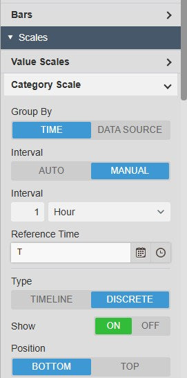
Let Box Plot+ choose the interval from the time range, or set it yourself.

  • Automatic or fixed intervals, from seconds to years.
  • A timeline or discrete time axis, with the date format you choose.
  • Recorded, interpolated or summary data, such as one-minute averages.
Box Plot+ Category Scale settings with Group By time or data source, manual interval of one hour and timeline or discrete axis
Category Scale settings: group by time or data source. Select the image to enlarge.

Several tags side by side

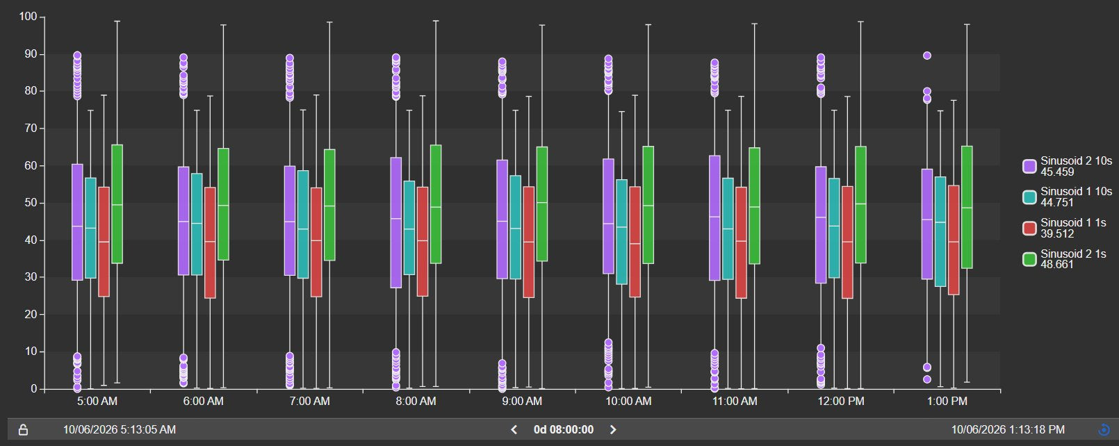
Add more data sources and each interval shows one box per tag, so you can see which signal varies most and when.

  • Each data source keeps its own colour and legend entry.
  • One shared value axis, or a separate scale per data source.
  • Add data sources by dragging attributes onto the chart.
Box Plot+ with four data sources shown side by side for each hour, with a legend and outliers
Four tags compared hour by hour. Demo data. Select the image to enlarge.

One box per data source

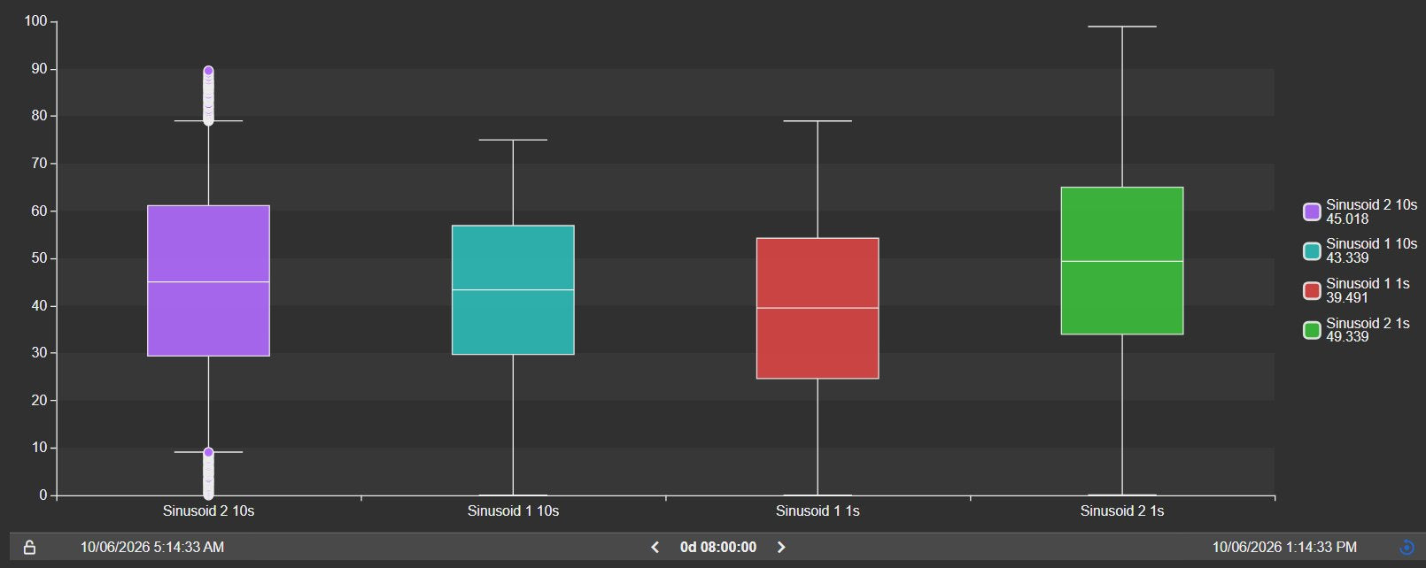
Switch the grouping to data source to compare equipment, lines or units over the same period.

  • One box per tag or AF attribute for the whole time range.
  • Vertical or horizontal orientation.
  • Category labels taken from the data source names.
Box Plot+ grouped by data source, showing one box for each of four tags with medians, quartiles and whiskers
Four tags, one box each, grouped by data source. Demo data. Select the image to enlarge.

Reference lines, scatter and limits on the same chart

Put the spread in context: add an average, a setpoint or a limit line next to the boxes.

Lines, areas and scatter next to the boxes

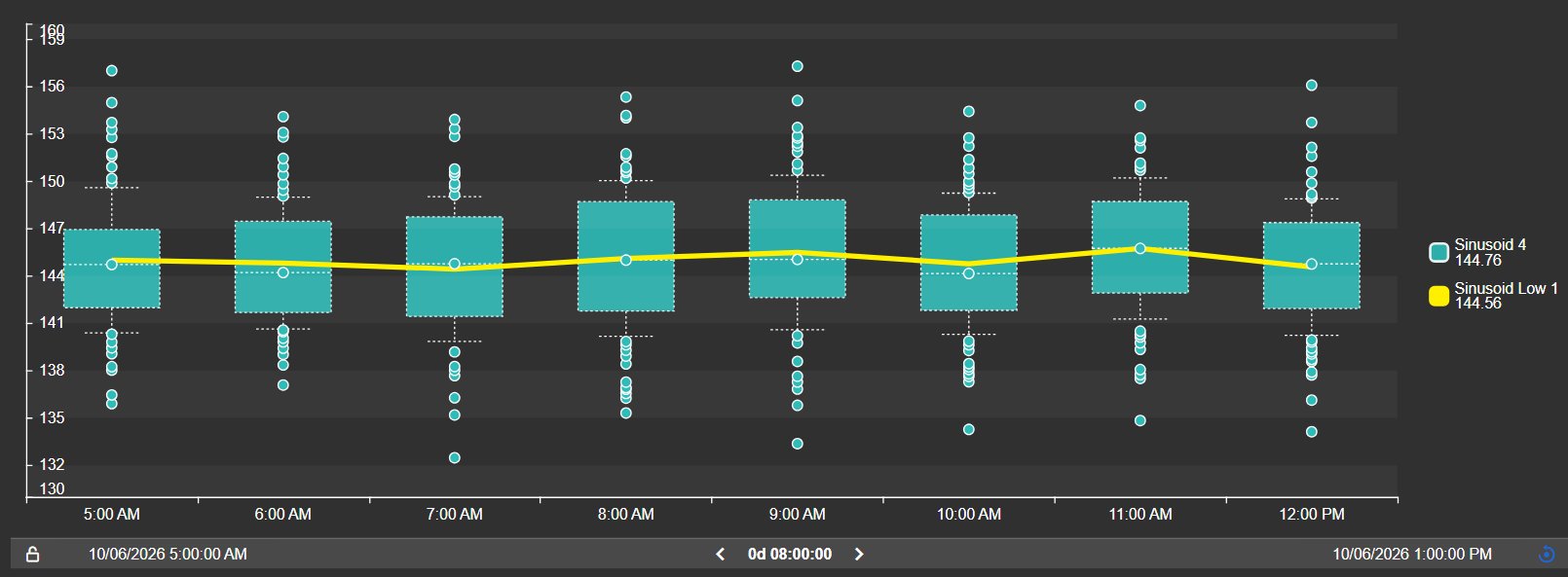
Every data source can be drawn as a box plot, line, area or scatter, so reference values sit on the same axis as the boxes.

  • Line, area and scatter traces aggregate each interval, for example as an average.
  • Raw-data scatter shows every recorded value as a dot.
  • Multi-state limits appear as dotted threshold lines.
  • Choose colour, stroke width and dash per trace.
Box Plot+ with hourly box plots and a thick yellow line showing the hourly average of a second tag
Hourly box plots with the hourly average of a second tag as a line. Demo data. Select the image to enlarge.

Zoom, export and match your display style

Look closer at a period, take the numbers with you, and make the chart look like the rest of your displays.

Toolbar, export and themes

A toolbar on the chart handles zoom, full screen and downloads. The style settings match the chart to your display.

  • Pan, box zoom, zoom in and out, reset and full screen.
  • Download as PNG, SVG or PDF, or the data as CSV, JSON or XLSX.
  • A built-in time bar steps through earlier or later periods.
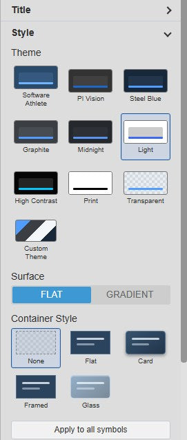
  • Ten themes, flat or gradient surfaces, and container styles from none to glass.
Box Plot+ Style settings with ten theme tiles, surface and container style options
Theme, surface and container style settings. Select the image to enlarge.

PI Vision box plot examples

Four common ways teams use Box Plot+ on their displays.

Shift-to-shift variation

Data
A key process value
Settings
One box per hour or shift, standard-deviation whiskers
Shows
Which periods run wider or drift away from normal

Equipment comparison

Data
The same measurement from several pumps, motors or lines
Settings
Group by data source
Shows
Which unit runs off-centre or with more spread

Setpoint versus actual

Data
A process value and its setpoint
Settings
Box plot plus a line trace
Shows
How far the process spreads around its target

Outlier screening

Data
A quality or sensor value
Settings
1.5 × IQR whiskers, outlier markers
Shows
Hours with unusual readings worth a closer look

Box Plot+ FAQ

Questions we are asked most often. Read the Box Plot+ documentation or ask a technical question.

What does a box in Box Plot+ show?

Each box summarises one interval or one data source. The box spans the first to the third quartile, the line inside marks the median, and the whiskers show the spread. Values outside the whiskers are drawn as outliers.

How are the whiskers calculated?

You choose: minimum and maximum, the furthest values within 1.5 × IQR, exactly 1.5 × IQR, a number of standard deviations around the mean, or custom lower and upper percentiles. Quartiles can be calculated inclusive or exclusive of the median.

Can I compare several tags or assets?

Yes. Add several data sources, then group by time to show them side by side for each interval, or group by data source to show one box per tag for the whole period.

Can I add a setpoint or average line?

Yes. Add another data source and set its trace type to line, area or scatter. Multi-state limits appear as dotted threshold lines.

What do we need to run it?

PI Vision 2021 or later with PI Web API, and PI AF Server 2018 SP2 or later. Box Plot+ runs in PI Vision and uses each user’s existing PI permissions.

How do we get Box Plot+?

Box Plot+ is part of Vision Library+, together with the other Vision Library+ symbols. Request a trial to test it in your own PI Vision environment.

Try Box Plot+ in your PI Vision

Box Plot+ is included in Vision Library+, the PI Vision custom symbol library from Software Athlete. Test it on your own displays and data.