Histogram+ for AVEVA PI Vision

PI Vision histogram with the statistics built in

See how your PI data is spread, where it clusters and how it sits against its limits, with the bell curve, sigma lines and quantiles drawn right on the display.

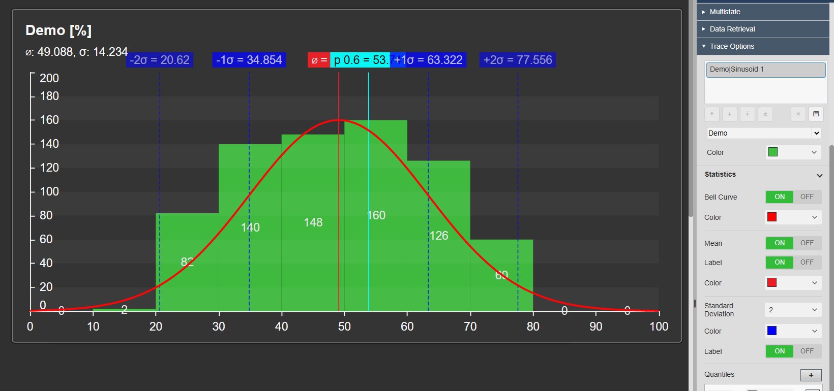
Histogram+ in PI Vision showing a process value distribution with bell curve, mean, plus and minus two sigma lines and a quantile marker, next to the Statistics settings in the configuration pane
Histogram+ v2.0 in PI Vision with its configuration pane. Demo data. Select the image to enlarge.

Statistical overlays for PI Vision histograms

See whether a process is centred and how far it spreads without exporting anything to a spreadsheet. Histogram+ draws the statistics on top of the bars.

Bell curve, mean, sigma lines and quantiles

Compare the real distribution with the normal curve it would follow, and read the key values straight from the chart.

  • Bell curve fitted to the data, in the colour you choose.
  • Mean line and ±1, 2 or 3 standard-deviation lines with values.
  • As many quantile markers as you need, for example P50, P75 and P90.
  • Mean and standard deviation shown under the chart title.
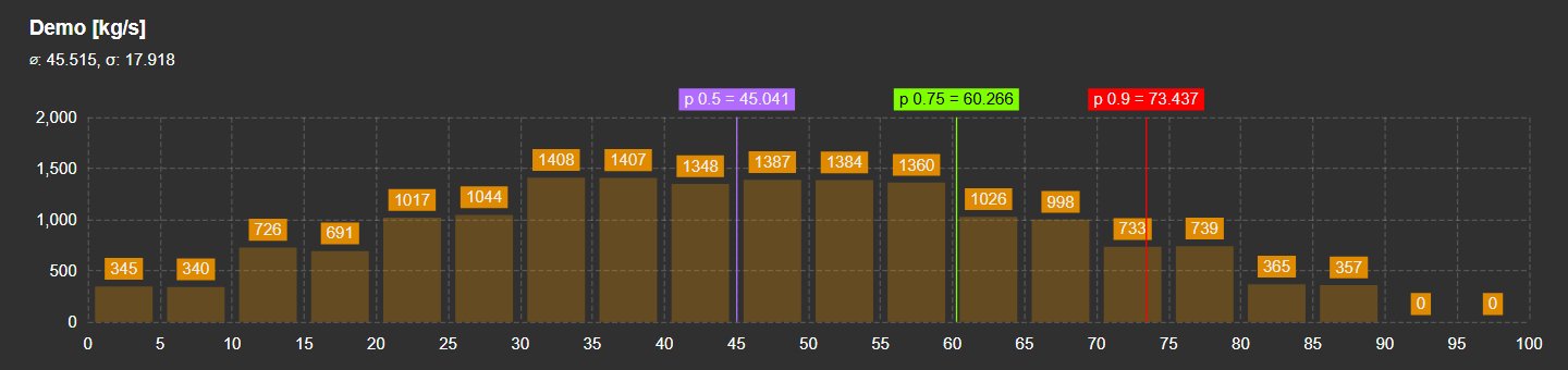
Histogram+ with labelled quantile markers at P50, P75 and P90 and a count printed on every bar
Quantile markers at P50, P75 and P90. Demo data. Select the image to enlarge.

Histograms for numbers, digital states and time in range

Use Histogram+ on PI points and AF attributes of any value type, and decide whether each value counts once or by how long it lasted.

Numbers, digital states and text

Numeric values are grouped into bins. Digital states, strings, booleans and enumerations are counted per value.

  • Digital states appear in the order of their PI state set.
  • Optionally show every state, including states that did not occur.
  • Exact counts on the bars, inside or outside.
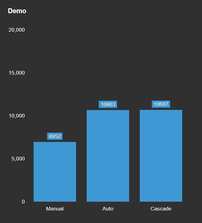
Histogram+ counting the operating modes Manual, Auto and Cascade of a digital PI tag
Operating modes of a digital PI tag. Demo data. Select the image to enlarge.

Pie mode for shares

When the share of each value matters more than the shape, switch the same symbol to a pie chart.

  • One setting switches between histogram and pie.
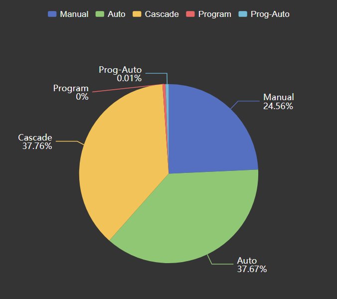
  • Labels show each value with its percentage.
  • Colours follow the data source or your own palette.
Histogram+ in pie mode showing the share of each operating mode with percentages
The same tag in pie mode. Demo data. Select the image to enlarge.

Time-weighted: time spent in each range

Count samples, or weight each value by its duration to see how long the process stayed in each range. This suits slow or irregularly sampled tags.

  • Event-weighted or time-weighted basis.
  • Recorded or interpolated data, with a data limit.
  • A built-in time bar steps through hours, shifts, days or weeks.
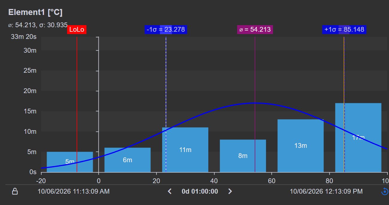
Time-weighted Histogram+ showing the minutes a temperature spent in each range during one hour, with LoLo, mean and sigma lines and the time bar below the chart
Minutes spent in each temperature range during one hour. Demo data. Select the image to enlarge.

Several data sources in one chart

Compare tags, units or production lines in one stacked histogram.

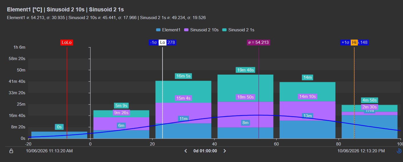
  • Legend with mean and standard deviation per data source.
  • Each data source keeps its own colour.
  • Reorder or remove data sources in the configuration pane.
Stacked time-weighted Histogram+ comparing three data sources, with a legend, per-source statistics and limit lines
Three data sources in one time-weighted chart. Demo data. Select the image to enlarge.

Operating limits and bins under your control

Show whether the distribution sits inside its operating window, and set the bins the way your engineers read them.

Limits as shaded ranges, lines or coloured bars

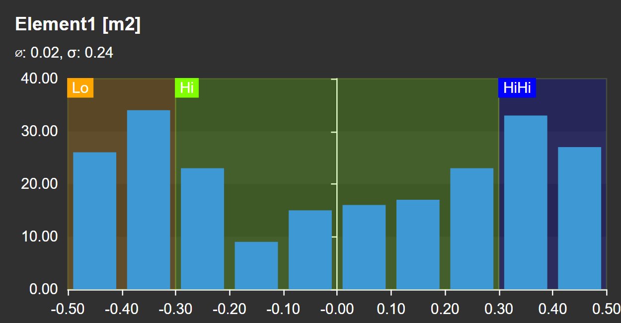
Add a PI Vision multi-state to mark Lo, Hi and HiHi ranges or a target band on the histogram.

  • Show limits as shaded ranges, lines or bar colours.
  • Place limit labels at the start, middle or end of a range.
  • Combine limits with the statistical overlays.
Histogram+ with multi-state ranges shaded as Lo, Hi and HiHi zones behind the bars
Lo, Hi and HiHi ranges from a multi-state. Demo data. Select the image to enlarge.

Bins, range and time window

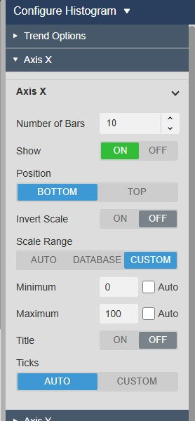
Choose the number of bars and the value range, or let Histogram+ set them from the data.

  • Number of bars, with an automatic or fixed minimum and maximum.
  • Use the display time range, a custom range, or a duration and offset.
  • Counts on the value axis, or durations when time-weighted.
Histogram+ configuration pane with the Axis X settings for number of bars and scale range, and the Data Retrieval settings
Axis X settings for bars and scale range. Select the image to enlarge.

Export histogram data and match your display style

Take the numbers into a report or an analysis tool, and make the chart look like the rest of your displays.

Download as image, document or data

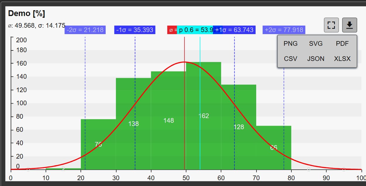
A toolbar on the chart opens it full screen or downloads it in the format you need.

  • PNG, SVG and PDF for reports and presentations.
  • CSV, JSON and XLSX for analysis. CSV uses your locale’s list separator.
  • Show the toolbar always or only on hover.
Histogram+ in the Light theme with the toolbar download menu open, offering PNG, SVG, PDF, CSV, JSON and XLSX
Download menu on a chart in the Light theme. Demo data. Select the image to enlarge.

Themes and styling

Pick a theme for one chart, or apply it to every symbol on the display.

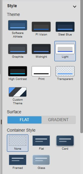
  • Ten themes, including PI Vision, Light, High Contrast, Print and a custom theme.
  • Flat or gradient surfaces, and container styles from none to card or glass.
  • Font size, grid, data labels and tooltips are configurable.
Histogram+ Style settings with ten theme tiles, surface and container style options
Theme, surface and container style settings. Select the image to enlarge.

PI Vision histogram examples

Four common ways teams use Histogram+ on their displays.

Quality spread

Data
A quality parameter, for example a concentration or a weight
Settings
Bell curve, ±2σ, specification limits as multi-state lines
Shows
Whether the process is centred and how much falls outside the limits

Operating modes

Data
A digital mode or status tag
Settings
Pie mode, time-weighted
Shows
The share of time spent in Manual, Auto or Cascade

Time in range

Data
A temperature, pressure or level
Settings
Time-weighted, Lo and Hi ranges, time bar set to one shift
Shows
How many minutes per shift the value was outside its operating window

Unit comparison

Data
The same measurement from two lines or units
Settings
Two data sources in one chart
Shows
Which unit runs wider or off-centre

Histogram+ FAQ

Questions we are asked most often. Read the Histogram+ documentation or ask a technical question.

Which PI data can Histogram+ use?

PI points and AF attributes with numeric, digital state, string, boolean or enumeration values. Several data sources can share one chart.

What is the difference between event-weighted and time-weighted?

Event-weighted counts every value once. Time-weighted counts how long each value lasted, so the chart shows the time spent in each range. Time-weighted suits slow or irregularly sampled tags.

Can I show operating limits on the histogram?

Yes. Add a PI Vision multi-state to the symbol and show its limits as shaded ranges, lines or bar colours.

How do I get the data out of the chart?

Use the download menu in the chart toolbar for PNG, SVG, PDF, CSV, JSON or XLSX, or Export Data in the symbol’s context menu.

What do we need to run it?

PI Vision 2021 or later with PI Web API, and PI AF Server 2018 SP2 or later. Histogram+ runs in PI Vision and uses each user’s existing PI permissions.

How do we get Histogram+?

Histogram+ is part of Vision Library+, together with the other Vision Library+ symbols. Request a trial to test it in your own PI Vision environment.

Try Histogram+ in your PI Vision

Histogram+ is included in Vision Library+, the PI Vision custom symbol library from Software Athlete. Test it on your own displays and data.