Navigation Menu+ for AVEVA PI Vision

PI Vision navigation menu shared across your displays

Give operators one consistent way to move between PI Vision displays. Navigation Menu+ builds a menu bar of display and web links, opens them in the current time range or asset, and can keep one menu for many displays in AF.

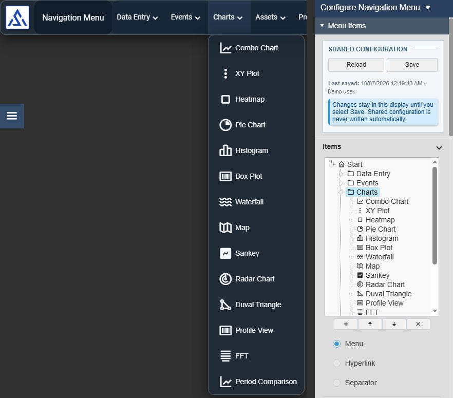
Navigation Menu+ in PI Vision: a horizontal menu bar with a company logo, the current display title and the menus Data Entry, Events, Charts and Assets, with the Charts dropdown open and listing chart displays with icons, next to the configuration pane with the Shared Configuration block, the item tree and the item type
Navigation Menu+ v2.0 on the demo display with its configuration pane. The menu is shared from an AF attribute; the user name is replaced. Select the image to enlarge.

PI Vision navigation menu layouts

Place the menu where it fits the display: as a side bar, a top bar or a single icon that opens when it is needed.

Vertical or horizontal, inline or dropdown

Choose how the bar sits on the display and how operators open submenus.

  • A vertical bar along the side or a horizontal bar along the top.
  • Inline opens a submenu inside the bar; Dropdown opens it as a floating panel on hover and the bar stays as it is.
  • Menus inside menus, for example for areas, units and equipment.
  • Wrap Items moves horizontal items that do not fit onto further rows.
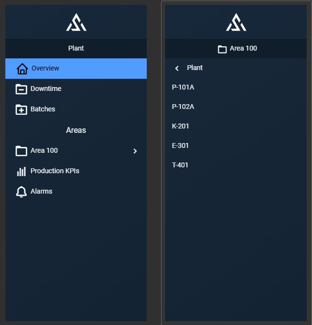
A vertical Steel Blue Navigation Menu+ bar at the top level with logo, title Plant, the highlighted current display, a text separator Areas and the Area 100 menu, and the same bar with Area 100 opened inline, showing a back row to Plant and the equipment items
A vertical inline menu at the top level and inside Area 100. The hero above shows the horizontal dropdown layout. Demo menu. Select the image to enlarge.

Static or expandable

Keep the menu in view, or give the display its full space and open the menu on demand.

  • Static keeps the bar visible at all times.
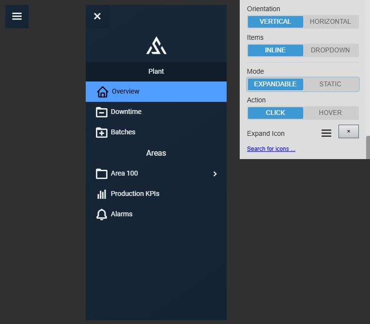
  • Expandable collapses the bar to an icon and opens it on click or on hover.
  • Your own expand icon from the icon library.
  • Scale with Zoom scales the menu with the PI Vision display zoom.
Navigation Menu+ collapsed to a menu icon and the same menu expanded with a close button, next to the Layout settings with Orientation Vertical, Items Inline, Mode Expandable, Action Click and the Expand Icon
An expandable menu, collapsed and open, with its Layout settings. Demo menu. Select the image to enlarge.

Show operators where they are

The menu highlights the open display, so nobody has to guess where they are in a large set of displays.

  • The item that links to the open display is highlighted.
  • Title: hidden, the name of the open menu, or the current display.
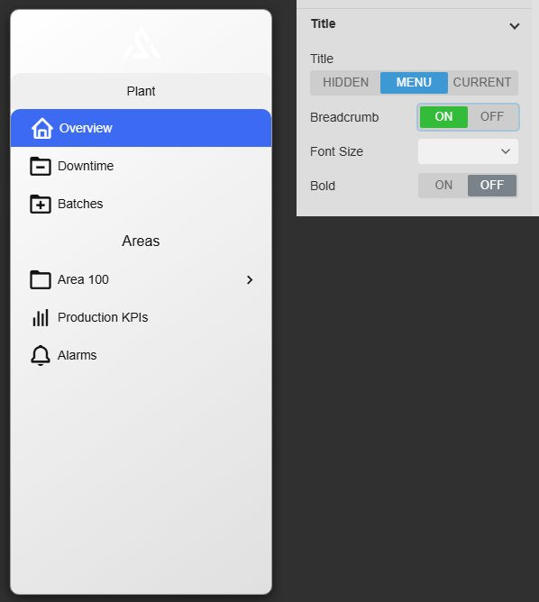
  • Breadcrumb adds a back row to the parent menu, so any level is one selection away.
  • The title tooltip shows the full path.
Navigation Menu+ in the Light theme with the Card container, the title Plant and the current display Overview highlighted, next to the Title settings with Title Menu and Breadcrumb on
The open display is highlighted; Title and Breadcrumb settings. Demo menu. Select the image to enlarge.

Shared PI Vision menus, themes and branding

Maintain one menu for a whole set of displays and give it the look of your company and control room.

One menu for many displays

Store the menu in an AF attribute, and every display that uses the attribute shows the same menu tree and settings.

  • One AF attribute of type String holds the shared menu; display-local menus need no data source.
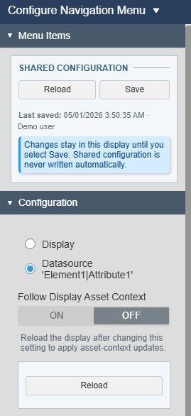
  • Changes stay in the display until someone selects Save; shared configuration is never written automatically.
  • The pane shows when the menu was last saved and by whom.
  • Saving needs write access to the AF attribute.
Navigation Menu+ Shared Configuration block with the Reload and Save buttons, the last saved time and user and the note that shared configuration is never written automatically, above the Configuration section with the Datasource store and Follow Display Asset Context
Shared Configuration with an explicit Save. User name replaced. Select the image to enlarge.

Themes, logo and kiosk toolbar

Match the menu to your displays and give wall and kiosk screens the controls they need.

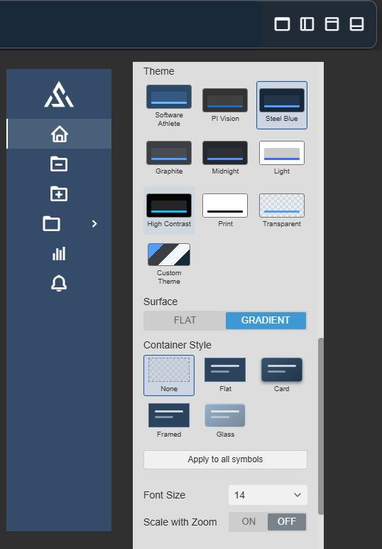
  • Shared Vision Library+ themes such as Steel Blue, Light or High Contrast, a flat or gradient surface and the containers None, Flat, Card, Framed or Glass, or your own colours and font.
  • A company logo at the start or end of the bar.
  • Icon position, alignment, spacing and padding for the items.
  • A back button, and a kiosk toolbar that switches kiosk mode, the sidebar, the toolbar and the time bar.
The end of a horizontal Navigation Menu+ bar with the four kiosk toolbar buttons, an icon-only vertical bar in a custom theme with the current display highlighted, and the Style settings with the theme grid, surface and container styles
Kiosk toolbar, an icon-only menu and the Style settings. Demo menu. Select the image to enlarge.

PI Vision navigation menu examples

Four common ways teams use Navigation Menu+ on their displays.

Plant-wide display portal

Data
A String AF attribute that holds the menu
Settings
Horizontal, Dropdown, logo at the start, Title Current, store Datasource
Shows
The same tree of areas, units and reports on every display, with the open display highlighted

Unit displays in asset context

Data
Links to an asset-relative unit display
Settings
Set asset context: Use current asset from the Display Asset; Set start and end time: Display time range
Shows
The unit display opened for the same asset and period

Control room wall display

Data
A menu stored in the display
Settings
Horizontal, Static, logo at the start, Show Kiosk Toolbar
Shows
A fixed top bar with the company logo and buttons for kiosk mode, sidebar, toolbar and time bar

Procedures next to the process

Data
URLs of operating procedures and reports
Settings
A text separator “Procedures”, hyperlinks with Open in New Tab
Shows
Procedures that open in a new browser tab beside PI Vision

Navigation Menu+ FAQ

Questions we are asked most often. Read the Navigation Menu+ documentation or ask a technical question.

When should we use Navigation Menu+ instead of Navigation Button+?

Use Navigation Menu+ when a display needs a hierarchy of several links: one menu bar with nested menus, the open display highlighted and, if you store it in AF, the same menu on every display. Use Navigation Button+ for one visible action that opens a display or URL, with its own text, icon and colours and a URL that can come from a PI Point or AF attribute. Both can pass the time range and asset context.

Can several displays share one menu?

Yes. Store the menu in an AF attribute of type String and add that attribute to each display. Changes stay in the display until someone selects Save in the configuration pane, which needs write access to the attribute; shared configuration is never written automatically. A menu stored in the display needs no data source.

Can a link open the next display for the same asset and time range?

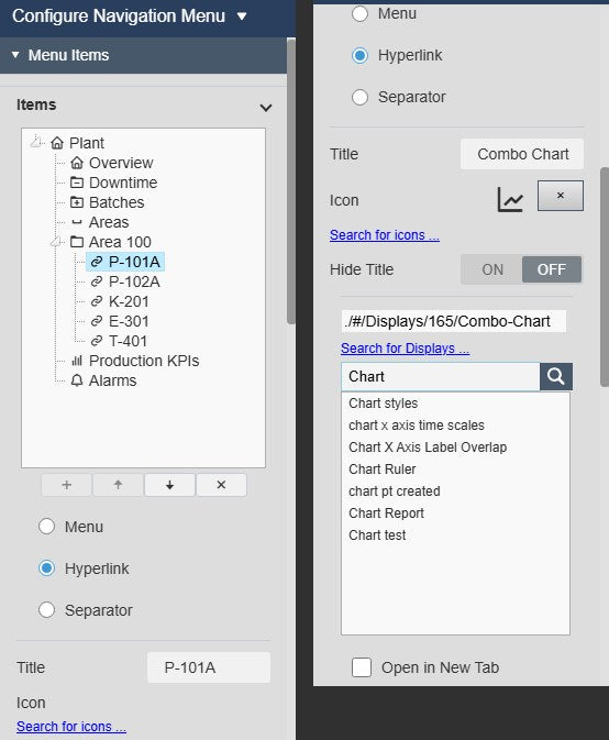
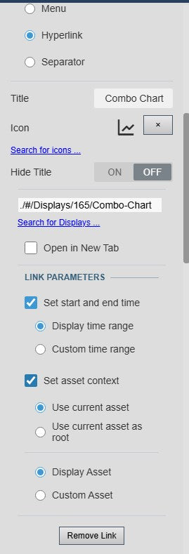
Yes. Each link can pass the current display time range or a custom start and end time, and the current asset, either as the asset to show or as the root of the destination’s asset tree. The asset comes from the display or from an AF element you set. Operators still need access to every linked display or page.

We already use Navigation Menu+. What changes with version 2.0?

Existing displays and shared menus keep working. Older options are mapped to their replacements when a menu loads, for example Multiple Rows to Wrap Items and Navigation History to Breadcrumb. Upgraded menus start without a frame; choose the Flat or Card container to add one. The mapped values are stored the next time the display or the shared menu is saved.

What do we need to run it?

PI Vision 2021 or later with PI Web API, and PI AF Server 2018 SP2 or later for a menu stored in AF. Shared menus are read and saved through PI Web API with each user’s existing PI permissions.

How do we get Navigation Menu+?

Navigation Menu+ is part of Vision Library+, together with the other Vision Library+ symbols. Request a trial to test it in your own PI Vision environment.

Try Navigation Menu+ in your PI Vision

Navigation Menu+ is included in Vision Library+, the PI Vision custom symbol library from Software Athlete. Test it on your own displays and data.