Vision Library+ / Asset navigation and context
Navigation Menu+
Navigation Menu+ builds a reusable navigation bar of links to PI Vision displays, URLs, and asset-context destinations, and can share one menu definition across many displays.
Overview
Navigation Menu+ builds a reusable navigation bar of links to PI Vision displays, URLs, and asset-context destinations, and can share one menu definition across many displays.
Watch the demo
See Navigation Menu+ in a practical PI Vision workflow.
When to use it
Use this symbol when you need to:
- Create consistent navigation across a set of operational displays.
- Maintain one shared menu definition that several displays reuse and stay synchronized with.
- Give operators a compact bar that collapses when it is not in use.
Before you begin
- Prepare the destination displays or approved URLs.
- Confirm which links must pass display time or asset context.
- For a shared menu, create an AF attribute of data type String to hold the configuration.
Add and set up the symbol
- Select the symbol in the PI Vision symbol gallery.
- For a shared menu, drag the String AF attribute that will store the configuration onto the display. For a display-local menu, no data source is required.
- Right-click the symbol and select Configure.
- Under Menu Items, build the item tree.
- Under Settings, choose the layout and appearance.
- Confirm that selecting an item opens the expected destination.
Use the symbol
Select an item to open its destination. A Menu item opens its child items; a Hyperlink opens a display or URL. Depending on the item's settings, the link can carry the display time range, the asset context, or open in a new browser tab.
In Expandable mode the bar stays collapsed until the operator clicks or hovers the expand icon.
Configure the symbol
Overview and behavior
Navigation Menu+ is built on three independent axes. Every combination is supported, and all three are set in the Layout group of the Settings section.
- Orientation - Vertical places the bar along the left edge of the symbol; Horizontal places it along the top.
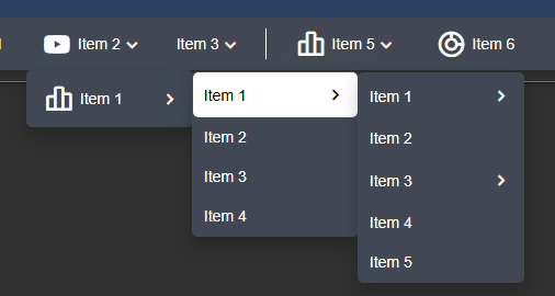
- Items - Inline drills down inside the bar itself: selecting a menu replaces the visible list with that menu's children. Dropdown opens child items as a floating panel over the display, so the bar never changes.
- Mode - Static keeps the bar visible at all times. Expandable collapses it to an icon and opens it on demand.
Two further settings belong to the Mode axis and appear only when Mode is Expandable:
- Action - opens the menu on Click or on Hover.
- Expand Icon - the icon shown while the bar is collapsed. Select Search for Icons to pick one, or remove it to return to the default icon.
The Navigation Menu+ always highlights the item that matches the currently open display, so operators can see where they are without any extra setting.
Menu items
The Menu Items section holds the navigation tree. Select an item in the tree to edit it; use the buttons below the tree to add a child item, move the selected item up or down, or delete it.
Three item types are available:
- Menu - a container that holds other menus and links. Selecting it opens its child items, inline or as a dropdown depending on the Items axis.
- Hyperlink - opens another display or an external URL.
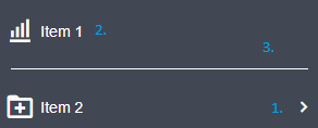
- Separator - a visual divider. Choose Line for a horizontal rule or Text for a labeled group heading. The separator editor is offered for vertical bars; a horizontal inline bar renders only the divider, not the text.
Every menu and hyperlink item has these settings:
- Title - the label shown in the bar.
- Icon - the icon shown next to the label. Select Search for Icons to pick one, or use the small x beside the preview to remove it.
- Hide Title - available once an icon is set; shows only the icon and suppresses the label.
Configure a navigation link
The link editor appears for a Hyperlink item, for the root item, and for a Menu item when Items is set to Dropdown (so a dropdown menu can both open its children and carry a destination of its own).
- Link - the target display URL or external URL. Select Search for Displays to look a PI Vision display up by name or owner and insert its link, instead of pasting the URL by hand.
- Open in New Tab - opens the target in a new browser tab.
- Remove Link - clears the configured link.
Giving the root item a link is what makes the title and the logo clickable: selecting either then opens that destination.
Below the link controls, under a Link Parameters heading, two further settings decide what the opened display should show. Both require a link to be configured first.
- Set start and end time - passes a time range to the opened display. Choose Display time range to hand over the current display's range, or Custom time range to enter a fixed start and end time.
- Set asset context - passes an asset to the opened display. Choose Use current asset or Use current asset as root, then choose whether the asset comes from the Display Asset or from a Custom Asset you type or drag onto the field.
Style
The Style group controls the colors and typography of the bar.
- Theme - the shared Vision Library+ style selector. Pick a preset, or select Custom to set the colors yourself. With Custom, the highlight drawn behind the hovered and the current menu item is computed automatically as a light or dark tint of the background color, so it stays visible on both light and dark bars.
- Foreground / Background - the item text color and the bar background. Available when the theme is Custom.
- Border - the color of the menu's outer border, drawn by the Flat and Card container styles. Available when the theme is Custom; leave it transparent to let the border color follow the foreground color automatically.
- Title Background - the background color of the title band above the menu items. Available when the theme is Custom and the title is not hidden; leave it transparent to show the bar background through the title band.
- Font Size - the font size for menu item text.
- Font Name - the font family for all menu text. Available when the theme is Custom.
- Scale with Zoom - scales the font and the item sizes with the display's zoom level, so the bar stays legible at any zoom setting.
Items
The Items group controls how each menu item is laid out.
- Icon Position - places the item icon Left of the title, Right of it, or Above it.
- Align - aligns the items within the bar: Left, Center, or Right.
- Spacing - the space between items.
- Padding - the space inside each item, around its icon and title. Item height follows the font size and this value.
- Wrap Items - horizontal bars only. When the items do not fit the bar's width, they wrap onto further rows instead of scrolling. This setting was called Multiple Rows in earlier versions.
Title
- Title - Hidden shows no title. Menu shows the name of the menu that is currently open. Current shows where the operator is: the name of the item matching the open display.

- Breadcrumb - shows where the operator is, in whichever way the current presentation allows. In an inline menu it lists the trail of parent menus as rows above the item list, so any level can be reached in one selection; with Breadcrumb off, a single Back row is shown instead. When Title is set to Current, it also spells the full path out in the title rather than showing only the last name - which is the visible effect in a dropdown menu, where the bar itself never drills down. The title's tooltip always shows the full path.

- Font Size and Bold - the title's own font size and weight. Both appear only when Title is not Hidden.
Logo
- Image - select a logo image to show in the bar, or clear the current one.
- Position - places the logo at the Start or the End of the bar.
- Size - the logo size, as a percentage.
Toolbar
- Show Back - adds a back button that returns the browser to the previously opened display.
- Show Kiosk Toolbar - shows the kiosk toolbar, whose four buttons toggle kiosk mode, the PI Vision sidebar, the display toolbar, and the time bar.

Configuration store
The Configuration section decides where the menu is stored.
- Display - the menu is saved inside this display only.
- Data source - the menu is saved in an AF attribute of data type String, so several displays can share it. PI Points are not supported.
Storing the configuration in an AF attribute lets you share and reuse one menu across multiple displays. Attribute-backed changes are written only when you select Save in the open configuration pane; nothing is ever written automatically, and nothing is written while a display loads.
Synchronize configuration across displays
Follow these steps to synchronize one Navigation Menu+ configuration across multiple displays:
- Create an AF attribute
Create an AF attribute with data type String on any element. This attribute acts as the shared configuration store. Navigation Menu+ reads the attribute as the authoritative shared menu; a menu copy previously saved inside a display is never used to replace a valid attribute configuration.

- Create the Navigation Menu+
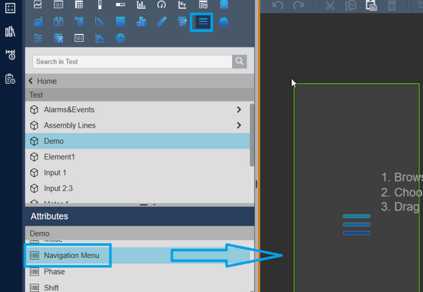
With the Navigation Menu+ symbol type selected in PI Vision, drag the AF attribute onto the display. This creates a Navigation Menu+ symbol already linked to that attribute.
- Set the configuration store
Right-click the symbol, open the Configuration section, and set the store to Data source.
If the attribute already contains a valid menu, Navigation Menu+ asks you to confirm before it replaces the display's own menu configuration. That replacement cannot be undone, so decline the prompt if you wanted to keep the menu you just configured; the store then stays on Display.
If the attribute is empty, nothing has been written yet. The symbol keeps showing your current menu as a preview of what will become the shared configuration, and the pane reports that the attribute is empty. Select Initialize Shared Configuration and confirm to write that menu to the attribute for the first time. Until you do, closing the configuration pane makes the symbol fall back to the default placeholder menu, because a data source-backed menu never renders configuration that only exists in the display.
After editing an attribute-backed menu, select Save. Changes remain local to the open editor until Save succeeds, and the pane reports unsaved changes until then. Closing the pane without saving discards the draft and restores the current shared configuration.
Use Reload to discard a draft and retrieve the current attribute value. If another display changes the attribute while you have unsaved edits, Navigation Menu+ reports a conflict and refuses to overwrite the newer value. Reload the shared configuration and reapply the intended changes.
The pane also shows when the shared configuration was last saved and by whom.
Add the same attribute to any other display to create a synchronized Navigation Menu+ that shares the same item tree and settings. Open displays refresh when PI Vision reports a changed attribute value; a dirty editor retains its draft and reports a conflict instead of replacing it silently.
To create a separate independent menu, create a new AF attribute and use that as the configuration store for the new symbol.
Asset context
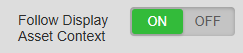
By default this symbol is not asset-context aware: an asset-context switch of the display does not change the symbol's data source. To change that, set the configuration store to Data source and toggle Follow Display Asset Context to ON. Reload the display after changing this setting so asset-context updates are applied.
Upgrading from earlier versions
Existing displays and shared attributes keep working. When a menu saved by an earlier version is loaded, the options it used are mapped onto their replacements automatically:
| Earlier version | Now |
|---|---|
| Multiple Rows | Wrap Items |
| Icon inline together with the icon position | Icon Position (Left / Right / Above) |
| Label alignment | Align (Left / Center / Right) |
| Title Show together with Title type | Title (Hidden / Menu / Current) |
| Navigation History and Show Path - the two separate "path" options | Breadcrumb |
| The old border and shadow settings | Container Style - every existing menu becomes None |
The old border color, border width, border radius and shadow settings are no longer used. The menu frame now comes entirely from Container Style in Style, which you can change at any time. Every existing menu starts on None, so it keeps its unframed look and a menu that used to draw a shadow or a border loses it once, on the first load after the upgrade.
A newly added Navigation Menu+ starts on Flat instead - a thin border and slightly rounded corners, with no extra padding. To give an upgraded menu the same frame, select Flat (or Card, which adds a drop shadow) in Container Style. Its border is drawn in the theme color; with the Custom theme you can recolour it with Border.
Some options were removed because the layout now derives them:
- Fixed item width, item height, container height, and vertical spacing are gone. Item height follows the font size and Padding.
- Title width and title alignment are gone. The title fits its own text.
- Remember Selection is gone as an option; highlighting the item that matches the open display is now always on.
- The Number Format section is gone; it had no effect on this symbol.
The mapped values are held in memory only. They are stored the next time the display is saved, or - for an attribute-backed menu - the next time you select Save. Until then the original settings remain untouched, so rolling back to an older Vision Library+ version still reads the menu exactly as it was.
Troubleshooting and limitations
- Check: If a link opens the wrong context, check its destination, its Link Parameters, and the configuration store it came from.
- Check: Operators need permission to access every linked display or external page.
- Check: Saving and initialization require proven AF write permission. If permission cannot be verified, the write actions remain disabled.
- Check: A malformed shared configuration is never replaced automatically. Repair the attribute value or restore valid Navigation Menu+ JSON, then select Reload.
- Check: Wrap Items applies to horizontal bars only; a vertical bar always scrolls.
- Limitation: Save performs a fresh conflict check immediately before writing. PI Web API does not provide an atomic compare-and-swap operation for this value, so two users who save at virtually the same instant still have a small last-writer-wins race window.