Vision Library+ / Charts and analytics
Event Analytics KPI+
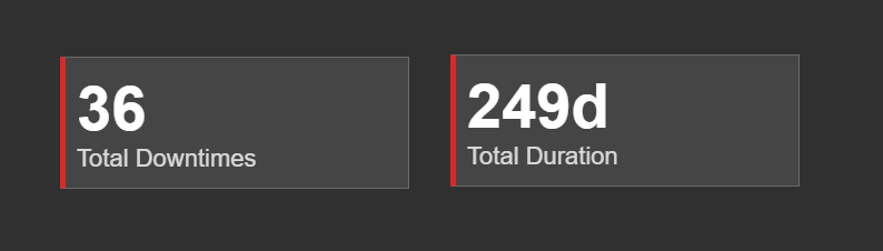
Event Analytics KPI+ summarizes an event-frame search as one or more key performance indicators.
Overview
Event Analytics KPI+ summarizes an event-frame search as one or more key performance indicators.
When to use it
Use this symbol when you need to:
- Show an event count, duration, total, average, or other aggregate as a KPI.
- Compare the same event measure across series.
- Compare each KPI card with a static target and see the difference immediately.
Before you begin
- Prepare an event-frame template and search that returns the intended events.
- Choose a numeric field for aggregations other than event count.
Add and set up the symbol
- Select the symbol in the PI Vision symbol gallery.
- Add the required data sources or asset context to the display.
- Right-click the symbol and open its configuration pane.
- Configure the minimum data, range, and display settings for a useful result.
- Confirm that the symbol shows the expected data.
Use the symbol
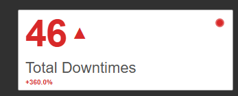
Review the KPI value and use any enabled click or hover action for additional context. When a target is enabled, one compact comparison badge below the card label combines the arrow, colored difference, and benchmark description.
Configure the symbol
Overview and behavior
The Event Analytics KPI+ symbol provides a high-level summary of event frame data as aggregated metrics displayed in a responsive grid of cards. Rather than listing individual event rows, it calculates KPIs - totals, averages, counts - and presents them at a glance.
Typical uses:
- Total Duration of all downtime events this week.
- Count of high-severity safety incidents.
- Average Duration of events grouped by Asset or Root Cause, displayed side-by-side.
Use it as a dashboard entry point - a quick read of critical metrics before drilling into charts or tables.
The core concept: values and series
KPI cards are generated from a combination of Values (the calculation) and Series (the grouping).
- Value only (no Series): A single card showing the aggregated total across all search results (e.g., Total Downtime).
- Value + Series: The symbol generates one card per unique category in the Series.
- Example: If your Value is Count, and your Series is [Asset](vscode-file://vscode-app/c:/Program%20Files/Microsoft%20VS%20Code/resources/app/out/vs/code/electron-browser/workbench/workbench.html), you will get a card for "Pump 1 - Count", "Pump 2 - Count", etc.
- Multiple Values: The card count multiplies. Configuring Count and Sum grouped by Asset (Pump 1, Pump 2) produces 4 cards total.
Configuration
1. Values (The Metrics)
Values define the metrics to calculate. Multiple values can be added to the same symbol.
- Name: The Event Frame property or Referenced Element Attribute (e.g., [Duration](vscode-file://vscode-app/c:/Program%20Files/Microsoft%20VS%20Code/resources/app/out/vs/code/electron-browser/workbench/workbench.html), [Severity](vscode-file://vscode-app/c:/Program%20Files/Microsoft%20VS%20Code/resources/app/out/vs/code/electron-browser/workbench/workbench.html), |Temperature) to analyze.
- Summary Type: The calculation method to apply to the numerical data. Options typically include Count, Sum, Average, Minimum, Maximum, CountDistinct, etc. (Note: Time-based properties like Duration will automatically format as readable timespans).
- Caption: By default the card title is the property name plus summary type (e.g., Duration (Average)). Override it with a friendly name such as Average Downtime.
2. Target (The Benchmark)
Each Value can have one optional static target. The target is evaluated separately for every card generated by that Value. For example, if Count is grouped by Asset, one Count target applies to every Asset card. The target value remains hidden by default so repeated cards stay compact.
To configure a target:
- Under Values, select the Value you want to compare.
- Keep Show enabled, then enable Target.
- Optionally enable the Target section's Show switch to append the configured target value to the comparison badge.
- Enter the target Value. Duration targets use the same duration format as the KPI.
- Choose how to display the Difference:
- Value shows the signed numerical difference, such as
+6or-2h. - Percent shows the signed percentage difference, such as
+12.5%. A percentage difference is not shown when the target is zero.
- Choose the semantic Direction:
- Higher is better treats values at or above the target as favorable.
- Lower is better treats values at or below the target as favorable.
The arrow always describes the numerical comparison: an up arrow means the current value is above the target, and a down arrow means it is below the target. No arrow is shown when the value equals the target. The whole badge uses the favorable or unfavorable color determined by Direction, so an up arrow can be unfavorable when lower values are better.
The arrow is a target comparison, not a change-over-time trend. The badge reads like ▲ +6 vs. Target. When Show is enabled, it becomes ▲ +6 vs. Target · 40. Target coloring is independent from Multi-state formatting, which can still control the card's other visual treatments.
3. Series (The Grouping)
Series slice Values by different categories.
- Name: The property to group by (e.g., Reason, [Asset](vscode-file://vscode-app/c:/Program%20Files/Microsoft%20VS%20Code/resources/app/out/vs/code/electron-browser/workbench/workbench.html), Shift).
- Top / Bottom N: Restrict the view to the most relevant categories when there are many.
- Mode & Count: Set the direction (Top or Bottom) and how many items to show (e.g., Top 3, Bottom 5).
- Value Index: The Value used to rank categories (e.g., Top 5 Assets ranked by Total Duration).
- Show Others: Aggregates remaining categories into a single Others card to preserve the grand total.
- Sort: Arrange cards in Ascending or Descending order based on a selected Value.
Interactive features
Click Action
Choose None, Drilldown, or Filter. Filter selects KPI cards and publishes them according to Output Mode: None, Master, Linked, or Both. Single selection replaces the previous card; Multiple selection keeps several categories active and republishes their complete distinct value set. Selected cards use the configured theme's highlight treatment.
Under Filtering > Input, Master and Linked filters can restrict the KPI's loaded Event Frames. Ignore Master keeps the KPI independent from incoming Master filters while preserving Linked inputs.
Drilldown behavior
Drilldown changes how multiple Series behave. Without drilldown, adding two Series (e.g., Asset and Reason) creates a card for every combination (e.g., Pump 1 - Motor, Pump 1 - Seal).
If Drilldown is enabled:
- The symbol initially only shows cards for the first Series (e.g., purely Assets: "Pump 1", "Pump 2").
- Clicking the Pump 1 card navigates deeper. The cards animate to show the second Series filtered for Pump 1 (e.g., Motor Failure, Seal Leak).
- A Drill Up (⇧) button appears in the top-right corner to navigate back up the hierarchy.
Drilldown and Filter are mutually exclusive click actions. See Filtering dashboards for the channel configuration and multi-selection rules.
Layout and styling
Layout Options
The Layout section controls how cards wrap and fill the symbol's bounding box.
- Auto: The symbol automatically determines the optimal row and column count based on its height and width.
- Fixed Rows / Fixed Columns: Forces the grid to a strict row or column count (set by Line Count), wrapping items as needed.
- Spacing: Controls the pixel gap between individual cards.
Card Style
Sets the base appearance for all cards:
- Colors: Set the default Text Color, Background Color, and Border Color.
- Typography: Set the Font Family, configure Font Size independently for the Value and the Title, and choose Text Alignment (Left, Center, Right).
- Border Radius: Add rounded corners to the cards.
Conditional formatting (Multi-state)
KPI cards can change color dynamically based on their calculated value. Right-click the symbol and choose Configure multi-state to set this up. multi-state is configured per Value - select the correct Value from the dropdown in the configuration pane.
- Enable multi-state: Turn on conditional formatting for the selected Value.
- Status: Type a limit and press Enter, or choose the
+button, then pick its color. Limits compare with <= and are listed from the highest down, whatever order you add them in. For example: Value ≤ 50 → Green; Value ≤ 100 → Yellow. For a Value whose data type is a timespan, such as Duration, type the limits as timespans (1h,30m,1d) instead of numbers. - Error: The first row sets the color for everything the limits do not cover: a value above the highest limit, a value that is not a number, and a Value with no data at all. Set it to transparent to leave those cards unpainted.
- Property: This defines how the color is applied to the card:
- Text: Only the numerical value changes color.
- Fill: The entire card background changes to the multi-state color. The symbol automatically selects a high-contrast text color (black or white) to keep the text readable.
- Border: Adds a thick, colored accent border to the left side of the card, leaving the standard background alone.
Troubleshooting and limitations
- Check: If a KPI is blank, validate the event search, value field, aggregation, and time range.
- Check: The KPI reflects only events returned by its configured search.