Vision Library+ / Data entry
Quick Input+
Quick Input+ writes one operator-selected value to a PI Point or AF attribute using a control suited to its data type.
Overview
Quick Input+ writes one operator-selected value to a PI Point or AF attribute using a control suited to its data type.
Watch the demo
See Quick Input+ in a practical PI Vision workflow.
When to use it
Use this symbol when you need to:
- Provide a compact button, switch, list, slider, or input for a single write.
- Record common operator actions with minimal interaction.
Before you begin
- Prepare a writable PI Point or AF attribute with the correct data type and security.
- Confirm whether writes require confirmation, a reason, or a custom timestamp.
Preparing tags
Before adding the symbol to a display, confirm that the PI Points to be used are configured correctly. Two point attributes are critical:
- Compression: Disable compression on every PI Point used for manual data entry. If compression is left enabled, the PI compression algorithm may silently discard manually entered values that fall within the compression deadband.
- Step: Set the Step attribute to On for all numeric PI Points used for manual entry. Without this, the PI System interpolates values between recorded timestamps, which can cause other symbols displaying the same tag to show incorrect intermediate values.
Add and set up the symbol
- Select the symbol in the PI Vision symbol gallery.
- Add the required data sources or asset context to the display.
- Right-click the symbol and open its configuration pane.
- Configure the minimum data, range, and display settings for a useful result.
- Confirm that the symbol shows the expected data.
Use the symbol
Select or enter a value and confirm it when required. Unless a submit button is enabled, the interaction writes immediately to the configured data source.
Configure the symbol
Overview and behavior
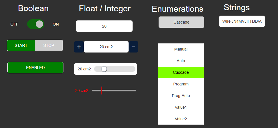
Quick Input+ is a lightweight data-entry symbol that writes a value to the PI System in a single interaction. No Save button is required by default - as soon as the operator selects or types a value, it is written to the PI data archive. The symbol supports all PI Vision data types: Numeric (integer and float), String, Boolean, and Enumeration Set.
General configuration
The Configuration pane provides access to all symbol settings, covering interactivity, timestamp behavior, visual styling, and tooltip options.
- Right-click the symbol and select Configure Quick Input to open the configuration pane.
- Under Interactivity, configure the symbol's write behavior and the input control displayed to the operator.
- Auto Save: When enabled, the value is written to the PI System immediately after the operator changes it. When disabled, an Apply button is shown and the write occurs only when the operator clicks it.
- Delay: Applies only when Auto Save is enabled. Specifies how many milliseconds the symbol waits after the operator's last input before writing the value to the PI System. Useful for debouncing rapid input changes.
- Type: Selects the input control rendered for this data source. The available control types depend on the data source's data type. See the following sections for details on each type.
- Under Value, configure the timestamp used when reading the current value and when writing new values.
- Time: Sets the reference timestamp used for both reading the current value and writing new values.
- Offset: An optional time offset applied to the reference timestamp. For example, an offset of -1h reads and writes values relative to one hour before the reference time.
- Exact: When enabled, the symbol loads only the value recorded at the exact reference timestamp. When disabled, it loads the most recent value at or before that timestamp (interpolated or the last recorded value).
- Under Style, configure the visual appearance of the symbol. Settings in the General sub-section apply to all control types. Some control types have additional style options in a dedicated sub-section - see the per-type sections below.
- Under Tooltip, configure the information shown when the operator hovers over the symbol. Options: Label, Value, and/or Time.
Configure a boolean data source
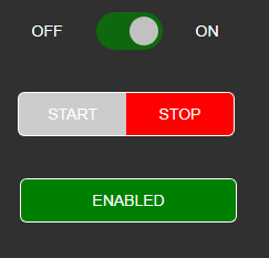
- Under Interactivity, select the control type for this Boolean data source. Options:
| Toggle-Switch |  | A toggle switch styled after the familiar iOS control. Tapping or clicking flips the Boolean state. |
| Segmented Button |  | A two-part segmented button with separate On and Off buttons. The active state is highlighted. |
| Toggle Button |  | A single button that reflects the current Boolean state and toggles it on click. |
| Value Button |  | Writes a single pre-configured Boolean value (true or false) on each click. The written value does not toggle - use this for one-shot writes. |
All Boolean controls write to the PI System immediately on click, regardless of the Auto Save setting. For example, if the current value is false and the operator clicks the Toggle Switch, true is written to the archive.
- Customize the labels displayed for each state with the following fields:
- True
The label shown when the data source value is True. Default: ON.
- False
The label shown when the data source value is False. Default: OFF.
- The Style section includes a Switch sub-section for configuring the control's color scheme:
- Foreground
Foreground: The text color of the control's labels.
- True (Color)
True: The control's background color when the data source value is True.
- False (Color)
False: The control's background color when the data source value is False.
- For the Value Button control, configure the button's label text and the Boolean value written on click. An Auto Reset option is also available: after the primary value is written, a second (reset) value is automatically written after the configured Delay.
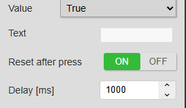
The Delay setting controls how long (in milliseconds) the symbol waits before writing the reset value.
Configure a numeric data source
- Under Interactivity, select the control type for this numeric (integer or float) data source. Options:
| Input |  | A free-form text field. The operator can type any numeric value. |
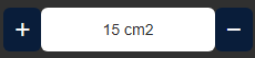
| Step Input |  | An input field flanked by − and + buttons. Each click increments or decrements the current value by the configured step size. Minimum, maximum, and step size are all configurable. |
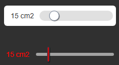
| Slider |  | A horizontal slider. The operator drags the indicator to select a value within the configured range. Step size and min/max limits are configurable. |
| Button | | Writes a single pre-configured numeric value on each click. Supports Auto Reset - see Boolean Value Button for details. |
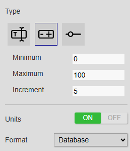
- The following additional settings apply to numeric data sources:
- Minimum
Minimum: The lowest value the operator is allowed to enter.
- Maximum
Maximum: The highest value the operator is allowed to enter.
- Increment (step input & slider only)
Increment (Step Input and Slider only): The amount by which the value changes with each button click or slider step.
- Allow NaN
Allow NaN: When enabled, a Delete button appears on the Input control, allowing the operator to write a NaN (No Data) value to the PI Point. Available for the Input control only.
- Units (step input & slider only)
Units (Step Input and Slider only): When enabled, the unit of measure is shown next to the current value.
- Format (step input & slider only)
Format (Step Input and Slider only): Sets the display format for the current value shown in the control.
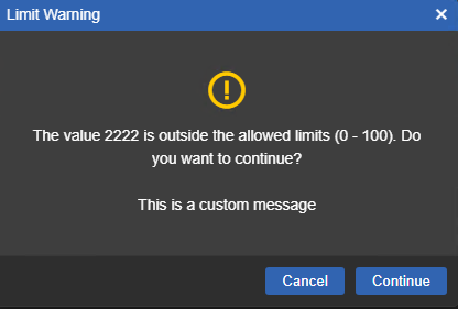
Input Validation can be enabled for any numeric data source. When enabled, the operator is shown a warning dialog if the value entered falls outside the configured valid range.
Limit Source: Choose between Database Limits and Custom Limits. When Database Limits is selected, the valid range is read from the Minimum and Maximum Attribute Traits defined in Asset Framework (for AF Attributes), or from the Zero and Span Point Attributes (for PI Points).
Prevent Entry Outside Limits: When enabled, the Save button is blocked if the entered value is outside the valid range, preventing the write to the PI System. When disabled, the warning is shown but the operator can still save the out-of-range value.
A custom message can be configured to appear in the validation dialog, providing operators with context-specific guidance (for example, specifying the expected value range or the reason for the limit).
- Under Style, two sub-sections are available for numeric controls:
- Buttons
Buttons: Sets the foreground (text) and background colors for the − and + step buttons.
- Slider
Slider: Configures the track and indicator appearance, including colors, sizes, and borders.
- For the Button control, configure the button's label text and the numeric value written on click. An Auto Reset option is also available: after the primary value is written, a reset value is written after the configured Delay.
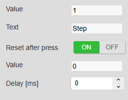
In the example above, pressing the button writes 1 to the PI Point, and then writes 0 after the configured Delay.
Configure an enumeration set
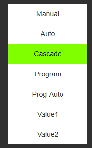
- Under Interactivity, select the control type for this Enumeration Set data source. Options:
| Dropdown |  | An expandable dropdown list from which the operator selects an enumeration value. |
| List |  | A visible list of all enumeration values. Clicking an item writes that value to the PI System immediately. |
| Button | | Writes a single pre-configured enumeration value on each click. |
- Under Style, the following sub-sections are available for enumeration controls:
- List (List only)
List: Configures the background and text color of the selected enumeration value item.
- multi-state (List only)
multi-state (List only): When enabled, colors the selected item according to the Multi-State configuration. Multi-State must be enabled on the symbol first by right-clicking it and selecting Add multi-state.
Configure a string data source
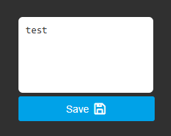
String data sources use a single input control (free-form text field). The following settings are available:
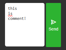
- Multiline: When enabled, the input field expands to accept multi-line text (for example, for notes or descriptions).
- Current Value: When enabled (default), the input field is pre-populated with the tag's current value. Disable this to always show an empty input field.
- Allow Empty: When enabled, the operator can save an empty string to the PI Point (clears the current value). Disabled by default to prevent accidental data loss.
Configure a date time data source
- Under Interactivity, select the control type for this Date/Time data source. Options:
| Calendar |  | A text input that opens a calendar date-picker when clicked. |
| Input |  | A plain text input. The operator types a date/time value directly; no calendar picker is shown. |
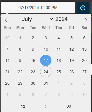
Additional settings:
- Disable / Enable Time: When disabled, the control becomes a date-only picker (no time selection). Use this when only the date portion of the timestamp is relevant.
- Now Button: When enabled, displays a Now button beside the input. Clicking it sets the control's value to the current system time.
- Allow Input: When enabled, the operator can type a date/time value directly into the field. When disabled, the only way to change the value is through the calendar picker.
- Increment (for time): Sets the step size used when adjusting the time portion in the calendar picker (for example, 15-minute increments).
- Under Style, configure the appearance of the Now Button when it is enabled.
Submit button
When Auto Save is disabled, this section configures the Apply button displayed to the operator. Options:
- Position: Places the Apply button below the control (Bottom) or to its right (Right).
- Size: Sets the dimensions of the Apply button.
- Icon: Selects the icon displayed inside the Apply button.
- Text (optional): An optional text label shown on the Apply button alongside the icon.
- Colors: Sets the background and foreground (text/icon) colors of the Apply button.
Troubleshooting and limitations
- Check: If a write fails, check the data type, validation range, timestamp, and write permission.
- Check: Immediate-write controls change PI System data as soon as the operator activates them.