



Vision Library+ / Charts and analytics
Box Plot+
Box Plot+ summarizes the distribution of time-series values and can overlay reference traces for comparison.
Overview
Box Plot+ summarizes the distribution of time-series values and can overlay reference traces for comparison.
Watch the demo
See Box Plot+ in a practical PI Vision workflow.
When to use it
Use this symbol when you need to:
- Compare distributions across several signals or time groups.
- Identify spread, median, quartiles, and outliers.
Before you begin
- Prepare numeric PI Points or AF attributes with enough recorded values for a distribution.
- Choose a time range that represents the operating period you want to compare.
Add and set up the symbol
- Select the symbol in the PI Vision symbol gallery.
- Add the required data sources or asset context to the display.
- Right-click the symbol and open its configuration pane.
- Configure the minimum data, range, and display settings for a useful result.
- Confirm that the symbol shows the expected data.
Use the symbol
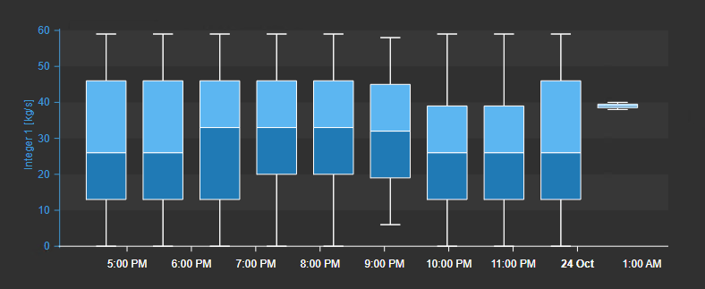
Hover over a box or point to inspect its statistics. Use the time bar and configured zoom controls to examine a narrower period.
Time bar
Box Plot+ supports the shared Time Bar for independent ranges, duration choices, and PI time expressions.
Configure the symbol
Overview and behavior
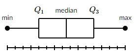
The Box Plot+ symbol displays data distributions as box-and-whisker charts directly in PI Vision. Each box summarizes a time period using the five-number summary: minimum, first quartile (Q1), median, third quartile (Q3), and maximum.
The box spans from Q1 to Q3 (the interquartile range). A line inside the box marks the median. Whiskers extend outward from the box to the minimum and maximum values, showing the full spread of the data.
Configuration
Open the Configuration pane to customize the symbol's appearance and behavior. The pane is organized into sections for title, style, legend, tooltip, grid, and bar orientation.
- Right-click the symbol and select Configure Box Plot to open the Configuration pane.
- In the Title section, set the chart's main title and optional subtitle.
- Title: The chart's main title. When enabled, enter the title text and set its font size.
- Subtitle: Follows the same options as the Title, but appears beneath it.
- Alignment: Aligns the title and subtitle to the left, center, or right.
- In the Style section, configure colors and visual style for the entire chart.
- Foreground: Sets the default text color across the chart.
- Background: Sets the chart's background color.
- Sparkline: Hides all axes and borders, reducing the chart to a minimal sparkline view.
- Border Width / Color: Toggles the chart border and sets its color and width.
- Shadow: Toggles a drop shadow around the chart.
- In the Legend section, configure the chart legend. The legend lists all active traces with their colors and current values.
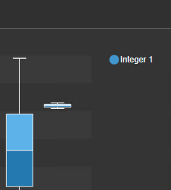
- Enabled: Toggles the legend on or off.
- Position: Places the legend at the Top, Left, Bottom, or Right of the chart.
- Alignment: Sets the text alignment for legend entries.
- Font Size: Controls the font size of legend text.
- Hide Errors: Removes traces in an error state - such as No Data or Pt Created - from the legend display.
- In the Tooltip section, control what information appears when the user hovers over the chart.
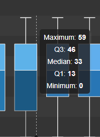
- Enabled: Toggles the hover tooltip on or off.
- X Axis: Shows the mouse cursor's position along the horizontal axis in the tooltip.
- Y Axis: Shows the mouse cursor's position along the vertical axis in the tooltip.
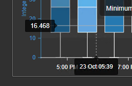
- In the Grid section, control what is drawn behind the data: the grid lines, the shaded bands, and the border of the plot area.
- Show: Turns the grid on or off. When it is off, no grid lines or bands are drawn; the Border setting still applies.
- Lines: Selects which grid lines are drawn: None, Horizontal, Vertical, or Both. The names always describe the direction the lines run on screen, whichever orientation is set in the Bars section.
- Bands: Draws alternating shaded bands across the plot area. The bands follow the value axis.
- Border: Bounds the plot area. Axes draws the two axis lines with their ticks, Frame draws a rectangle around the plot instead of the axis lines, and None draws neither. Grid lines drawn with Border set to None are dashed.
Grid line color and opacity are not settings; they follow the chart's foreground color and theme.
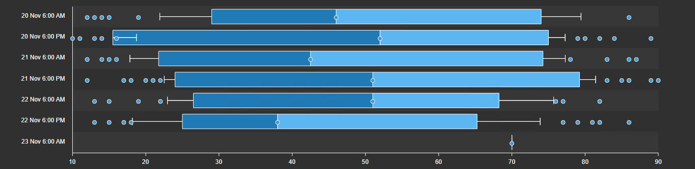
- In the Bars section, set the chart orientation to horizontal or vertical.
Configure value scales
This section controls the Y-axis scale(s) for the chart. Two modes are available:
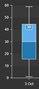
- Single Scale

Renders all traces against a single shared Y-axis. Set a custom minimum and maximum, or enable auto-scaling.
- Multi Scale

Assigns a dedicated Y-axis scale to each data source, allowing different ranges side by side.
Note: Multi Scale is only available when the chart orientation is set to vertical.
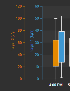
Scale settings for each trace are found in Trace Options. Select the data source, then open the Axis-Y sub-section. The following options are available for each Multi Scale trace:
- Enabled: Shows or hides the full scale axis and its labels for this trace.
- Scale: Hides the scale tick marks while keeping the axis label visible.
- Position: Places this trace's axis on the left or right side of the chart.
- Scale Range: Sets the minimum and maximum for this trace's axis. Options are manual, auto-scale, or database-defined settings.
Configure time scale
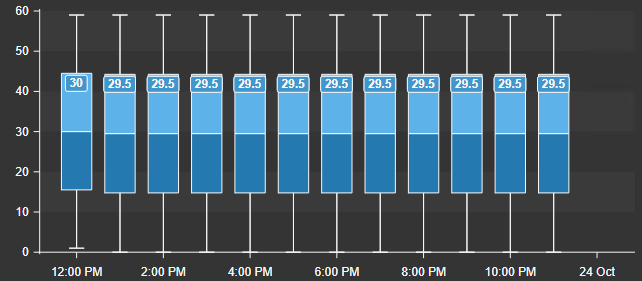
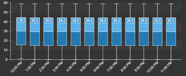
The X-axis (time scale) supports two display modes:
- Range: Generates a dynamic time axis with automatically calculated tick intervals. When the chart is dense, labels are hidden automatically to prevent overlap. This mode is only available in vertical orientation.
- Discrete: Places a tick and label at every data point, giving a precise, one-to-one time axis. Allows manual configuration of the timestamp format.
The visual difference between the two modes is shown below:
Range Discrete
- Labels: Toggles the time labels on the X-axis on or off.
- Position: Places the X-axis at the top or bottom of the chart.
- Datetime Format: Controls how timestamps are displayed along the axis. Defaults to Auto.
Configure data retrieval
This section defines how data is loaded and grouped to build each box-and-whisker shape.
- Interval: The time interval used to group raw data points into individual boxes. Two modes are available:
- Auto: The chart calculates an appropriate interval based on the current time range.
- Manual: Specify a fixed time interval for grouping data points.
Start and End Time
Sets the time range for the chart. The following modes are available:
| Display time range | Uses the current PI Vision display time range. |
| Custom time range | Set a fixed start and end time, independent of the display. |
| Duration and offset | Sets a rolling duration and offset relative to the display's current end time. |
Configure the toolbar
The Toolbar group controls the chart's own button strip, which appears in the top right corner of the plot.
- Show: Turns the toolbar on. It is off on existing displays and on for newly placed charts.
- Reveal: Choose On hover (the default) so the strip appears when the pointer or keyboard focus enters the chart and fades shortly after it leaves, or Always so it stays visible. Always keeps a band of the plot free for the strip; On hover keeps none, because the strip is not there until you reach for it. A touch device always shows the strip, whichever mode is saved.
Configure interactivity
This section controls what a drag and a zoom do on the chart:
- Zoom: Lets users zoom into the chart. Set the Interval to Auto so the chart recalculates box groupings as you zoom. With Zoom off the chart has no zoom controls at all. This setting is off by default on Box Plot+.
- Drag mode: The mode the chart starts in. Pan drags the plot along its category or time axis; Box zoom drags a rectangle and zooms into it. Viewers can switch modes from the toolbar, and the chart returns to this setting the next time the display is opened. Box zoom is offered only on a vertical chart: with horizontal bars the categories run down the Y axis, which the box selection cannot address, so the drag always pans there.
- Apply to Display Time: When enabled, zooming updates the PI Vision display time range for all symbols. This option appears only when the argument axis is a time axis: set the X-Axis Type to Range, group by time, and keep the bars vertical. On a discrete argument axis the zoom moves through the box categories, which name no start and end time, so there is nothing to send to the display clock.
- Show Scrollbar: Adds a scrollbar under the plot for dragging the visible window. This is not the button strip above - it is a slider, and it appears only while Zoom is on.
Toolbar buttons
The strip carries only the buttons the chart can actually honour. The zoom group needs Zoom to be on, and the mode buttons additionally need vertical bars.
| Pan | Mode: a drag moves the visible window along the argument axis. |
| Box zoom | Mode: a drag draws a rectangle and the chart zooms into it. Vertical bars only. |
| Zoom in | Halves the visible window around its centre. |
| Zoom out | Doubles it, up to the loaded data. With Apply to Display Time on, this widens the display time range instead. |
| Reset | Returns to the full window. With Apply to Display Time on, it also restores the display time range the chart navigated away from. |
| Fullscreen | Opens the chart in a large dialog. The dialog has its own download button; the zoom controls stay on the chart behind it. |
| Download | Opens a menu with PNG, SVG, PDF, CSV, JSON and XLSX. The three data formats are hidden where data export is disabled for the installation. |
Configure traces
The Trace Options section lists every data source added to the chart. Select a trace to configure its appearance and statistical settings.
- Type: Sets the rendering style for this trace. Options are: Box Plot, Line, Area, and Scatter.
- Box Plot: Includes an Outliers option that overlays individual outlier data points as dots on the chart. A data point is classified as an outlier if it falls above Q3 + 1.5×IQR or below Q1 − 1.5×IQR.
- Line / Area / Scatter: These types expose an Aggregation setting, which controls how multiple data points within the same time interval are combined into a single plotted value.
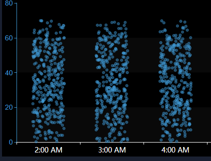
- Scatter (raw): This will create a scatter plot, where each recorded value of the tag is represented as a semi-transparent dot.
- Median Type: Controls how the median is treated when splitting the dataset for quartile calculation. Two options:
- Inclusive: Retains the overall median in both halves of the dataset when computing Q1 and Q3. Every data point contributes to the calculation, including boundary values.
- Exclusive: Removes the overall median from both halves before computing Q1 and Q3, preventing it from influencing the quartile boundaries.
- Whisker Type: Defines how far the whiskers extend from the box. Options:
- Min / Max: Whiskers reach the dataset's absolute minimum and maximum, showing the complete data range.
- < 1.5 IQR: Whiskers reach the furthest data points still within 1.5×IQR of Q1 and Q3. Points beyond this threshold are treated as outliers.
- = 1.5 IQR: Whiskers are fixed precisely at 1.5×IQR above Q3 and below Q1, regardless of whether data points exist at those exact positions.
- Standard Deviation: The whiskers extend to a fixed number of standard deviations above and below the mean, reflecting variability in the data.
- Custom: Set the lower and upper percentiles for the whiskers manually.
- Outliers: Toggles outlier markers on the chart. Configure their color, size, and shape.
- Mean: Overlays a marker at the mean value for each box.
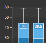
Data Labels: Toggles data labels for this trace. Overlapping labels are hidden automatically to avoid clutter. Use the Value dropdown to choose which statistical value (e.g., median, Q1, Q3) is displayed.
- Stroke: Configures the outline color, width, and dash pattern for the box borders.
Combining box plots with other chart types
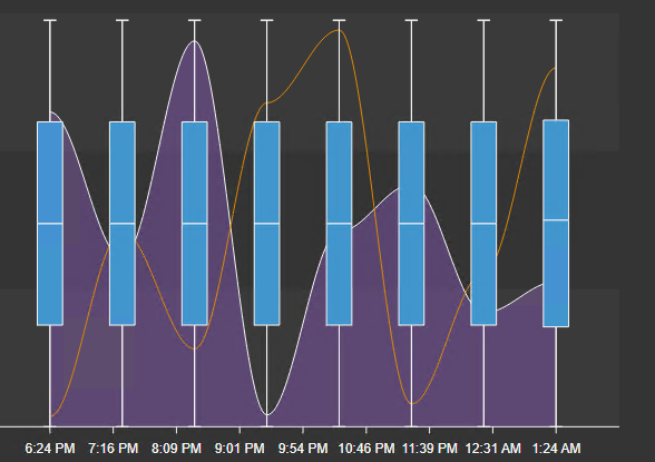
The Box Plot+ chart can overlay additional trace types - line, area, or scatter - alongside the box plots. This is useful for adding reference lines such as averages, setpoints, or process limits. To add one, drag another attribute onto the chart and change its trace type in the configuration pane.
Multi-state
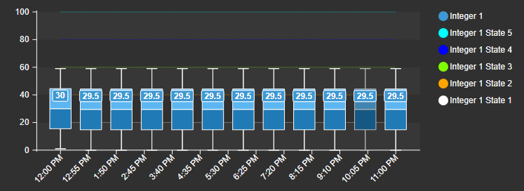
Box Plot+ supports multi-state rules. When enabled for a trace, multi-state threshold lines appear as dotted overlays on the chart.
Troubleshooting and limitations
- Check: If a box is empty, confirm that the source has enough valid numeric values in the selected range.
- Check: Very large time ranges or many traces can increase retrieval time.



