Vision Library+ / Charts and analytics
Asset Analytics KPI
Asset Analytics KPI summarizes a set of AF elements and their attribute values as one or more key performance indicators.
Overview
Asset Analytics KPI summarizes a set of AF elements and their attribute values as one or more key performance indicators.
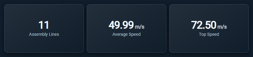
The three cards above come from one set of eleven assets: a count of the assets, the average of their Speed attribute, and the highest value of the same attribute. Units and decimals come from the AF attribute.
When to use it
Use this symbol when you need to:
- Show an asset count, total, average, minimum, or maximum as a KPI.
- Compare the same asset measure across template, description, or an attribute value.
- Compare each KPI card with a static target and see the difference immediately.
Before you begin
- Prepare the AF elements the symbol should summarize, either as a fixed set of assets or as a dynamic asset search.
- Choose a numeric attribute for aggregations other than a count.
Add and set up the symbol
- Select the symbol in the PI Vision symbol gallery.
- Drag one or more AF elements or attributes onto the symbol, or add dynamic search criteria.
- Right-click the symbol and open its configuration pane.
- Under Attributes, add the attributes the KPI should read.
- Under Dimension, choose what to calculate in Values and how to group it in Series.
- Confirm that the symbol shows the expected data.
Use the symbol
Review the KPI value and use any enabled click or hover action for additional context. When a target is enabled, one compact comparison badge below the card label combines the arrow, colored difference, and benchmark description.
When the symbol is narrowed by another symbol on the display, a filter indicator appears in its top-left corner and reports how many assets remain, such as 5 of 11 assets. Clear the selection in the publishing symbol, or through the indicator, to see the full set again.
Configure the symbol
Overview and behavior
Asset Analytics KPI provides a high-level summary of a set of assets as aggregated metrics displayed in a responsive grid of cards. Rather than listing one row per asset, it calculates KPIs - totals, averages, counts - and presents them at a glance.
One row is one asset. Each asset contributes exactly one row, carrying the current value of every configured attribute, which is the same value PI Vision shows in the other asset symbols on the display. The symbol performs no time aggregation of its own: there is no value type, no calculation basis, and no summary retrieval mode. A time-based question - "the average of this attribute over the last shift" - belongs in an AF analysis or in Asset Time Series Chart+, not here.
Typical uses:
- Count of assets returned by a dynamic asset search.
- Sum of an installed-capacity attribute across a fleet.
- Average of a numeric attribute grouped by Template, displayed side-by-side.
Use it as a dashboard entry point - a quick read of critical metrics before drilling into charts or tables.
The core concept: values and series
KPI cards are generated from a combination of Values (the calculation) and Series (the grouping).
- Value only (no Series): a single card showing the aggregated total across all assets, such as the count of assets or the sum of an attribute.
- Value + Series: the symbol generates one card per unique category in the Series.
- Example: if your Value is Count and your Series is TemplateName, you get a card for "Pump - Count", "Compressor - Count", and so on.
- Multiple Values: the card count multiplies. Configuring Count and Sum grouped by TemplateName with two templates produces 4 cards in total.
Configuration
1. Attributes (the data)
The Attributes section lists the AF attributes the symbol reads from every asset. It opens on two lists: Current Attributes, the attributes the symbol reads, and Additional Attributes, the ones the selected assets offer but the symbol does not read. Select an entry and use the transfer buttons between the lists to add it to or remove it from the current list, and the arrow buttons under Current Attributes to reorder it. There is nothing to configure per attribute, because how an attribute is aggregated is a Value setting, so the section shows the two lists and nothing else.
2. Values (the metrics)
Values define the metrics to calculate. Multiple values can be added to the same symbol.
- Value: the asset property or attribute to analyze. The offered asset properties are Asset, AssetName, Description, TemplateName, Path, and HasChildren; attributes appear with a leading pipe, such as
|Temperature. - Summary: the calculation to apply. Numeric attributes offer Count, CountDistinct, Sum, Min, Max, Average, Median, and StdDev; text, boolean, and date properties offer Count and CountDistinct.
- Title: by default the card title is the summary type plus the property name, such as Average of |Speed. Override it with a friendly name such as Average Speed.
- Show: clear this switch to keep a Value in the configuration without giving it a card.
3. Target (the benchmark)
Each Value can have one optional static target. The target is evaluated separately for every card generated by that Value. For example, if Count is grouped by TemplateName, one Count target applies to every template card. The target value remains hidden by default so repeated cards stay compact.
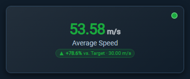
The card above compares an average against a target of 30.00 m/s, shows the difference as a percentage, and carries a multi-state color on the value and a status dot in the corner.
To configure a target:
- Under Values, select the Value you want to compare.
- Keep the Value's Show switch on, then turn on Enabled in the Target section.
- Optionally turn on the Target section's Show switch to append the configured target value to the comparison badge.
- Enter the target Value.
- Choose how to display the Difference:
- Value shows the signed numerical difference, such as
+6. - Percent shows the signed percentage difference, such as
+12.5%. A percentage difference is not shown when the target is zero.
- Choose the semantic Direction:
- Higher is better treats values at or above the target as favorable.
- Lower is better treats values at or below the target as favorable.
The arrow always describes the numerical comparison: an up arrow means the current value is above the target, and a down arrow means it is below the target. No arrow is shown when the value equals the target. The whole badge uses the favorable or unfavorable color determined by Direction, so an up arrow can be unfavorable when lower values are better.
The arrow is a target comparison, not a change-over-time trend. The badge reads like ▲ +6 vs. Target. When Show is enabled, it becomes ▲ +6 vs. Target · 40. Target coloring is independent from multi-state formatting, which can still control the card's other visual treatments.
4. Series (the grouping)
Series slice Values by different categories.
- Value: the property to group by, such as TemplateName, Description, or a digital attribute's state name.
- Top N: restrict the view to the most relevant categories when there are many.
- Mode and Count: set the direction (Top or Bottom) and how many items to show, such as Top 3 or Bottom 5.
- Value: the Value used to rank categories, such as the top 5 templates ranked by total capacity.
- Others: aggregates remaining categories into a single Others card to preserve the grand total.
- Sort Order and Sort By: arrange cards in ascending or descending order based on a selected Value.
A digital attribute is also available split by level: |Mode|Level1 groups by the first segment of a compound state name, which is useful when the state text encodes a hierarchy.
Interactive features
Click Action
Choose None, Drilldown, or Filter. Filter selects KPI cards and publishes them according to Output Mode: None, Master, Linked, or Both. Single selection replaces the previous card; Multiple selection keeps several categories active and republishes their complete distinct value set. Selected cards use the configured theme's highlight treatment.
Asset Analytics KPI publishes and receives master filters on the asset channel, so it narrows with Asset Filter+ and the other asset symbols, and ignores a filter published by Event Filter+ or by the Event Analytics family.
Under Filtering > Input, master and linked filters can restrict the rows the KPI aggregates. Ignore Master keeps the KPI independent from incoming master filters while preserving linked inputs.
Drilldown behavior
Drilldown changes how multiple Series behave. Without drilldown, adding two Series, such as TemplateName and a state attribute, creates a card for every combination.
If Drilldown is the click action:
- The symbol initially only shows cards for the first Series, for example purely templates.
- Clicking a card navigates deeper. The cards animate to show the second Series filtered for that template.
- A Drill Up (⇧) button appears in the top-right corner to navigate back up the hierarchy.
Drilldown and Filter are mutually exclusive click actions. See Filtering dashboards for the channel configuration and multi-selection rules.
Layout and styling
Layout Options
The Layout section controls how cards wrap and fill the symbol's bounding box.
- Auto: the symbol automatically determines the optimal row and column count based on its height and width.
- Rows / Columns: forces the grid to a strict row or column count, set by Count, wrapping items as needed.
- Spacing: controls the pixel gap between individual cards.
Style
Sets the base appearance for all cards:
- Theme: choose a shared style preset, or Custom to set the Text and Background colors yourself.
- Typography: set the Font, configure Font Size independently for the Value and the Title, and choose Text Alignment (Left, Center, Right).
- Show Aggregation in Caption: append the summary type to each card title.
The separate Number Format section controls how numeric card values are formatted.
Conditional formatting (multi-state)
KPI cards can change color dynamically based on their calculated value. Right-click the symbol and choose Configure multi-state to set this up. Multi-state is configured per Value - select the correct Value from the list in the configuration pane.
- Enable multi-state: turn on conditional formatting for the selected Value.
- Status: type a limit and press Enter, or choose the
+button, then pick its color. Limits compare with<=and the list sorts itself from the highest limit down, whatever order you add them in. For example: Value <= 50 - Green; Value <= 100 - Yellow. For a Value whose data type is a timespan, type the limits as timespans (1h,30m,1d) instead of numbers. - Error: the first row sets the color for everything the limits do not cover: a value above the highest limit, a value that is not a number, and a Value with no data at all. Set it to transparent to leave those cards unpainted.
- Property: this defines how the color is applied to the card. Text colors the value and adds a status dot, Status Dot shows the dot alone, Border and Accent + Tint color the card's edge and surface, Soft Fill and Solid Fill color the whole card, Value Badge frames the value, and Progress, Progress and Value, Fill Level, and Radial Progress draw the value as a proportion of the highest limit.
Troubleshooting and limitations
- Check: if a KPI is blank, validate the asset selection or dynamic search, the attribute list, and the Value property name.
- Check: the KPI reflects only the assets its data sources resolve to, narrowed by any incoming asset-domain filter.
- Check: when no assets remain, a card shows
0only when every visible Value is a Count or a CountDistinct. Any other summary has no answer over an empty set, so the symbol shows the "No assets found" message instead of a card. - Limitation: the symbol reads the current attribute value that PI Vision delivers for the display's time range. It does not aggregate an attribute over time; use an AF analysis or Asset Time Series Chart+ for that.
- Limitation: the asset property list offers Asset, AssetName, Description, TemplateName, Path, and HasChildren. Element categories and extended properties are not available.