



Vision Library+ / Charts and analytics
Asset Time Series Chart+
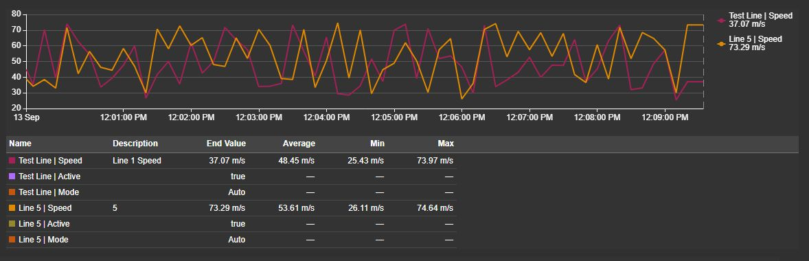
Asset Time Series Chart+ compares measurements and digital operating states across selected assets. Configure an attribute once to give it the same appearance, applicable analysis, and multi-state settings on every matching asset.
Overview
Asset Time Series Chart+ compares measurements and digital operating states across selected assets. Configure an attribute once to give it the same appearance, applicable analysis, and multi-state settings on every matching asset.
When to use it
Use this chart to compare the same measurements across pumps, production lines, or other AF assets. Choose a fixed asset selection, find assets with Search Criteria, or follow the display's asset context.
Use Combo Chart+ when you want to select and configure individual data sources instead of comparing a common set of attributes across assets.
Before you begin
- Select AF assets with numeric or digital/enumeration attributes and readable history. A digital attribute has a defined set of named states, such as Stopped and Running.
- Ensure PI Web API is configured and your account can read the selected attributes.
- Keep the selection within 100 supported numeric or digital asset-and-attribute combinations. For example, 20 assets with three measurements and one digital state produce 80 traces.
Add and set up the symbol
- Select Asset Time Series Chart+ in the PI Vision symbol gallery.
- Drag an AF attribute, asset, or attribute category onto the display.
- Choose the assets through PI Vision's asset selection or Search Criteria.
- Right-click the chart and open Asset Time Series Chart+.
- In Attributes, select Modify Attribute List. Select an item in Additional Attributes and use Add to include it in Current Attributes. Keep at least one attribute.
- Select Modify Attribute Properties and choose the attribute to configure. Start with Line for a measurement or State display > Trend for a digital state. Confirm that each asset has a trace over the display time range.
The initial chart uses the PI Vision theme and shows its legend. Numeric traces with exactly matching units share a scale; digital Trend traces share a named scale when their complete state definitions match. Dynamic searches and display asset-context changes update the assets being compared.
Use the symbol
Read values and show or hide traces
Hover over the plot to compare values at a time. Tooltips and rulers use the loaded chart samples:
| Trace appearance | Value between samples |
|---|---|
| Straight or Smooth Line or Area | Interpolates between valid samples. |
| Stepped Line or Area, or Bar | Holds the preceding value. |
| Scatter | Shows a value only when a sample exists at that instant. |
| Digital state Trend | Holds the preceding valid state name until the next loaded state change. |
Bad-data gaps remain gaps. Readouts keep the original values and units, including on a stacked chart. A 100% stack also shows the percentage contribution of each participating trace.
Click a legend item to hide or show a trace for your current session. This does not change its saved Visible setting. Hover times and pinned rulers synchronize with compatible time-series charts on the display.
Navigate with the toolbar
The toolbar appears at the top right of the plot when the pointer or keyboard focus enters the chart. Hover over a button to see its name. A display designer can keep it visible with Trend Options > Toolbar > Reveal > Always. Touch devices keep it visible automatically.
| Control | Action |
|---|---|
| Pan | Drag to move the visible time window. |
| Box zoom | Drag across the plot to zoom into a time interval. The mode stays selected for the next drag. |
| Select | Drag to choose a Summary Table interval without zooming. Available when the table is enabled. |
| Zoom In / Zoom Out | Halve or double the visible span around its center. |
| Reset Zoom | Restore the loaded time range. |
| Clear rulers | Remove both rulers. |
| Toggle Summary | Open or collapse an enabled table. |
| Fullscreen | Open a larger chart view. |
| Download | Choose an image or sample-data export. |
The mouse wheel also zooms. Your toolbar drag-mode choice lasts for the session; the next display load starts with the designer's Interactivity > Drag mode setting.
Zoom normally affects only this chart. When Apply to Display Time is enabled, zooming changes the time range of the entire display; Reset Zoom restores the display range from before those changes. Turning Enable Zoom off disables wheel and drag zoom and removes the drag-mode and zoom buttons.
Compare two times with rulers
- Click the plot to place ruler A, then click again to place ruler B.
- Drag either ruler's handle to adjust its time. The readout shows the time difference and each numeric trace's B-minus-A value difference. Digital Trend readouts show state names; states have no numeric value difference.
- Select Clear rulers to remove both, or focus a handle and press Delete or Backspace to remove one.
With a handle focused, use the Left and Right arrow keys for small adjustments; hold Shift for a larger step. Dragging a handle outside the time range removes that ruler. Rulers keep their absolute times when the time window changes and are hidden while outside it.
The same ruler handles and value boxes are available in Fullscreen, including keyboard movement and removal. Changes remain synchronized with compatible time-series charts, and closing fullscreen keeps the ruler positions on the display. Clicking a legend entry changes trace visibility without placing or moving rulers.
Read the summary table
When enabled, the table shows one row per asset and configured attribute. It uses server-calculated statistics and exact-time server values, independently of the samples drawn on the chart.
The summary interval is chosen in this order:
- The interval between rulers A and B, when both are placed.
- The interval drawn with Select, when present.
- The full symbol time range.
Visual zoom and changing drag modes do not change an existing summary interval. End Value is the server value at that interval's end. Start and end columns follow chronological order. A and B columns keep their ruler identities; each value difference is the B value minus the A value, even when the ruler order is reversed. Ruler columns appear when both rulers are placed.
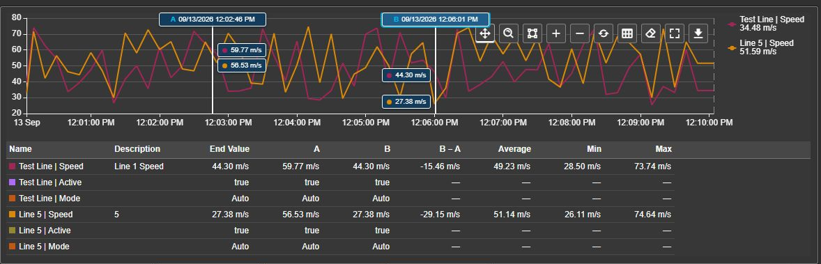
Chart readouts and exact-time table cells can differ because the chart works from its loaded samples while the table queries the server at the requested time. Changing Plot density does not recalculate table statistics from chart samples.
Optional action columns provide checkboxes. Show affects one trace for the current session. Regression, moving average, and multi-state actions affect the configured attribute across all matching assets; their tooltips identify this all assets scope. A hidden trace keeps its row so that you can show it again.
Collapse or reopen the table with Toggle Summary. This is temporary and does not change Start Expanded. Scroll within the table to reach additional rows or columns. Pending cells update when their results arrive; a dash indicates an unavailable result.
Fullscreen, exports, and reload
Fullscreen enlarges the chart using its loaded data. The view retains chart controls but does not include the Summary Table. Close it to return to the display.
Choose Download for PNG, SVG, or PDF chart images, or CSV, JSON, or XLSX samples. Sample exports contain visible traces in the visible time window, including labels, asset and attribute identities, source paths, UTC and local timestamps, units, original values, and quality flags. Digital samples retain their state names and original codes; drawn holds and Bands are not extra samples. Range Area exports retain both inputs. Files use the symbol name and local export time. If your administrator disables data exports, only image formats remain available.
To retry loading, open the configuration pane and select Data Retrieval > Reload. This refreshes history and an enabled summary while retaining a valid selected interval. Exports and fullscreen do not include the Summary Table.
Configure the symbol
The following sections follow the configuration pane's order. Multi-state settings open separately through the chart's right-click menu.
Trend options
Use Title, Style, Legend, Tooltip, Data Labels, and Grid to control the chart's presentation. These changes redraw the loaded data. The legend is shown and data labels are hidden by default.
Use the legend's position, placement, alignment, and text settings to keep asset names readable. A name-and-value legend helps compare the latest loaded readings; hover and rulers provide values at a chosen time.
Under Toolbar, Show Toolbar controls the standard action buttons, drag-mode buttons, and Clear rulers. An enabled Summary Table keeps its own toggle available. Reveal chooses On Hover or Always. Always reserves space above the plot so the buttons do not cover the data.
Under Bars, Width sets how much of each bar's time slot the bar occupies, from 10 % to 100 %. The slot is the retrieval interval when the retrieval mode states one, and otherwise the shortest gap between the plotted points; at 100 % neighbouring bars touch. The group appears only while at least one trace uses the Bar chart type, and bars that share a time without being stacked split the width between them.
Scales
Open Value Scales and choose a scale arrangement:
| Mode | Use |
|---|---|
| Multiple | Group numeric traces by exactly matching units, including an empty-unit group. Group digital Trend traces by matching complete state definitions. |
| Single | Share one numeric scale for measurements and original digital Trend codes, including traces with different state definitions. |
| Custom | Create scales, then assign each attribute to a Scale in Attributes. Incompatible state definitions and numeric values remain on separate effective scales within that assignment. |
Configure the scale's range, position, labels, and title as needed. Titles appear only when enabled and configured; the chart does not automatically use units as titles. A message in the configuration pane identifies a scale combining different units. Values are not converted, so choose combinations that make sense to compare.
In Single mode, digital Trend plots original codes: codes 0, 10, and 50 appear at those numeric values, even in a chart containing only digital attributes. Single uses ordinary numeric scale settings and autoscaling from loaded values; unused state definitions do not stretch it. Multiple and Custom retain named state scales with every defined state at an evenly spaced tick. These named scales hide numeric range, logarithmic, tick-density, and stacking controls; position, title, color, visibility, and inversion remain available. State names remain in the legend, tooltip, and rulers in every mode. Bands do not add a visible state scale.
Time Scale controls time-axis labels and formatting. Choose Scale labels for ticks along the axis or Range labels for the two endpoints.
Stack values or percentage contributions
In Single or Custom mode, use Stacking > Off, Normal, or 100%. Custom scales can choose independently. Line, Area, and Bar traces on the same scale can stack across assets. Enable Stack bars only to restrict stacking to Bar traces.
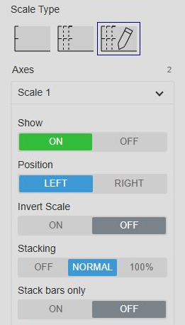
Normal stacks original values. 100% divides each contribution by the sum of absolute values and retains negative signs. The percentage scale includes the positive and negative ranges needed by the data. Stacked scales use linear coordinates.
Scatter, Range Area, digital states, analysis lines, and limit overlays do not join the stack. Give unstacked measurements another Custom scale when their original values would fall outside the percentage range. Tooltip, ruler, legend, summary, and exported values keep their original units; ruler positions follow the plotted stack.
Data retrieval
| Mode | Use |
|---|---|
| Default | Loads plot data for an overview. Returns a representation sized to the chart width. |
| Recorded | Inspect recorded samples within the point limit. Shorten the range when you need more detail. |
| Interpolated | Compare values at a regular interval. Set the interval and synchronization time. |
Digital states use the selected retrieval mode too. Plot is a sampled overview, and Interpolated requests regular samples; either can miss short state changes. Recorded can provide more detail within the point limit. A held line or shaded band describes the loaded samples, not a guarantee that every archived transition is shown.
Each load is limited to 50,000 historical points across all traces. If an Interpolated request exceeds the limit, shorten the range, increase the interval, or choose Default. The chart does not silently change your interval or mode.
The time-range settings in Data Retrieval use the display time range by default. Choose a custom range or a duration and offset when this chart should cover a different period. A changed range or asset context resets local zoom.
Live charts in Default mode update recent plot data automatically and periodically refresh the full history. Historical windows stay cached until a relevant range, source, or retrieval-setting change. The chart remains visible while replacement data loads after a time-range change. Clicking PI Vision's Now button requests fresh history when the chart follows display time.
Live Line and Area traces extend their last eligible value toward the current time. A dashed Now marker appears when the current time is inside the visible range. Bad-quality observations still create gaps.
Time bar
Enable Time Bar for time navigation below the chart. Configure the available durations; Interpolated retrieval can use a corresponding interval for each duration. Operators can move to the previous or next range, choose a duration, edit the endpoints, or reset the range.
Enable Lock Time Bar to keep this chart independent of later display-time changes. Initial Range selects its starting duration. A custom symbol range or locked time bar keeps its own range when PI Vision's Now button is used.
Interactivity
- Enable Zoom: Enables wheel zoom, drag modes, and the zoom buttons.
- Drag mode: Sets the initial Pan, Box zoom, or available Select mode.
- Apply to Display Time: Makes chart zoom change the whole display time range.
Filter the asset selection
Open Filtering to configure incoming filters. Asset Master filters apply by default. Enable Ignore Master to ignore them; linked inputs still apply. Add a linked input, choose another symbol's output channel, and map it to an asset property. Prefer Asset Path when names are not unique. Choose whether to show all assets or none while a channel has no selection.
Master filters and linked inputs narrow the selected or discovered assets together. They cannot add assets outside that selection. The filter indicator shows the remaining asset count or a waiting state. See Filtering for channel and property mappings.
Limitation: The pane includes Asset Selection action settings, but the chart currently has no gesture for invoking those actions or publishing an asset selection. Clicking the plot places a ruler.
Summary table
Enable Show to add the table. Use Start Expanded for its saved starting state. Height % (0 = automatic) accepts 0-60 in steps of five; automatic sizing leaves room for the plot.
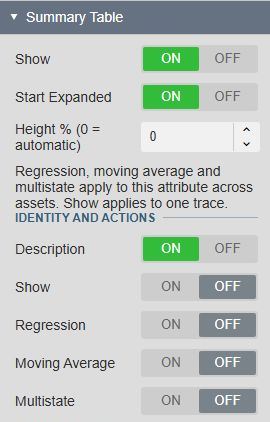
Choose columns under Identity and actions, Statistics, and Boundaries and differences. Name is always visible. The default table shows Name, Description, End Value, Average, Min, and Max. Statistics use time-weighted server calculations by default and honor the source's Step setting. Event count counts recorded events. Sum/Total is not offered.
Turning an attribute's Visible setting off excludes it from the table across all assets. Temporary legend or Show checkbox changes keep its rows available. Filtered-out assets are excluded. Both Range Area inputs retain their own summary rows and units.
An available server source can still supply summary cells when it has no numeric line to draw. Boolean, digital, and string sources can provide supported event counts and exact-time values; numeric statistics remain unavailable. Missing sources, bad quality, and unsupported results show a dash without a warning for that expected unavailable result. Request failures and malformed responses have details in the PI Vision log. The table does not substitute loaded chart samples for missing server results.
Attributes
Select an attribute in Current Attributes to edit its settings across all assets. Use the arrow buttons to reorder attributes. Modify Attribute List opens Additional Attributes and the add/remove controls; Modify Attribute Properties returns to the editor.
Set Visible, Label, and, in Custom scale mode, Scale.
Label chooses how the attribute's traces are named. Pick Asset | Attribute to combine both names, Asset for the asset name alone, the attribute name alone, or Custom and type your own text. Custom text replaces the attribute part only, so each trace still reads as the asset name followed by your text; leaving it empty falls back to the combined name. The combination of asset and attribute name is the default. A label set in Trace Overrides takes precedence over this choice, and a custom asset label replaces the asset part of the name in every mode that shows it, including Custom.
Numeric attributes also offer number format, Type, and the relevant Appearance settings:
| Setting | Choices and effect |
|---|---|
| Type | Line, Area, Bar, Scatter, or Range Area. Bar draws vertical columns. |
| Color | The primary color. Automatic leaves each trace's automatically assigned color in use. |
| Line Shape | Straight, Stepped, or Smooth. |
| Line Style | Solid, Dashed, or Dotted. |
| Line Width | 0-10 pixels; default 2. Zero hides the line or outline. |
| Marker | None, Circle, Square, Diamond, or Triangle. Scatter requires a visible marker. |
| Marker Size | 1-30 pixels; default 5. |
| Opacity (%) | Area fill opacity, 0-100% in steps of five; default 20%. |
Only settings relevant to the selected type appear. Switching types preserves the other appearance choices for when you switch back.
Digital states
Select a digital or enumeration attribute, then choose State display. This choice applies to that attribute across every matching asset.
| Choice | What you see |
|---|---|
| Trend | A stepped line using numeric state codes in Single scale mode and state-name ticks in other modes. This is the default. Use it to compare operating states across assets. |
| Bands | Shaded intervals with optional vertical lines and state labels. Use it to show activity alongside measurements. No numeric partner is required. |
Trend offers the primary color, line style, width, and markers. Its final inferred hold stops at Now or the range end, whichever comes first. Bad or unknown states create gaps. State names remain available in the legend, tooltip, and Trend ruler readouts. Bands do not place value boxes on a state scale.
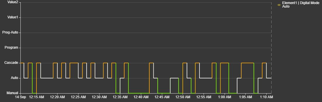
This Trend example has multi-state colors enabled and a named scale. It shows all seven defined states, including those not reached during the displayed interval. Single mode instead displays numeric ticks.
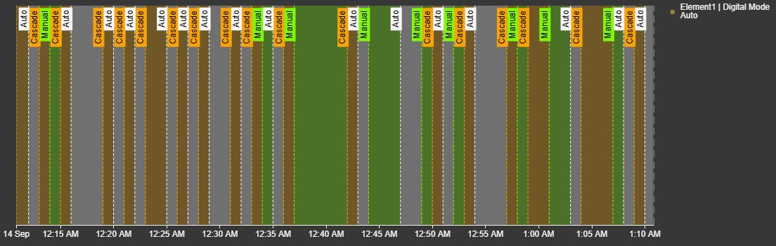
In Bands, use Region, Opacity (%), Lines, and Labels to choose the annotations. Label settings control the background, position, side, orientation, and size. Turning Region off keeps any enabled lines and labels. The last loaded band extends to the symbol range end. States in legend optionally adds informational state names and colors alongside the asset trace entries; clicking these state-name entries does not hide individual states.
The same attribute in Bands uses its enabled multi-state colors for the shaded intervals, transition lines, and labels.
Automatic asset trace colors remain in use unless you choose a primary color or enable native multi-state colors. State-only attributes do not offer numeric chart types, Range Area pairing, regression, moving averages, or stacking. Their original numeric state codes are identifiers, not measurements to average or subtract.
The Summary Table can request state names at its exact boundary and ruler times, plus supported event counts. Numeric statistics and state value differences remain unavailable. These server requests are independent of the sampled state trace.
Range area
Choose Range Area, then select another configured attribute in Target. Each band pairs those two attributes on the same asset and replaces their separate traces. Configure the band through the first attribute; the Target attribute's editor directs you back to it.
The chart shades between the smaller and larger value, even when they cross. Both bounds use the first attribute's scale. The Target attribute's separate scale applies again when the pair is removed. Different or empty units are allowed without conversion; make sure the numeric comparison is meaningful.
If a target is invalid, the configuration pane explains why. If one asset lacks an available partner, its band is omitted and a warning is recorded in the PI Vision log. Other assets continue to draw. Both inputs retain their original values in readouts, summary rows, and sample exports.
Analysis
Enable Regression or Moving Average for a numeric Line, Area, Bar, or Scatter attribute. Each asset is calculated separately. Range Area does not offer analysis.
Samples sets the moving-average window from 1-100 valid loaded samples, with a default of 5. This is an arithmetic sample average, not an average over a number of minutes. Calculations use the loaded symbol range; visual zoom alone does not recalculate them. A changed range or refreshed Plot samples can change the result.
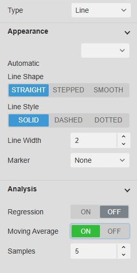
Regression uses a dashed line and moving average a dotted line. Both use the source color, a one-pixel width, and no markers. Use the Summary Table for server-calculated statistics over a selected interval.
Assets
When dynamic Search Criteria is off, Assets lists the fixed selection. Select an asset to set a custom Label; clear it to restore the original name. Use the list buttons to reorder or remove assets. At least one must remain.
Custom asset labels apply to all its traces. A label in Trace Overrides takes precedence. Dynamic searches manage their own results and hide this fixed-asset editor.
Trace overrides
Choose one asset-and-attribute combination in Trace to change its visibility, label, color, or ordinary numeric chart type. Digital State display and Bands settings remain on the attribute; an ordinary chart-type override does not change them. Reset removes that trace's overrides. Reordering assets or temporarily filtering one out does not transfer its overrides to another asset.
Range Area pairing is configured under Attributes, not as a trace override. A paired Target has no independent appearance, analysis, or multi-state action.
Multi-state
- Right-click the chart and select Add Multi-State... or Configure Multi-State....
- Select the attribute and enable its multi-state definition.
- Configure state colors under States. Numeric attributes also offer historical-limit presentation under Options.
Each matching asset evaluates the definition against its own measurement and limit histories. Type, Range Area, Appearance, and Analysis stay in the normal configuration pane.
For a digital attribute, Color series applies the configured state colors to Trend. Bands use the enabled state colors directly. Numeric limit, target, and limit-label controls are not offered for digital states. A hidden state suppresses its drawing and annotations while retaining its valid name for readouts and exports. Ordinary transparent colors do not erase state values. The definition and color choices still apply across all matching assets.
| Options | Effect |
|---|---|
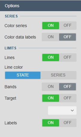
| Color series | Color the measurement by state, including lines, fills, markers, columns, and the owning Range Area band. |
| Color data labels | Apply state colors to measurement labels independently of the series. |
| Lines | Draw historical limits as dashed one-pixel lines. |
| Line color | Use State colors or the primary Series color when Lines is on. |
| Bands | Shade the state ranges. |
| Target / Target color | Show and color the target when one is available. |
| Labels | Show the names of enabled limit, target, or state overlays. |
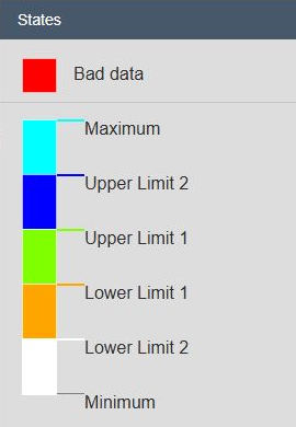
Limits and targets do not expand an automatic value scale; only their visible portions appear. On a 100% stacked scale, original-unit limit lines, target lines, bands, and their labels are omitted. Color series still evaluates the original measurements against their limits. Identical labels at the same position may be combined. Labels stay with the latest valid visible limit segment and disappear when none remains visible.
With Color series enabled, a hidden state hides the affected drawing while retaining valid measurements for calculations and exports. Color data labels can hide labels independently. A limit that cannot be read leaves out its own overlays, and measurements are then colored against the next limit that is available. They keep the primary color only while no limit at all can be read for that moment. Analysis keeps its own source-color styling. Blinking is not available.
Examples
Compare pump speed during a changeover
- Select the pumps and add their common Speed attribute.
- Keep Type > Line and Scales > Value Scales > Multiple so matching units share a scale.
- Enable Summary Table > Show with Average, Min, and Max columns.
- Place rulers before and after the changeover to compare the same interval across pumps.
- Enable Moving Average for Speed when short sample-to-sample fluctuations make the pattern hard to see. Set Samples to a suitable count for the selected retrieval interval.
The same Speed appearance and analysis choices apply to every pump; each pump keeps its own values and summary results.
Show an operating envelope for every asset
- Add the attributes defining the lower and upper measurements, such as Minimum Temperature and Maximum Temperature.
- Select Minimum Temperature, choose Range Area, and set Target to Maximum Temperature.
- Adjust Color and Opacity (%) so overlapping assets remain readable.
- Give the owning attribute an appropriate scale and confirm that both inputs exist on each asset.
Each asset shows its own shaded envelope. Enable the Summary Table when you also need the two inputs' separate values and statistics.
Troubleshooting and limitations
See Troubleshoot chart data loading for the PI Vision log, loading failures, and information to send support.
| Symptom | Check or action |
|---|---|
| An asset or attribute is missing | Check the fixed selection or Search Criteria, incoming filters, and whether the attribute exists on that asset. |
| No history is drawn | Confirm the attribute has readable numeric or digital/enumeration history in the selected range. Boolean, arbitrary string, calculation, and event-frame histories are outside this chart's history scope. |
| A digital trace is missing or has gaps | Check access to that asset's state definition, sample quality, and whether each loaded state belongs to the definition. Review the PI Vision log. Other assets can continue to draw. |
| A line has gaps | Inspect data quality. Invalid values remain gaps; lines do not bridge them. |
| A Range Area band is missing | Check its Target and both attributes on the affected asset. Review the PI Vision log for the omission reason. |
| History could not be loaded | Read the source and reason in the PI Vision log. Default mode retries failed plot requests automatically; check access and connectivity if the failure persists. |
| Recorded history is incomplete or the selection exceeds a loading limit | Narrow the asset/attribute selection, shorten the range, increase the Interpolated interval, or use Default. |
| A summary cell shows a dash | Check source availability, quality, and whether that statistic supports the source type. Exact-time values may still be available when numeric statistics are not. |
| A table value differs from a ruler readout | The table queries exact-time server values; the chart uses its loaded samples and line shape. |
| A trace action changes several table rows | Regression, moving average, and multi-state apply to the attribute across all assets. Show affects only one trace. |
If a live refresh fails, the chart can retain its last complete history for the same sources while retrying. A new asset context cannot reuse unrelated data. Separate chart panels and event-frame creation are not available.



