Vision Library+ / Charts and analytics
Asset Comparison Bar Chart+
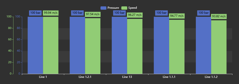
Asset Comparison Bar Chart+ compares attributes across AF assets as grouped or stacked bars.
Overview
Asset Comparison Bar Chart+ compares attributes across AF assets as grouped or stacked bars.
Watch the demo
See Asset Comparison Bar Chart+ in a practical PI Vision workflow.
When to use it
Use this symbol when you need to:
- Rank comparable assets by one or more values.
- Compare several attributes across a selected asset set.
Before you begin
- Prepare comparable AF assets based on a common element template.
- Confirm that compared attributes use compatible units when they share a scale.
Add and set up the symbol
- Select the symbol in the PI Vision symbol gallery.
- Add the required data sources or asset context to the display.
- Right-click the symbol and open its configuration pane.
- Configure the minimum data, range, and display settings for a useful result.
- Confirm that the symbol shows the expected data.
Use the symbol
Hover over a bar to read its asset, attribute, and value. Use configured selection behavior to apply an asset context when available. Use the Ad Hoc Chart button in the top-right corner of the chart to open a PI Vision trend of everything the chart is showing; it replaces the plot double-click that used to open that trend, so the same view is now reachable on a touch device and from the keyboard. When the toolbar is enabled, the buttons beside it also open the chart full screen or download it as an image or a data file.
Configure the symbol
Overview and behavior
The Asset Comparison Bar Chart+ extends the standard Asset Comparison table concept into a fully configurable bar chart. You can compare attribute values across assets using the same familiar search criteria, but visualize the results as stacked or grouped bars - with multi-state conditional formatting and multiple value axes.
Configure bar chart
Use the Configuration pane to customize visual styles, legend, data labels, and interactivity.
- Right-click the symbol and select Configure Bar Chart to open the configuration pane.
- In the Title section, configure the chart's title and subtitle.
- Title: Enables or disables the chart title.
- Text: The title text to display.
- Position: Aligns the title Left, Center, or Right.
- Font Size: Sets the title font size.
- In the Style section, configure the chart's global colors and visual properties.
- Foreground: Sets the chart's text color.
- Background: Sets the chart's background color.
- Font Size: Global font size applied to all text in the chart except the title, which has its own separate font size setting.
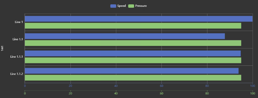
- Orientation: Switches the chart between vertical and horizontal layouts. An example of a horizontal chart is shown below.
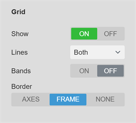
- Grid: Controls what is drawn behind the data: the grid lines, the shaded bands, and the border of the plot area.
- Show: Turns the grid on or off. When it is off, no grid lines or bands are drawn; the Border setting still applies.
- Lines: Selects which grid lines are drawn: None, Horizontal, Vertical, or Both. The names always describe the direction the lines run on screen, whichever Orientation the chart uses.
- Bands: Draws alternating shaded bands across the plot area.
- Border: Bounds the plot area. Axes draws the two axis lines with their ticks, Frame draws a rectangle around the plot instead of the axis lines, and None draws neither. Grid lines drawn with Border set to None are dashed.
Grid line color and opacity are not settings; they follow the chart's foreground color and theme.
- Gap: Controls the spacing between individual bars (0% = no gap, 100% = maximum spacing).
0% 20% 100%
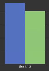
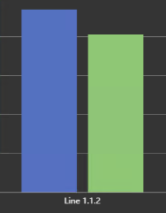
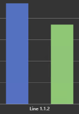
- In the Legend section, configure the chart legend, which lists all active traces and their assigned colors.
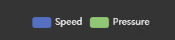
- Show: Enables or disables the legend.
- Position: Places the legend at Top, Left, Bottom, or Right of the chart area.
- Alignment: Sets the text alignment of legend entries.
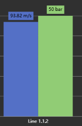
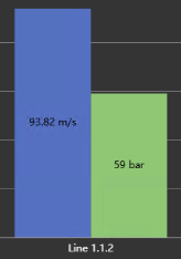
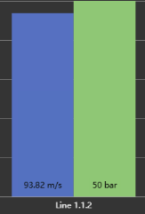
- In the Data Labels section, configure the appearance of the value labels shown on each bar.
- Show: Shows or hides the data labels.
- Units: Toggles display of the series unit of measure alongside each label.
- Position: Places labels at the Top, Center, or Bottom of each bar.
Top Center Bottom
- In the Toolbar section, configure the chart toolbar - a small strip of buttons in the top-right corner of the chart.
- Show: Turns the generic toolbar buttons - Full screen and Download - on or off. It is on for a newly placed symbol and off on displays saved before the toolbar existed, so an existing display never changes until you switch it on. Ad Hoc Chart is not affected: it replaces a gesture the symbol has always had, so it stays available either way.
- Reveal: Chooses when the strip appears. On hover keeps it hidden until the pointer or keyboard focus enters the chart, which costs the plot no space. Always keeps it on screen permanently and reserves a band at the top of the chart for it. On a touch device the strip is always shown, because there is no hover to reveal it with.
The toolbar carries, in order, three buttons:
- Ad Hoc Chart: Opens a PI Vision trend of every asset and attribute the chart is currently showing. It replaces the plot double-click that used to open that trend, so the same view is now reachable on a touch device and from the keyboard. Because it is a capability every saved display already had, this button stays available even when Show is off.
- Full screen: Opens the chart in a large dialog over the display. The dialog redraws the chart at its own size and keeps any legend entries you have switched off. Close it to return to the display.
- Download: Opens a menu of export formats - PNG, SVG, PDF, CSV, JSON, and XLSX. The image formats capture the chart as drawn. The data formats write one row per plotted asset and attribute, carrying Asset, Attribute, Timestamp, Value, Units, and Status. Status is empty for good data and otherwise names the condition: the PI system state, or Bad, Substituted, or Questionable. A digital attribute exports its state name as the value. Only the attributes the chart draws are exported, so hidden measures, the grouping attribute, the asset label attribute, and tooltip-only attributes are left out. CSV and XLSX print the timestamp in your local display format - XLSX as a real date cell - while JSON keeps raw ISO timestamps for downstream tools. If your administrator has disabled data exports, only the image formats are offered.
- In the Interactivity section, configure the action triggered when a user clicks a bar.
- Enabled: Enables or disables asset selection on click.
- Action: Determines what happens when an asset is clicked. Set Asset Context updates the current display's asset context to the selected asset. Open Hyperlink opens a configured PI Vision display with the clicked asset as its referenced asset.
Configure category scale
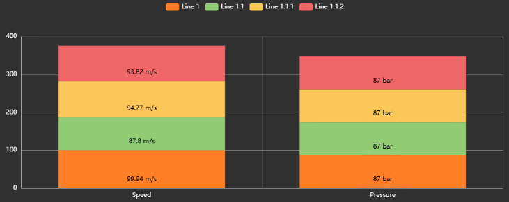
The category scale defines the chart's primary axis - typically the X axis. It can represent either your assets or your attributes, depending on the Type setting.
- Type: Sets whether the categories represent Assets or Attributes.
Asset: Categories are your assets; series are your attributes.
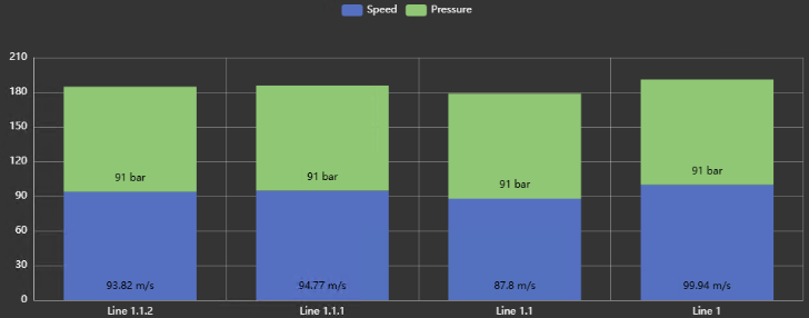
Attribute: Categories are your attributes; series are your assets.
- Show: Shows or hides the category scale.
- Opposite: Moves the scale to the opposite side of the chart.
- Name: Sets a custom name for the scale axis.
- Rotation: Rotates axis labels to prevent overlap - choose 0°, 45°, or 90°.
- Label: Selects the asset label format: Name, Description, Path or any of the added attribute values.
The following settings are only available when Type is set to Asset. They control how assets are sorted and filtered in the chart - for example, sorting by a specific attribute value and applying a Top N filter to show only the top or bottom 5.
Asset-only settings:
- Sort By: The attribute used to sort assets. If the desired attribute is not listed, add it in the Attributes configuration first.
- Descending: Sets sort direction. Disable to sort ascending, which is required for a Bottom N calculation.
- Top N: When enabled, limits the chart to the top N assets based on the Sort By property and sort direction.
- Group: Enable categories to be grouped by an attribute value. Choose the attribute from the list below. If you do not see that attribute, add it to the symbol first. It will be automatically hidden from the chart. This option is only available if the chart is in vertical mode.
Attribute-only settings:
- Stack: When enabled, bars sharing the same attribute are stacked on top of each other.
- Color: Auto assigns a unique color to each asset automatically. Custom lets you define each asset's color individually in the Assets section.
Configure value scale
In this section, configure the value scales and their ranges. Three scaling modes are available (Note: these are only available when the category scale is set to Asset):
| Stacked |  | All traces that support stacking are stacked on top of each other. |
| 100% |  | Stacks all bars to a combined total of 100%. Only available when all traces are of type Bar. Does not work with Line, Scatter, or Area traces. |
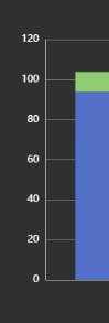
- Single Scale

Displays all bars on a single Y axis. You can set a custom minimum and maximum value, or use auto scaling.
- Multi Scale

Creates one independent value scale for each attribute.
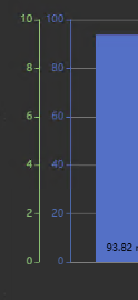
The configuration for Multi Scale is part of each individual attribute. Open the Attributes settings and select the attribute to configure. Each multi-scale attribute has the following options:
- Show: Shows or hides the scale and its labels for this trace.
- Opposite: Positions the scale on the opposite side of the chart area.
- Scale Range: Sets the minimum and maximum values for this scale. Choose between manual values or auto scaling.
- Custom Scale

Allows creation of fully customized value scales. You can add as many scales as needed, then assign individual attributes to each scale - for example, assigning attributes 1 and 2 to Scale 1 and attribute 3 to Scale 2.
Create a custom scale
Click the Add Scale button to create a new custom scale. Each custom scale has the following options:
- Show: Shows or hides the entire scale.
- Name: Sets the display name for the scale.
- Color: Sets the scale's color.
- Units: The unit of measure shown on the scale's numbers.
- Opposite: Positions the scale on the opposite side of the chart.
- Scale Range: Choose between auto range, fit to data, or a custom min/max range.
Assign an attribute to custom scale
In the Attribute settings, select the attribute and choose the target scale from the Scale dropdown. Multiple attributes can share a single scale, but each attribute can only be assigned to one scale.

Configure assets
When Dynamic Search Criteria is not enabled, you can configure asset-specific settings here:
- Color: Only available when Color Mode is Custom and Value Scales Type is Attribute. Sets the color for this asset's bars.
- Label: A custom display label for this asset.
Use the buttons below the asset list to reorder or remove assets.
Configure attributes
The Attributes section controls which attributes appear in the chart and how each one is styled.
To add attributes, drag them from the PI Vision attribute toolbar onto the symbol, or select an attribute from the Additional Attributes list and click the Arrow Up button.
To remove an attribute, select it in the Current Attributes list and click the Arrow Down button.
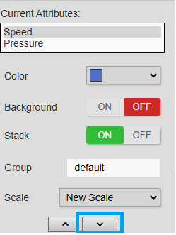
Each attribute can be configured with the following settings:
- Value: Selects what the bar represents. The default, Current, displays the attribute's live value. Additional summary and analytic options are available.
- Label: A custom text to be displayed instead of the attribute’s name
- Display: Choose how that attribute value is displayed:
- Visible: Show a normal bar
- Tooltip: Hide the bar but show the value in the tooltip
- Reference: Show a reference dot instead of a bar
- Basis: Only available when Value is not set to Current. Sets the calculation basis: Event Weighted or Time Weighted.
- Boundary Type: Only available when Value is not set to Current. Inside uses only values within the current time range. Outside also includes the last recorded value before the time range begins.
- Color: Sets the fill color of this attribute's bars.
- Background: Adds a background shade behind each bar. Adjust the Color and Opacity to taste.
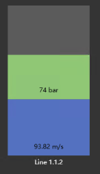
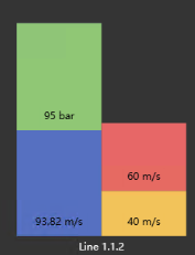
- Stack: When enabled, bars for this attribute are stacked. Use the Group property to control which attributes stack together.
- Group: Attributes sharing the same group name are stacked together as one unit.
Group1 Group2
Configure top n rules
Top N rules filter the chart to show only the top or bottom N assets based on a chosen attribute value - for example, the 5 best or worst performing assets. To set this up, start by configuring the search criteria to include all assets:
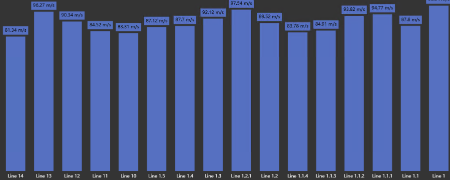
Then open the Scales and Category configuration section. Set Sort By to the desired attribute and enable Top N.
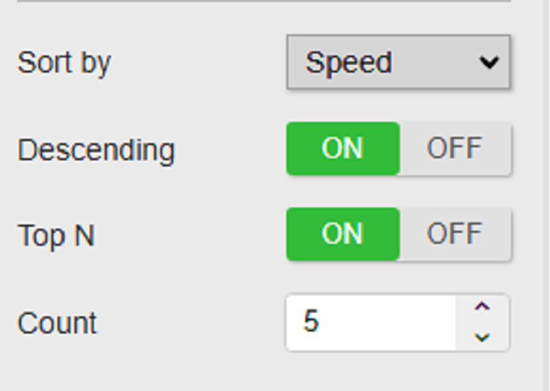
The chart now shows only the top 5 assets ranked by the selected attribute.
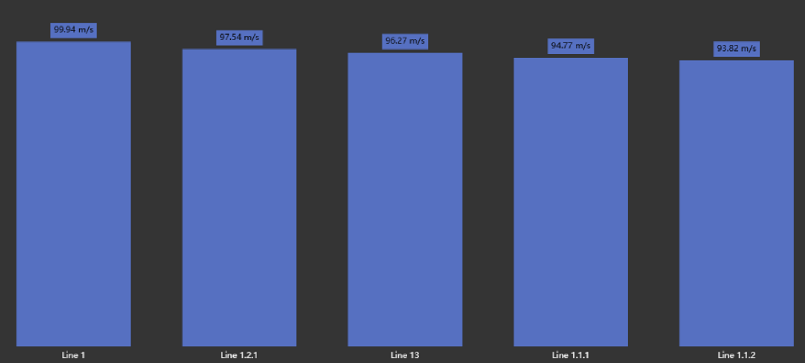
Filtering
Asset Comparison Bar Chart+ receives asset Master filters and Linked inputs. Enable Asset Selection and set its action to Filter to publish the clicked asset through configured Linked outputs. The selected asset is highlighted across its rendered bars or markers. Filtering is mutually exclusive with the other asset click actions.
See Filtering dashboards for channel mapping, identifier guidance, and cross-family examples.
Troubleshooting and limitations
- Check: If assets are missing, check the asset search root, template, and filters.
- Check: Large asset sets can reduce label readability and increase retrieval time.