



Vision Library+ / Charts and analytics
Event Comparison Chart+
Event Comparison Chart+ aligns event-frame time series so operators can compare event behavior, markers, and reference events.
Overview
Event Comparison Chart+ aligns event-frame time series so operators can compare event behavior, markers, and reference events.
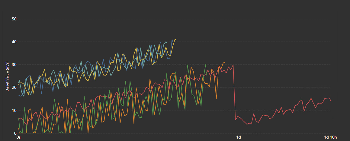
Watch the demo
See Event Comparison Chart+ in a practical PI Vision workflow.
When to use it
Use this symbol when you need to:
- Compare process behavior across batches, shifts, trips, or other events.
- Use pinned or golden events as an operational reference.
Choose this chart instead of a standard trend
Use this symbol when you need one or more of the following:
- You want to compare the shape of behavior across repeated events rather than only their absolute timestamps.
- You need to compare events with different durations and still align them meaningfully.
- You want to keep a few reference events visible even when they are outside the current search results.
- You want to compare events by category or context, such as asset, severity, operating mode, product grade, or event status.
- You want a chart and a table together, so operators can both see the pattern and act on individual events.
If your question is mainly “what happened over clock time,” a normal trend is usually simpler. If your question is “how do these events compare to each other,” this symbol is the better fit.
Before you begin
- Prepare an event-frame search and attributes that are available for each compared event.
- Choose an alignment and time basis appropriate for events of different duration.
Add and set up the symbol
- Select the symbol in the PI Vision symbol gallery.
- Add the required data sources or asset context to the display.
- Right-click the symbol and open its configuration pane.
- Configure the minimum data, range, and display settings for a useful result.
- Confirm that the symbol shows the expected data.
Getting started
1. Define the event set
The first job of this symbol is to decide which event frames belong in the comparison.
Use the symbol’s context menu and open Events Search Criteria. That search determines the event frame database, template, filters, time range, update behavior, and context-following behavior.
Why this matters:
- The symbol is only as useful as the event population you feed it.
- If you compare unrelated events, the chart becomes noisy very quickly.
- A well-defined search creates a meaningful population, such as “all CIP events for Line 3 this month” or “all trips with Severity = High.”
How to use it well:
- Start with a narrow template or event type.
- Add business filters that make the events truly comparable.
- Decide whether the symbol should follow the display time bar and asset context, or whether it should stay independent.
- If this is a live monitoring view, enable event updates so in-progress events refresh automatically.
2. Add the attributes you want to compare
The symbol plots one or more event frame attributes. These attributes become either:
- Trace attributes, which actually draw lines, areas, or scatter series.
- Category attributes, which do not draw traces, but instead provide context for color grouping, trellis layout, tooltips, and table columns.
Why this matters:
- Too many plotted traces can make the chart unreadable.
- Some attributes are better as context than as plotted signals.
- Good event comparison often depends on a balance between numeric traces and categorical context.
A good starting pattern is:
- Add 1 to 3 trace attributes you truly want to compare.
- Add a few category attributes only if they will help you group, color, or explain the events.
3. Choose the X-axis alignment mode early
The alignment mode changes what the X-axis means. That is one of the most important decisions in the symbol.
Use:
- Matched Start when you care about what happens after the event begins.
- Matched End when you care about what happens leading up to the event end.
- Normalized (0-100%) when you care about the overall shape of the event regardless of duration.
Why this matters:
- The same data can tell very different stories depending on alignment.
- A ramp-up process usually makes sense in matched-start mode.
- A completion or trip analysis often makes sense in matched-end mode.
- Mixed-duration events are usually easiest to compare in normalized mode.
4. Choose the Y-axis scale strategy
Once the X-axis comparison is meaningful, decide whether traces should share one scale, have separate scales, or be split into panels.
Use:
- Single Scale when all traces have compatible units and ranges.
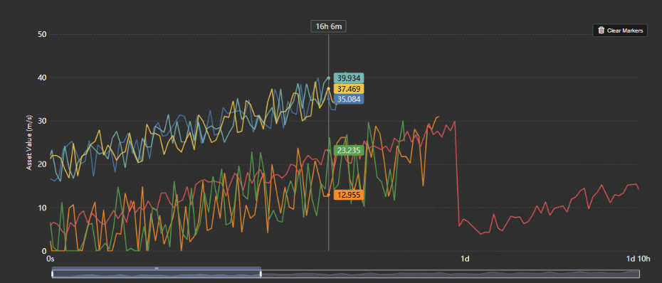
- Multiple Scale when traces need their own axes but you still want them overlaid.
- Separate Scales when readability matters more than overlaying everything in one panel.
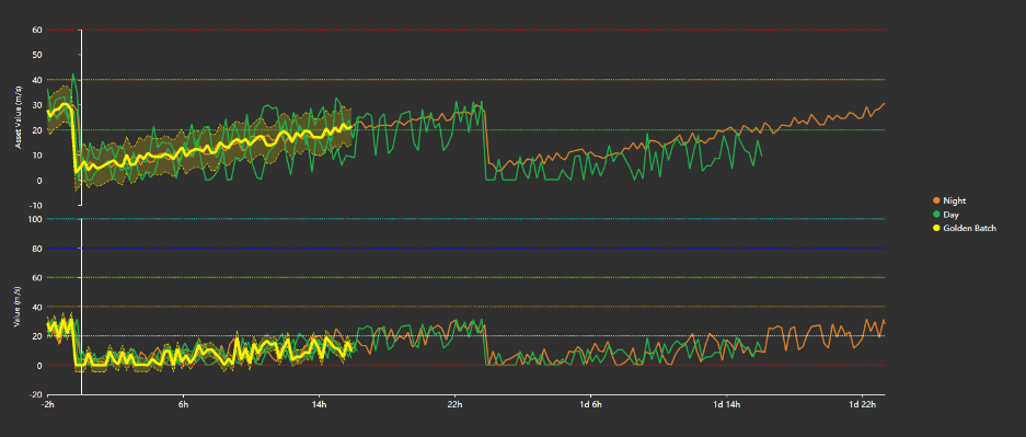
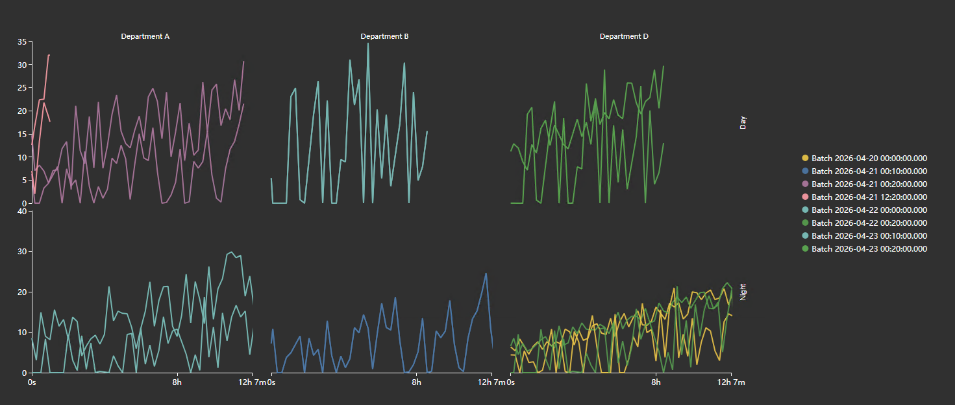
- Trellis Grid when you want to facet the comparison by category.
Why this matters:
- Bad scale choices hide patterns or exaggerate noise.
- A shared scale is honest when units match, but misleading when they do not.
- Separate panels make dense comparisons easier to read.
- Trellis turns one comparison into many smaller, easier comparisons.
Use the symbol
Select events, inspect tooltips, add markers, or pin a reference event using the enabled controls. These actions change chart context but do not edit the source event frames.
How to read the symbol
The symbol has two main parts:
- The chart area, where event-aligned traces are rendered.
- The table, which acts as both a summary and an action surface.
In the chart area
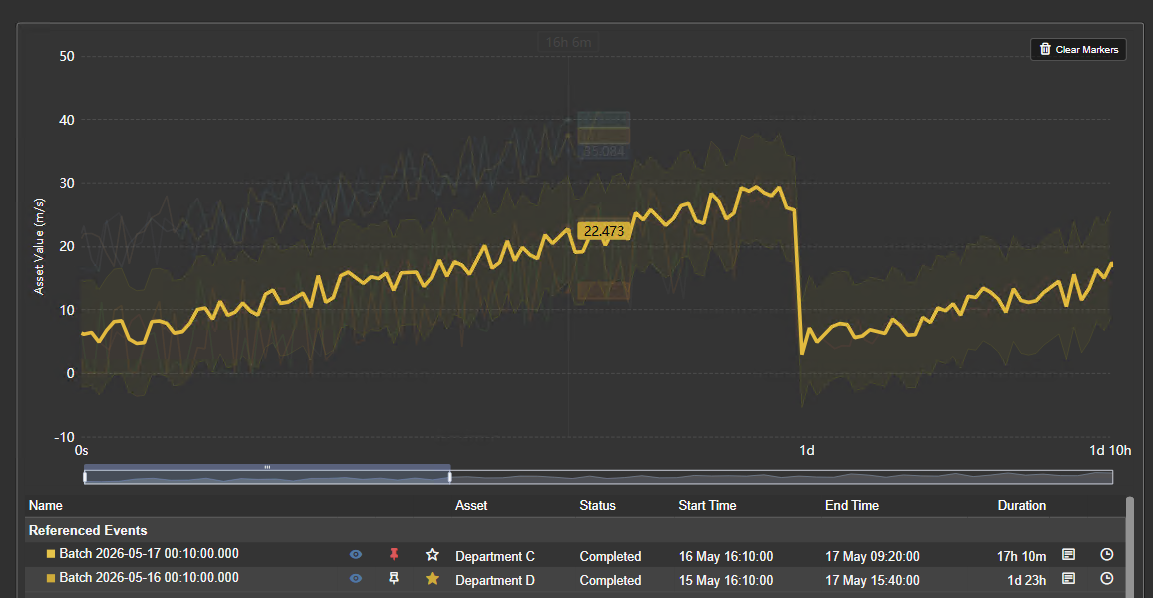
Each visible trace represents a plotted attribute for an event. Depending on configuration, the chart may also include:
- Benchmark overlays from golden events
- Additional reference traces from pinned events
- A tolerance band around the golden reference
- Child event frame overlays as contextual bands
- multi-state threshold lines
- Dropped marker lines for manual visual comparison
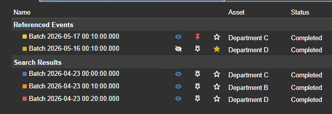
In the table
The table is more than a legend. It can show:
- Event name, Asset, Status, Start time, End time, Duration, Optional category columns, Optional plot statistics, Optional shift controls
It also gives the user direct actions for:
- Show/hide, Pin, Mark as golden, Open event details, Apply event time range to the display time bar, Shift an event left or right for runtime analysis
Why the table matters:
- In a dense comparison chart, the table often becomes the fastest way to act on a specific event.
- It reduces the need to guess which line belongs to which event.
- It turns the symbol from a passive visualization into a working analysis tool.
Runtime features
Chart toolbar
When Show Toolbar is on, a small button strip appears in the top-right corner of the chart. By default it uses On Hover reveal: the buttons are hidden until the pointer or keyboard focus enters the chart, and they fade out again shortly after it leaves. Set Reveal to Always to keep the strip permanently on screen; the chart then keeps a band of its top edge free for it, so the plot is slightly shorter.
The buttons appear in a fixed order:
- Pan and Box zoom choose what a drag on the plot does. They are a pair, and exactly one of them is active at a time.
- Zoom in, Zoom out and Reset step the visible comparison window in and out around its centre, and restore the full window.
- Clear rulers removes any rulers placed on the chart.
- Fullscreen opens the chart in a large dialog.
- Download opens a menu with PNG, SVG, PDF, CSV, JSON and XLSX. The three image formats export the chart as drawn; the three data formats export one row per plotted sample, carrying Event, Asset, StartTime, EndTime, Series, Timestamp, the elapsed position on the X-axis, Value and Units. The elapsed column names its own unit: Elapsed (s) in seconds when the events are matched by start or end, Elapsed (%) when the X-axis is normalized. An event still in progress has an empty EndTime. CSV and XLSX print the three times in your local display format - XLSX as real date cells - while JSON keeps raw ISO timestamps for downstream tools.
The Pan / Box zoom pair, the three zoom buttons, Clear rulers, Fullscreen and Download are all part of the toolbar, so they appear only while Show Toolbar is on. The zoom family additionally follows Enable Zoom: with zoom switched off, the mode pair and the three zoom buttons are not offered at all.
Zoom and scroll
The chart supports X-axis zooming, and you can optionally show a scrollbar-style slider.
Why to use it:
- Event comparisons are often dense at the beginning or end of events.
- Zoom lets you inspect a narrow comparison window, such as the first 2 minutes or the last 10%.
How it works:
- The mouse wheel always zooms while Enable Zoom is on.
- A drag either pans the window or draws a zoom rectangle, depending on the toolbar's Pan / Box zoom mode. The starting mode comes from the Drag Mode setting; a change a viewer makes on the toolbar lasts for that session only, and the display opens in the configured mode again next time.
- Zooming always applies to every panel at once, so split and trellis layouts stay comparable.
- The scrollbar gives an explicit, operator-friendly zoom control.
- The slider is especially useful on displays where mouse wheel or drag gestures are not ideal.
Fullscreen
Use the toolbar's Fullscreen button to open the chart in a large dialog. Double-clicking the plot no longer opens fullscreen; a double click had no visible affordance and could fire while placing a second ruler. The fullscreen dialog carries its own Clear rulers and Download buttons, but no zoom controls: zooming there would move the chart behind the dialog.
Tooltip modes
The tooltip can summarize data at the current X position in different ways.
Available behavior depends on the scale layout:
- In split or grid layouts, you can choose between Current Chart and All Charts.
- In single or multiple scale layouts, the symbol uses All Traces.
Why to use each mode:
- Current Chart keeps tooltips readable in multi-panel layouts. Use it when a grid or split view would otherwise create a huge tooltip.
- All Charts helps compare the same X position across all panels at once.
- All Traces is the natural mode when everything is already in one plot.
You can also choose whether the tooltip shows:
- Event frame name
- Value name
- Category values
- The real timestamp of each value
That real timestamp is especially important in normalized and matched-end modes, because the X-axis no longer represents absolute wall-clock time.
Dropped markers
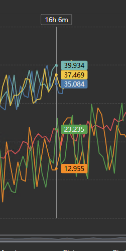
Clicking in the chart drops vertical comparison markers. Clicking again near an existing marker removes it. When markers exist, the symbol shows a Clear Markers button.
Why this feature matters:
- It lets you compare different events at a specific relative point without moving the mouse precisely.
- It is useful in meetings, troubleshooting sessions, or handoffs where you want a fixed visual reference point.
- Marker labels can show values at the marker position, using actual or interpolated values depending on the series.
This is one of the most effective ways to answer questions like “what do all events look like at 5 minutes in?” or “how much spread is there near completion?”
Pinned events
Pinned events are reference events you want to keep visible even if they are not part of the current search results.
Why use pinned events:
- You have one or two known “good” or “bad” historical events you always want for comparison.
- Your current search changes with display time, asset context, or live updates, but you still want a stable reference.
How they behave:
- They are stored by event identity and reloaded as reference events.
- They remain individual reference traces, not averaged traces.
Golden events
Golden events define a benchmark reference.
Why use golden events:
- You want a “best practice” or “reference profile” overlaid on the event population.
- You want a tolerance envelope around benchmark behavior.
How they behave:
- If you select one golden event, the chart uses that event as the reference trace.
- If you select multiple golden events, the chart builds a golden average profile.
- The tolerance band is then built around that golden reference.
This is the core feature for “compare current behavior to benchmark behavior.”
Event shifting
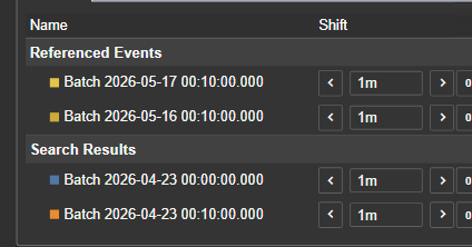
If the Shift column is enabled in the table, each row can be shifted left or right using PI duration strings such as 5m, 30s, or 1h.
Why this feature matters:
- Sometimes event boundaries are operationally correct but analytically imperfect.
- You may want to test whether a signal aligns better if an event is shifted slightly.
- It helps compare process response lag without editing the actual event frame.
How it behaves:
- Shifts are runtime only.
- They affect the visual comparison, not the underlying event frame data.
- They are intended for analysis, not permanent data correction.
This is best used as a hypothesis-testing tool: “What if this event starts 2 minutes earlier than the official event boundary?”
Configure the symbol
Overview and behavior
Event Comparison Chart+ is designed to compare many event frames against each other on a common relative time axis instead of only on calendar time. In practice, that means the symbol answers questions like:
- How do similar events behave at the start, middle, or end of the event?
- Do events follow the same shape even when their absolute start times are different?
- Which events are still in progress, and how do they differ from completed events?
- How do benchmark or “golden” events compare to the current population?
- What context fields, categories, or child events explain why one event behaves differently from another?
This makes the symbol especially useful for batches, startups, shutdowns, cleaning cycles, alarms, trips, failures, maintenance windows, or any recurring operational event where the comparison itself matters more than the absolute timestamp.
Unlike a normal trend, the chart is not primarily telling you “what happened at 10:32 AM.” It is telling you “what tends to happen 5 minutes after an event starts,” or “how events compare in the last 10% before they end,” or “how benchmark events differ from the current event set.”
Configuration reference
Event Search And Data Selection
Events Search Criteria
This is the search definition behind the symbol.
- Use the event search criteria to decide which event frames enter the comparison. This is the most important setup step, because no styling choice can fix a poor event population.
- If the display should behave like an operational dashboard, let the symbol follow the display time and asset context. That way, the chart updates with the display instead of becoming stale.
- If the display is meant to be an investigation workspace, make the search more independent and explicit. That gives repeatable results.
- If live events matter, configure the event update rate so in-progress events refresh automatically. This works especially well with the active-event styling options.
Dragged attributes
The symbol supports multiple event frame attributes.
- Add trace attributes for numeric series you want to plot.
- Add category attributes when you want context for grouping, coloring, tooltips, or table columns instead of more plotted lines.
- Keep the attribute list intentional. Event comparison charts become hard to read when every available attribute is plotted.
Trend Options
Common
- Title should be used when the chart meaning is not obvious from the display context alone. A strong title should tell the reader what events are being compared and how they are aligned.
- Title text matters because event comparison charts are interpretive. A title such as “CIP Events, Matched Start, Flow + Conductivity” is much better than a generic title.
- Title font size should be increased when the chart will be viewed in operations rooms or wallboards, and reduced when the display is more analysis-dense.
Style
- Foreground color drives chart text, table text, icons, and linework accents. Use it to maintain contrast and readability.
- Background color affects the visual weight of the symbol. Transparent or soft backgrounds work well when the symbol must blend into a display, while solid dark backgrounds often help dense comparisons stand out.
- Font size changes more than aesthetics. It affects axis readability, legend readability, tooltip readability, and even practical table density.
Legend
- Enabled should be turned on when color carries a stable meaning that operators need to scan quickly. If the table is already visible and complete, the legend may be redundant.
- Position should be chosen based on layout. Top and bottom work better when the plot is wide; left and right work better when the plot is tall.
- Horizontal alignment matters only for top or bottom legends. Use it to keep the legend visually balanced rather than floating awkwardly.
Grid
The Grid section controls what is drawn behind the data: the grid lines, the shaded bands, and the border of the plot area.
- Show: Turns the grid on or off. When it is off, no grid lines or bands are drawn; the Border setting still applies.
- Lines: Selects which grid lines are drawn: None, Horizontal, Vertical, or Both. The names always describe the direction the lines run on screen.
- Bands: Draws alternating shaded bands across the plot area.
- Border: Bounds the plot area. Axes draws the two axis lines with their ticks, Frame draws a rectangle around the plot instead of the axis lines, and None draws neither. Grid lines drawn with Border set to None are dashed.
Grid line color and opacity are not settings; they follow the chart's foreground color and theme.
Event Comparison Chart+ always plots horizontally, so Horizontal draws lines along the event rows and Vertical draws lines across the value axis. The Trellis Grid layout option is a panel arrangement and has nothing to do with this section.
The right grid choice is about cognitive load. If the chart already has many traces, overlays, or child-event bands, use fewer lines.
Toolbar
- Show Toolbar turns the chart's button strip on. It is off on existing displays and on for newly placed symbols.
- Reveal decides when the strip is visible: On Hover shows it only while the pointer or keyboard focus is on the chart, and Always keeps it permanently on screen. Always reserves a band of the plot's top edge for the strip, so the plot is a little shorter. Touch devices have no hover state, so they always get the permanent strip whatever this is set to.
Interactivity
- Enable Zoom should be on for analytical views where users need to inspect a specific phase of the event. It is the master switch for the whole zoom family: with it off, the wheel does nothing, a drag cannot draw a zoom rectangle, and the toolbar drops the drag-mode pair together with Zoom in, Zoom out and Reset.
- Drag Mode sets what a drag on the plot does when the display opens: Pan moves the visible window, and Box zoom draws a rectangle to zoom into. Viewers can switch between the two on the toolbar; that choice is not saved, so the display always opens in the configured mode. The row is hidden while Enable Zoom is off.
- There is no Apply to Display Time option on this symbol. Its X-axis measures elapsed time from each event's own alignment point rather than wall-clock time, so a zoom here describes a stretch of event progress and not a range of clock time that the rest of the display could adopt. For the same reason, this chart's hover and ruler cursors synchronize only with other Event Comparison Chart+ symbols using the same alignment mode, never with ordinary trends.
- Show Scrollbar should be on when users need an obvious, persistent zoom control. It is especially helpful in shared displays, touch environments, or less technical operator audiences.
Tooltip
- Tooltip Mode should be chosen based on layout density. In split or grid mode, “Current Chart” keeps tooltips readable, while “All Charts” is better for synchronized cross-panel comparison.
- Event controls whether the event frame name is shown. Turn it off when the chart is already visually labeled elsewhere and the tooltip feels repetitive.
- Value controls whether the attribute name is shown. Turn it off when the user only needs the number and the series identity is already obvious.
- Category adds category-attribute context. Use it when you want every hover to answer not only “what value is this?” but also “what kind of event is this?”
- Timestamp adds the actual value timestamp. This is most important in normalized or matched-end mode, where the X-axis no longer equals actual clock time.
Events
Event Context
- Pre-Event Offset loads additional data before the event start. Use it when the cause or lead-up to the event matters more than the event boundary itself.
- Post-Event Offset loads additional data after the event end. Use it when recovery, settling, or after-effects matter.
- The reason to use offsets is not decoration. It is to make the comparison window more analytically truthful. Many events are operationally defined too narrowly for root-cause analysis.
Use offsets carefully:
- Small offsets reveal cause and effect.
- Large offsets can dilute the visual comparison and clutter the chart.
Series
- Highlight Active Events separates in-progress events from completed events using distinct styling. Use it when your event set mixes live and historical events and you want users to understand that difference immediately.
- Color By determines what visual grouping means. This is one of the most important interpretive settings in the symbol.
- If you color by Name, each event gets its own color. This is best when individual event identity matters.
- If you color by In Progress, the chart emphasizes event state rather than event identity. This is useful for live monitoring.
- If you color by an event property or category attribute, the chart becomes a grouped comparison. This is useful when you are asking questions like “Do events from Asset A behave differently than Asset B?”
- Group Interval appears for DateTime properties and bins those values into time groups. Use it to avoid a different color for every timestamp.
- Coloring: Auto vs Custom controls whether the symbol uses a palette automatically or whether you explicitly define the color mapping for each category.
- Palette changes the visual tone of automatic coloring. Use a softer palette for dense operational views and a higher-contrast palette when group distinction is more important than subtlety.
- Global Trace Styling is used when active-event highlighting is off. It defines line width, opacity, and line style for all traces.
- Live Trace Styling and Historical Trace Styling appear when active-event highlighting is on. Use this when you want in-progress traces to stand out without relying only on color.
A useful pattern is:
- Set Color By to In Prgoress
- Turn on Highlight Active Events
- Use a thicker, more opaque live line and a lighter dashed historical line
That makes the operational state readable even from a distance.
Tolerance Band
The tolerance band is built around the golden reference.
- Enabled turns on the benchmark envelope.
- Type controls whether the band is calculated as percent of the golden average, as an absolute value offset or as Sample Standard Deviation.
- Upper Limit and Lower Limit can be asymmetric. This is valuable when overperformance and underperformance do not have the same operational meaning.
- Color and Opacity control how strong the envelope feels visually. Use a subtle area if the band is background guidance; use a stronger area if the band is an operating target.
- Boundary Lines are useful when users need to read the upper and lower limits explicitly instead of only seeing a filled zone.
- Boundary line style and width should be used sparingly. Heavy boundaries can overpower the underlying traces.
Why this feature matters:
- It turns the chart from pure comparison into benchmark monitoring.
- It makes it much easier to answer “Are these events still within expected behavior?” instead of only “How do these events compare?”
Child Event Frames
- Show overlays child event frames as contextual bands inside each parent event.
- Color mode = Series inherits the parent/event color context, which keeps the display visually consistent.
- Color mode = Custom gives a stable child-event color regardless of parent grouping, which is better when you want child events to read as a separate layer of meaning.
Use child events when:
- The parent event contains meaningful phases or subevents.
- You want to see not just the signal shape, but the internal event structure.
Do not use child events when:
- The chart is already visually dense.
- Child events are numerous and low-value, because they can quickly become clutter.
Filtering
- Ignore Master determines whether the symbol responds to Master filters
from other symbols.
- Leave it off when you want the symbol to participate in coordinated analysis with other symbols.
- Turn it on when the comparison should ignore Master filters. Configured
Linked inputs remain active.
- Add Linked inputs to map named channels to this chart's Event Frame target
properties. The chart is a receiver and does not publish Linked outputs.
Pinned reference events retain their established filter-independent behavior. See Filtering dashboards for channel setup and search limitations.
Table
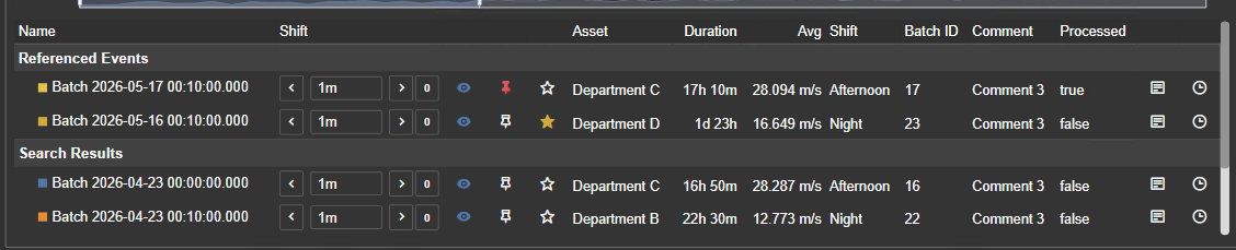
Table layout
- Enabled controls whether the lower comparison table is shown. In most analytical scenarios, the table is worth keeping on because it is also the action surface.
- Height (%) - 0 = Auto is an important choice. Use 0 when you want the table to size to its contents. Use a fixed percentage when you want to protect chart space on smaller displays.
- Category Values adds columns for category attributes. This is useful when users need context without hovering each trace.
- Plot Values adds summary statistics for plotted attributes. This is useful when users need quick comparison without opening another tool.
Plot Values
- Min is helpful for finding lowest excursion behavior.
- Max is helpful for peak comparison.
- Average is the most generally useful summary and is on by default for good reason.
- Time at Min and Time at Max help answer not only “how extreme was it?” but also “when inside the event did the extreme occur?”
If you have multiple trace attributes, these statistics become especially useful because they let the table act as a compact comparison matrix.
Standard table columns
- Asset should be shown when the same event template exists across many assets.
- Status is useful when the event set contains both in-progress and completed events.
- Start Time and End Time help tie relative-time analysis back to operations.
- Duration is important whenever event length itself is part of the story.
- Shift exposes the runtime shift controls. Turn it on when analysts need alignment experimentation; leave it off when operators only need a clean summary.
Table runtime actions
When the table is enabled, it also exposes event actions:
- Show/Hide toggles series visibility. This is a practical way to reduce clutter without changing the search.
- Pin keeps an event as a persistent reference.
- Golden marks an event as part of the golden benchmark set.
- Details opens the event frame details dialog for deeper inspection.
- Apply to Display Time sets the display time bar to the selected event’s actual time window.
- Shift adjusts the event visually for analysis without editing the stored event frame.
This is why the table should be treated as part of the symbol’s analysis workflow, not as an optional afterthought.
Axes
X-Axis
- Show should stay on unless the chart is embedded in a tightly guided layout where axis meaning is explained elsewhere.
- Data Alignment is one of the most important settings in the entire symbol.
Use Matched Start when:
- You care about event onset
- You want to compare ramp-up, startup, or initial response
Use Matched End when:
- You care about the run-in to completion or failure
- You want the event end to become the comparison anchor
Use Normalized (0-100%) when:
- Event durations vary significantly
- You care about shape and phase more than elapsed minutes
- Opposite moves the X-axis to the opposite side of the plot. Use it only if it improves layout readability with your legend, table, or split-panel arrangement.
Y-Axis
- Scale Type changes the overall comparison architecture.
Use Single Scale when:
- All plotted traces share comparable units and magnitudes
- You want direct magnitude comparison in one visual space
Use Multiple Scale when:
- Traces need different axes but you still want them overlaid
- You want one combined plot but cannot honestly force one shared scale
Use Separate Scales when:
- Readability matters more than overlay
- You have multiple traces with very different units or ranges
- You want each trace in its own stacked comparison panel
Use Trellis Grid when:
- You want to split the comparison into small multiples by row/column category
- You want to compare sub-populations, not just the whole event set
- Show should generally remain on unless the chart is acting as a purely visual overlay.
- Opposite is available when it makes sense for the chosen scale mode. In single-panel modes it can help balance the display. In multi-axis mode, axis side is controlled per attribute instead.
Trellis options
These appear in grid mode.
- Trellis Rows chooses the category or property that defines the row dimension.
- Trellis Columns chooses the category or property that defines the column dimension.
- Trellis Headers: Inline vs Outer changes whether cell titles are embedded into each chart or placed more externally. Use inline headers for compact dashboards and outer headers when clarity matters more than density.
- Y-Axis Scaling: Uniform vs Independent decides whether every trellis cell shares the same Y scale.
- Use Uniform when cross-cell magnitude comparison matters.
- Use Independent when each cell needs to show shape clearly even if magnitudes differ.
- Chart Height: Auto vs Fixed controls whether the grid/split layout sizes itself or enforces a consistent panel height.
- Use Fixed when you want predictable layout and readable mini-charts.
- Use Auto when the symbol needs to flex with the display space.
Scale range behavior
- Auto lets the chart choose a practical range from the actual data.
- Database uses AF metadata limits where supported. This is best when engineering limits are trusted and consistency matters more than zooming into observed behavior.
- Custom lets you enforce known operating limits or presentation limits.
Important behavior:
- In Single Scale, scale range is global.
- In Multiple Scale and Separate Scales, scale range can be configured per attribute.
- In Uniform Trellis, database range is not used; the symbol falls back to modes that make sense for the shared comparison.
Attributes
This panel controls what each attribute means in the comparison.
Attribute order
- The order of attributes affects render order, panel order, and table/statistic order.
- Move the most important attributes higher so they become visually primary.
Custom Label
- Use custom labels to replace raw attribute names with operator-friendly terms.
- This is especially valuable in tooltips, table columns, and legends where clarity matters more than technical naming.
Role: Trace vs Category
This is the most important attribute-level decision.
- Trace means the attribute is plotted.
- Category means the attribute is used as context, not as a plotted series.
Use Trace when:
- The attribute is numeric and behavior over event-relative time is the point of the analysis.
Use Category when:
- The attribute explains or classifies the event rather than forming a useful time-series line.
- You want to use it in tooltips, table columns, color grouping, or trellis.
A common mistake is plotting too many contextual attributes as traces. If an attribute answers “what kind of event is this?” more than “how does it evolve over time?”, make it a category.
Series Type
- Line is the default and best choice for most process traces.
- Area is useful when the magnitude band or occupied region matters more than the exact stroke.
- Scatter is useful when the event is sparse or point-driven rather than continuous.
Choose series type based on the physical meaning of the signal, not only appearance.
Step
- Step mode is for traces that change in discrete states or hold values until the next change.
- Use it for digital-like behavior, batch phase indicators, or piecewise-constant signals.
- Do not use it for naturally smooth analog signals unless you explicitly want that interpretation.
Axis Assignment
This appears in multiple-scale mode.
- Left and Right decide which side axis a trace belongs to.
- Use it to keep related traces visually grouped and to avoid a confusing mix of scales on one side.
Per-attribute scale range
This appears where per-trace axis control matters.
- Auto is the best default during exploration.
- Database is best when engineering metadata should define the visual contract.
- Custom is best when you want repeatable presentation-scale behavior or strict comparison limits.
multi-state
The symbol also supports multi-state configuration for attributes through the context menu.
Why to use it:
- You want to overlay threshold or state-limit lines on top of event traces.
- You want the chart to show not only the raw value but the meaningful operating bands.
How to use it:
- Enable multi-state on the selected attribute.
- Configure the multi-state levels.
- The chart will render those thresholds as contextual horizontal lines.
This is especially useful when “inside/outside operating band” matters more than the exact numeric value.
Troubleshooting and limitations
- Check: If an event or trace is missing, check the search, event duration, attribute mapping, and selected comparison mode.
- Check: Large event sets and high-resolution traces can reduce browser performance.
Best practices
- Choose the event search first, then choose the styling. A clean event set matters more than any visual option.
- Decide whether you are comparing shape, magnitude, or context. That determines alignment mode, scale mode, and attribute roles.
- Use category attributes aggressively for context, but use trace attributes sparingly for readability.
- Use pinned events for named references and golden events for benchmark references.
- Use normalized mode when event duration varies a lot, but turn on tooltip timestamps if users still need the real time context.
- Use split or grid layouts when a single overlaid chart becomes visually crowded.
- Use event shifting only as an analytical aid. It is for testing alignment ideas, not redefining the event.
- Use child event frames only when they add meaningful event structure. Otherwise they become visual overhead.
- Use database scale limits when you want consistency across displays; use auto when you want to see the actual spread of the current data.



