



Vision Library+ / Charts and analytics
Radar Chart+
Radar Chart+ compares several attributes across one or more AF assets on a common radial scale.
Overview
Radar Chart+ compares several attributes across one or more AF assets on a common radial scale.
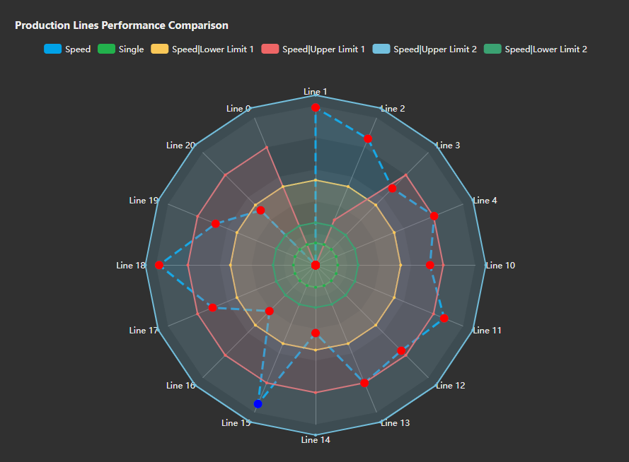
Watch the demo
See Radar Chart+ in a practical PI Vision workflow.
When to use it
Use this symbol when you need to:
- Compare an asset's multivariable profile with peers or a reference.
- Show relative strengths and deviations across several measures.
Before you begin
- Prepare comparable AF assets based on a common element template.
- Choose compatible ranges or normalize attributes that use different units.
Add and set up the symbol
- Select the symbol in the PI Vision symbol gallery.
- Add the required data sources or asset context to the display.
- Right-click the symbol and open its configuration pane.
- Configure the minimum data, range, and display settings for a useful result.
- Confirm that the symbol shows the expected data.
Use the symbol
Select an asset or hover over a point to compare its profile and exact value with the other series.
The chart toolbar appears at the top right when the pointer or the keyboard focus enters the chart, and hides shortly after it leaves. Set Toolbar > Reveal to Always to keep it in view; the chart then keeps a band of its plot area free, so the radar is drawn slightly smaller and the buttons never cover it. On a touch device the toolbar is always shown. The toolbar carries, in order: Ad Hoc Chart, Fullscreen and Download.
Ad Hoc Chart opens a PI Vision trend of every asset and attribute the radar is currently showing. It replaces the plot double-click that used to open that trend, so the same view is now reachable on a touch device and from the keyboard. Because it is a capability every saved display already had, this button stays available even when Toolbar > Show is off.
Fullscreen opens the chart in a large dialog, keeping the legend entries you have switched off; the dialog carries the same toolbar without the Fullscreen button. Download opens a menu of PNG, SVG, PDF, CSV, JSON and XLSX. The data formats export one row per series and category - the series name, the category name, the plotted value and its unit - and are hidden when your administrator has disabled data exports.
Configure the symbol
Overview and behavior
Radar Chart+ is a custom symbol that visualizes multiple process values across units or assets using a polar (spider) chart. Ideal for comparing equipment performance or highlighting anomalies, Radar Chart+ supports dynamic data labels, multi-state styling, and auto-generated axes based on asset search criteria.
Configuring selectable assets
Populate Radar Chart+ with either a static asset list or a dynamic asset search. For a static list, drag the required assets onto the symbol and set an optional custom label for each asset under Assets.
Dynamic Assets
In Order to dynamically load assets, right-click the control and select Add Dynamic Search Criteria…
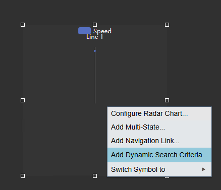 | => | 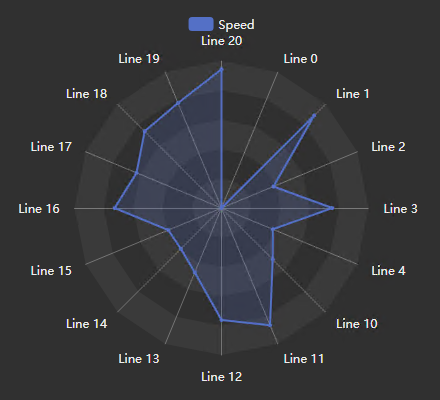 |
In the search criteria pane on the right side, you are now able to search and filter for your assets.
The Search Criteria supports the following options:
- Database
- Search Root
- Asset Name
- Asset Type
- Asset Category
- Number of Results
- Asset Order
Click Refresh to update the assets in the control. If you are not seeing the assets you are filtering for, make sure to set the Return All Descendents in the Search Root as well as check the Number of Results.
Static Assets
If Dynamic Asset Search Criteria is not used, and the assets are configured manually, you can additionally configure the following properties for the assets.
- Label: Change the name of the asset
Additionally, if the scale category type is set to Attribute (meaning the Assets are the series/legend items) the following options are available to be configured for assets.
- Color: The series color
- Symbol (Type/Size): Change the symbol appearance for each node
- Line (Style/Width/Opacity): Change the appearance of the connecting lines
Important: These options are only available if Dynamic Asset Search Criteria is NOT used.
Configuring the scale
The most important part when configuring the Radar Chart+ is the type of category that you want to use for the scale. So essentially, you can choose to have your Assets or your Attributes as the Edges and Series.
If you set the Category Type to Asset, your assets will be shown on the edges, and each attribute is a series, or legend item.
On the other hand, if you set the Category type to Attribute, the attributes will be shown on the edges, and each asset is a series or legend item.
Below you can see the same symbol, with the Category Type changed.
Category Type Asset Category Type Attribute
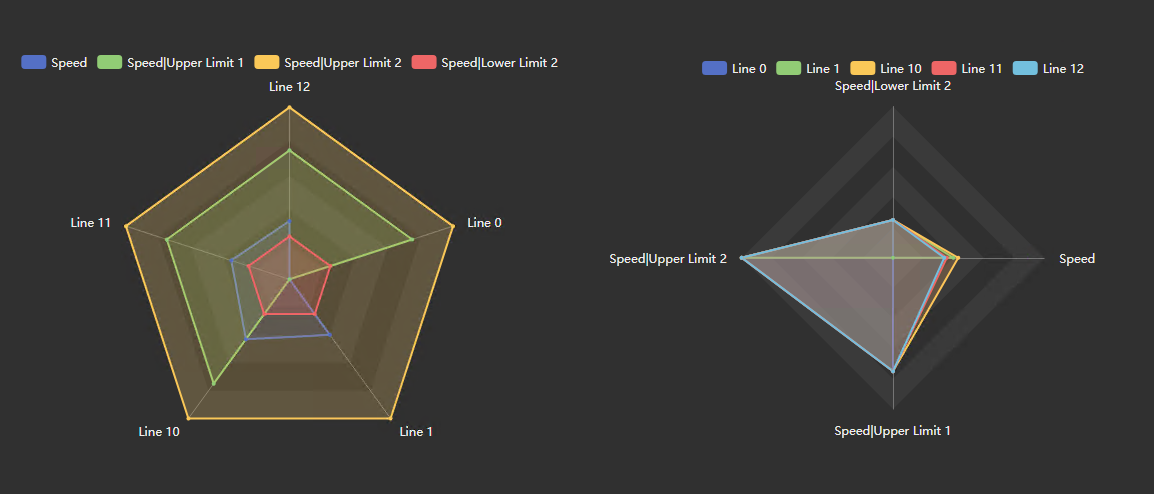
Additionally, the following configuration options are available.
- Labels: Show/Hide the category labels
- Clockwise: Whether to order the assets/attributes clock-wise or counter clock-wise
- Start: The start angle of the Radar Chart
- Scale Range: Choose between auto, custom and individual. The range applies to all assets and attributes on the radar chart. The individual option is only available if the category type is set to attribute, allowing you to individually configure the scale range for each attribute.
General configuration
Title
Configure the title of the chart, and change it’s position and styling.
- Title: Enable / Disable Title
- Input: The actual title of the chart
- Position: The position of the title, choose between Left / Center / Right
- Font Size: The font size of the title
Style
Configure the basic styling options for the Radar Chart.
- Foreground: The text color
- Background: The symbols background color
- Font size: The font size
- Shape: Choose between Polygon and Circle. Polygon will draw straight lines between the edges, whereas circle will draw curved lines.
Grid
The Grid section controls what is drawn behind the data: the grid rings, the shaded bands, and the border of the plot area.
- Show: Turns the grid on or off. When it is off, no rings or bands are drawn; the Border setting still applies.
- Lines: Selects whether the grid rings are drawn. A radar plot has no horizontal or vertical distinction, so the choice is None or Both.
- Bands: Draws alternating shaded bands between the rings.
- Border: Bounds the plot area. Axes draws the spokes that run from the center to each category, Frame draws the outer ring instead, and None draws neither.
Grid line color and opacity are not settings; they follow the chart's foreground color and theme.
Legend
The position and alignment of the charts legend.
Toolbar
The Toolbar section controls the chart toolbar described under Use the symbol above.
- Show: Turns the generic toolbar buttons - Fullscreen and Download - on or off. Ad Hoc Chart is not affected: it replaces a gesture the symbol has always had, so it stays available either way.
- Reveal: Chooses between showing the toolbar on hover and showing it always. Always also reserves a band of plot area for the toolbar, which makes the radar slightly smaller.
Series
This section is available if Dynamic Search Criteria is used and the Scales Category Type is set to Attribute. It allows the global configuration of the markers and lines:
- Symbol (Type/Size): Change the symbol appearance for each node
- Line (Style/Width/Opacity): Change the appearance of the connecting lines
Asset configuration
If Dynamic Search Criteria is not used, this section allows the configuration of settings for individual assets.
- Label: Change the name of the asset
Additionally, if the scale category type is set to Attribute (meaning the Assets are the series/legend items) the following options are available to be configured for assets.
- Color: The series color
- Symbol (Type/Size): Change the symbol appearance for each node
- Line (Style/Width/Opacity): Change the appearance of the connecting lines
Attribute configuration
In this section, you can add and remove attributes to the chart, as well as configured individual attributes settings.
- Value: Change the value type for that attribute. Choose between the current value, minimum, maximum, average, standard deviation and count.
The following options are only available if the Scale’s Category Type is set to Asset:
- Color: The series color
- Symbol (Type/Size): Change the symbol appearance for each node
- Line (Style/Width/Opacity): Change the appearance of the connecting lines
Filtering
Radar Chart+ receives asset Master filters and Linked inputs and reports the effective asset count through the shared filter indicator. It is intentionally receiver-only; clicking a radar series or point does not publish a filter.
See Filtering dashboards for receiver configuration and the loaded-data boundary.
Troubleshooting and limitations
- Check: If an asset or attribute is missing, check the search criteria and template mapping.
- Check: A shared scale can be misleading when attributes use incompatible units or ranges.



