



Vision Library+ / Charts and analytics
Histogram+
Histogram+ groups numeric values into bins to show their frequency distribution over a selected period.
Overview
Histogram+ groups numeric values into bins to show their frequency distribution over a selected period.
Watch the demo
See Histogram+ in a practical PI Vision workflow.
When to use it
Use this symbol when you need to:
- Review the spread and most common range of a process value.
- Compare distributions across several numeric data sources.
Before you begin
- Prepare numeric PI Points or AF attributes with recorded values in the selected range.
- Choose a bin count that is meaningful for the sample size.
Add and set up the symbol
- Select the symbol in the PI Vision symbol gallery.
- Add the required data sources or asset context to the display.
- Right-click the symbol and open its configuration pane.
- Configure the minimum data, range, and display settings for a useful result.
- Confirm that the symbol shows the expected data.
Use the symbol
Hover over a bar to inspect its range and count. Use the time bar to compare distributions for different periods.
The chart toolbar
The chart toolbar appears at the top right when the pointer or the keyboard focus enters the chart, and hides shortly after it leaves. Set Toolbar > Reveal to Always to keep it in view; the chart then keeps a band of its plot area free so the buttons never cover the plot or the legend. On a touch device the toolbar is always shown. Histogram+ has no zoom, so the toolbar carries two buttons: Fullscreen and Download.
- Fullscreen: Opens the chart in a full-screen dialog, laid out for the larger canvas. Series you hid in the legend stay hidden there. The dialog carries its own Download button.
- Download: Opens a menu of six formats. PNG, SVG and PDF save a picture of the chart; CSV, JSON and XLSX save the binned data behind it - the same table the pane's Data export button writes. Files are named after the symbol and the time of the export.
The toolbar is switched off on existing displays until you turn it on, and on for a newly placed symbol.
Time bar
Histogram+ supports the shared Time Bar for independent ranges, duration choices, and PI time expressions.
Configure the symbol
Overview and behavior
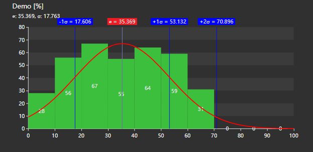
The Histogram+ visualizes the distribution of quantitative data by grouping values into bins and displaying how frequently each range occurs. It supports statistical overlays - bell curve, mean, and standard deviation lines - and flexible axis configuration to suit a wide range of process analysis needs.
Basic configuration
Use the Configuration pane to customize the Histogram+ symbol. Options cover the chart title, visual styling, bar appearance, axis ranges, statistical overlays, and data retrieval behavior.
General
Histogram supports two different modes: Histogram and Pie
- Histogram: Will show a regular histogram. If histogram is enabled, you can also enable Stacking here if the symbol has multiple data sources
- Pie: Will show the individual buckets represented as a pie chart
Title
- Show: Toggles the chart title on or off.
- Title: The text displayed as the chart heading.
- Units: When enabled, appends the data source unit of measure to the title.
- Statistics: When enabled, appends the calculated mean and standard deviation values to the chart title.
Style
Controls the overall appearance
- Foreground: Sets the color of chart text and labels.
- Background: Sets the background fill color of the chart area.
- Font Size: Sets the base font size for all chart text.
- Opacity: The opacity of the bars
- Stroke: Colored border around the bars
- Grid: Controls what is drawn behind the data: the grid lines, the shaded bands, and the border of the plot area. The section is hidden when the chart type is set to pie.
- Show: Turns the grid on or off. When it is off, no grid lines or bands are drawn; the Border setting still applies.
- Lines: Selects which grid lines are drawn: None, Horizontal, Vertical, or Both. The names always describe the direction the lines run on screen.
- Bands: Draws alternating shaded bands across the plot area.
- Border: Bounds the plot area. Axes draws the two axis lines with their ticks, Frame draws a rectangle around the plot instead of the axis lines, and None draws neither. Grid lines drawn with Border set to None are dashed.
Grid line color and opacity are not settings; they follow the chart's foreground color and theme.
Data Labels
Enable / Disable data labels
Legend
Configure Legend visibility and position
Toolbar
The Toolbar section controls the chart toolbar. Show turns it on or off - every button - and Reveal chooses between showing the toolbar on hover and showing it always. Always also reserves a band of plot area for the toolbar; with Show off nothing is drawn and no plot area is reserved. Existing displays keep the toolbar off until you switch it on; a newly placed symbol starts with it on.
Axis X
The Axis X section controls the number of histogram bars and the scale range displayed on the horizontal axis. The following scale range modes are available:
- Database Settings: The axis min and max values are read from the PI point's Span and Zero attributes.
- Actual Data Range: The chart automatically fits the min and max values to the range present in the retrieved data.
- Custom Settings: Lets you specify fixed min and max values for the horizontal axis.
Finally you can configure the Tick Labels to show / hide and also change the tick interval from Auto to Custom.
Axis Y
The Axis Y section controls the scale of the vertical (frequency) axis. Two options are available:
- Actual Data Range: The chart automatically scales the Y axis to fit the frequency counts in the data.
- Custom Settings: Lets you specify fixed min and max values for the frequency axis.
- Labels: Toggles the display of numeric tick labels on the Y axis.
Data source options
These options are generally available for all data sources.
- Label: Change the displayed label of the data source
- Color: Color of the displayed bar
The Statistics section lets you overlay additional analytical markers on the histogram:
- Bell Curve: Overlays a Gaussian normal distribution curve on the histogram. You can also configure the color.
- Mean: Draws a vertical line at the mean value of the data.
- Standard Deviations: Draws vertical lines at 1, 2, or 3 standard deviations from the mean.
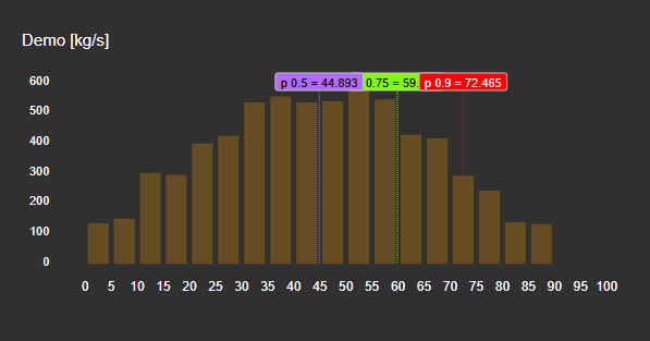
- Quantiles
You can add any number of quantile markers to the chart. Each quantile is defined by a percentage threshold - the chart draws a vertical line at the point where that percentage of values falls below (or above) it:
Data retrieval
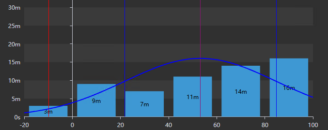
Select the data retrieval method for the histogram. Recorded mode uses all stored data points; Interpolated mode uses only interpolated values at regular intervals.
When Recorded mode is selected, you can also configure a Calculation Basis. Event Weighted counts the number of discrete data points in each bin. Time Weighted weighs each bin by the duration the value was active rather than by event count.
Data export
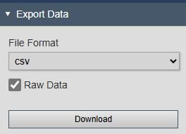
The Data export section downloads the calculated histogram data shown in the chart - one row per bin (or per digital state), with a column per data source. Choose CSV or XLSX and select Download. The same section is what right-clicking the symbol and choosing Export Data opens, and the toolbar's Download button writes the same table, so all three routes produce identical columns. Files are named after the symbol and the time of the export. The section is hidden when data exports are disabled for the installation.
Troubleshooting and limitations
- Check: If the histogram is empty, check the time range, retrieval mode, and whether the source contains numeric values.
- Check: Too many bins for a small sample can produce a sparse or misleading distribution.



