Vision Library+ / Tables and monitoring
Time Series Table+
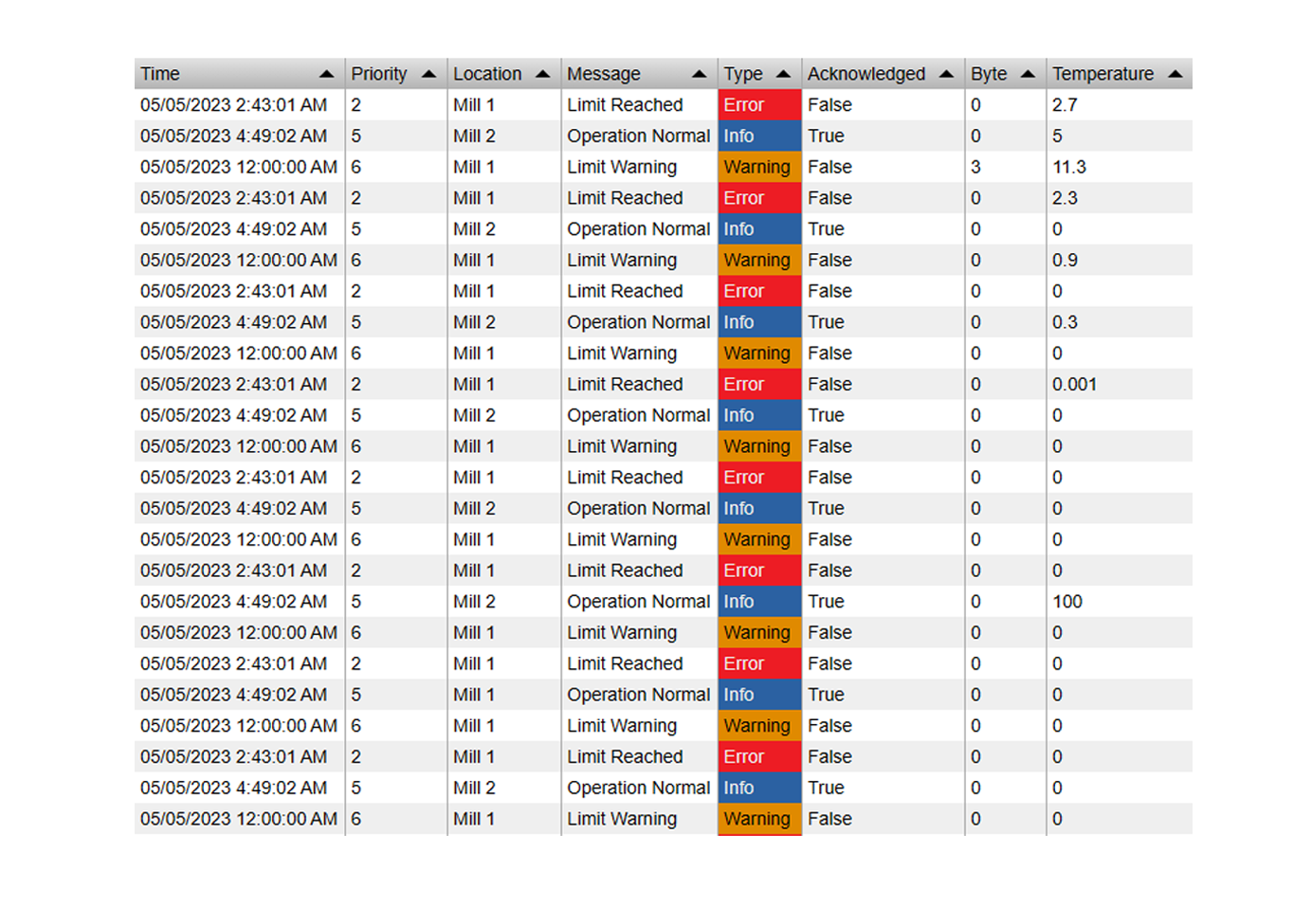
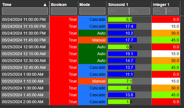
Time Series Table+ presents recorded or calculated values in rows with sorting, filtering, grouping, multi-state styling, and export.
Overview
Time Series Table+ presents recorded or calculated values in rows with sorting, filtering, grouping, multi-state styling, and export.
Watch the demo
See Time Series Table+ in a practical PI Vision workflow.
When to use it
Use this symbol when you need to:
- Review several time-series sources in a precise tabular form.
- Filter, group, or export values for a selected period.
Before you begin
- Prepare the PI Points or AF attributes and choose a compatible retrieval method.
- Select a time range and interval that keep the row count manageable.
Add and set up the symbol
- Select the symbol in the PI Vision symbol gallery.
- Add the required data sources or asset context to the display.
- Right-click the symbol and open its configuration pane.
- Configure the minimum data, range, and display settings for a useful result.
- Confirm that the symbol shows the expected data.
Use the symbol
Sort, filter, group, or select rows to investigate values. Export creates a file from the currently configured table data.
Time grouping
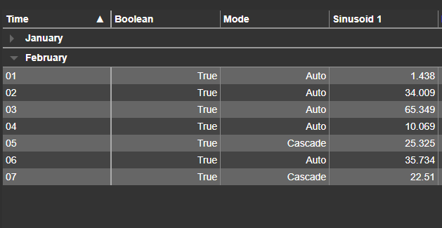
Data can be grouped by timestamp using the following intervals: Year, Month, Week, Day, Hour, or Minute. Multiple intervals can be combined to create an expandable tree view.
For example, grouping by Year, Month, and Day of Month creates the following expandable data tree:
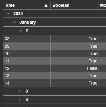
Note: The datetime format in this example is set to Hour.
Time bar
Time Series Table+ supports the shared Time Bar for an independent table range. Its duration options can also define the retrieval interval used for that range.
Exporting data
To export table data, right-click the symbol and select Export Data.
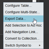
Choose from CSV, JSON, XLSX, or PDF export formats.
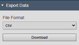
PDF and XLSX use the same background and text color priority as the screen, including the fallback colors from Apply to row / Apply to column. Transparent data source style colors inherit; a state configured to hide a value exports a blank cell. CSV and JSON contain data without visual styling.
Exports retain the colors for Text, Solid Fill, Soft Fill, and Accent + Tint. Soft and partially transparent colors are blended against the export's own background, so their shade may differ from a dark display theme. Border, dot, badge, and progress-bar decorations and blinking are not reproduced: those cells export their ordinary values with the applicable data source or propagated colors. They do not become solid state-colored cells. A propagated Value Badge uses Soft Fill; propagated Progress modes use Accent + Tint.
Configure the symbol
Overview and behavior
The Time Series Table+ symbol displays time-series data from the PI data archive in a tabular format. It supports filtering, grouping, multi-state coloring, and data export.
General configuration
Use the Configuration pane to customize the symbol's visual styles, columns, interactivity, and multi-state settings.
- Right-click the symbol and select Configure Table to open the configuration pane.
- Under Table, configure the following basic table settings:
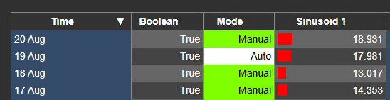
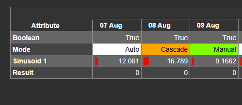
- Orientation: Choose between Horizontal and Vertical table orientation. In Horizontal mode, timestamps appear as columns; in Vertical mode, timestamps appear as rows.
Vertical Horizontal
- Max. Rows / Max. Columns: Limits the number of time rows or columns displayed. The sort order is controlled by the Sort By and Descending settings.
- Sort By / Descending: Choose the property by which to sort the table data. By default, data is sorted by time and returned chronologically. Selecting a different property sorts by that value instead - for example, sorting by a numeric property with Descending enabled returns the largest values first.
- Layout
Select from three column-width layout modes:
| Manual | Allows you to manually resize the columns, and save that column width. |
| Fit Data | Sizes each column to the minimum width needed to display its content. |
| Fit Table Width | Expands columns to fill the full table width. |
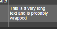
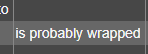
- Wrap Text: Wraps long cell text to the next line rather than truncating it.
Wrap Text ON Wrap Text OFF
- Right to Left: Displays all table text in right-to-left reading order.
- Paging: Choose between paging and scrolling when the number of rows exceeds the table height. Not available when Wrap Text is enabled.
- Under Header, configure the following column header settings:
- Show: Show or hide the column headers.
- Units: Display units of measure (UOM) in column headers.
- Wrap Text: Wrap or truncate column header text.
- Vertical: Display column header text vertically.
- Column Filters: Show or hide per-column filter controls, allowing users to filter table data interactively.

- Under Group, configure how data columns and rows are grouped:
- Enabled: Enable or disable data grouping.
- By: Choose the property to group by: Custom, Asset, Category, or Description. The Custom option lets you set a unique grouping value for each data source.
- Auto Expand: Start groups expanded or collapsed on load.

- Under Totals, configure row and column total calculations:
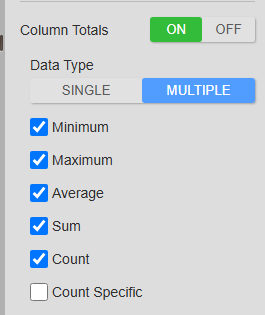
When column totals are enabled, choose between two modes: Single displays one calculation row at the top or bottom of the table, and Multiple lets you select which calculation rows to show. Note: In Multiple mode, calculation rows can only appear at the top.
- Under Auto Scroll, you can configure the table to automatically scroll through the data, or select the next page if pagination is enabled
Multiple
Selecting a calculation type adds a corresponding row at the top of the table.

Single
In this mode, the table displays a single calculated value row at the top or bottom:
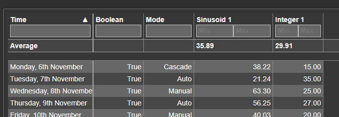
Values are calculated from the data currently displayed in the table. Six calculation functions are available: Average, Sum, Min, Max, Count, and Count Specific.
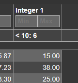
Count Specific counts occurrences matching a defined condition. Once enabled, open the column settings and set the operator and value to match. The following example counts all values less than 10:
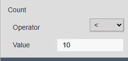
The result appears in the column header as follows:
- Under Time, configure the time columns and rows:
- Datetime Format: Choose between Default (milliseconds excluded) and Exact (milliseconds included) timestamp format.
- Pin Time Column: When the table content exceeds the visible width and a horizontal scrollbar appears, keep the first time column fixed while scrolling.
Data can also be grouped by timestamp using the following intervals: Year, Month, Week, Day, Hour, or Minute.
- Enabled: Enable or disable timestamp grouping.
- Auto Expand: Start timestamp groups expanded or collapsed on load.
- Count: Show or hide the row count for each timestamp group.
- Style: Configure colors and font styles for the time column. Only available in Vertical orientation.
- Under Interactivity, enable or disable the following settings:
- Ad Hoc Chart: Allow users to generate an ad hoc chart by clicking a row or column header.
Data source configuration
Under Columns, configure the data sources to display in the symbol. The following properties are available for each data source:
- Label: Control how the data source is identified in the column header. Choose from attribute name, asset name, and/or PI point name.
- Show Units: Show or hide the unit of measure (UOM) in table cells.
- Alignment: Set the horizontal alignment of cell values: Left, Right, or Center.
- Filter: Define conditions to pre-filter data at the source. This server-side filter is recommended over the table column filter, as it reduces the data transferred and improves load performance.
- Style: Enable a data source style to set its Background, Text, Border, and Bold. These settings apply to that data source's value cells in both orientations, including each value produced by Split String. They do not restyle headers or totals. Leave a color transparent to inherit the applicable multi-state or table color; turn Style off to use inherited styling for all four settings.
Cell multi-state has priority over the data source style for the properties it changes. For example, Text changes text alone and preserves an explicit data source background; Solid Fill replaces the background and chooses contrasting text. The remaining properties keep their data source style, then any row or column multi-state fallback, then the table theme.
Data retrieval configuration
- Mode
| Recorded | Loads all data from the PI data archive exactly as recorded. |
| Summary | Loads aggregated data over the selected time period. Available aggregation methods include Average, Min, Max, Count, and Sum. Set the calculation basis to Event Weighted or Time Weighted. |
| Interpolated | Loads interpolated data from the configured tags. The following options are available:; - Interval; The time interval between loaded values.; - Sync Time; The reference time used to align retrieved data points. For example, setting this to 00:15:00 ensures the minute component of each timestamp is always 15. |
| Joined | Designate one data source as the time reference. All other data sources return interpolated values aligned to that source's timestamps. |
- Start- and End times
| Display time range | Uses the current display time range to load data. |
| Custom time range | Specify a custom start and end time. |
| Duration and offset | Set a fixed duration and offset relative to the current display's end time. |
Configure style
Under Style, choose a Theme and Container Style. Tables do not offer Surface because the table owns its header and row surfaces. See Themes and container styles.
- Custom: Provides controls for table colors, fonts, borders, and row and header heights.
- Copy/Paste Custom Style: A Custom style can be copied from one table and pasted onto another compatible Vision Library+ table. Select Copy on the source table, select the target table, and then select Paste.
Filtering
When column filters are enabled in the configuration menu, a filter control appears in each column header.
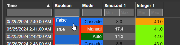
The control displayed depends on the column's data type:
- Enumeration sets and Boolean values: dropdown selector.
- Strings: text input field.
- Numeric values: two input fields - one for the minimum value and one for the maximum.
Note: Column filters are applied client-side, meaning the full dataset is loaded from the server before filtering. For large datasets, use the data source filter instead, which filters server-side and improves performance.
Time column
The following configuration options are available for the time column:
- Pin Time Column: Keep the time column fixed at the left edge regardless of horizontal scroll position.
- Background / Text / Border: Adjust the background color, text color, and border style of the time column.
- Mode: Where to apply the column style to. Choose between all timestamps, or weekends only.
The displayed timestamp format can also be customized, as described in the Changing the Displayed Timestamp section below.
Changing the displayed timestamp
The Time Series Table+ allows you to customize the displayed timestamp format. In the General configuration section, select from the available timestamp formats.
Adjust the format to match your selected time range and interval. For daily values, the Short Date or Date format is recommended.
All formats are localized to the user’s browser language settings.
| Format | Examples |
| Time | 2:00 PM, 12:00 AM |
| Time with seconds | 4:45:42 AM |
| Short Date | 02 Feb, 12 Dec |
| Date | 11/06/2023 |
| Long Date | November 6, 2023 |
| Date and Time | 02/05/2024 4:47:35 AM |
| Long Date and Time | Nov 6, 2023 4:48 AM |
| Full Date | Friday, 2nd February |
| Full Date and Time | Friday, February 2, 2024, 4:49 AM |
| Day of Month | 02 |
| Day of Week | Monday |
| Month | 12 |
| Month and Year | Nov 23 |
| Long Month and Year | November 2023 |
| Year | 2023 |
Multi-State
Multi-state coloring applies colors to values based on limits defined in Asset Framework or configured directly in PI Vision. To enable multi-state:
- Right-click the symbol and select Add Multi-State.
- Select a data source and enable Multi-State. For Split String, select the derived column and enable its Multi-State.
- Choose the coloring mode:
| Mode | Appearance |
|---|---|
| Text | Colors the value text. |
| Border | Adds a state-colored inset border. |
| Soft Fill | Adds a light state-colored background and outline. |
| Accent + Tint | Adds a light background, a colored leading edge, and state-colored text. |
| Status Dot | Adds a colored dot beside the value. |
| Value Badge | Places the value in a colored badge with contrasting text. |
| Solid Fill | Replaces the cell background with the state color and chooses contrasting text. |
| Progress | Displays a colored progress bar scaled to the data source's minimum and maximum limits. |
| Progress and Value | Displays both the value and the colored progress bar. |
- If the data source is an attribute with configured traits, limits are populated automatically. Otherwise, define static limits manually.
For a Split String column, type a limit and press Enter, or choose the + button, then pick its color. Each new limit starts in its own color, and the button beside a limit removes it. How the limits are read depends on the column's Data Type:
- Number: limits compare with ≤ and the list sorts itself from the highest limit down, whatever order you add them in, including after you edit an existing limit.
- String: limits are text patterns and keep the order you add them in; they are never sorted. The pane states the rule: "Limits are matched in order; the first match wins. \* matches any text." For example,
Run*matchesRunning, whileStopmatches only the exact textStop.
A cell whose value matches no limit is left unpainted by the column's multi-state.
- To use this source's state for other cells at the same timestamp, enable Apply to row in Vertical orientation or Apply to column in Horizontal orientation. Each timestamp uses its own state; changing orientation preserves the setting. Vertical propagation also reaches unstyled timestamp cells. Data source row labels, column headers, and calculated totals keep their own styling.
Propagation only fills properties that have no explicit cell or data source style. For example, a data source background remains visible when another source applies Solid Fill to the timestamp row or column, while an unset text color can still inherit that propagated state. To let propagation supply a color, leave that data source color transparent. The source cell retains its chosen presentation; a propagated Value Badge becomes Soft Fill, and the two Progress modes become Accent + Tint.
Split strings into columns
Some systems send data as a delimited string, with values separated by a character such as ";" or "|". The Time Series Table+ can split these strings into individual columns.
To use this feature, ensure the attribute or tag value is of type String. Then enable Split String and define a Delimiter:
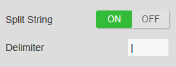
The string is split into values at each delimiter occurrence. To display a specific value in the table, create a column and set its Index (zero-based) to the position of that value in the split result. The following additional options are available:
- Name: The display name for the new column.
- Index: The zero-based position of the value in the split result.
- Data Type: Select String or Number. This affects filtering behavior and column calculations.
The following additional options apply when Data Type is set to Number:
- Decimal Separator: The character used to parse the decimal part of the number.
- Display Digits: The numeric format used when displaying the value.
Troubleshooting and limitations
- Check: If rows are missing, check the retrieval mode, interval, filters, and time range.
- Check: Large ranges and small intervals can create high row counts and slow rendering.