



Vision Library+ / Charts and analytics
ProfileView+
ProfileView+ displays cross-directional scanner measurements as a time-based heatmap for monitoring profile uniformity.
Overview
ProfileView+ displays cross-directional scanner measurements as a time-based heatmap for monitoring profile uniformity.
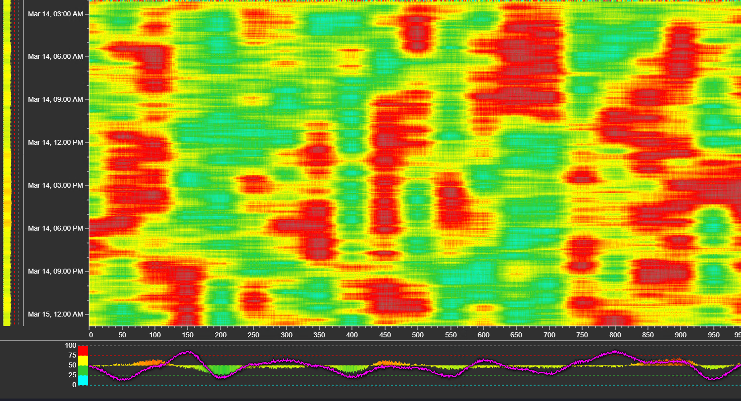
Watch the demo
See ProfileView+ in a practical PI Vision workflow.
When to use it
Use this symbol when you need to:
- Monitor sheet, web, or scanner-zone profiles over time.
- Identify streaks, edge effects, and deviation from a target profile.
Before you begin
- Prepare an ordered set of numeric zone PI Points or AF attributes.
- Confirm the expected physical order and a suitable retrieval interval.
Add and set up the symbol
- Select the symbol in the PI Vision symbol gallery.
- Add the required data sources or asset context to the display.
- Right-click the symbol and open its configuration pane.
- Configure the minimum data, range, and display settings for a useful result.
- Confirm that the symbol shows the expected data.
Use the symbol
Hover over the heatmap to inspect a zone and time, and compare the current scan with historical color patterns or configured events.
Configure the symbol
Overview and behavior
ProfileView+ is a high-performance heatmap symbol designed primarily for the Pulp & Paper and continuous web manufacturing industries. It visualizes large volumes of Cross-Directional (CD) scanner data - such as basis weight, moisture, or caliper - over time, enabling operators to immediately spot wet streaks, heavy edges, and quality drift.
To configure the heatmap, drag the symbol onto a display, add your cross-directional scanner tags, right-click the symbol, and select Configure.
General settings (Style)
Controls the overall appearance of the heatmap and its surrounding text elements.
- Foreground Color - sets the color for text, axis labels, and gridlines.
- Background Color - sets the background of the symbol container. Use a dark color (such as #303030) for high-contrast dark-mode dashboards, or transparent to blend with the display.
- Font Size & Font Family - adjusts the global typography of scales, histograms, and data labels for readability at different screen sizes.
Scales configuration
Fine-tune the X (Time) and Y (Value/Zone) axes of the heatmap, including the Histogram and Deviation features.
Value Scale (The Y-Axis / Machine Zones)
The Value Scale represents the physical width of the machine - the individual scanner zones or tags.
- Sort By - determines how dropped tags are ordered on the Y-axis.
- Default - tags appear in the exact sequence they were dropped onto the symbol.
- Name - sorts tags alphabetically by label or name.
- Show Scale - toggles the visibility of Y-axis labels.
- Label Mode - controls what text appears along the axis.
- Auto - the symbol selects the best fit automatically.
- Names - displays the actual tag names (for example, Zone 1, Zone 2).
- Numbers - displays a numeric sequence, useful when you only need physical slice numbers (for example, 1, 2, 3 … 50).
- Tick Interval - controls how frequently labels appear.
- Auto - spaces labels automatically to prevent overlapping text.
- Manual - set a specific interval (for example, setting 5 shows a label for every fifth zone).
Value Scale Histogram & Display Modes (not available for Digital/State data):
- Show Histogram - displays a bar chart distribution attached to the Y-axis, showing statistical variance across the machine width.
- Height - adjusts the height and thickness of the histogram rendering.
- Display Mode:
- Absolute - displays the raw, actual values from the PI tags in the histogram.
- Deviation - a quality control tool. Enter a Target Value (for example, Target Moisture = 50). The histogram and heatmap then subtract the target from live readings, highlighting positive and negative variances from the specification.
- Show Current Scan - overlays a line graph on top of the heatmap representing the most recent scanner profile.
- Current Scan Color - choose a bright, contrasting color (such as Magenta or Cyan) so the real-time profile stands out against historical heatmap colors.
Time Scale (The X-Axis / History)
The Time Scale represents the historical time range of the data.
- Show Scale - toggles the visibility of timestamps on the X-axis.
- Show Histogram - displays a bar chart distribution along the bottom of the heatmap, showing how the total profile average varies over time.
- Display Mode (Absolute vs. Deviation) - works the same as the Value Scale. Set a Target Value to see how the profile average deviates from target across the selected time range.
Color modes
ProfileView+ provides four color modes for numeric data. Each mode uses the same configured color limits but maps values to colors differently.
1. Off (discrete)
How it works - no smoothing between limits. Each value maps directly to a color band (step behavior). Color changes occur only at threshold boundaries.
Best for - alarm-style monitoring, threshold-based decisions, and situations where users must clearly identify which range a value falls in.
What users notice - sharp transitions, clear in-range vs. out-of-range interpretation, and less visual nuance within each band.
2. Smooth (RGB)
How it works - colors blend continuously between limits using standard RGB interpolation. The transition is mathematically linear across red, green, and blue channels.
Best for - general trending and users who want continuous gradients and smooth visuals.
What users notice - smooth transitions, but transitions may look visually uneven in brightness or saturation - a known characteristic of RGB interpolation.
3. Smooth (Perceptual)
How it works - colors blend continuously with perceptual correction so transitions look more uniform to the human eye. Configured limits and limit colors are still respected.
Best for - most day-to-day analysis, users who felt the gradient looked wrong previously, and dashboards where visual quality and readability matter.
What users notice - smoother, more natural gradient progression with better visual balance across low, mid, and high ranges.
Recommended default - this mode is generally the best starting point for most users.
4. Diverging (centered at target)
How it works - uses a center reference (target value) and maps colors so values below and above the target diverge symmetrically. Configured limits and colors are retained, but the gradient is rebalanced around the target. For the different target value configurations, see below.
Best for - setpoint and control applications, analysis of how far a value deviates above or below target, and bias detection around operating targets.
What users notice - strong visual emphasis on direction from target (below vs. above) and better interpretability for deviation-focused workflows.
Additional configuration options include:
Deviation: Choose between Absolute and Percent.
Target: Choose between the following target types:
- Custom: A static value used as the target
- MS (multi-state): Uses the Configured Target Attribute’s value
- Event: Allows you to define an attribute name to load the target value from the currently active / last event frame. Use this if different reels have different target values.
Range: The range defines the min and max values to be used along side the target. The following modes are available:
- Auto: ProfileView+ will automatically calculate appropriate min and max values
- MS (multi-state): Use configured multi-state limits for the range
- Manual: Manually define the min and max offset from the target value
Quick Selection Guide:
- Choose Off (discrete) when thresholds are the most important signal.
- Choose Smooth (Perceptual) for the best general-purpose gradient.
- Choose Smooth (RGB) for classic linear blending or to maintain backward visual consistency.
- Choose Diverging (centered at target) when target deviation is the key story.
These color modes apply to numeric data only. Digital/enumeration data uses state-based colors rather than continuous gradients.
Events
Profile view+ allows you to overlay event frames such as paper reels. To enable that, go to Events General and set the Enabled to ON.
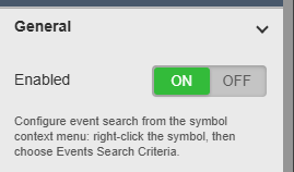
Afterwards right-click the symbol and select Events Search Criteria and define your event search configuration.
Events can be displayed in two different modes:
- Continuous: In this mode ProfileView+ will show the profile for your configured display time range, and overlay the different events on top of the profile.

- Selection: Shows a list of events, and when selecting an event, the profile view will show the profile of that specific event, ignoring the configured display time range.
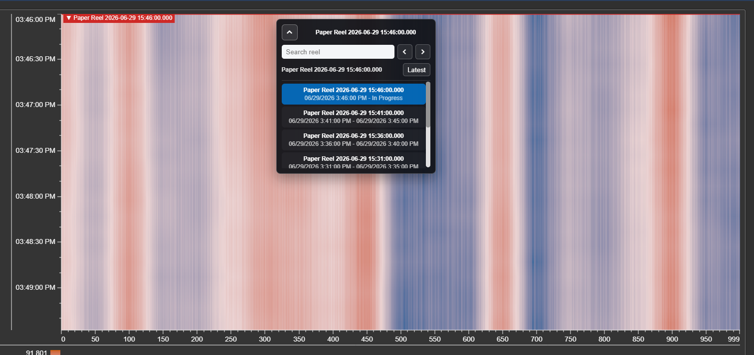
Style
In the Style section, you can configure how these events are displayed. Choose to show the Start, End or the entire duration, configure line styles and coloring modes.
Padding
The padding option allows you to define a start and end padding for the profile view time range. If that setting is enabled, the profile view will also show the first and/or last X Minutes/Hours before that reel started/ended.
Data retrieval
ProfileView+ handles large volumes of data. This section lets you optimize how the symbol queries the PI System to keep the browser fast and responsive.
- Mode - defaults to Interpolated, which ensures a smooth, continuous color gradient by retrieving data at evenly spaced intervals.
- Interval Calculation:
- Auto (recommended) - the symbol dynamically calculates the optimal data interval based on the pixel width of the symbol on screen. This prevents the browser from fetching unnecessary data points and keeps load times under one second.
- Manual - force a specific interval (for example, 1 minute or 5 seconds). Caution: a very small interval over a long time range can significantly degrade dashboard performance.
- Sync Time (Manual interval only) - aligns interpolated data requests to a specific hour, minute, or second boundary (for example, snapping exactly to the top of the hour).
Time Range Settings
Detach the heatmap from the main PI Vision display time to lock it to a specific historical window.
- Display - the heatmap follows the standard Timebar at the bottom of the PI Vision screen.
- Custom - specify a fixed Start Time and End Time (for example, a specific web break that occurred last week).
- Duration and Offset - configure a rolling window independent of the display. For example, set Duration to 8h and Offset to 1d to always show the previous day's shift.
Trace options (Managing zones)
Because a cross-directional profile depends on physical machine geometry, the order of tags is critical.
- Rows List - shows all PI Tags or Attributes currently mapped to the Y-axis.
- Reordering Buttons - select a tag and use the arrow buttons (Up, Down, Top, Bottom) to reposition that zone on the heatmap. This lets you align tags from the front to the back of the machine.
- Delete (×) - removes a tag from the heatmap.
- Point Attributes - click the detail icon to toggle a view showing the underlying metadata (Zero, Span, Engineering Units, and so on) for the selected PI Point.
Troubleshooting and limitations
- Check: If zones appear in the wrong position, check the configured row order.
- Check: Small intervals over long ranges can retrieve large data volumes and reduce performance.



