Asset Analytics Pie+ for AVEVA PI Vision

PI Vision pie charts for your AF assets

See what share of your assets falls into each mode or template, or what share of a total each one contributes. Asset Analytics Pie+ draws every pie and donut from the current attribute values of the AF assets you choose, not over time.

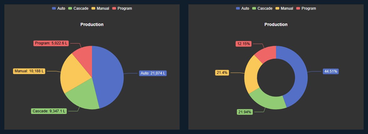
Asset Analytics Pie+ in PI Vision: a pie chart with the production of the assembly lines per operating mode with value labels, next to a donut chart of the same data with percentage labels
Asset Analytics Pie+ in PI Vision: production per operating mode as a pie and as a donut with percentages. Demo data. Select the image to enlarge.

Pie and donut charts for AF assets in PI Vision

Choose a set of assets, decide what to measure and what makes the slices, and every slice shows the share of one category.

Count assets by category

Drag one asset onto the display, add a dynamic search, and the pie counts every asset with the same template, one slice per value of the attribute you pick.

  • A fixed set of assets or an asset search by database, root and template.
  • One slice per value of an attribute or asset property, such as the operating mode of a line.
  • Count and Count Distinct work for text, Boolean and date attributes.
  • A title above the pie that names what is counted.
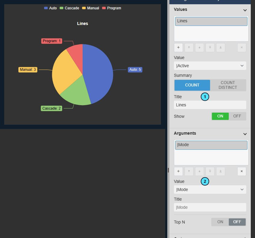
Asset Analytics Pie+ with the number of lines per operating mode as a pie chart with value labels, next to the Values settings with the Active attribute, the summary Count and the title Lines, and the Arguments settings with the Mode attribute
Lines per operating mode, counted from an AF asset search. Demo data. Select the image to enlarge.

Total an attribute for each category

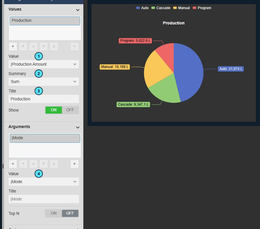
Show how much instead of how many, such as the production of the lines in each mode, with the unit on every label.

  • Sum, Average, Min, Max, Median and Standard Deviation for numeric attributes.
  • Slice labels show the value with its unit.
  • Every asset contributes its current value; the pie does not aggregate over the display time range.
  • For a total over the last shift, use an AF analysis or Asset Time Series Chart+.
Asset Analytics Pie+ with the summed production per operating mode as a pie chart, next to the Values settings with the Production Amount attribute, the summary Sum and the title Production, and the Arguments settings with the Mode attribute
Production summed per operating mode from the current attribute values. Demo data. Select the image to enlarge.

Donut with percentages, labels and legend

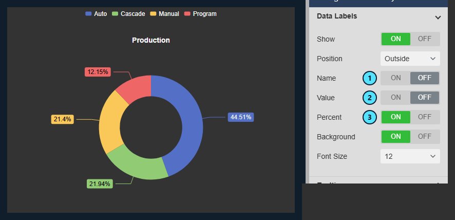
Switch to a donut and show each slice as a share when proportion matters more than the raw values.

  • Pie or donut, with percentage, name or value labels in any combination.
  • Labels outside or inside the slices, with an optional background; a legend with position and placement.
  • Themes, surface and container styles, and a tooltip with category, value and percentage on hover.
  • Automatic colours from the theme, or a custom colour for each slice category.
Asset Analytics Pie+ donut chart with the percentage share of the production per operating mode, next to the Data Labels settings with Name and Value off and Percent on
A donut with percentage labels and the data label settings. Demo data. Select the image to enlarge.

Largest assets, Others and one pie per category

Arguments decide what becomes a slice, and Series decide how many pies you get.

Keep the largest assets and group the rest

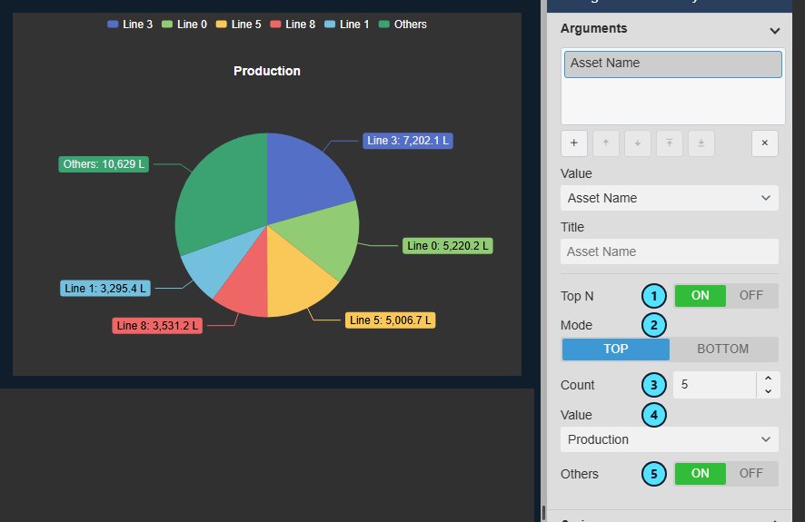
Use the asset name as the slice and keep only the assets that matter, with one slice for everything else.

  • One slice per asset, ranked by the value you choose.
  • Top or Bottom N, with a count you set.
  • An Others slice that sums all remaining assets, switched on or off.
  • Date attributes can be grouped by day, month or year.
Asset Analytics Pie+ with the five assembly lines with the highest production and an Others slice, next to the Arguments settings with Asset Name, Top N on, mode Top, count 5, the value Production and Others on
The five lines with the largest production and one Others slice. Demo data. Select the image to enlarge.

One pie per category

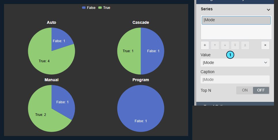
Add a series and the symbol draws one pie for each value of a second attribute, so the breakdowns sit side by side.

  • One pie per value of the series attribute, such as one pie for each mode.
  • A title above each pie, arranged automatically or in a set number of rows or columns.
  • One legend for all pies, listing the slice categories once.
  • Top N for series keeps only the top or bottom pies, with an optional Others pie.
Asset Analytics Pie+ with one pie per operating mode showing how many lines are active or not, with a title above each pie and one shared legend, next to the Series settings with the Mode attribute
One pie per operating mode, arranged in two rows. Demo data. Select the image to enlarge.

Filter the display and inspect the assets behind a slice

Use the pie as the entry point of an asset dashboard and see which assets stand behind every number.

Filter other asset symbols with a click

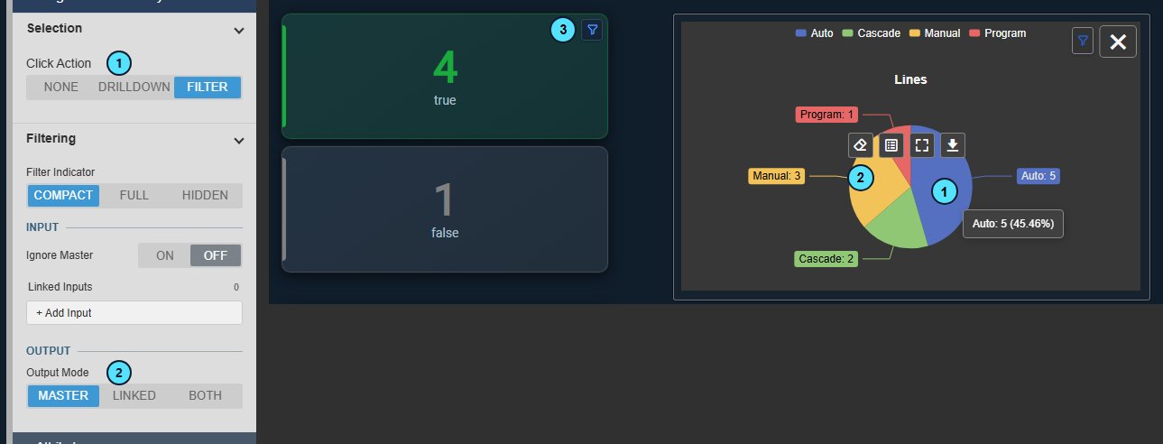
A click on a slice can narrow the other asset symbols on the display to the assets of that category.

  • Click Action Filter, with Master, Linked or Both as the output mode.
  • Other asset symbols, such as Asset Analytics KPI+, recalculate for the assets of the clicked slice and show a filter icon.
  • The pie also follows filters from Asset Filter+ and other asset symbols; Ignore Master keeps it independent.
  • A Clear Filter button in the toolbar removes the filter.
Asset Analytics Pie+ after a click on the Auto slice, with two Asset Analytics KPI+ cards that now count only the five lines in Auto mode and show a filter icon, next to the Selection and Filtering settings with Click Action Filter and Output Mode Master
A click on a slice filters the KPI cards beside it. Demo data. Select the image to enlarge.

Inspect the data and download it

Open the numbers and the assets behind a slice, and take them into a spreadsheet.

  • Inspect Data lists one row per slice with its value and percentage of the pie.
  • Select a slice to see the assets behind it, with their properties and attributes.
  • Export the tab you are viewing as CSV, JSON or XLSX.
  • A toolbar with Fullscreen and Download, shown on hover or always.
Inspect Data dialog of Asset Analytics Pie+ on the Rows tab, listing the five assets behind the Auto slice with their properties and attributes, the Data as of time, a Refresh button and the CSV, JSON and XLSX buttons
Inspect Data: the five of eleven assets behind the Auto slice. Demo data. Select the image to enlarge.

PI Vision asset pie chart examples

Four common ways teams use Asset Analytics Pie+ in their asset displays.

Lines by operating mode

Data
An AF asset search of lines with a mode attribute
Settings
Value Asset Name with Count, Argument |Mode, Pie
Shows
How many lines run in each mode

Production share by mode

Data
A numeric production attribute on every line
Settings
Value Sum of the production, Argument |Mode, Donut with percentages
Shows
Which modes account for most of the production

Biggest producers

Data
The same production attribute across all lines
Settings
Argument Asset Name, Top N 5 by production, Others on
Shows
The five largest lines and one slice for the rest

Status per mode

Data
A Boolean status attribute and a mode attribute
Settings
Argument |Active, Series |Mode, Rows layout
Shows
One pie per mode, each split into active and inactive lines

Watch the asset pie chart for PI Vision in action

A captioned tour of Asset Analytics Pie+ on a PI Vision display: values, arguments and series, filtering with a click, Inspect Data, Top N with Others and a donut with percentages.

Asset Analytics Pie+ product demo. Demo data.

Asset Analytics Pie+ FAQ

Questions we are asked most often. Read the Asset Analytics Pie+ documentation or ask a technical question.

When should we use Asset Analytics Pie+ rather than Pie Chart+ or Asset Analytics Chart+?

Use Asset Analytics Pie+ when the slices come from a set of AF assets, such as the lines in each operating mode or the production of each asset. Pie Chart+ shows PI points and AF attributes, one slice per data source. Asset Analytics Chart+ suits readers who must compare precise values or many categories, and Event Analytics Pie+ summarizes event frames.

Does it show values over time?

No. Each asset contributes its current attribute value, so the pie summarizes many assets at one moment. It does not aggregate an attribute over the display time range. For a time-based answer, such as the total over the last shift, use an AF analysis or Asset Time Series Chart+.

Which assets does the pie use?

Either a fixed set of AF elements or an asset search by database, root and template. For a sum, average, minimum, maximum, median or standard deviation, use a numeric attribute; text, Boolean and date attributes offer Count and Count Distinct.

Does it work with Asset Filter+ and the other asset symbols?

Yes. The slices recalculate when Asset Filter+ or another asset symbol narrows the display, and a filter icon appears. With Click Action Filter, a click on a slice filters the other asset symbols, such as Asset Analytics KPI+, in turn. A click never writes to the PI System.

What do we need to run it?

PI Vision 2021 or later with PI Web API, and PI AF Server 2018 SP2 or later. Asset Analytics Pie+ is new in Vision Library+ 2.2, runs in PI Vision and uses each user’s existing PI permissions.

How do we get Asset Analytics Pie+?

Asset Analytics Pie+ is part of Vision Library+, together with the other Vision Library+ symbols. Request a trial to test it in your own PI Vision environment. The Asset Analytics Pie+ documentation covers every setting.

Try Asset Analytics Pie+ in your PI Vision

Asset Analytics Pie+ is included in Vision Library+, the PI Vision custom symbol library from Software Athlete. Test it on your own displays and data.