


PI Vision Custom Symbol
The Ultimate Combination Chart for PI Vision
Combine bars, lines, areas, and scatter plots on a single, powerful chart. Combo Chart+ gives you the flexibility to visualize complex relationships and tell a complete data story in one place.
Unleash Your Data's Full Potential
Versatile Charting Engine
- Combine Any Chart Type: Overlay lines, bars (stacked or grouped), areas, and scatter plots for comprehensive visuals.
- Multiple Y-Axes: Display data with different scales and units on unlimited, configurable Y-axes.
- Sparkline Mode: Enable compact, minimalist chart views perfect for dashboards and summary tables.
Powerful Analytical Overlays
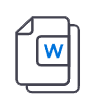
- Event Frame Visualization: Overlay event frames directly on the chart to correlate events with process data.
- Multistate Limit Lines: Use multistate features to clearly display operational limits, targets, or thresholds.
- On-Demand Statistics: Calculate statistics like averages, min, and max values by simply selecting a time range on the chart.
Intuitive User Experience
- Customizable Time Range: Easily adjust the time range for targeted, ad hoc analysis.
- One-Click Data Export: Export chart data in CSV or JSON formats for external analysis and reporting.
- No-Code Configuration: All features are managed through an easy-to-use panel directly within PI Vision.
Bring Statistical Process Control (SPC) Back to PI Vision
For years, users have missed the built-in SPC capabilities of PI ProcessBook. With Combo Chart+, you can finally create powerful SPC control charts directly within modern PI Vision dashboards.
- Visualize Control Limits: Plot your process variable as a line and overlay your Upper and Lower Control Limits (UCL/LCL) as separate traces.
- Identify Special Causes: Use multistate coloring to automatically highlight points that violate standard SPC rules (e.g., Nelson, WECO).
- Correlate with Events: Overlay event frames on your control chart to instantly see how process upsets impact statistical performance.

From Process Analysis to Business Intelligence
Production vs. Target Analysis
Plot actual production as a bar chart against a target line, and overlay downtime events to see their impact.
Statistical Process Control (SPC)
Monitor process stability by plotting your key variable against its calculated statistical control limits (UCL/LCL).
Energy & Utility Consumption
Compare electricity usage (line chart) with gas consumption (bar chart) on a single timeline with multiple Y-axes.
Quality & Process Correlation
Plot a key quality parameter as a scatter plot over your main process variable to identify correlations.
Build Any Chart You Can Imagine

All-In-One Charting
Combine multiple chart types like lines, bars, and areas for a complete, holistic view of your data.

Stacked or Grouped Bar Charts
Visualize data series effectively with powerful bar chart overlays, either stacked or grouped.

Area Chart Overlays
Highlight trends and visualize cumulative data by adding shaded area charts to your display.

Multiple Y-Axes
Customize and manage unlimited Y-axes to cohesively display data series with different scales and units.
Multistate Limit Lines
Visually indicate key thresholds, targets, or statistical control limits (UCL/LCL) with dashed or solid lines.

Display Event Frames
Overlay and annotate event frames directly on the chart to correlate process data with operational events.

On-Demand Statistics
Simply click and drag to select a time range and instantly calculate key statistics like average, min, and max.

Compact Sparkline Mode
Enable a minimalist sparkline view for quick, compact trend visualizations in tables or summary dashboards.
See Combo Chart+ in Action

Questions?
Click the button below to get in contact, or simply email us at contact@software-athlete.com. We would love to help you.