Vision Library+ / Charts and analytics
Event Filter+
Event Filter+ provides display controls that filter compatible event-analytics symbols by selected event fields.
Overview
Event Filter+ provides display controls that filter compatible event-analytics symbols by selected event fields.
When to use it
Use this symbol when you need to:
- Let operators narrow event analytics without editing the underlying search.
- Apply the same event filter to several compatible symbols on a display.
Before you begin
- Place a compatible event-analytics symbol on the same display.
- Use matching event fields and filter configuration across the connected symbols.
Add and set up the symbol
- Select the symbol in the PI Vision symbol gallery.
- Add the required data sources or asset context to the display.
- Right-click the symbol and open its configuration pane.
- Configure the minimum data, range, and display settings for a useful result.
- Confirm that the symbol shows the expected data.
Getting started: creating your filter
Follow these steps to add an Event Filter+ symbol to your display and connect it to your event data.
Step 1: Find and Select Your Event Frames
- Open the Event Frame Search pane in PI Vision.
- Define your search criteria (e.g., event frame template, time range) to find the set of events that will populate the filter.
- Click Apply to run the search and view the results.
Step 2: Add the Symbol to the Display
- From the event search results, select an event and locate the list of Attributes below.
- From the symbol gallery, select the Event Filter+ icon.
- Click and hold on an attribute you want to use for filtering (e.g., "Reason Code").
- Drag the icon onto your display. A new, unconfigured filter symbol will appear.
Step 3: Configure the Event Search (Critical Step!)
A newly placed symbol does not inherit the search criteria from the Event Frame Search pane. You must link it manually so it receives the correct event data.
- Right-click on the new Event Filter+ symbol.
- From the context menu, select Search Criteria....
- In the dialog, re-enter the exact same search criteria you used in the main search pane.
- Click Apply.
The symbol now loads the specified event frames and populates its filter list from their attribute values.
Note: The filter list is generated dynamically from your event search results. If a specific attribute value - for example, a Reason Code of "Unplanned Outage" - does not appear on any loaded event frame, it will not appear as an option in the list.
Use the symbol
Select one or more filter values to update connected event-analytics symbols. Clear the selection to restore the unfiltered result.
Configure the symbol
Overview and behavior
The Event Filter+ is an interactive filter control for PI Vision displays. It scans your event frame data, discovers all unique attribute values, and presents them as a clickable list - giving users a simple, direct way to slice their dashboards without any manual configuration.
When a user selects an item, the symbol publishes according to Output Mode: Master, Linked, or Both. A Linked output maps the selected filter item to a named channel so a consumer can use a differently named target property.
Arguments (The filter items)
Arguments define which event frame attribute values populate the items in the filter list. Each unique value found in your event data becomes a selectable item.
- Attribute: The event frame attribute whose unique values will appear as list items (e.g., Severity, Reason Code, Acknowledged).
- Caption: A custom label for this argument. It is not displayed in the filter list itself, but keeping it consistent with your other symbols is good practice.
- Data Type: Declare whether the attribute is a String, Boolean, or DateTime value.
- Group Interval (DateTime only): Groups raw timestamp values into user-friendly buckets such as Year, Month-Year, or Day of Week, making date-based filtering much easier.
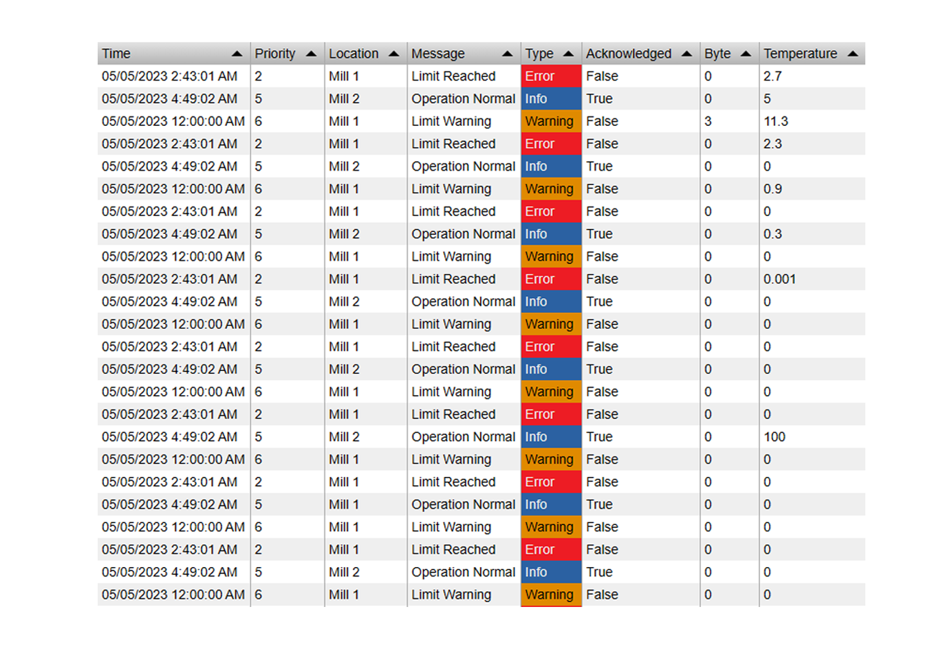
Combining Multiple Arguments: You can add more than one attribute to the Arguments list. When you do, the filter generates a list of all unique combinations of those attribute values. For example, adding both "Severity" and "Acknowledged" produces items like:
- Critical - true
- Critical - false
- High - true
- …and so on. Clicking an item such as "Critical - true" filters all compatible symbols to show events where Severity is "Critical" AND Acknowledged is "true".
General configuration
These settings control the appearance and behavior of the Event Filter+ symbol.
- Layout:
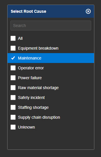
- Type: Static keeps the list permanently visible. Collapsible presents the list as a dropdown menu.
- Start Expanded: For collapsible layouts, determines whether the dropdown is open or closed when the display first loads.
- Collapse on Select: For collapsible layouts, automatically closes the dropdown after the user picks an item.
- View: List presents items as a flat list. Tree groups items hierarchically - requires at least two Arguments to be configured.
- Selection:
- Mode: Single or Multiple.
- Single: Only one item may be active at a time. An optional radio button can be shown for visual clarity.
- Multiple: Any number of items may be active simultaneously. Optional checkboxes can be shown next to each item.
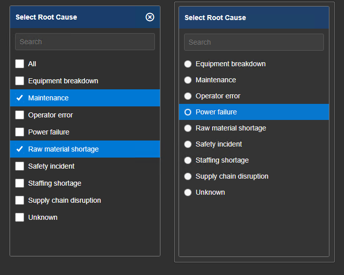
- Allow Empty Filter (Single mode only): When disabled, one item must always remain selected, ensuring the display always has an active filter. When enabled, users can deselect all items to clear the filter entirely.
- Show Input Control: Displays radio buttons (Single mode) or checkboxes (Multiple mode) next to each list item, making the selection state more obvious to users.
- Style: Customize the visual appearance of the filter list. Options include Font Size, Item Padding, and individual color controls for the background, text, selected items, and hovered items.
- Header:
- Show: Toggles the header bar on or off.
- Text Mode:
- Custom: Always shows the static Header Text value.
- Selection: Dynamically updates to reflect the currently selected item(s).
- Header Text: The fixed label shown in the header when Text Mode is set to Custom.
- Background / Text Color: Set the background and text colors for the header bar.
- Search:
- Show: Adds a search bar at the top of the filter list so users can quickly locate items by typing.
- Filtering:
- Ignore Master: Prevents the filter list from reacting to Master filters
from other symbols. Linked inputs remain active.
- Output Mode: Master publishes the filter criteria display-wide. Linked
publishes configured channel values. Both uses both mechanisms.
- Input and Output mappings: Connect a channel's source property to the
target property used by this filter's loaded events.
See Filtering dashboards for a complete configuration example and the additive matching rules.
Troubleshooting and limitations
- Check: If another symbol does not respond, confirm that both symbols use compatible event configuration.
- Check: The filter affects only supported symbols on the current display.