Vision Library+ / Asset navigation and context
Asset Select+
Asset Select+ lets an operator choose an AF asset and apply it as display context.
Overview
Asset Select+ lets an operator choose an AF asset and apply it as display context.
Watch the demo
See Asset Select+ in a practical PI Vision workflow.
When to use it
Use this symbol when you need to:
- Provide a focused asset selector on a reusable display.
- Show selected attribute values beside each available asset.
Before you begin
- Prepare a static asset list or an AF search based on a common template.
- Configure the target display to use asset-relative data sources.
Add and set up the symbol
- Select the symbol in the PI Vision symbol gallery.
- Add the required data sources or asset context to the display.
- Right-click the symbol and open its configuration pane.
- Configure the minimum data, range, and display settings for a useful result.
- Confirm that the symbol shows the expected data.
Use the symbol
Select an asset to update the display context. Other asset-relative symbols refresh for the selected asset.
Configure the symbol
Overview and behavior
The Asset Select+ control provides a configurable asset browser with tree and list views, text search, filtering, and optional multi-state coloring based on live process data.
Configuring selectable assets
Assets can be populated in two ways. For a static asset list, drag assets directly onto the control - the assets you drop appear in the list, and you can assign a custom label to each in the Assets section of the configuration pane.
For dynamic population, right-click the control and select Add Dynamic Search Criteria.
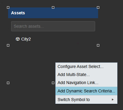 | => | 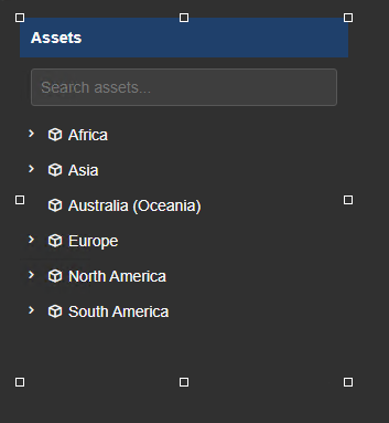 |
The search criteria pane opens on the right side. Configure the following filters to define which assets appear:
The Search Criteria supports the following options:
- Database
- Search Root
- Asset Name
- Asset Type
- Asset Category
- Number of Results
- Asset Order
Click Refresh to reload the asset list after changing filters. If expected assets are missing, verify that Return All Descendants is enabled in the Search Root setting and that the Number of Results limit is high enough.
Layout configuration
The control supports two layout types. Collapsible lets users expand and collapse the asset list. Static always shows the full list.
Static Expandable
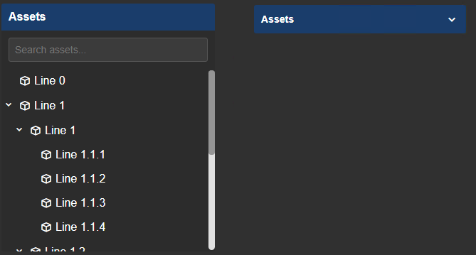
In Collapsible mode, additional options are available:
- Collapse on Select: Closes the list automatically when the user selects an asset.
- Start Expanded: Opens the list automatically when the display loads.
View configuration
The asset list can be displayed in Tree or List view:
Tree List
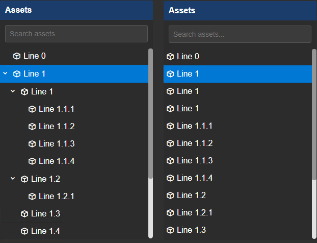
Additional view settings:
Tree
- Auto Expand: Automatically expands all tree nodes when the display loads.
- Allow Selecting Parent Nodes: When enabled, parent (folder) nodes are selectable as assets. When disabled, they serve only as organizational containers.
General
- Icon: Shows or hides the asset icon.
- Description: Shows or hides the asset description.
- Column Headers: Shows or hides column header labels. Useful when multiple attribute values are displayed.
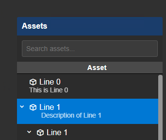
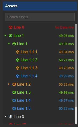
Asset Select+ with Description, Icons, and Column Headers enabled.
- Sort By: Sorts the asset list by name or by any added attribute value.
- Direction: Sorts in ascending or descending order.
Configure header and search
The control header can display custom static text or the name of the currently selected asset. Change the Text setting from Custom to Asset to switch to dynamic display.
You can also set the header Background and Text colors, and enable or disable the search input field.
The search field supports wildcard patterns such as Line* to filter assets by name prefix.
Showing attribute values
Beyond the asset name and description, you can display live attribute values (or summary values such as averages) directly in the asset list.
In the Current Attributes list in the configuration pane, set Show to On for the attribute you want to display. The value appears to the right of each asset name.
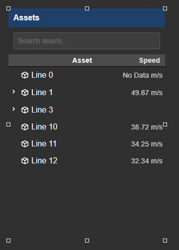
Multi-state
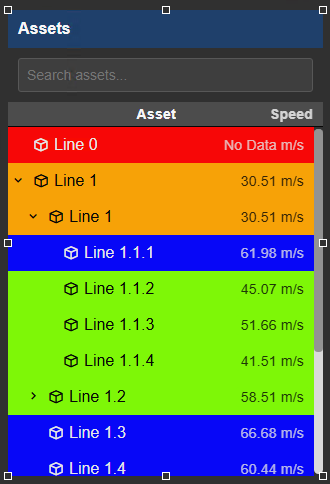
Adding a multi-state configuration lets you color the displayed value - or the entire asset row - based on configured limit ranges.
By default, multi-state color is applied only to the attribute value.
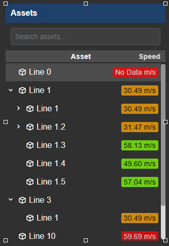
Enable Apply to Asset to apply the multi-state color to the entire asset row. You can then hide the value itself to produce a simple color-coded asset list with no numeric display.
Filtering
Asset Select+ receives asset Master filters and Linked inputs and reports the effective asset count through the shared filter indicator. It remains receiver-only because its primary click interaction changes PI Vision asset context rather than publishing a filter channel.
See Filtering dashboards for receiver configuration and the relationship between Master and Linked filters.
Troubleshooting and limitations
- Check: If the display does not update, confirm that its symbols use asset-relative data sources.
- Check: A dynamic search requires a valid AF root and element template.