



Vision Library+ / Charts and analytics
Period Comparison Chart+
Period Comparison Chart+ overlays repeated time periods so operators can compare current behavior with historical or baseline periods.
Overview
Period Comparison Chart+ overlays repeated time periods so operators can compare current behavior with historical or baseline periods.
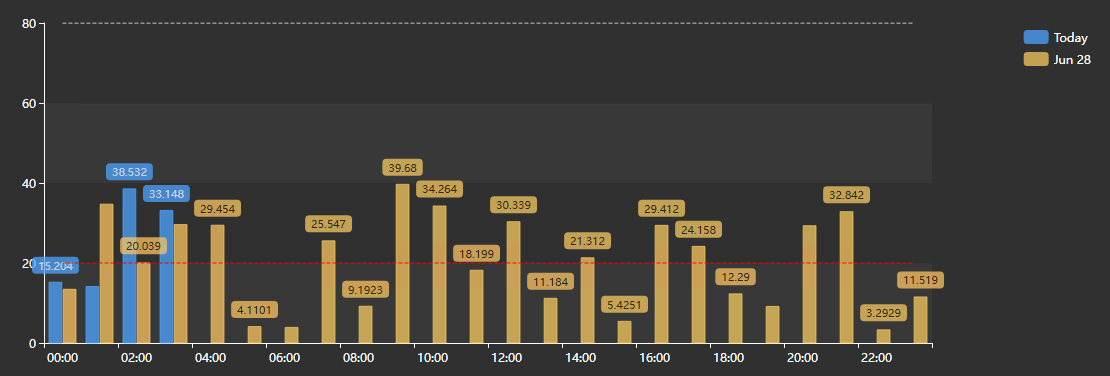
Watch the demo
See Period Comparison Chart+ in a practical PI Vision workflow.
When to use it
Use this symbol when you need to:
- Compare a shift, day, week, or batch with earlier periods.
- Measure deviation from a selected baseline.
Choose period comparison instead of a standard trend
Use this symbol when you need one or more of the following:
• You want to compare the same measurement across repeated time periods. • You need a visual answer to “is this period behaving like previous periods?” • You want year-over-year, month-over-month, day-over-day, or shift-over-shift analysis. • You need baseline, delta, or percent delta comparisons between periods. • You want a chart and summary table together, so users can both see the pattern and inspect exact statistics. • You want to keep a few reference periods visible even when the display time changes.
If your question is mainly “what happened over absolute clock time,” a normal trend is usually simpler. If your question is “how does this period compare to another equivalent period,” Period Comparison Chart+ is the better fit.
Before you begin
- Prepare numeric time-series data with sufficient history.
- Choose aligned period duration, offset, and anchor rules.
Add and set up the symbol
- Select the symbol in the PI Vision symbol gallery.
- Add the required data sources or asset context to the display.
- Right-click the symbol and open its configuration pane.
- Configure the minimum data, range, and display settings for a useful result.
- Confirm that the symbol shows the expected data.
Getting started
1. Add the data sources you want to compare
The symbol supports multiple data sources. Each data source is repeated across the configured comparison layers unless you choose to show it only on the anchor layer.
Why this matters:
• One data source with many layers is best for clear period-over-period comparisons. • Multiple data sources with many layers can become dense quickly. • data sources with different units may need multiple or separate value scales.
A good starting pattern is:
• Add one primary data source first. • Configure the comparison layers. • Add more data sources only if they answer the same comparison question. • Use clear labels so the legend and summary table stay readable.
2. Decide what the anchor period is
The anchor period is the main period the other layers are compared against. By default, this follows the display or symbol time range.
Examples:
• If the display time is today, the anchor layer is today. • If the display time is the last 8 hours, the anchor layer is the last 8 hours. • If the symbol is configured for a custom time range, that custom range becomes the anchor.
Why this matters:
• Every generated comparison layer is built from this first period. • A poorly chosen display time creates confusing comparisons. • For operational displays, the display time bar can become a simple way to change the comparison window.
3. Choose Dynamic or Manual layers
Use Dynamic layers when the comparison follows a repeatable rule.
Examples:
• Today versus yesterday • This week versus the previous 3 weeks • This month versus the same month in previous years • This year versus the last 3 years
Use Manual layers when you want to compare hand-picked periods.
Examples:
• A known good campaign versus a current campaign • A startup from last month versus a startup today • A production run before and after a process change • A custom troubleshooting window
Why this matters:
• Dynamic mode is easier to maintain on dashboards. • Manual mode is better for analysis and one-off comparisons. • Manual layers should be named clearly because the layer label becomes part of the chart and table.
4. Choose the period type
In Dynamic mode, the period type decides how the generated layers are built.
Use Display Time when the exact selected time range matters.
Examples:
• Last 8 hours versus the 8 hours before that • Current shift versus previous shift • A manually selected troubleshooting window versus the same-length window before it
Use Calendar when the comparison should align to calendar boundaries.
Examples:
• Today versus yesterday • This week versus previous weeks • This month versus previous months • This year versus previous years
Why this matters:
• Display Time preserves the exact selected start and end. • Calendar mode snaps to full calendar periods such as day, week, month, or year. • Calendar mode is usually better for reporting-style comparisons.
5. Choose the data retrieval mode
Use Default / Plot for normal trend-style displays. It is the best starting point because it loads display-friendly data.
Use Recorded when exact archived events matter, such as state changes, setpoint changes, or manually entered values. Use it carefully on long ranges because it can return many points.
Use Interpolated when every period should be sampled at the same interval. This is useful when points need to line up cleanly, such as every hour, every day, or every month.
Use Summary when each interval should show a calculated result. This is useful for averages, totals, minimums, maximums, counts, standard deviations, or percent good.
Why this matters:
• The retrieval mode changes what each point means. • Plot mode is best for visual shape. • Interpolated mode is best for evenly spaced comparison points. • Summary mode is best for reporting and KPI-style comparisons.
Use the symbol
Hover over aligned traces and use the chart toolbar or the layer controls to compare the same relative time across periods.
How to read the symbol
The symbol has two main parts:
• The chart area, where comparison layers are rendered. • The summary table, which acts as both a statistics table and a runtime action surface.
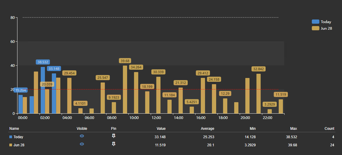
In the chart area
Each visible series represents a data source for a specific comparison layer.
Depending on configuration, the chart may also include:
• Multiple comparison layers for each data source • Delta or percent-delta series • A shaded band between a layer and its baseline • A reference overlay • multi-state limit lines • A current-time marker when the anchor period contains the current time • Data labels on individual points • Separate panels when separate scales are enabled
The legend can be used to identify series, but on dense comparisons the summary table is usually the faster way to interact with the chart.
Use the toolbar's Fullscreen button to open the chart in a fullscreen dialog. The fullscreen view preserves useful chart state such as selected legend items and zoom state.
In the summary table

The summary table is more than a readout. It can show:
• Series name • Visibility control • Pin control • Current value • Average • Standard deviation • Minimum • Minimum time • Maximum • Maximum time • Count • Sum
Why the table matters:
• It gives exact values without requiring users to hover point by point. • It helps identify which series belongs to which layer. • It provides runtime controls for hiding, isolating, and pinning comparison periods. • It makes dense multi-layer charts easier to work with.
Runtime features
The chart toolbar
The chart toolbar appears at the top right when the pointer or the keyboard focus enters the chart, and hides shortly after it leaves. Set Chart > Toolbar > Reveal to Always to keep it in view; the chart then keeps a band of its plot area free so the buttons never cover the plot. On a touch device the toolbar is always shown. The toolbar carries, in order: the drag-mode buttons Pan and Box zoom, Zoom in, Zoom out, Reset zoom, Fullscreen and Download.
- Drag mode: Pan and Box zoom choose what dragging the plot does. In Pan, dragging moves the visible window; in Box zoom, dragging draws a selection to zoom into and stays selected for the next drag. The mode starts at the Chart > Interactivity > Drag mode setting each time the display loads and is not saved when a viewer changes it.
- Zoom in, Zoom out and Reset zoom step the visible window in and out around its centre and put the whole comparison back. The mouse wheel zooms in both drag modes.
- Fullscreen opens the chart in a dialog. Legend visibility and the current zoom are carried into it, the dialog's own toolbar carries every button except Fullscreen, and closing it returns to the embedded display.
- Download offers PNG, SVG and PDF images and CSV, JSON and XLSX data. The data export writes one row for each plotted point, carrying Series, Data Source, Period, Aligned Time, Timestamp, Value and Units. Aligned Time is the position on the shared X-axis that every period is folded onto and Timestamp is the sample's own instant, so a pivot over Aligned Time and Period reproduces a period-per-column table for any number of data sources. CSV and XLSX print both times in your local display format - XLSX as real date cells - while JSON keeps raw ISO timestamps for downstream tools. Your administrator can hide the three data formats.
Why to use it:
• Period comparisons can become dense when many layers or data sources are visible. • Zooming and fullscreen make it easier to inspect small differences. • It is useful in reviews, troubleshooting sessions, or control room displays where the embedded symbol is small.
Zooming this chart moves only the chart. The argument axis is an aligned axis - every comparison period is folded onto the anchor window - so a zoom here never changes the display time range.
Summary table visibility toggles
Each row in the summary table has a visibility control.
Why this feature matters:
• Large comparisons can produce many series. • Users often need to temporarily remove a noisy or irrelevant layer. • Hiding a series is faster than changing configuration.
How it behaves:
• Clicking the visibility icon hides or shows that series. • Hidden state is runtime state for the current symbol session. • The chart updates immediately. • The table remains available as the control surface for bringing hidden series back.
Use this when a chart is too busy but you do not want to permanently remove layers or data sources.
Pinned layers
Pinned layers are reference time periods that stay available even when the dynamic comparison changes.
Why use pinned layers:
• You have a known good historical period you always want visible. • You want to keep a known bad or abnormal period as context. • The display time changes, but one reference period should remain available. • You are comparing current behavior against a hand-selected operating window.
How they behave:
• Pinning is done from the summary table. • Pinned layers are stored by their start and end time. • Pinned layers are grouped separately from dynamic layers in the summary table. • If a pinned layer is already part of the dynamic result, it is not duplicated. • Unpinning removes it from the pinned reference group.
This is the period-comparison equivalent of keeping a reference event visible in an event comparison chart. The difference is that this symbol pins time ranges, not event frames.
Current-time marker
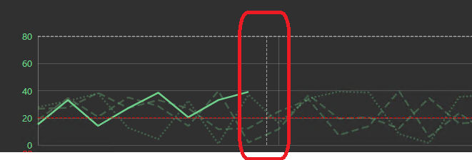
When the anchor period contains the current time, the chart can show a vertical current-time marker.
Why this feature matters:
• It shows where “now” sits inside the comparison period. • It helps operators understand whether today is ahead of or behind previous periods at the same relative point. • It is especially useful for current shift, current day, and current month displays.
How it behaves:
• The marker appears only when the current time falls inside the anchor period. • It follows the comparison axis, so it remains meaningful when periods are aligned. • It is not shown when the current time is outside the compared range.
Configure the symbol
Overview and behavior
Period Comparison Chart+ is designed to compare the same data source across multiple time periods on a common comparison axis. In practice, that means the symbol answers questions like:
• How does today compare to yesterday? • How does this shift compare to the previous shift? • Is this month tracking like the same month last year? • How do monthly values this year compare against previous years? • Which historical period should be used as the baseline? • Are current values above, below, or within the expected historical range?
This makes the symbol especially useful for production monitoring, daily operating reviews, energy comparisons, seasonal behavior, shift performance, campaign analysis, and recurring process patterns.
Unlike a normal trend, the chart is not only telling you “what happened at this clock time.” It is helping you compare equivalent positions inside different periods. For example, it can show what normally happens 3 hours into a shift, 10 days into a month, or halfway through a yearly cycle.
The symbol works with one or more data sources. Each data source can be shown across one or more comparison layers, where each layer represents a time range such as today, yesterday, last week, last month, or a manually selected period.
Multi-state limit lines
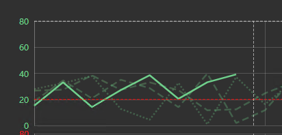
The symbol supports multi-state configuration per data source. When enabled, multi-state limits are loaded for the latest layer and rendered as dashed limit lines.
Why this feature matters:
• Users can compare historical behavior against the current operating limits. • It provides context for whether a period is not only different, but outside an expected range. • It helps avoid reading a chart only by relative comparison when absolute thresholds still matter.
How it behaves:
• multi-state is configured from the symbol’s multi-state configuration mode. • Limits are drawn as reference lines and are not included as normal summary rows. • multi-state lines are most useful when the latest/current period is the operational reference.
Chart options
The Chart section controls the general appearance of the symbol.
Use Foreground and Background to match the display theme and maintain contrast.
Use Font Size to tune readability. Larger fonts help operator displays; smaller fonts allow denser analytical views.
Use Title when the symbol needs to explain the comparison on its own. For example, “Compressor Power - Current Month vs Prior Years.”
Use Legend when users need to identify series directly from the chart. Put it on the right when there are many series. Put it on top when the chart is wide and vertical plot space is more important.

Use Data Labels for low-density charts where exact values should be visible without hovering. Avoid them on dense charts because they can overlap and distract from the trend shape.
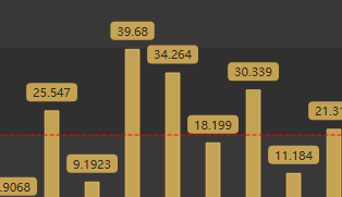
The Grid section controls what is drawn behind the data: the grid lines, the shaded bands, and the border of the plot area.
- Show: Turns the grid on or off. When it is off, no grid lines or bands are drawn; the Border setting still applies.
- Lines: Selects which grid lines are drawn: None, Horizontal, Vertical, or Both. The names always describe the direction the lines run on screen.
- Bands: Draws alternating shaded bands across the plot area.
- Border: Bounds the plot area. Axes draws the two axis lines with their ticks, Frame draws a rectangle around the plot instead of the axis lines, and None draws neither. Grid lines drawn with Border set to None are dashed.
Grid line color and opacity are not settings; they follow the chart's foreground color and theme.
The Toolbar section controls the chart toolbar. Show turns it on or off - every button, the drag-mode buttons included - and Reveal chooses between showing the toolbar on hover and showing it always. Always also reserves a band of plot area for the toolbar; with Show off nothing is drawn and no plot area is reserved. Existing displays keep the toolbar off until you switch it on; a newly placed symbol starts with it on.
The Interactivity section controls what a viewer can do to the plot.
- Zoom is the master switch. With it off there is no wheel zoom, no drag navigation, and no drag-mode or zoom buttons on the toolbar.
- Drag mode chooses whether a drag on the plot pans or draws a box zoom. It is the mode the chart starts in; the toolbar's drag-mode buttons switch it for the current viewer only and never change what is saved.
Apply to display time is not offered on this symbol: the argument axis is an aligned axis, so a window on it names no wall-clock range to retime the display to.
Layers
The Layers section is the core of the symbol.
Important options include:
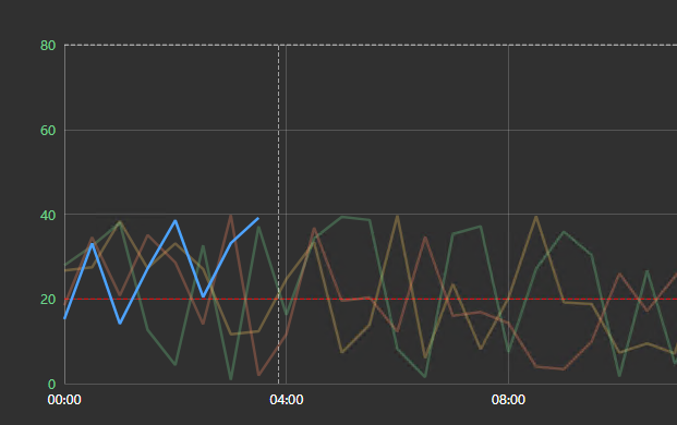
• Mode: Dynamic or Manual • Period Type: Display Time or Calendar • Count: number of generated layers • Direction: past or future • Shift By: period length or calendar unit • Distinguish Layers By: color, line style, or opacity • Show Full Historical Periods • Highlight First Layer • Manual layer labels, offsets, and custom start/end times
Use Count carefully. A chart with 4 data sources and 6 layers produces up to 24 rendered series before baseline comparison or reference overlays are added.
Use Distinguish Layers By based on chart density:
• Color is best for one data source. • Line style is best when each data source already has its own color. • Opacity is best when the first/current layer should stand out. • Auto chooses a practical default based on the number of data sources.
Use Highlight First Layer when the first rendered layer is the main subject and all other layers are context:
Scales
The Scales section controls the X-axis and Y-axis behavior.
Use Time Scale > Range for normal continuous comparison. This is the best default for trends.
Use Time Scale > Discrete when values should be compared as categories instead of continuous time.
For the value scale, use:
• Single Scale when all visible series share compatible units and ranges. • Multiple Scales when data sources need their own axes but should remain overlaid. • Separate Scales when data sources need their own panels for readability.
Why this matters:
• A shared scale is honest when values are comparable. • Multiple scales can make different units readable, but users must understand that axes differ. • Separate scales reduce clutter and are usually best for multi-data source comparisons with different units.
Data retrieval
The Data Retrieval section controls how values are requested from PI Web API.
Use:
• Default / Plot for normal trend shape. • Recorded for exact archive events. • Interpolated for evenly spaced samples. • Summary for calculated interval results.
For interpolated and summary data, configure:
• Interval value • Interval unit • Sync Time • Summary type • Calculation basis • Conversion factor for time-weighted totals
Use Summary with Bar series type when you want a reporting-style chart such as daily totals or monthly averages.
Summary table

The Summary Table section controls whether the table is visible, how much space it uses, and which statistics are shown.
Use it when:
• Users need exact comparison values. • There are many layers and the legend is not enough. • You want runtime controls for visibility, row isolation, and pinning. • You want a dashboard that supports both monitoring and analysis.
Set Height (%) to 0 for automatic height. Use a fixed percentage when the table should reserve a predictable amount of space.
Available statistic columns include:
• Value • Average • Standard deviation • Minimum • Minimum time • Maximum • Maximum time • Count • Sum
The name, visibility control, and pin control are always part of the table behavior.
Baseline comparison
Baseline Comparison compares each non-reference layer against a selected reference layer.
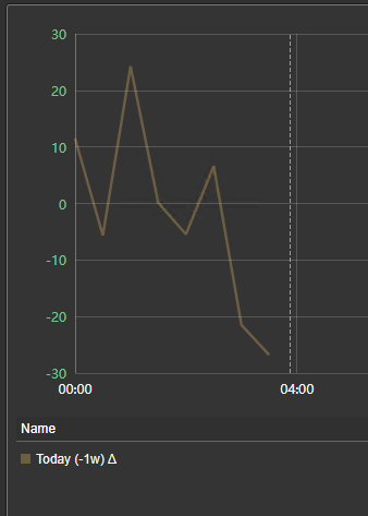
Use Delta when the absolute difference matters.
Example: “This period is 12 degrees hotter than the reference.”
Use Percent Delta when relative change matters.
Example: “This month is 8% higher than last year.”
Use Band Between Series when you want to keep the original series and visually shade the difference.
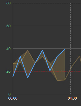
Example: “Show the spread between this month and last month.”
Use Tooltip Only when the original chart should remain unchanged, but users should still see baseline, delta, and percent delta details on hover.
The reference layer can be:
• First rendered layer • Last rendered layer • A specific layer number
Use Overlay in delta or percent-delta mode when users still need to see the reference curve while reviewing transformed values.
Data source settings
Each data source has its own settings.
Use Label to make chart and table names meaningful. Clear labels are especially important because series names combine data source and layer labels when multiple data sources are used.
Use Color to identify the data source. When multiple layers are present, the final rendered color may also depend on the layer style.
Use Series Type based on the data:
• Line for normal trends • Area for filled trend emphasis • Bar for interval summaries • Scatter for individual observations
Use Line Shape based on process behavior:
• Straight for most values • Smooth for easier visual scanning • Step for state-like values that hold until the next change
Use Dash Style, Line Width, Marker Size, and Markers to improve readability.
Use Layers > Anchor Only when a data source should appear only on the first layer. This is useful for targets, limits, or context values that should not be repeated for every historical period.
When the chart uses multiple or separate value scales, each data source can also control its own axis position, range, and inversion.
Practical examples
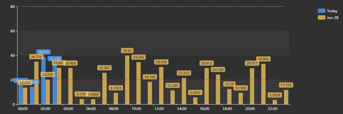
Today versus yesterday
Use Dynamic layers with:
• Period Type: Calendar • Duration: 1 day • Count: 2 • Direction: Past • Shift By: Calendar / 1 day
This is a good operator view for daily progress.
Current shift versus previous shifts
Use Dynamic layers with:
• Period Type: Display Time • Display time set to the current shift window • Count: 3 or 4 • Direction: Past • Shift By: Period
This is useful when shifts are not calendar days.
This month versus the same month in prior years
Use Dynamic layers with:
• Period Type: Calendar • Duration: 1 month • Count: 3 or more • Direction: Past • Shift By: Calendar / 1 year
Use this for seasonal or year-over-year comparisons.
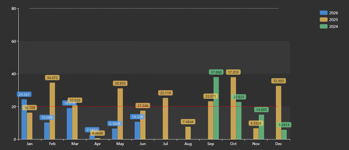
Monthly totals for this year versus previous years
Use Dynamic layers with:
• Period Type: Calendar • Duration: 1 year • Data Retrieval: Summary • Interval: 1 month • Summary Type: Total, Average, or Maximum • Series Type: Bar or Line
This is useful for production, energy, emissions, or throughput reporting.
Current period against a known reference period
Use the summary table to pin a known historical layer, or use Manual mode with a custom start and end time.
This is useful when the reference period is not yesterday, last week, or last year.
Troubleshooting and limitations
- Check: If a layer is missing, check its offset, source history, time alignment, and retrieval settings.
- Check: Many layers, sources, or small intervals can reduce browser performance.



