Vision Library+ / Charts and analytics
Heatmap+
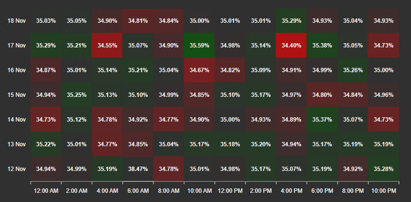
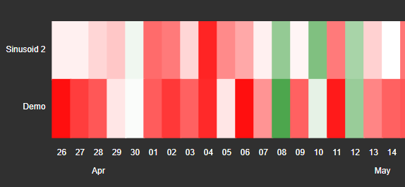
Heatmap+ displays values in a two-dimensional color grid to reveal patterns across time and data sources.
Overview
Heatmap+ displays values in a two-dimensional color grid to reveal patterns across time and data sources.
Watch the demo
See Heatmap+ in a practical PI Vision workflow.
When to use it
Use this symbol when you need to:
- Compare many signals or categories across a time range.
- Identify clusters, gaps, and high or low operating regions.
Before you begin
- Prepare numeric data sources with comparable meaning.
- Choose an aggregation interval appropriate for the display range.
Add and set up the symbol
- Select the symbol in the PI Vision symbol gallery.
- Add the required data sources or asset context to the display.
- Right-click the symbol and open its configuration pane.
- Configure the minimum data, range, and display settings for a useful result.
- Confirm that the symbol shows the expected data.
Use the symbol
Hover over a cell to inspect its source, time, and value. Use enabled time controls to focus on a smaller region.
Toolbar
When the toolbar is enabled, a small button strip appears in the top-right corner of the chart. By default it reveals itself when the pointer enters the chart and hides again shortly after it leaves; set Reveal to Always to keep it on screen, which reserves a band of the plot area for it. On a touch device the strip is always visible.
The strip carries:
- Pan and Box zoom: choose what dragging across the chart does. Pan moves the visible time window; Box zoom draws a rectangle and zooms into it. The starting mode comes from the Drag mode setting and is not remembered between sessions.
- Zoom in, Zoom out, and Reset zoom: step the visible time window in whole time buckets, or return to the full loaded range.
- Fullscreen: opens the chart in a large dialog, carrying over the current legend selection and zoom window. The dialog offers download only - use the inline chart's own buttons to zoom.
- Download: exports the chart as PNG, SVG, or PDF, or the plotted cell values as CSV, JSON, or XLSX. The data export is a grid: one header row of time buckets, then one row per heatmap row. A zoomed chart exports only the buckets it is showing.
The zoom buttons and the Pan / Box zoom group appear only when the chart has a time window to move - that is, when the Y axis lists data sources and Zoom is enabled. A cycle heatmap (Y axis set to Time) and a sparkline show neither.
Zoom and selection
Clicking a cell applies that cell's own time range to the display time, and dragging or zooming applies the visible window - both only when Apply to Display Time is on.
> Changed in this release. Zooming or panning the chart used to change the display time range whether or not Apply to Display Time was enabled. It now respects that switch: with Apply to Display Time off, a zoom or a pan moves only what this chart is showing and leaves the rest of the display alone.
For cell clicks and zooms to behave predictably, configure a custom Start and End Time in the Data Retrieval settings so the heatmap's own time range is decoupled from the display time.
Time bar
Heatmap+ supports the shared Time Bar for independent ranges, duration choices, and PI time expressions.
Configure the symbol
Overview and behavior
The Heatmap+ is a two-dimensional data visualization that encodes magnitude as color. Each cell in the grid represents a value - the color of the cell indicates where that value falls within the configured color range, making patterns and outliers immediately visible.
Configure heatmap
Use the Configuration pane to customize the Heatmap+ symbol. Options cover title, style, coloring, legend, data labels, interactivity, and data retrieval.
- Right-click the symbol and select Configure Heatmap to open the configuration pane.
- Title section - configures the chart headings:
- Title: Sets the main title text and style.
- Sub Title: Sets the secondary title text and style.
- Style section - controls the overall visual appearance of the chart:
- Foreground: Sets the text color for the chart.
- Background: Sets the background fill color of the chart.
- Sparkline: When enabled, hides all axis borders and labels for a minimal embedded view.
- Border Width / Color: Enables or disables the border, and sets its width and color.
- Font Size: Sets the font size for all heatmap text.
- Shadow: Enables or disables a drop shadow on the chart container.
- Coloring section - sets the color strategy for heatmap cells. Three modes are available:
- Gradient
Maps cell values to a continuous color gradient. The min and max of the gradient range are set in the Range section. You can add any number of color stops to the gradient.
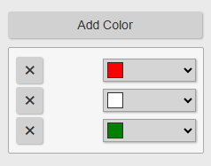
You can add an unlimited number of colors to the gradient.
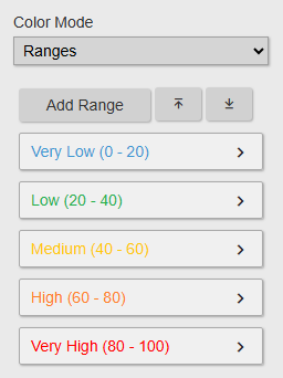
- Ranges
Assigns cells to discrete named color bands. Each band has a Name, Color, Start Value, and End Value - with no gradient blending between bands.
- Multiple
Assigns a distinct base color to each data source. The magnitude of each value is represented by the opacity of that color.
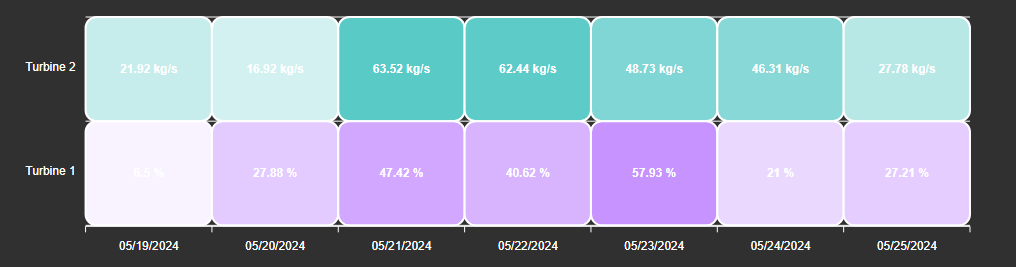
In all coloring modes, you can choose between Custom Colors (user-defined) and multi-state colors (driven by configured multi-state limits) using the Type selector.
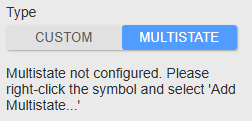
To use multi-state colors, right-click the chart and select Add multi-state first. The state thresholds and colors are then configured in the multi-state settings.
Heatmap+ has no Grid section, because the cells themselves are the grid; the Border toggle in the Coloring section draws the outline around each cell, not a plot border.
- Legend section - available only when Color Mode is set to Ranges. Displays a color key for the configured range bands.

- Enabled: Toggles the legend on or off.
- Position: Sets the legend position: Top, Left, Bottom, or Right.
- Format: Controls whether the range name, range values, or both are shown in each legend entry.
- Data Labels section - controls the labels displayed inside each heatmap cell, including font size and format.
- Toolbar section - controls the button strip in the top-right corner of the chart:
- Show Toolbar: Toggles the strip on or off. Newly placed symbols start with it on; symbols saved before this release keep it off until you switch it on.
- Reveal: On hover shows the strip only while the pointer is over the chart; Always keeps it on screen and reserves a band of the plot area for it.
- Interactivity section - controls what dragging and zooming do, and whether they retime the display:
- Enable Zoom: Turns zooming and panning on or off. With it off, the chart has no zoom controls at all. The row is hidden when the chart has no time window to move - on a cycle heatmap (Y axis set to Time) and on a sparkline.
- Drag mode: Sets what dragging across the chart does when the display opens - Pan or Box zoom. Viewers can switch modes from the toolbar; their choice is not saved.
- Apply to Display Time: When on, clicking a cell applies that cell's time range to the display time, and a zoom or a pan applies the visible window. When off, both stay local to this chart.
- Include Endtime: When Apply to Display Time is on, decides whether the last second of a clicked cell's interval is included in the applied range.
Drag mode and Apply to Display Time follow Enable Zoom, so all three are hidden on a chart with no time window to move. Include Endtime always stays available, because a cell click works on every heatmap.
For these to work correctly, configure a custom Start and End Time in the Data Retrieval settings to decouple the heatmap's time range from the display time.
- Data Retrieval section - controls how data is loaded and the time range used.
- Mode:
| Summary | Automatically computes summaries (e.g., average) for each configured interval. Set the Calculation Type and Calculation Basis (Time Weighted or Event Weighted). |
| Interpolated | Loads interpolated values from the data source tags. The following options are available:; - Interval; The interval between loaded values.; - Sync Time; Synchronizes retrieved values to a fixed minute or second offset. For example, a Sync Time of 00:15:00 always retrieves values at :15 past each hour. When disabled, timestamps align to the current time. |
| Joined | Designates one data source as the time reference. All other data sources return interpolated values matching that source's timestamps. |
- Start and End Times:
| Display time range | Uses the current global display time range for data retrieval. |
| Custom time range | Specifies a fixed custom start and end time, independent of the display time. |
| Duration and offset | Sets a rolling duration and offset relative to the display's end time. |
Configure axis Y
- Type: Controls what the Y axis rows represent:
- data source: Creates one row label per configured attribute or tag.
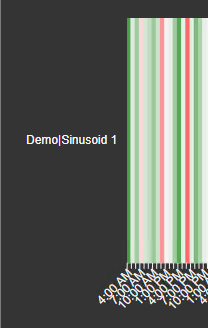
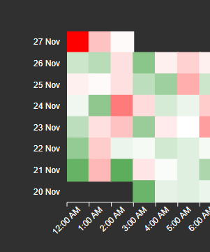
- Time: Creates grouped time labels based on the selected Group Interval (Minute through Year). Data is bucketed along the Y axis by this interval.
- Position: Places the Y axis on the left or right side of the chart.
- Border / Ticks: Enables or disables axis lines and tick marks.
Configure axis X
- DateTime Format (Category axis only): Sets the date and time display format for X axis labels.
- Group: Groups timestamps into the configured time interval. For example, with Group set to Month and DateTime Format set to Day, each column represents one day within its month.
Troubleshooting and limitations
- Check: If cells are blank, check the retrieval interval, aggregation, time range, and source data.
- Check: Large grids can increase retrieval time and reduce label readability.