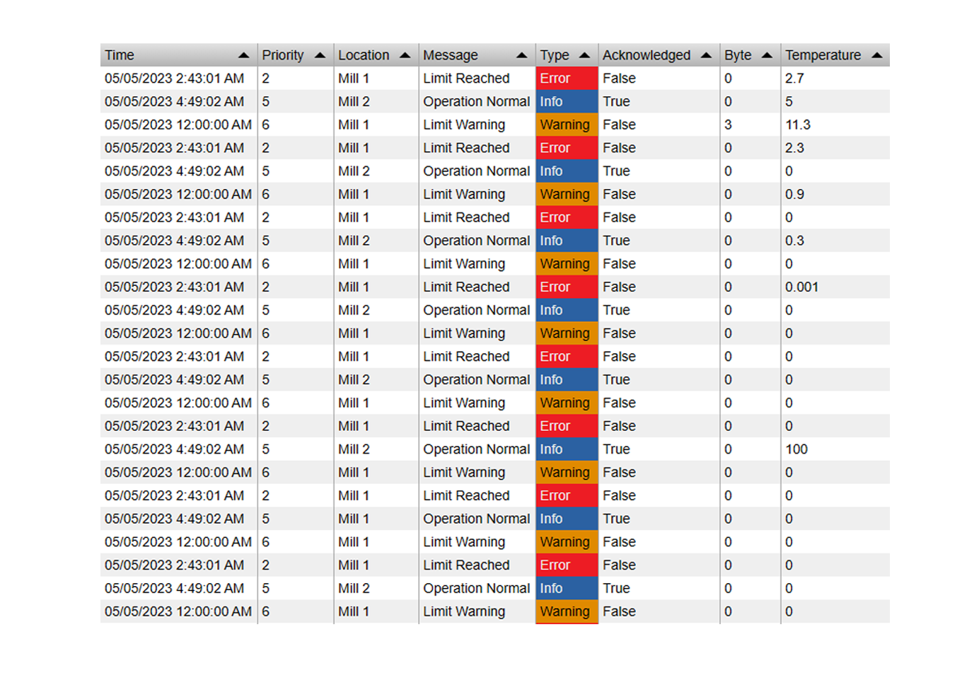
Vision Library+ / Charts and analytics
Event Analytics Chart+
Event Analytics Chart+ aggregates event-frame data into configurable chart dimensions, values, arguments, and series.
Overview
Event Analytics Chart+ aggregates event-frame data into configurable chart dimensions, values, arguments, and series.
Watch the demo
See Event Analytics Chart+ in a practical PI Vision workflow.
When to use it
Use this symbol when you need to:
- Compare event metrics by asset, category, batch, or another event attribute.
- Turn an event-frame search into an aggregated operational chart.
Before you begin
- Prepare an event-frame template and search that returns the intended events.
- Confirm that selected value fields support the required aggregation.
Add and set up the symbol
- Select the symbol in the PI Vision symbol gallery.
- Add the required data sources or asset context to the display.
- Right-click the symbol and open its configuration pane.
- Configure the minimum data, range, and display settings for a useful result.
- Confirm that the symbol shows the expected data.
Getting started: creating your first analytics chart
Follow these steps to create and configure a new Event Analytics Chart+ symbol.
Step 1: Find and Select Your Event Frames
- Open the Event Frame Search pane in PI Vision.
- Define your search criteria (e.g., specific event frame template, time range, asset) to find the set of events you want to analyze.
- Click Apply.
Step 2: Add the Symbol to the Display
- Select the Event Analytics Chart+ symbol
- From the event search results, locate the list of Attributes below. These are the attributes available across the found event frames.
- Click and hold on any attribute that you plan to use in your chart (it doesn't have to be the final one).
- Drag the attribute onto your display. A new, unconfigured Event Analytics Chart+ symbol will appear.
Use the symbol
Hover over chart items to inspect aggregated values and use enabled selection actions to filter or navigate.
Time bar
Event Analytics Chart+ supports the shared Time Bar for an independent Event Frame analysis range.
Interactivity
Use Click Action to give one unambiguous meaning to a chart click:
- None leaves chart items informational.
- Drilldown navigates through the configured Argument or Series hierarchy.
- Filter selects one chart item and publishes it according to Output Mode.
When Click Action is Filter, Output Mode can be None, Master, Linked, or Both. Under Filtering > Input, Linked channels can also restrict this chart's loaded Event Frames. Ignore Master affects only incoming Master filters; it does not disable Linked inputs.
See Filtering dashboards for channel setup and matching behavior. Chart publication remains single-selection.
The chart toolbar
The chart toolbar appears at the top right when the pointer or the keyboard focus enters the chart, and hides shortly after it leaves. Set Toolbar > Reveal to Always to keep it in view; the chart then keeps a band of its plot area free so the buttons never cover the plot. On a touch device the toolbar is always shown. Turn it off entirely with Toolbar > Show. The toolbar carries two buttons: Fullscreen and Download. This chart has no zoom, so there are no zoom or reset buttons.
- Fullscreen opens the chart in a dialog at the size of the display. The legend visibility you left on the embedded chart is carried into it, the dialog's own toolbar carries Download only, and closing it returns to the embedded display. A click inside the dialog does what a click on the embedded chart does - the drill-down or filter action you configured - and both charts follow it.
- Download offers PNG, SVG and PDF images and CSV, JSON and XLSX data. The data export writes one row for each plotted point - the argument category, the series it belongs to, and the summarised value the mark was drawn from - so the file holds exactly the aggregate the chart shows rather than the underlying Event Frames. Drill-down level and any active filters are already applied. Your administrator can hide the three data formats.
Configure the symbol
Overview and behavior
The Event Analytics Chart+ aggregates and visualizes event frame data in a flexible Cartesian chart - bar, line, or area. Unlike display-only charts, it performs calculations on your data so you can surface trends and insights directly on a PI Vision display.
The sections below cover each configuration option.
Step 3: configure the event search (Critical step!)
By default, a new symbol does not inherit the search criteria you ran in the Event Frame Search pane - you must link it manually.
- Right-click on the new Event Analytics Chart+ symbol you just added to the display.
- From the context menu, select Search Criteria....
- Configure your Event Search criteria and Click Apply.
The symbol is now configured to query the event frame data needed for its analysis.
Note: If the chart appears empty or shows "No Data," the most likely cause is that the symbol's event search criteria (Step 3) returns no matching events. Check this configuration first.
How it works: dimensions
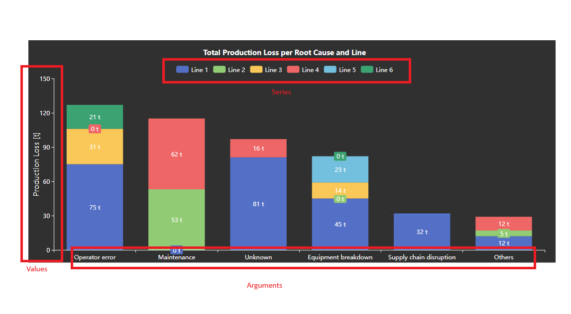
The chart is built around three core dimensions: Values, Arguments, and Series.
- Values: The numerical data you want to plot on the Y-axis (or X-axis in a horizontal chart).
- Arguments: The categories that will be displayed along the X-axis (or Y-axis in a horizontal chart).
- Series: The way you want to split or group your data into different colored bars or lines within the chart.
Values (The "What")
Values define what is measured and plotted on the chart. You can add one or more attributes; the available calculation methods depend on the attribute's data type.
- Attribute: The event frame attribute containing the data to be analyzed (e.g., Temperature, Status, Reason Code).
- Title: A user-friendly name (e.g., "Max Temperature").
Summary Type
The available summaries depend on the attribute's data type:
| Data Type | Summary Types | Description |
|---|---|---|
| Numeric (Float, Integer) | Count, Sum, Average, Min, Max, and others. | Offers full statistical analysis, allowing you to total, average, and find extremes in your numerical data. |
| Categorical (String, Enumeration) | Count, Count Distinct. | Since the values are not numbers, they cannot be summed or averaged. Aggregation is limited to counting the occurrences of each unique value. |
- Count: The total number of events that occurred within the category.
- Sum / Average / Min / Max: Statistical calculations applied only to numeric data points.
- Count Distinct: The number of unique values observed within the category (e.g., counting how many unique users logged an event).
- Show: Toggle off to hide the value from the chart while still using it for sorting or filtering.
- Series Type: How this value should be visualized.
- Bar: Displays the data as vertical or horizontal bars.
- Line: Displays the data as a connected line. Can be styled as a Step line.
- Area: A line chart with the area below it filled in.
- Scatter: Displays individual data points as markers.
- Stacking: If you have multiple values or series, this controls how bar/area charts are displayed.
- None: Bars are grouped side-by-side (clustered).
- Stacked: Bars are stacked on top of each other to show a combined total.
- Normalized: Bars are stacked and scaled to 100%, showing the relative contribution of each part.
- Secondary Axis: When enabled, this value is plotted against a separate Y-axis on the right - useful for comparing two values with different scales (e.g., Temperature and Pressure).
- Data Labels: Configure labels that appear directly on data points. Options include showing the value, argument name, or series name, and setting the position (top or inside).
- Lines: Add static reference lines (e.g., targets or limits). Configure the value, color, style, and label for each line.
Arguments (The "Where")
Arguments define the categories used to group values. Add one or more arguments to create combined categories - for example, combining Asset and Severity produces categories such as "Pump 1 - Critical" and "Pump 1 - High".
- Attribute: The attribute that defines the categories (e.g., Severity, Reason Code, Asset).
- Title: A custom name for this argument, used in axis titles.
- Group Interval (for DateTime): If the data type is DateTime, you can group the data by intervals like Year, Month, Day, Day of Week, etc.
- Sort: Control the order of the arguments on the axis.
- Order: Ascending or Descending. Default is alphabetical/chronological.
- Sort By: The configured Value to use for sorting. For example, sort assets by Sum of Downtime rather than by name.
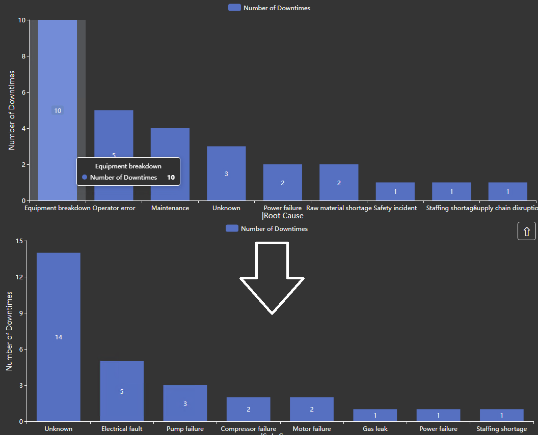
- Top N: Filter the chart to show only the top or bottom contributing arguments.
- Mode: Top or Bottom.
- Count: Number of items to display (e.g., 5).
- Value: Choose which Value to use for ranking.
- Show Others: When enabled, all remaining items are aggregated into a single “Others” category.
Series (The "How")
Series split the data within each argument. For example, with an argument of Month and a series of Reason Code, the chart renders a separate colored bar or line for each reason code within each month.
Series share the same configuration options as Arguments: Attribute, Caption, Data Type, Group Interval, and Top N.
General chart options
These settings control the chart's overall appearance and behavior.
- Title: Show, hide, and customize the main title of the chart.
- Style:
- Orientation: Vertical (standard) or Horizontal (swaps X and Y axes).
- Grid: Controls what is drawn behind the data: the grid lines, the shaded bands, and the border of the plot area.
- Show: Turns the grid on or off. When it is off, no grid lines or bands are drawn; the Border setting still applies.
- Lines: Selects which grid lines are drawn: None, Horizontal, Vertical, or Both. The names always describe the direction the lines run on screen, whichever Orientation is selected.
- Bands: Draws alternating shaded bands across the plot area.
- Border: Bounds the plot area. Axes draws the two axis lines with their ticks, Frame draws a rectangle around the plot instead of the axis lines, and None draws neither. Grid lines drawn with Border set to None are dashed.
Grid line color and opacity are not settings; they follow the chart's foreground color and theme.
- Legend: Configure the position, alignment, and visibility of the chart legend.
- Toolbar: Controls the small button strip at the top right of the chart.
- Show: Turns the toolbar on or off. Existing displays keep it off; a newly placed symbol has it on.
- Reveal: On hover shows the strip only while the pointer or keyboard focus is in the chart, and costs no chart area. Always keeps it permanently in view and reserves a band at the top for it.
- Axis (X, Primary Y, Secondary Y): Configure each axis individually:
- Show/Hide: Control the visibility of the axis line, labels, and title.
- Title Text: Set a custom title for the axis.
- Scale Range: For value axes (Primary Y, Secondary Y), you can switch from Auto to Custom and set a fixed minimum and maximum range.
- Coloring:
- Auto: Uses the built-in color palette.
- Custom: Assign a specific color to each unique series value. The symbol automatically discovers the series in your data and lists them for coloring.
Troubleshooting and limitations
- Check: If the chart is empty, test the event search and confirm its time range and template.
- Check: High event counts and many dimensions can increase query and rendering time.