



Vision Library+ / Charts and analytics
Pie Chart+
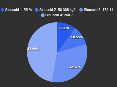
Pie Chart+ shows how numeric values contribute to a whole. Choose a pie, donut, half-donut, or polar layout and display names, values, or percentages in the legend and labels.
Overview
Pie Chart+ shows how numeric values contribute to a whole. Choose a pie, donut, half-donut, or polar layout and display names, values, or percentages in the legend and labels.
When to use it
Use Pie Chart+ when you need to:
- Compare the relative contribution of a small number of values.
- Show a part-to-whole relationship at the current display time.
- Place a total value in the center of a donut chart.
Use a bar chart when precise comparisons or many categories are more important than the part-to-whole relationship.
Before you begin
- Prepare two or more numeric PI Points or AF attributes.
- Use compatible units when the values represent parts of the same total.
- Limit the number of slices so labels and colors remain distinguishable.
Add and set up the symbol
- Select Pie Chart+ in the PI Vision symbol gallery.
- Drag the numeric data sources onto the display.
- Right-click the symbol and select Configure Pie Chart.
- Select the chart type and enable the legend or data labels needed by operators.
- Confirm that every slice represents the expected data source and value.
Use the symbol
Compare slice size to understand each value's share of the whole. Use the legend or data labels to read exact names, values, and percentages. Hover over a slice to display its configured tooltip.
Configure the symbol
Chart type
Select one of four layouts:
| Type | Example | Description |
|---|---|---|
| Pie |  | Displays a complete circular pie. |
| Donut |  | Adds an open center that can contain a total label. |
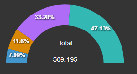
| Half Donut |  | Uses a semicircular layout. |
| Polar |  | Uses radial bar length to compare values. |
Titles and appearance
- Title: Sets the main chart heading.
- Sub title: Sets the secondary line below the title.
- Foreground: Sets the chart text color.
- Background: Sets the chart background color.
- Border width and color: Sets the chart outline.
- Shadow: Adds or removes a drop shadow.
Legend

- Enabled: Shows or hides the legend.
- Position: Places the legend above, below, to the left, or to the right of the chart.
- Alignment: Aligns the legend entries within the available space.
- Font size: Sets the legend text size.
- Format: Shows the name, value, percentage, or a combination of these fields.
Grid
The Grid section appears only when the chart type is Polar; the pie, donut, and half-donut layouts draw no grid at all.
- Show: Draws or hides the grid rings and spokes behind the radial bars.
Nothing else in the section applies to a polar plot: it has no horizontal or vertical line direction, no alternating bands, and no rectangle to bound, so Show is the only setting offered. Grid line color and opacity are not settings; they follow the chart's foreground color and theme.
Data labels
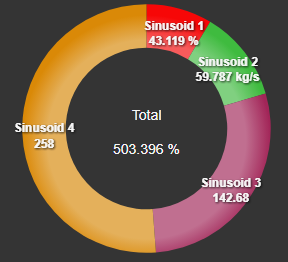
- Enabled: Shows or hides labels on the slices.
- Foreground: Sets the label text color.
- Background: Sets the fill behind each label.
- Font size: Sets the label text size.
- Format: Shows the name, value, percentage, or a combination of these fields.
- Hide zeros: Omits labels for values equal to zero.
Tooltip
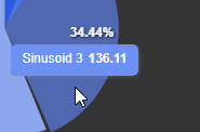
- Enabled: Turns the hover tooltip on or off.
- Font size: Sets the tooltip text size.
- Format: Shows the name, value, percentage, or a combination of these fields.
Center label
Donut and half-donut charts can display the sum of all slice values in the center of the chart.
Troubleshooting and limitations
- A slice is missing: Confirm that its data source returns a valid numeric value and is not being hidden as zero.
- Labels overlap: Increase the symbol size, reduce the number of data sources, or use the legend instead of labels.
- Percentages are misleading: Confirm that the values use compatible units and represent parts of the same total.
- The center label is unavailable: Select Donut or Half Donut as the chart type.



