



Vision Library+ / Gauges and process visualization
Map+
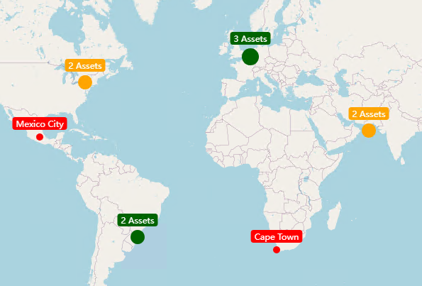
Map+ plots assets and values on a geographic map with labels, clustering, lines, views, and multi-state styling.
Overview
Map+ plots assets and values on a geographic map with labels, clustering, lines, views, and multi-state styling.
When to use it
Use this symbol when you need to:
- Monitor geographically distributed assets.
- Navigate between locations while preserving operational context.
Before you begin
- Prepare valid latitude and longitude values for each asset.
- Configure an approved map provider and any required API credentials.
Add and set up the symbol
- Select the symbol in the PI Vision symbol gallery.
- Add the required data sources or asset context to the display.
- Right-click the symbol and open its configuration pane.
- Configure the minimum data, range, and display settings for a useful result.
- Confirm that the symbol shows the expected data.
Use the symbol
Pan or zoom the map, select a marker for details, and use configured views or navigation actions. Clusters expand as you zoom in.
Configure the symbol
Overview and behavior
The Map+ symbols is an interactive world map, that uses multiple different map providers (like OpenStreetMap) to display maps directly in PI Vision. You can then display your pi data on top of the map, by configuring the longitude and latitude properties of your data.
Configure asset location
For the map to work properly, you need to create Elements and configure their respective Longitude and Latitude Attributes accordingly.
- Create a new Element Template (for example, City for a collection of cities)
- Create two Attributes, Longitude and Latitude, of type Double

- Set the attribute properties to Longitude and Latitude respectively
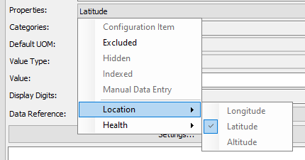
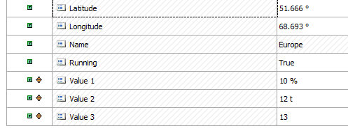
- Add Attributes for your actual process data. You can add and display multiple values for each asset in the map:
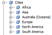
- Create a root element, and then create your actual assets using your previously created template:
In the next step, we can create the actual map and load the previously created assets.
Configure asset search criteria
Next, use any of the previously created assets attributes to create the symbol. Initially, the symbol will only show that single asset. There are two ways to use asset data in the symbol.
- Manually drag the other assets you want to display onto the map
- right-click the symbol and select Add Search Criteria. In this mode, asset data is automatically retrieved depending on your configured Asset Search Criteria.
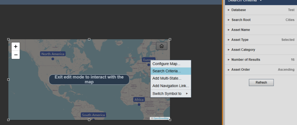
After that, the assets will be automatically loaded and display on the map.
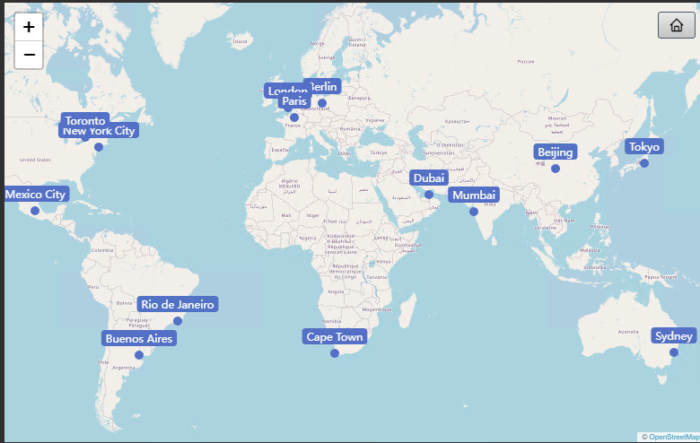
Configure map provider
The Map+ control supports a number of different map providers, most of them free to use:
- Open Street Map
- Carto
- Open Topo Map
- Arc GIS (Esri)
- WikiMedia
- Map Box (Paid)
With the exception of Map Box, all of them are free to use. Map Box is a paid map provider, that requires an access token to use. The advantage of this is higher quality maps.
Configure series
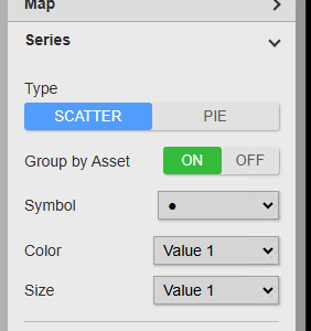
The Map+ control supports two different types of series: Scatter and Pie. Scatter will show symbols like circles or rectangles for each data point, whereas Pie will show an actual pie chart on the map.
Scatter Pie
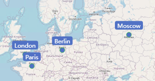
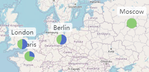
- Symbol: Change the symbol of the grouped assets. If attribute is selected, it will use the underlying values symbol type. You can then configure the values for the marker type in the attribute configuration section:
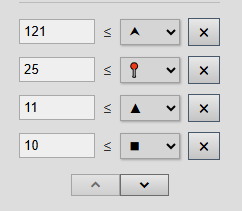
- Color: Choose the attribute to take the color from or select custom to use a custom color. You can for example enable multi-state for an attribute and then choose to use this color for the grouped dot.
- Size: Same as for the color. Choose which attributes size to use for the grouped asset dot.
- Border: Adjust Color and Width of the scatter borders.
- Show No Data: Whether to show data points that have bad or no data.
Configure data labels
In this section, you can show or hide the individual data labels. You can also decide how the labels are displayed: Show the name, value and/or asset.
- Show Name/Value/Time: Show or hide the individual data points information
- Position: For the data label position, you can choose from three different options:
- Auto: This will try to automatically align the data labels for the best position possible (recommended)
- Custom: Allows you to define a direction (left, right, top, bottom) where the data label should be displayed.
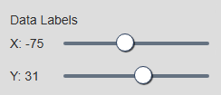
- Fixed: In this setting, you can adjust the data label position yourself. In the Asset Configuration you will see a Data Label Position and two sliders for the X and Y Position, moving those will move the data label to this position.
Configure clustering
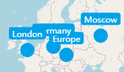
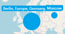
If many points are very close to each other, it often makes sense to cluster them together to get a better picture of the chart. Fore example, consider the following data points. After enabling clustering, they will start to show as a single (bigger) dot:
Clustering Off: Clustering On:
You can configure how and when these dots are clustered together:
- Threshold: The actual proximity threshold of the dots. This decides at which point the start to cluster together.
- Aggregation: When data points are clustered together, choose which aggregation type to use. For example if Mean is selected, the new dot will represent the mean value of all clustered dots.
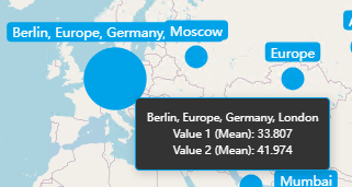
- Dynamic Size: Enable if you want the clustered dots to be bigger than the non-clustered dots.
- Factor: The size factor for bigger clustered dots.
- Symbol: The symbol to use for clustered dots. Inherit will use the configured symbol for the first value attribute. By selecting a different symbol, you can show different symbols for clustered dots.
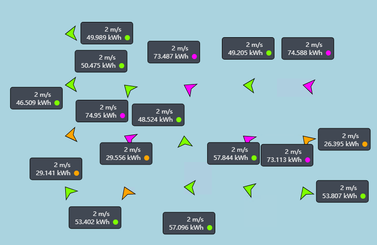
- Rotation: Choose the attribute from which to pick the rotation value from. Allows you to set wind directions for example. Only available if the symbol type is set to Arrow. See an example screenshot of wind directions below:
Configure interactivity
In this section, you can configure what happens when a user clicks a data point on the map. Choose between the following actions:
- Ad Hoc Chart: This will open an adhoc chart with the clicked data points (default).
- Set asset context: Clicking an asset on the map will change the asset context of the current display.
- Open hyperlink: Opens a hyperlink with the selected asset as the context. Choose between Custom or Attribute. Before enabling attribute, create a new attribute on the asset of type URL Builder, and set the URL to open in the attribute. Next, select the newly created attribute in the Url dropdown.
Configure views
The Map+ symbol allows you to define a different set of views for the user to choose from, and also configure the default view when opening the display.
To change the default view, set the Mode to Custom, move the map to the desired position and click Save Current View.
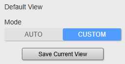
Next time the display is opened or the user clicks the home button, this view will not automatically be applied.
Additionally, you can configure a set of views for the users to choose from. Add a new View by clicking the + Button. Then move the map to the desired position and click the apply icon.
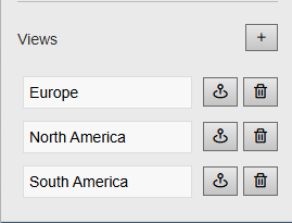
This will then create a set of buttons in the map, that allows the users to quickly jump between different locations.
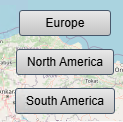
Automatically move between views
If you want the map to move automatically between multiple locations, you can enable Auto View Cycling. If this setting is enabled, the map will automatically move between your configured locations. The following settings are available:
- Start on Load: Whether to start the animation when the display is loaded
- Time per View: Time in seconds for how long to wait at a certain view point
- Animate: If enabled, the map will slowly move to the next location. If disabled, it will display the next location instantly.
- Transition Time: If Animate is enabled, this time in seconds define how long the camera will travel from one view to another.
- Buttons: Show/hide the view buttons for the user.
Configure attributes
In this section, you can configure which attributes to show, and their respective settings. By clicking the up and down arrow button, you can add new attributes or remove existing attributes. Each attribute can be configured in the following ways:
- Value: Choose which value to display. Current will display the last value. The other value types calculate the displayed value with respect to the current display time range. For example, Average will calculate the average value during the display time range.
- Hidden: Whether to hide that attribute from data labels and tooltips. Useful for when you need to use it’s multi-state color, but don’t want to display the actual value.
- Color: Change the color of the dots. Will be overridden if multi-state is enabled.
- Symbol: The symbol to use.
- Size: Choose between relative and fixed. Relative will adjust the size of the dot in relation to the current value and the value range. So bigger values will show bigger dots. Fixed will set a fixed size for each dot.
- Opacity: Change the opacity of the dot
Configure multi-state
The map symbol also supports multi-state. To enable multi-state, right-click the symbol and select Add multi-state. The dots will then be colored by the current multi-state range. For clustered dots, multi-state also applies.
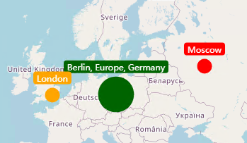
If you have multiple values grouped by asset, you can select the multi-state color from the desired attribute by changing the Color Value of the series configuration. If multi-state is enabled for Value 1 and Value 1 is selected for the color, the groudped dot will show that color:
Configure lines
The map allows you to display lines with data and colors between your asset locations. This allows you to visualize power lines or pipelines for example.
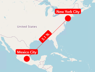
To do that, you first need to add a new line by clicking the + button. Afterwards, you can configure how and where the line is displayed:
- Name: The name of the line
- Start: The asset start location
- End: The asset end location
- Size: The width of the line
- Opacity: The opacity of the line
- Style: Choose between solid, dash or dotted.
- Value: Choose which attribute to use for displaying the value.
- Type: The calculation type for the value. The line will use the values of the start and the end asset to calculate the value. For example, if average is selected, the value of the line will be the average of the start and end assets value.
Add map files
The map allows the display of standardized map files like .kml, .gpx and .geojson. You can click the upload button and selected your file, to display your map data.
Filtering
Map+ receives asset Master filters and Linked inputs. Set the marker action to Filter to publish a marker's canonical asset. Selecting a cluster publishes one deduplicated value set for the assets represented by that cluster. Navigation, asset-context, ad-hoc, and Filter actions are mutually exclusive.
The filter indicator is placed away from the native map controls and can clear a selection owned by the map. See Filtering dashboards for channel and identifier configuration.
Troubleshooting and limitations
- Check: If tiles or markers are missing, check network access, provider credentials, coordinates, and asset search criteria.
- Check: External map availability and usage limits depend on the selected provider.



