



Vision Library+ / Charts and analytics
Control Chart+
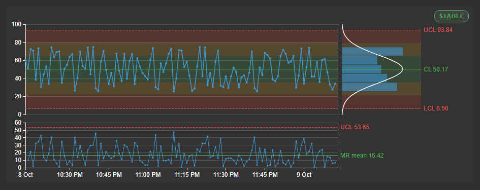
Control Chart+ shows whether a process is in statistical control. It plots one measured value against control limits, marks the points that break a rule, and states in a badge whether the process is stable. With specification limits it also reports the capability indices Cpk and Ppk.
Overview
Control Chart+ shows whether a process is in statistical control. It plots one measured value against control limits, marks the points that break a rule, and states in a badge whether the process is stable. With specification limits it also reports the capability indices Cpk and Ppk.
When to use it
Use this symbol when you need to:
- See whether a process stays within its normal spread, and catch a shift or trend before a value reaches an alarm limit.
- Compare today's process with a period you know was normal.
- Show control limits that your AF model or quality system already stores.
- Check how well the process meets its specification with Cpk and Ppk.
- Chart the mean and spread of subgroups of fast data with an X-bar-R or X-bar-S chart.
- Replace a ProcessBook SQC chart.
Choose Combo Chart+ to trend several values together, or when a line is a fixed alarm limit and not a statistical control limit. Choose Histogram+ to see the distribution of a value.
Important: Control Chart+ checks the rules only while a display that contains it is open. It does not alert anyone. Use AF analyses and notifications for alerting.
Migrating from ProcessBook SQC
| ProcessBook SQC | Control Chart+ |
|---|---|
| Individuals chart with a moving range chart | Chart type Individuals and moving range (I-MR), the default. |
| Western Electric rules | Rule set Western Electric. See Choose which rules to check. |
| Limits stored in the PI System | Limit source AF limit traits or Limit data sources. |
| Limits from a reference period | Limit source Baseline period. |
| Cp and Cpk | Capability > Specification limits. |
| X-bar and R, X-bar and S | Chart type X-bar and range (X-bar-R) or X-bar and standard deviation (X-bar-S). |
Before you begin
- Choose a PI Point or AF attribute with numeric values. It is the first data source and the measured value.
- Configure PI Web API for Vision Library+. The chart loads its own history instead of using the display data pump.
- For a baseline, know the start and end time of a period when the process ran normally.
- For limits from AF limit traits, the measured data source must be an AF attribute that has limit traits such as Target, Hi and Lo.
Add and set up the symbol
- Select Control Chart+ in the PI Vision symbol gallery.
- Drag the measured value onto the display, for example the Speed attribute of a production line.
- Right-click the symbol and select Configure Control Chart+....
- Under Control Chart > Limits, leave Limit source on Baseline period.
- Enter Baseline start and Baseline end as absolute times of a normal period, such as
2026-10-06 08:00and2026-10-06 20:00. - Under Data Retrieval, leave Mode on Interpolated and Automatic Interval on.
- Close the pane. The chart shows the center line (CL), the upper and lower control limits (UCL, LCL), the histogram, the moving range chart and the status badge.
Common tasks
Calculate limits from a known good period
Use a baseline when you want to judge today's process against a period you trust. The limits stay fixed while the display time moves.
- Right-click the symbol and select Configure Control Chart+....
- Under Control Chart > Limits, set Limit source to Baseline period (1).
- Enter Baseline start (2) and Baseline end (3) as absolute times.
- Or set the display time to the good period and select Use current time range (4). The button copies that period into both fields.
- Set the display time to the period you want to monitor.
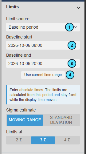
The limits do not move when the display time changes. A relative time such as *-1d is not accepted: the badge then says No baseline: limits from the visible window.
Use limits stored in the PI System
Use stored limits when your AF model or an AF analysis already defines what normal is.
- Make sure the measured data source is an AF attribute with limit traits.
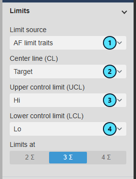
- Under Control Chart > Limits, set Limit source to AF limit traits (1).
- Choose the trait for Center line (CL) (2), Upper control limit (UCL) (3) and Lower control limit (LCL) (4). The defaults are Target, Hi and Lo.
- Set Limits at to the number of sigma your stored limits represent.
The chart draws the stored limits (1), and the badge (2) counts the points that break a rule. A limit that changed during the time range appears as a step. In this example the stored Hi and Lo are tighter than the normal spread of the process, so most points are marked red.

To read limits from PI Points or other attributes instead, see Limit data sources under Limits.
Add specification limits and read Cpk and Ppk
Use capability when the product has a specification and you need to know whether the process meets it.
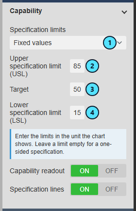
- Under Control Chart > Capability, set Specification limits to Fixed values (1).
- Enter Upper specification limit (USL) (2), Target (3) and Lower specification limit (LSL) (4) in the unit the chart shows.
The chart shows the Cpk and Ppk box (1) beside the badge, and draws the USL (2), Target (3) and LSL (4) as purple lines. The value is green at 1.33 or more, orange from 1.00 to 1.33 and red below 1.00. Here the process is stable but not capable: its normal spread is wider than the specification.
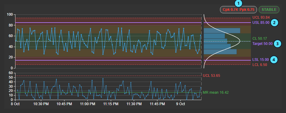
Chart subgroups of fast data
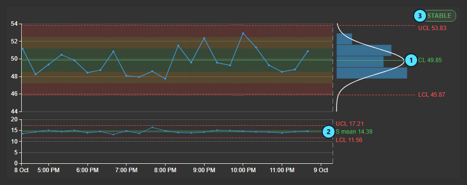
Use an X-bar chart when the value changes many times per interval. Each point is the mean of all values in an interval, and the lower chart shows the spread within it.
- Under Control Chart, set Chart type to X-bar and standard deviation (X-bar-S).
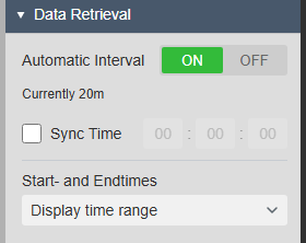
- Under Data Retrieval, leave Automatic Interval on. The pane shows the interval in use, such as Currently 20m.
- To make a subgroup match a shift or a batch, switch Automatic Interval off and set Interval.
The upper chart plots one subgroup mean per point against its limits (1). The lower chart (2) shows the standard deviation of each subgroup against its own limits, and the badge (3) covers both charts. For hundreds of values per interval, X-bar-S estimates the spread better than X-bar-R.
Choose which rules to check
Use the Western Electric set to check fewer patterns, or Custom to switch single rules on or off.
- Under Control Chart > Rules, set Rule set (1) to Nelson (all 8), Western Electric or Custom.
- With Custom, change a run length under Points, or Count and Window for rules 5 and 6 (2).
- Switch a rule off with its OFF button (3).
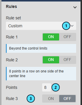
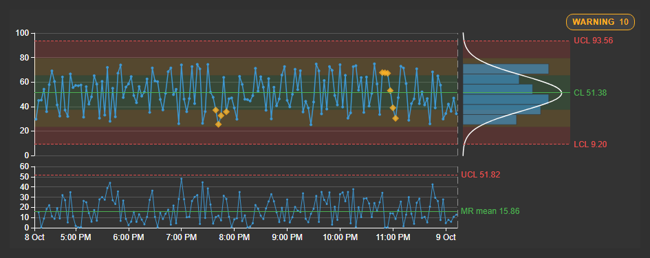
Fewer rules mean fewer markers. On the same data, Western Electric showed a STABLE badge where Nelson (all 8) showed WARNING 6. The rules are listed under Rules.
Use the symbol
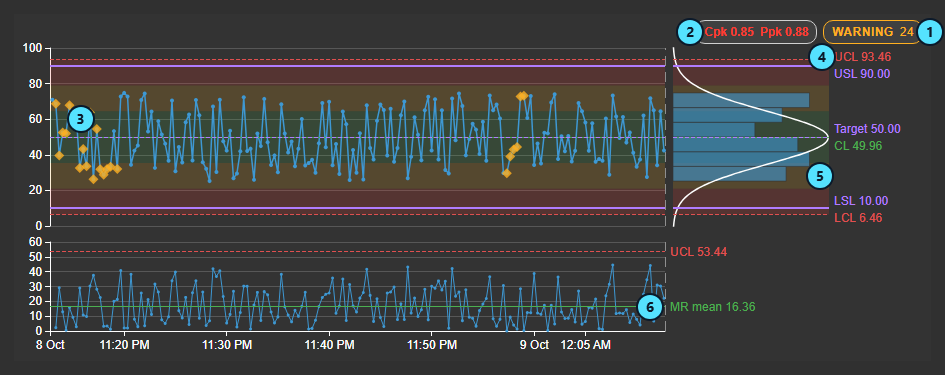
| What it shows | |
|---|---|
| (1) | The status badge: STABLE, WARNING, VIOLATION or NO LIMITS, followed by the number of points that break a rule. |
| (2) | Cpk and Ppk for the visible time range. Shown when specification limits are set. |
| (3) | A rule marker. Red marks a point beyond the control limits. Orange marks a point in any other rule pattern. |
| (4) | The upper control limit, center line and lower control limit with their values. |
| (5) | The histogram of the plotted points with a normal curve. It uses the same value scale as the chart. |
| (6) | The moving range chart: the difference between each point and the one before it, with its mean. |
What the limits and the badge tell you
- Control limits show how much the process normally varies. They are not alarm limits and not specifications. A point beyond them means something other than normal variation acted.
- Zones divide the space between the limits: zone C is within 1 sigma of the center line, B is 1 to 2 sigma and A is 2 to 3 sigma. Rules 5 to 8 look for patterns in these zones.
- WARNING means a pattern was found but no point is beyond the control limits. VIOLATION means at least one point is.
- Stable is not the same as capable. Control limits describe what the process does. Specification limits describe what it must do. Cpk measures the spread from the process mean to the nearer specification limit. Ppk does the same with the overall spread, including drifts. A Cpk far above Ppk means the process drifted during the period.
The chart plots one sample per interval, not every recorded value, because limits and rules need evenly spaced samples. To see every spike, use an X-bar chart or a trend beside the chart.
Interactions
- Hover a point to see its time, value, the limits in force and the rules it breaks. Hover the badge to see each rule that fired. Hover the capability box to see Cp, Pp and the specification limits.
- Zoom with the mouse wheel. Drag to pan, or to zoom into an interval in Box zoom mode. The toolbar at the top right of the plot offers Pan, Box zoom, Zoom In, Zoom Out, Reset Zoom and Clear rulers.
- Click the plot to place ruler A, and click again for ruler B. The chart shows the values at each ruler. Drag a ruler's handle to move it. Rulers are not saved.
- With Apply to Display Time on, zooming and panning change the time range of the whole display. The display follows a moment after your last wheel step or button click, and a pan applies when you release the mouse button. Zooming never recalculates the limits, the rules or the capability.
- Hover and rulers are shared with other time-series charts on the display, such as Combo Chart+.
Bad values and system states such as Calc Failed are left out and leave a gap. No action in the chart writes data to the PI System.
Configure the symbol
The pane has seven sections: Control Chart (what the chart calculates), Trend Options (how it looks), Axes, Data Retrieval, Time Bar, Interactivity and the data sources section.
Chart type
| Setting | What it does |
|---|---|
| Chart type | Individuals and moving range (I-MR), the default, plots one value per point with a moving range chart. X-bar and range (X-bar-R) and X-bar and standard deviation (X-bar-S) plot one subgroup per Data Retrieval interval. See Chart subgroups of fast data. Use X-bar-R for short intervals or sparse values. |
On an X-bar chart, the subgroup size n is the number of good values in the interval. An interval with fewer than 2 good values, or fewer than Minimum subgroup size, is drawn but not counted for the limits, rules or capability. When n varies, the limits are drawn as steps. Only rule 1 is checked on the lower chart.
Limits
| Setting | What it does |
|---|---|
| Limit source | Where the center line and control limits come from. Baseline period is the default. See the next rows. |
| Baseline period | Calculates the limits once from Baseline start to Baseline end, sampled like the trace. Absolute times only. Use current time range copies the chart's current range into both fields. See Calculate limits from a known good period. Until a usable baseline exists, the limits come from the visible time range and the badge says so. |
| AF limit traits | Reads the limits from the limit traits of the measured AF attribute. Choose a trait for Center line (CL) (default Target), Upper control limit (UCL) (Hi) and Lower control limit (LCL) (Lo). See Use limits stored in the PI System. |
| Limit data sources | Reads the limits from further data sources of the chart. In the data sources section, set each one's Role to Center line (CL), Upper control limit (UCL) or Lower control limit (LCL). A data source you drop takes the first free role, so check the roles. With two data sources of the same role, the first one is used. The limit at a point is the last good value at or before it. |
| Visible window (exploratory) | Calculates the limits from the displayed time range, so they change with it and a shift inside the window widens them. Use it for a first look, then set a baseline. |
| Sigma estimate | Moving range (default) uses the mean moving range divided by 1.128: short-term variation, the usual choice for individuals. Standard deviation uses all counted values and grows when the process drifts. Available for Baseline period and Visible window on the individuals chart. |
| Limits at | The control limits at 2, 3 (default) or 4 sigma. With stored limits it states how many sigma they represent. |
| Minimum subgroup size | An interval with fewer good values is drawn but not counted. Default 1; X-bar charts need at least 2. Available with Interval average and on X-bar charts. |
With stored limits and no center line, the chart uses the midpoint of UCL and LCL. With only one of them, the other is mirrored around the center line. A point without valid limits is not checked. Sigma zones are drawn only while the limits stay the same over the whole time range.
Rules
| Setting | What it does |
|---|---|
| Rule set | Nelson (all 8) is the default. Western Electric checks rules 1, 2, 5 and 6, with rule 2 at 8 points. Custom lets you switch each rule on or off and change its run length. |
| Points, Count, Window | Run lengths of a custom rule. Available when Rule set is Custom. |
| Rule | A point is marked when |
|---|---|
| 1 | It is beyond the control limits. |
| 2 | It is one of 9 points in a row on the same side of the center line. |
| 3 | It is one of 6 points in a row that steadily increase or decrease. |
| 4 | It is one of 14 points in a row that alternate up and down. |
| 5 | It is one of 2 out of 3 points in a row beyond 2 sigma on the same side. |
| 6 | It is one of 4 out of 5 points in a row beyond 1 sigma on the same side. |
| 7 | It is one of 15 points in a row within 1 sigma of the center line. |
| 8 | It is one of 8 points in a row beyond 1 sigma on either side, with none within 1 sigma. |
A gap ends every run. A point exactly on the center line is on neither side.
Capability
| Setting | What it does |
|---|---|
| Specification limits | Where the USL, LSL and target come from. None (default) hides the readout and the lines. AF limit traits: USL defaults to HiHi, Target to Target and LSL to LoLo. Limit data sources: set each data source's Role to Upper specification limit (USL) or Lower specification limit (LSL); there is no target role. Fixed values: enter the numbers. A specification may be one-sided, and the target is optional. |
| Capability readout | Shows the Cpk and Ppk box. On by default. Available when Specification limits is not None. |
| Specification lines | Draws the USL, LSL and target lines. On by default. Available when Specification limits is not None. |
| Index | What it tells you |
|---|---|
| Cp | How many times the process spread fits into the specification width if the process were centered. Needs both limits. |
| Cpk | The same, measured from the mean to the nearer limit. With one limit it uses that limit. |
| Pp, Ppk | Like Cp and Cpk, but from the overall spread, which includes drifts and shifts. |
| Cpm | Like Cp, with the distance between the mean and the target. Shown only with a target. |
The indices use the points of the visible time range, so they follow the display time range whatever the limit source is. With Interval average or on an X-bar chart they use all the values in the counted intervals, not the averages. The box says No capability, with the reason, when the range holds fewer than 10 counted points, the values do not vary, no specification limit has a value or the USL is not above the LSL, or a stored specification limit changes within the range.
Display
| Setting | What it does |
|---|---|
| Moving range chart (R chart or S chart on an X-bar chart) | Shows the lower chart. On by default. Off, the upper chart takes the full height. A hidden R or S chart is not checked against its limits. |
| Sigma zones, Opacity | Shades zones A, B and C. On by default. |
| 1 and 2 sigma lines | Adds dotted lines at 1 and 2 sigma. Off by default. |
| Line Style | SOLID or DASHED control limit lines. Default DASHED. |
| Status badge | Shows the badge. On by default. |
| Format | The number format of labels and the tooltip. |
| Trace, Center line, Control limits, Violation, Warning | Colors of the trace, center line, limit lines, rule 1 markers and markers of the other rules. The violation and warning colors also shade zones A and B. |
Histogram
| Setting | What it does |
|---|---|
| Show, Normal curve | Show the histogram beside the upper chart and the normal curve over it. On by default. |
| Histogram width (%) | 10, 15, 20 (default), 25 or 30 percent of the plot width. On a symbol too narrow for it, the histogram is left out. |
| Binning rule | Freedman-Diaconis (default), Sturges, Scott or Manual, as in Histogram+. Manual uses Number of bins, from 1 to 100. |
Title, Style, Tooltip, Grid and Toolbar
| Setting | What it does |
|---|---|
| Title, Sub Title | Show a title and subtitle. |
| Style | Theme, surface, container style, font size and font. |
| Tooltip | Turns the tooltip on or off and sets the pointer. |
| Grid | Grid lines, bands and border, as on the other charts. |
| Show Toolbar, Reveal | Show the toolbar. On Hover shows it while the pointer is in the chart. Always keeps it visible above the plot. |
Time Scale and Value Scale
| Setting | What it does |
|---|---|
| Time Scale | Show, Position (Bottom or Top), Title, Labels (Scale or Range), Format (Timestamps, Relative or Offset from Start Time), Fit Data and Datetime Format. Both charts share one time axis. |
| Label Position | Outside or Inside the plot for the value labels of both charts. |
| Show, Invert Scale, Title, Ticks | Show, invert, title and tick control of the upper value axis. |
| Scale Range | Auto widens the scale to show the control limits. Custom fixes Minimum and Maximum, each with its own Auto box, in the unit shown. Anything outside is cut off at the plot edge but still counted by the limits and rules. When Minimum is not below Maximum, the scale stays automatic. The lower chart always scales automatically. |
Data Retrieval and Time Bar
| Setting | What it does |
|---|---|
| Mode | Interpolated (default): one interpolated value per interval, for continuous values. Recorded: every archived value, up to 20,000, for sparse values such as lab results. Interval average: one average per interval, for fast and noisy values. Not used on an X-bar chart. |
| Automatic Interval | On by default with Interpolated and on X-bar charts. Chooses a round interval for about 200 points (30 subgroups on an X-bar chart) over the time range. Off, you set Interval. |
| Interval, Sync Time | Fixed interval, and an optional start of the interval grid. The default grid starts at midnight in the display time zone. |
| Start- and Endtimes | Display time range, Custom time range or Duration and offset. |
| Time Bar > Enabled | Adds the shared Time Bar. It offers no interval: the interval always comes from Data Retrieval. |
Interactivity
| Setting | What it does |
|---|---|
| Enable Zoom | Turns on wheel zoom, the drag modes and the zoom buttons. On by default. |
| Drag mode | PAN (default) or BOX ZOOM. |
| Apply to Display Time | Zoom and pan change the time range of the whole display. On by default. Available when the chart follows the display time. |
Data sources
The first data source is the measured value. Further data sources are never plotted. They are read only as limits through their Role. The list offers only the roles the chart reads with the current settings. A role of None is not used.
Troubleshooting and limitations
| Symptom | Cause | What to do |
|---|---|---|
| The badge says No baseline: limits from the visible window. | No baseline is set, the times are relative, or the end is not after the start. | Enter absolute start and end times, or select Use current time range. Except with Recorded, the baseline must also be at least one interval long. |
| The badge says NO LIMITS. | Fewer than two good points, or values that never vary. | Read the reason on the badge. Choose a longer time range or interval. With stored limits, check that they have values in the range. |
| AF limit traits shows no limits. | The measured data source is a PI Point, or the traits are not set. | Use an AF attribute with limit traits. |
| The chart stays empty. | A fixed interval over more than 20,000 intervals, or an interval longer than the time range. | Choose a longer time range or a different interval, or switch Automatic Interval on. |
| Rules 2 to 8 fire almost all the time. | The interval is too short, so consecutive values are not independent. | Switch Automatic Interval off and choose a longer interval, or use Interval average. |
| The capability box says No capability. | Fewer than 10 points, no variation, or no specification limit. | Hover the box for the reason. |
| Points or limits are cut off. | Value Scale > Scale Range is Custom. | Set it to Auto or widen the range. |
| The histogram is missing. | Show is off, or the symbol is too narrow. | Turn Show on, widen the symbol or choose a smaller Histogram width (%). |
- Limitation: The chart checks rules only while a display is open and sends no alerts.
- Limitation: The chart has no legend and no data export. Values and limits are shown in the unit of their data sources.
- Limitation: Capability is calculated only while the specification limits stay the same over the visible time range, and sigma zones are not drawn while stored limits change within it.


