Vision Library+ / Tables and monitoring
AF Table+
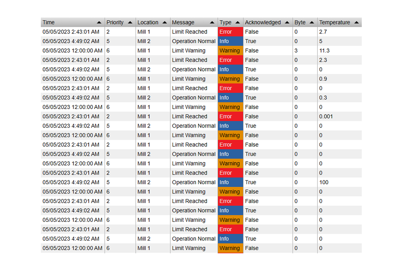
AF Table+ displays an AF table and can filter its rows by display time or attribute values.
Overview
AF Table+ displays an AF table and can filter its rows by display time or attribute values.
Watch the demo
See AF Table+ in a practical PI Vision workflow.
When to use it
Use this symbol when you need to:
- Present reference or configuration records from an AF table.
- Let operators filter table rows using the current display context.
Before you begin
- Configure an AF table with the columns the display requires.
- Confirm whether the selected table is read-only or supports writes.
Preparation
Before creating the symbol, open PI System Explorer and create the AF Tables you want to display.
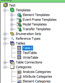
The symbol supports static tables, linked CSV files, and SQL tables.
- SQL Tables
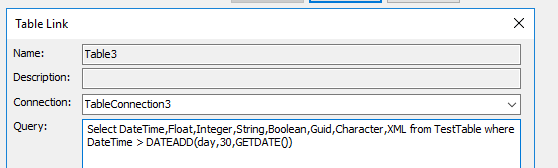
When linking SQL tables, use a database view or a dynamic query so that only the rows that need to be displayed are loaded.
The table's built-in filters operate on the client side only, so filtering data at the query level will significantly improve load performance.
For example, the query below filters the DateTime column to show only the last 30 days:
Important: The SQL decimal data type is not supported. If your table contains decimal columns, cast them to float (or another supported type) in the table link query settings.
Add and set up the symbol
- Select the symbol in the PI Vision symbol gallery.
- Add the required data sources or asset context to the display.
- Right-click the symbol and open its configuration pane.
- Configure the minimum data, range, and display settings for a useful result.
- Confirm that the symbol shows the expected data.
Use the symbol
Use the table controls to sort, filter, and, when write mode is enabled, edit supported values.
Configure the symbol
Overview and behavior
The AF Table+ symbol displays Linked AF Tables from PI System Explorer directly in PI Vision. It supports static tables, linked CSV files, and SQL tables.
Configuration
Use the Configuration pane to customise the symbol's visual style, columns, interactivity, and multi-state rules.
- Right-click the symbol and select Configure Table to open the configuration pane.
- Under Table, choose the AF Database source:
- data source: Uses the data source in position 1 for AF Table lookups. This option only works with attributes, but is recommended because the display can be migrated to other PI Vision servers.
- Custom: Lets you select a specific AF Server and AF Database. Note that displays configured in this mode cannot be migrated to another PI Vision server.
- Select the table to display by configuring the following properties:
- AF Server (custom mode only): The AF Server that hosts the database.
- AF Database (custom mode only): The AF Database that contains the linked AF Table.
- AF Table: The specific table to display, as configured in PI System Explorer.
- Optional: under Query Parameters, pass values to a parameterized AF Linked Table query.
The matching parameters and SQL predicates must already be configured on the Linked Table in PI System Explorer. AF Table+ supplies parameter values; it does not create or modify SQL. Parameter names must exactly match the Linked Table names and begin with @.
Supported value sources are:
- Display Start Time: Sends the PI Vision display start as a canonical ISO timestamp.
- Display End Time: Sends the PI Vision display end as a canonical ISO timestamp.
- Custom: Sends the saved text exactly as entered, including an empty value.
- Data Source: Sends the current raw scalar value from the selected AF Table+ data source.
For example, configure @StartTime with Display Start Time and @EndTime with Display End Time when the Linked Table SQL query uses those parameters to limit its production rows. Parameterized AF tables are always read-only in AF Table+, even if Write mode was previously selected. Removing all query parameters restores the saved mode.
Before deployment, confirm that the target PI Web API server's own Table GetData help page lists the parameters URL argument. Availability depends on the installed PI Web API version.
Query Parameters filter at the AF/SQL server before rows are returned. The existing DateTime, Basic, Advanced, and column filters remain client-side filters and apply only after the server result reaches AF Table+.
When resolving a table relative to a data source, an unavailable table clears the displayed rows and reports a load error. AF Table+ does not fall back to a table from the previous asset context.
- Under Columns, configure which columns to display and how each one appears.
- Show: Toggles visibility of the column.
- Label: Override the default column header label with a custom name.
- Alignment: Sets the text alignment within the cell - Left, Center, or Right.
- Filter (DateTime columns only): Enables time-range filtering on this column. When active, the table rows are filtered to match the current display time range.
- Number Format (numeric columns only): Specifies the display format for numeric values.
The following options are only available when the table is in Edit mode:
- Allow Edit: Controls whether this column is editable when the table is in Edit mode.
- Input Type: Select Text Input for a free-text field, or Dropdown List to restrict entries to a predefined set of values.
- Under General, configure settings that apply to the table as a whole.
- Mode: Sets the table to Read or Write mode. Write mode lets users edit and save data back to the table, but is only supported for static tables - SQL tables are read-only.
- Auto Reload: Reloads the table periodically. It is on by default and reloads every 1 minute; use Reload Every to choose another interval. The shortest effective interval is 5 seconds, because the table can only reload on a PI Vision data update.
The interval only controls the periodic refresh. The table always reloads immediately - whatever the interval, and also when Auto Reload is off - when the display time range changes, the selected asset changes, the configured AF table changes, a query parameter value changes, or the configuration is saved. Users can also reload on demand with the Reload button in the table toolbar. Turn Auto Reload off for tables whose contents do not change on their own, such as static tables and linked CSV files; leave it on for SQL-backed Linked Tables whose rows change over time.
- Layout: Controls how column widths are sized. Choose from three modes:
| Manual | Columns can be resized manually and the widths are saved. |
| Fit Data | Each column is sized to fit its content. |
| Fit Table Width | Columns are stretched to fill the full table width. |
- Range Selection: Enables selecting a range of cells to copy and paste.
- Column Headers: Toggles the visibility of column header labels.
- Column Filters: Shows or hides per-column filter inputs, allowing users to filter table data interactively.

- Right to Left: Displays all table text in right-to-left reading order.
- Wrap Text: When enabled, long text wraps onto the next line; when disabled, overflow is clipped.
- Paging: Choose between paginated pages or continuous scrolling when the row count exceeds the table height.
- Auto Focus Row: When enabled, the table automatically scrolls to the first or last row after each data load.
- Under Filter, configure pre-defined filters for the table.
- Enabled: Activates or deactivates all pre-configured filters.
- Mode: Selects between Basic and Advanced filter modes (see below).
Basic filter mode
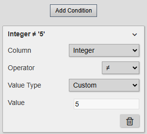
Basic mode lets you define pre-configured filter conditions. For each condition, select the column, operator, and value type. Use Custom to filter against a fixed value, or data source to filter against a live attribute value. For details on attribute filtering, see Filter table by attribute values below.
All configured conditions must match, including multiple conditions on the same column. Basic and Advanced attribute filters re-evaluate the cached rows on data updates even when Auto Reload is off, without fetching the table again. Pending table edits are preserved and are not re-filtered automatically.
Click Add Condition to add a new filter condition.
Advanced filter mode
Data source references such as '[1]' follow their attributes when you reorder the symbol's data sources. This applies to both the saved expression and any unapplied expression in the editor. Deleting a referenced data source changes its reference to '[0]'. The filter then hides all rows and reports the invalid reference until you replace it with a valid reference and apply the expression. Existing saved expressions are not automatically corrected on load because the original intended attribute cannot be recovered from a positional reference.
Advanced mode supports complex filter expressions. Examples:
ColumnInt > 5 and ColumnString == "Info"
ColumnBool == 1 or ColumnFloat >= 0.25
Each expression follows the pattern: column name, operator, value.
To filter against a data source attribute, reference it by index - '[1]' for the first data source, '[2]' for the second, and so on. Examples:
ColumnInt > ‘[1]’
ColumnString == ‘[2]’
Note: ColumnInt and ColumnString are placeholder names used in these examples - replace them with your actual column names.
- Under data source, manage the data sources attached to the symbol.
Data sources attached to this symbol are used solely for attribute value filtering. If you are not using attribute filtering, any data source can be assigned.
- Under Style, choose a Theme and Container Style. Tables do not offer Surface because the table owns its header and row surfaces. See Themes and container styles.
- Custom: Provides controls for table colors, fonts, borders, and row and header heights.
- Copy/Paste Custom Style: A Custom style can be copied from one table and pasted onto another. Select Copy on the source table, select the target table, and then select Paste. This works across compatible Vision Library+ table symbols and across different displays.
Filter table by display time range
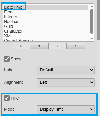
This feature requires a DateTime column in the table. That column's values are compared against the current display time range to filter rows. To configure it:
- Confirm that the column’s data type is DateTime or Date.
- In the Columns configuration, select the column and enable the Filter checkbox.
- Set the Mode to Display Time.
Filter table by attribute values
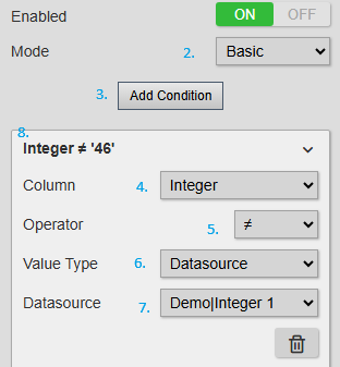
The AF Table+ symbol can filter table rows based on live attribute values. To set up an attribute value filter:
- Drag the attribute or PI point onto the table symbol.
- In the configuration pane, under Filter, enable filtering and set the Mode to Basic.
- Click Add Condition to create a new filter condition.
- Select the column to filter by.
- Select the comparison operator.
- Set the Value Type to data source.
- For the data source, select the attribute or PI point that was dragged onto the symbol.
- The configuration pane will display the completed filter condition.
multi-state styling
The multi-state section lets you color individual cells or entire rows based on their underlying data. For each column, choose from the following multi-state styles:
- Text: colors the cell's text based on the current state.
- Fill: colors the entire cell background based on the current state.
Apply to Row: Extends the current state's color to all cells in the row.
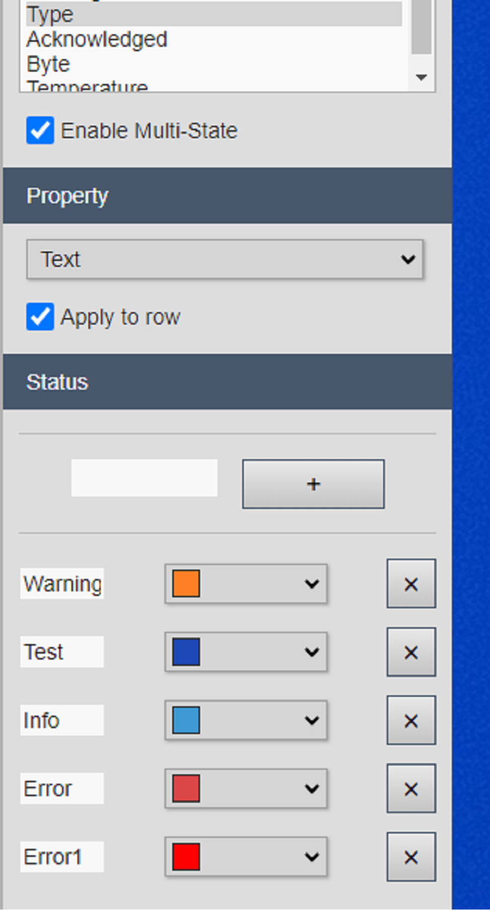
For String columns, wildcard characters are supported. For example: Search or test*
Troubleshooting and limitations
- Check: If no rows appear, confirm the AF table name, filter expression, and selected data source.
- Check: SQL-backed tables are read-only.