Vision Library+ / Gauges and process visualization
Linear Gauge+
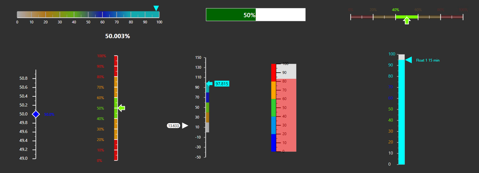
Linear Gauge+ shows one or more process values on a horizontal or vertical scale. Use markers or bars to show each value and add multi-state ranges when operators need to see the current operating band.
Overview
Linear Gauge+ shows one or more process values on a horizontal or vertical scale. Use markers or bars to show each value and add multi-state ranges when operators need to see the current operating band.
When to use it
Use Linear Gauge+ when you need to:
- Monitor one or more numeric values against a shared scale.
- Show whether a value is within a normal, warning, or alarm range.
- Compare related values in a compact horizontal or vertical layout.
- Present a value as a pointer or as a bar filled from the scale minimum.
Use Radial Gauge+ when a circular gauge is a better fit for the display. Use a trend when the operator needs to understand how a value changed over time.
Before you begin
- Prepare at least one numeric PI Point or AF attribute.
- Use data sources with compatible units and ranges when several values share the same scale.
- Configure PI Vision multi-state rules if the gauge should display operating ranges or change colors with the current value.
Add and set up the symbol
- Select Linear Gauge+ in the PI Vision symbol gallery.
- Drag one or more numeric data sources onto the display.
- Right-click the symbol and select Configure.
- Under Scale, select the orientation and choose an automatic or custom scale range.
- Under Trace Options, select each data source and choose Marker or Bar.
- If multi-state rules are enabled, configure the range bar and select the data source that should highlight the active range. Confirm that every value appears at the expected position on the scale.
Use the symbol
A marker shows the current value at a specific position on the scale. A bar fills the scale from its minimum to the current value.
When labels are enabled, the gauge can show the data source name, value, and unit of measurement. Hover over the gauge to show the configured tooltip.
If active-range highlighting is enabled, the range containing the selected data source's current value remains emphasized while the other ranges are dimmed.
Configure the symbol
The pane groups related settings into collapsible sections. Open only the sections you need; closing a section keeps its settings. Controls appear when they apply to the selected pointer or enabled feature. All settings remain available through these sections. Existing gauges retain their configuration when you open the pane.
Some configuration screenshots below show the earlier arrangement of the controls.
Title
- Show: Shows or hides the title.
- Text: Sets the title text.
- Font Size: Sets the title font size.
The title is always centered.
Appearance
Use General > Style to choose the theme, surface and outer container appearance. These settings control the common foreground and background, including ordinary scale and tick colors. A custom theme exposes its foreground, background and font controls. See Themes and container styles for the available choices.
Layout and range
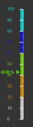
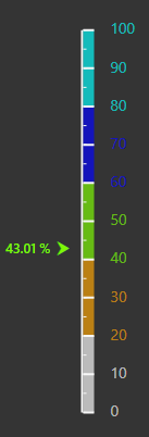
The Scale section opens with two groups: Range for the value range and Layout for the gauge arrangement.
Under Scale > Layout:
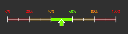
- Orientation: Arranges the gauge vertically or horizontally.
- Opposite: Moves the scale and its labels to the opposite side of the center line.
Under Scale > Range:
- Range: Uses an automatically calculated range or a custom minimum and maximum.
- Invert scale: Reverses the direction of the values along the scale.

Scale
- Show: Shows or hides the scale line.
- Width: Sets the scale-line width. Set the width to
0to hide the line while retaining the scale values.
Ticks
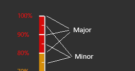
Major and minor tick marks can be configured independently.
- Tick spacing: Choose Automatic, Fixed interval, or Multi-state boundaries for major ticks.
- Show: Shows or hides the selected tick type.
- Auto: Calculates minor tick intervals automatically. Disable it to enter a fixed minor interval.
- Density: Adjusts the automatically calculated major tick spacing.
- Min / Max: Includes the scale endpoints when major ticks use range boundaries.
- Size: Sets the tick length.
- Position: Places ticks to the left, center, or right of the scale line.
Scale labels
- Show: Shows or hides numeric labels along the scale.
- Position: Places labels to the left or right of the scale line.
- Offset: Adjusts the distance between the labels and the scale line.
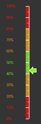
- Color: Uses the theme foreground or the color of each multi-state range. Range coloring requires multi-state rules.
- Units: Selects the unit of measurement displayed with scale values.
- Font size: Sets the label text size.
- Number format: Controls decimal places and numeric formatting.
- Opacity: Sets the label opacity.
Bar container
The optional container frames data sources displayed as bars. Its size adjusts automatically when the gauge contains several bar data sources.
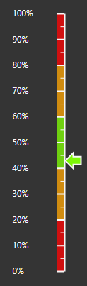
- Type: Selects None, Normal, Rounded, or Thermometer.
- Background: Sets the container fill color.
- Border width and color: Sets the container outline.
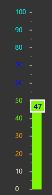
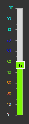
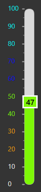
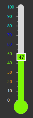
Multi-state range bar
This section is available when multi-state rules are enabled. The range bar uses the colors and limits from those rules; edit the range values in the PI Vision multi-state configuration.
- Show: Shows or hides the range bar.
- Position: Places the bar to the left, center, or right of the scale line.
- Start width and end width: Sets the width at each end. Different values create a tapered bar.
- Offset: Adjusts the distance from the scale line.
- Opacity: Sets the opacity of the range bands.
- Gradient: Blends adjacent range colors in horizontal orientation. Gradient and active-range highlighting cannot be enabled at the same time.
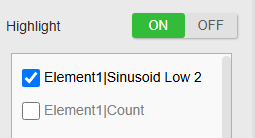
- Highlight: Emphasizes the active range and dims the other ranges.
- Highlight data source: Selects the data source whose current value determines the active range.


Tooltip
- Enabled: Turns the hover tooltip on or off.
- Name: Shows only the value or shows the data-source name with the value.
Data source value and display type
Configure each data source independently under Trace Options.
- Value: Displays the current value or a supported summary such as average, minimum, or maximum.
- Type: Displays the data source as a marker or bar.
Marker places an arrow or shape at the current value position.


- Marker type: Selects the marker shape.
- Size: Sets the marker size.
- Side: Places the marker to the left, center, or right of the scale line.
- Offset: Adjusts the marker's distance from the scale line. Use different offsets when markers overlap.
Bar fills from the scale minimum to the current value.
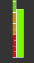
- Width: Sets the bar width.
Data source labels
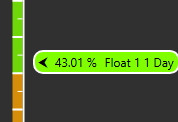
Each marker or bar can display its own text label.
- Show: Choose Off, Value, Name, or Name + Value. Turning the label off retains its text and appearance settings.
- Units: Shows or hides the unit of measurement.
- Font size: Sets the label text size.
- Bold: Uses normal or bold text.
- Background: Adds a background behind the label and enables a separate text-color setting.
- Position: Places the label to the left, center, or right of the marker or bar.

Data source style
- Color: Uses one custom color or the current multi-state range color.
- Opacity: Sets the marker or bar opacity as a percentage. Scale-label and range-band opacity also use percentages in the pane.
- Border color and width: Sets the outline around the marker or bar.
Examples
Show one value against operating limits
Use one marker, enable multi-state range bands, and turn on active-range highlighting. This configuration makes the current value and its operating state visible without using much display space.
Compare related values
Add related data sources that use compatible units and ranges. Give each marker a different offset or use separate bars so operators can distinguish overlapping values.
Data quality
Linear Gauge+ supports Stale warning. When any displayed live pointer is stale, the amber clock's tooltip identifies each affected data source.
See Data Quality for the timestamp rules, threshold guidance, supported symbols, and global override behavior.
Troubleshooting and limitations
- Range settings are unavailable: Enable multi-state rules for at least one data source before configuring range colors or the range bar.
- Markers or labels overlap: Increase the symbol size or assign different marker offsets and label positions.
- Values are difficult to compare: Confirm that the data sources use compatible units and that the custom minimum and maximum include every expected value.
- Highlight cannot be enabled: Disable Gradient. Gradient and active-range highlighting are mutually exclusive.
- A summary value is unexpected: Confirm the selected value calculation and the active display time range.