Vision Library+ / Charts and analytics
Gantt Chart+
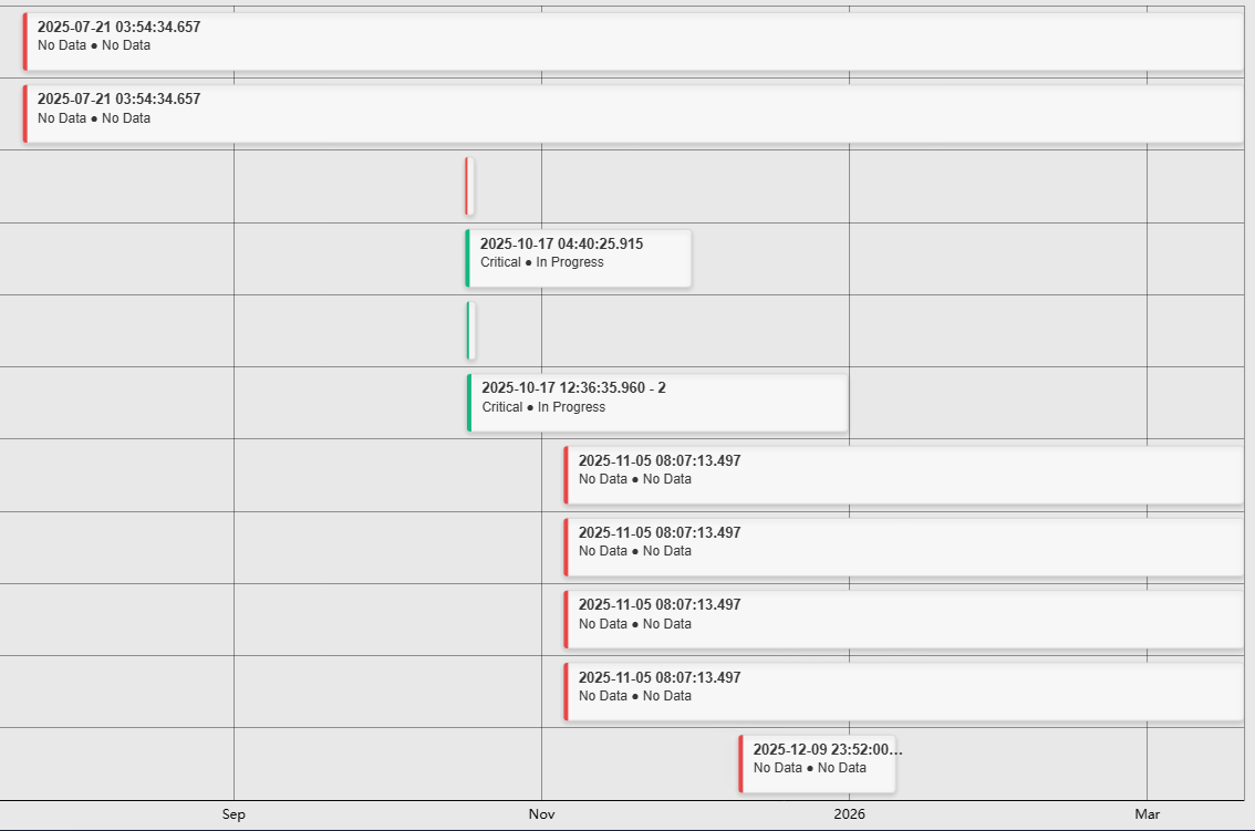
Gantt Chart+ displays event frames on a timeline so operators can compare duration, overlap, and sequence.
Overview
Gantt Chart+ displays event frames on a timeline so operators can compare duration, overlap, and sequence.
Watch the demo
See Gantt Chart+ in a practical PI Vision workflow.
When to use it
Use this symbol when you need to:
- Review process events, batches, shifts, or downtime on a shared timeline.
- Compare event duration and overlap across groups.
Before you begin
- Prepare an event-frame search with valid start and end times.
- Choose grouping fields that keep the number of lanes readable.
Add and set up the symbol
- Select the symbol in the PI Vision symbol gallery.
- Add the required data sources or asset context to the display.
- Right-click the symbol and open its configuration pane.
- Configure the minimum data, range, and display settings for a useful result.
- Confirm that the symbol shows the expected data.
Use the symbol
Hover over an event for details and select it to open the configured event action or details view.
The chart toolbar appears at the top right when the pointer or the keyboard focus enters the chart, and hides shortly after it leaves. Set Toolbar > Reveal to Always to keep it in view; the chart then keeps a band of its plot area free so the buttons never cover the plot. On a touch device the toolbar is always shown. The toolbar carries, in order: the drag-mode buttons Pan, Box zoom and Select, Zoom in, Zoom out, Reset zoom, Fullscreen and Download. The drag-mode buttons switch the mode for the person looking at the display only - the saved Drag mode in the Interactivity section is where the display starts each time it is opened. With Enable Zoom off the whole zoom group, the mode buttons included, is not offered; a saved Select drag mode still draws its measurement rectangle there.
Time bar
Gantt Chart+ supports the shared Time Bar for an independent Event Frame search range.
Configure the symbol
Overview and behavior
The Gantt Chart+ displays event frames on a timeline, with each row representing a group or individual event and each bar spanning the event's start-to-end duration. It is purpose-built for visualizing process events, shift patterns, and downtime in PI Vision.
Configure trend
Use the Configuration pane to customize the Gantt Chart+ symbol. The sections below cover title, style, legend, tooltips, bar appearance, data labels, and interactivity.
- Right-click the symbol and select Configure Gantt Chart to open the configuration pane.
- Common section - configures the chart headings:
- Title: Toggles the chart title on or off.
- Text: Sets the text displayed as the chart title.
- Style section - controls the overall visual appearance of the chart:
- Foreground: Sets the text color for the chart.
- Background: Sets the background fill color of the chart.
- Font Size: Sets the base font size for all chart text.
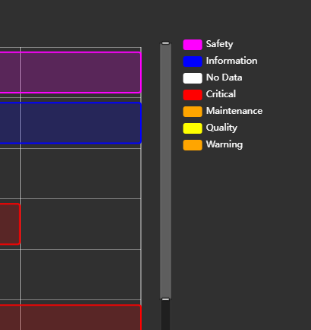
- Legend section - configures the chart legend. The legend shows all event frame groups with their assigned colors and series values. The displayed values reflect the configured Series property (see Configure Measures below).
- Enabled: Toggles the legend on or off.
- Position: Sets the legend position: Top, Left, Bottom, or Right.
- Alignment: Controls the text alignment of legend entries.
- Font Size: Sets the font size of legend text.
- Tooltip section - configures the hover tooltip shown when a user points at an event frame bar.
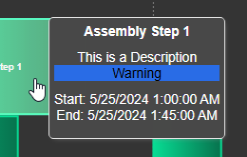
- Enabled: Toggles the hover tooltip on or off.
- Properties: Check or uncheck individual event frame properties to control what appears in the tooltip.
- Grid section - controls what is drawn behind the data: the grid lines, the shaded bands, and the border of the plot area:
- Show: Turns the grid on or off. When it is off, no grid lines or bands are drawn; the Border setting still applies.
- Lines: Selects which grid lines are drawn: None, Horizontal, Vertical, or Both. The names always describe the direction the lines run on screen. Gantt Chart+ plots horizontally, so Horizontal draws lines along the event rows and Vertical draws lines across the time axis.
- Bands: Draws alternating shaded bands across the plot area.
- Border: Bounds the plot area. Axes draws the two axis lines with their ticks, Frame draws a rectangle around the plot instead of the axis lines, and None draws neither. Grid lines drawn with Border set to None are dashed.
Grid line color and opacity are not settings; they follow the chart's foreground color and theme.
- Toolbar section - controls the chart toolbar described under Use the symbol:
- Show: Turns the toolbar on or off. Every button belongs to this switch, the drag-mode buttons included; with Show off nothing is drawn and no plot area is reserved. A newly placed Gantt Chart+ has the toolbar on; a display saved before the toolbar existed keeps it off until you switch it on.
- Reveal: Chooses between showing the toolbar on hover and showing it always. Always also reserves a band of plot area for it.
The toolbar's Download button opens a menu offering PNG, SVG and PDF pictures of the chart and CSV, JSON and XLSX files of the event frames behind it. The Export Data section further down the configuration pane writes the same three data files. Every export is named after the symbol and the time it was taken.
A data export writes one row per event frame the chart is showing, so any filter that shortens the chart shortens the file with it. Each row carries Name, Template, Asset, StartTime, EndTime, Duration, Severity, Acknowledged, AcknowledgedBy and AcknowledgedDate, plus Reason when the events' template declares one. An event still in progress has an empty EndTime, and an unacknowledged event has an empty AcknowledgedDate. Duration is the same text the chart shows. CSV and XLSX print the three times in your local display format - XLSX as real date cells - while JSON keeps raw ISO timestamps for downstream tools.
- Bars section - controls the visual style of the event frame bars:
- Color Mode: Individual assigns a single color to all bars. Series derives each bar's color from the configured Series grouping (see Configure Measures - Series).
- Bar Style: Choose the visual style of the bars:
- Modern

- Classic

- Card

- Radius / Height: Additional settings controlling bar corner radius and row height.
- Data Labels section - controls the labels displayed inside or on the event frame bars:
- Show: Toggles data labels on or off.
- Value Selection: Select any event frame property to display as a label, then click the + button to add it. Multiple properties can be shown simultaneously (e.g., Name, Attribute, Severity).
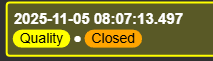
- Background: Sets the background fill color of the data label.
- Truncate Overflowing Text: When enabled, labels that do not fit within a bar are hidden rather than overflowing.
- Horizontal / Vertical Alignment: Controls the positioning of the data label within the bar.
- Title: When enabled, displays the property name alongside its value in the label.
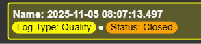
- Font Size: Sets the font size of the label text.
- Interactivity section - controls how the chart responds to user interactions:
- Enable Zoom: The master switch for zooming along the time axis. When it is off, the mouse wheel does not zoom, the Drag mode and Show Zoom Bar X rows are hidden, and the toolbar drops its zoom buttons.
- Drag mode: Chooses what happens when the user clicks and drags on the chart. This is the starting mode for the display; a viewer can switch modes from the chart toolbar without changing the saved setting.
- Pan: drags the chart left and right along the time axis.
- Box zoom: drags a rectangle across the time axis and zooms to it.
- Select: draws a measurement rectangle over the chart, showing the start, end and duration of the selected span. This was previously called "Range Selection".
- Show Zoom Bar X: Toggles a zoom navigation bar at the bottom of the chart.
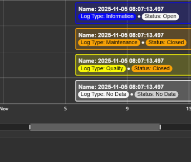
- Row Sizing Mode: Controls how rows are sized. Fit scales all rows to fill the available height. Fixed sets a minimum row height - if rows exceed the chart height, a vertical scrollbar appears.
- Event Select: Defines the action taken when a user clicks an event frame bar:
- Event Details: Takes the user to the event details page
- Open Dialog: Shows the event details dialog window.
- Apply Time Range: Wil apply the event frames time to the current display
- Editing: When enabled, users can edit event frame properties directly from the chart.
Configure measures
Arguments
Arguments define the Y axis rows. When Show Child Events is enabled, each row represents an individual event frame, and rows can be expanded or collapsed to show the hierarchy.
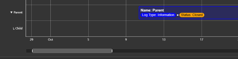
When Show Child Events is disabled, events are grouped by any basic event property or by a configured attribute.
Asset: Groups all event frames by their associated asset - each asset gets its own row.
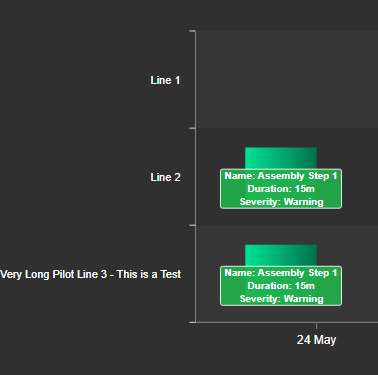
Other properties (e.g., Severity): Creates one row per unique value of the chosen property.
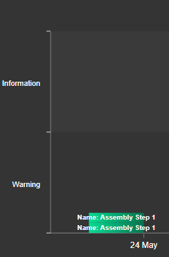
You can also group rows by a custom event frame attribute.
Series
The Series setting groups event frames by a shared property and assigns each group a color. Setting Series to Asset, for example, gives all event frames from the same asset the same color.
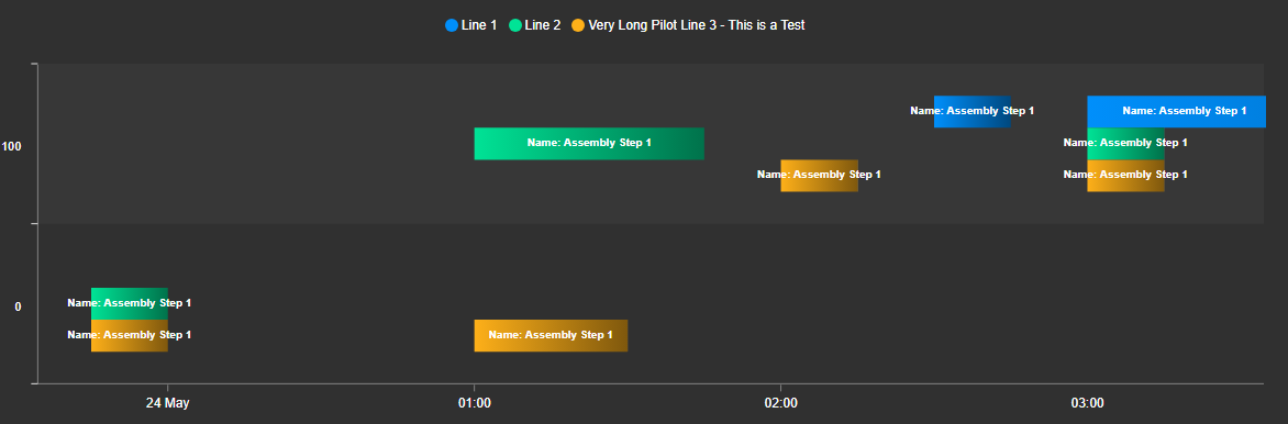
- Property: The event frame property used to define series groups.
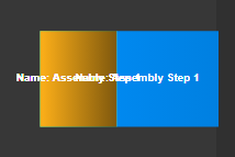
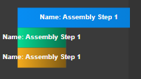
- Overlap: When enabled, bars from different series overlap each other instead of stacking side by side.
Overlap On Overlap Off
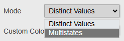
- Color Mode: Controls bar coloring. Distinct Values assigns a unique color to each series group. multi-state derives bar color from configured multi-state limits.
For multi-state color mode, you must (1) select an attribute for the Series property and (2) enable multi-state for that attribute first.
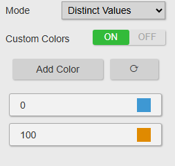
- Custom Colors: When Color Mode is set to Distinct Values, you can assign specific colors to each series value here.
Multi-state event frames
The Gantt Chart+ can color event frame bars based on the multi-state limits of one of their attributes, providing at-a-glance status coloring across the timeline.
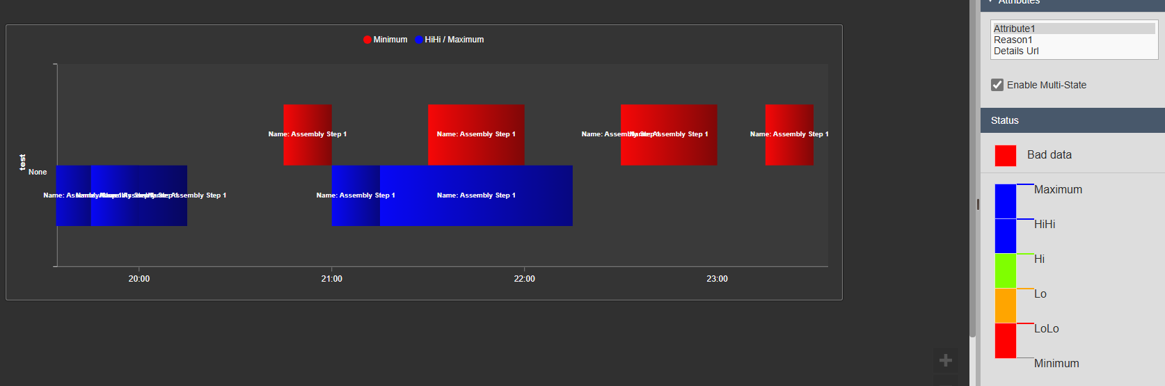
To configure multi-state coloring, follow these steps:
- Drag the actual event frame attribute onto the display, so it shows up in the attributes list.
- Right-click the Gantt Chart+ and select Add multi-state. Configure the limit thresholds and colors.
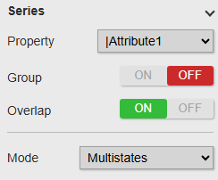
- In the configuration pane, navigate to Measures → Series and select the attribute created in step 1.
- Set Color Mode to multi-state.
Event frame details
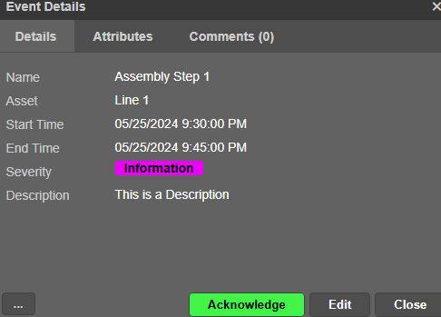
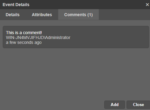
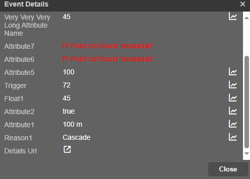
When the Event Select property in the Interactivity section is set to Open Dialog, clicking an event frame bar opens a details dialog. The dialog contains three tabs:
- Details
Displays the full information for the selected event frame. Users can also acknowledge or edit the event frame from this view.
- Comments
Shows all comments attached to the event frame. Users can read existing comments and add new ones.
- Attributes
Lists all attributes of the event frame and their current values.
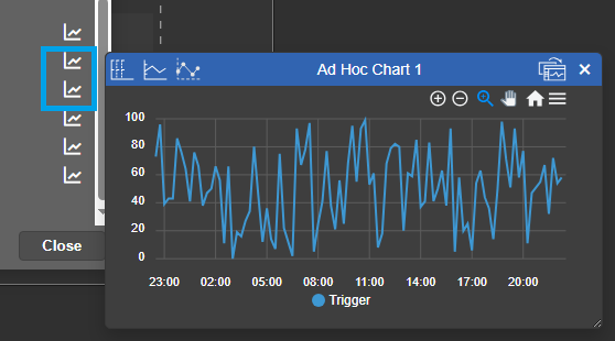
Click the chart icon next to any attribute to view a trend of its value over the event frame's duration.
Filtering
Gantt Chart+ receives Master and Linked filters. Under Filtering > Input, map a channel to a target Event Frame property. Incoming filters are applied to the loaded event population before measures, series, and chart rows are built. The symbol does not publish filters.
See Filtering dashboards for empty-channel behavior, strict type matching, and loaded-search limitations.
Troubleshooting and limitations
- Check: If an event is missing, check the search, time range, grouping, and event start and end values.
- Check: Dense or long event searches can make the timeline difficult to read.