Vision Library+ / Asset navigation and context
DateTime Picker+
DateTime Picker+ lets operators set the PI Vision display time range from a list of ready-made periods, a named list of ranges, the values of a data source, or a calendar.
Overview
DateTime Picker+ lets operators set the PI Vision display time range from a list of ready-made periods, a named list of ranges, the values of a data source, or a calendar.
When to use it
Use this symbol when you need to:
- Offer production periods such as days, shifts, weeks, or months as one selectable item each.
- Let operators pick a date or a date range without using the PI Vision time bar.
- Turn the recorded values of a data source into selectable periods, so each shift or batch becomes one item.
- Give a display its own start range every time it opens.
If operators only need to nudge the current range backwards and forwards, the standard PI Vision time bar is enough.
Before you begin
- Decide which periods the display needs, how long each one is, and which boundary it starts on.
- For Data source mode, prepare a PI Point or AF attribute whose values mark the start of each period, for example a shift name written at every shift change.
- To color those periods by status, configure a multi-state on the same data source.
- Periods, List, and Calendar mode need no data source at all.
Add and set up the symbol
- Select the symbol in the PI Vision symbol gallery.
- For Data source mode, drag the attribute that marks each period onto the display. The other modes need no data source.
- Right-click the symbol and open its configuration pane.
- In the Source group, select a Quick Start preset, or set Mode and the settings below it by hand.
- Confirm that selecting an item changes the display time range.
Use the symbol
Select an item to apply its range to the display. Every symbol that follows display time refreshes to that range, and the selected item stays highlighted.
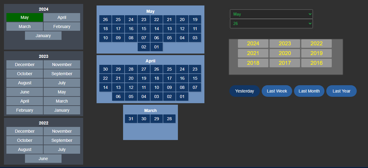
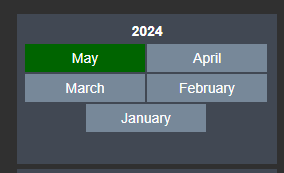
- In Buttons view every item is a button; in Dropdown view the items are offered in a combo box. With Group By set, a second combo box selects the group first.
- Navigation Arrows step to the previous or next item, or to the previous or next day in a single-date calendar. Stepping past either end does nothing.
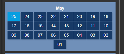
- In Calendar mode, selecting a date or a range applies it immediately. The reset button, the small clock beside the input, returns the display to the configured default range.
- A single-date calendar always mirrors the display start time, so the input keeps showing the day the operator picked even after another symbol or an asset switch changes the display time.
Configure the symbol
All settings are in one General panel, in five groups: Source, Selection, Behavior, Style, and Layout.
Quick Start
Quick Start, at the top of the Source group, is an action rather than a setting. Selecting an entry writes a complete, working combination of settings and returns to Select, so the same preset can be applied again after experimenting. Everything a preset writes stays editable in the rows below it.
| Preset | What it configures |
|---|---|
| Last 7 days | Periods mode, one day per item aligned to the day, no offset, 7 items with relative labels, no grouping, buttons view. |
| Shift days from 06:00 | Periods mode, one day per item aligned to the day with a 6 hour offset, 14 items labeled by date, grouped by month, buttons view. |
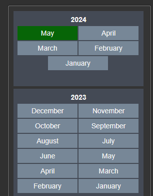
| Months of this year | Periods mode, one month per item aligned to the month, 12 items labeled with the month name, grouped by year, dropdown view. |
| Weeks | Periods mode, one week per item aligned to the week, 8 items labeled by calendar week and year, grouped by month, dropdown view. |
| Shift tag (data source) | Data source mode, recorded values from *-7d to *, each item labeled with its value, grouped by day, dropdown view. |

Source
- Mode: where the selectable items come from. Periods generates rolling periods relative to now, List is a list of named ranges you type in, Data source turns each value of a data source into one period, and Calendar replaces the item list with a date input.
Periods
- Period: how long each item covers, as a value and a unit. One day produces one item per day.
- Align To: the boundary each period starts on. Day starts at midnight, Month on the first of the month, Hour at the top of the hour.
List
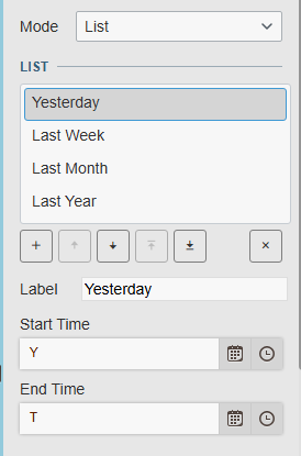
The Filters list holds the named ranges. Select Add to create one, select an entry to open its settings, and use the controls in the list to reorder or remove it. Each entry has three settings:
- Label: the text shown on the item.
- Start Time and End Time: the PI time expressions the item applies, for example
*-7dand*.
Data source
- Mode: the shared data retrieval setting. Recorded makes one period per recorded value; Interpolated makes evenly spaced periods and adds an Interval and a Sync Time.
- Start Time and End Time: the range the values are read from.
- Label: what each item is named after: its Value, its Start Time, or its End Time. With Start Time or End Time selected, Label Format decides the date pattern.
Calendar
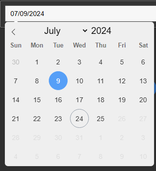
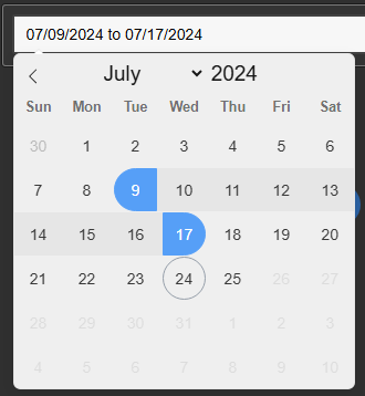
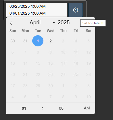
- Mode: Single Date for one day, Date Range for a start and end day in one input, Start & End Time for two separate inputs, stacked with the start above the end.
- Selected Day Covers: how long a clicked day covers, as a value and a unit. Single Date only; one day by default.
- Include Time of Day: adds a time part to both inputs, so a range can start and end at a precise time. Start & End Time only.
- Allow Typing: lets the operator type a date into the input instead of only clicking one in the calendar.
- Allow Future: allows dates after today. With it off, the calendar stops at the current day.
- Reset Button: adds a small clock button beside the input that returns the display to a default range.
- Default Range: how long the range applied by the reset button is. Shown only while Reset Button is on.
- Align To: the boundary that default range starts on. Shown only while Reset Button is on.
Items
These rows sit under an Items heading and are shared by the modes that generate their own items. Each one is offered only where it applies.
- Offset: shifts every period start by a fixed duration. Set it to 6 hours to make each day run from 06:00 to 06:00. Periods and Calendar mode.
- Label Format: the date pattern used for the item labels, chosen from the shared list of formats. Periods mode, and Data source mode when Label is not Value.
- Show End Time in Label: adds the end of the period to its label, so an item reads as a range rather than a single date. Periods mode.
- Number of Periods: how many items are generated. Periods and Data source mode.
- Skip Most Recent: leaves out that many of the newest periods and still generates the configured number of items. Set it to 1 to hide the period that is still running. Periods and Data source mode.
- Group By: groups the items under a heading of the selected unit, for example days grouped by month. Select OFF for one flat list. Periods and Data source mode.
Selection
- Auto-Select Default Item: applies one item's range as soon as the display loads, so the display always opens on a known range.
- Default Item: the position of the item to select, counting from 1 at the start of the list. Shown while Auto-Select Default Item is on, outside Calendar mode.
- Follow Latest Time Range: when a rolling period rolls over, reapplies the default item and moves the display onto the new period. Leave it off when operators should stay on the period they are looking at across a day or shift rollover. Periods mode, while Auto-Select Default Item is on.
- Show 'All' Item: adds one extra item covering the whole generated window. Periods and Data source mode.
Only the first picker on a display applies its default. When several pickers have Auto-Select Default Item on, the first one to load owns the display range and the others render their lists without highlighting anything, so two pickers can never disagree about what the display is showing. Selecting an item, a navigation arrow, a calendar date, or the reset button applies the range from any picker. A picker also leaves the range alone when the display URL carries a start or end time, which is how a link from a report keeps the range it was rendered for. A range whose start would be later than its end is never applied: the picker keeps the display's current range and writes a warning to the browser console instead, because PI Web API rejects every data request on such a range.
Behavior
- Include Endtime: with it on, a period ends on its exact boundary, for example the following midnight. With it off, the end is set one second earlier, at 23:59:59.
- Navigation Arrows: adds arrows on either side of the control for stepping to the previous or next item. Offered for a Periods dropdown and a single-date calendar, the two presentations that can use them.
- Hide Timebar: hides the PI Vision time bar while the display is open, so the picker is the only way to change the range. Several pickers can ask for this at once, and the bar comes back when the last of them is gone.
Style
- Theme: the shared Vision Library+ style selector. Pick a preset, or select Custom Theme to set the colors yourself.
- Surface: Flat or Gradient. Gradient shows through the buttons, the combo boxes, and the calendar inputs, which stay visible as translucent controls while the selected item keeps its solid accent color.
- Container Style: the frame around the control. None, the default, means no container at all: the items float directly on the display with no background behind them. Flat, Card, Framed, and Glass each draw the shared container. A gradient needs a container to show through, so with None selected the controls stay solid.
The remaining rows appear only with Custom Theme selected:
- Surface: the background of the control itself.
- Items: the color the buttons, the combo boxes, and the calendar inputs are painted with. Calendar mode keeps its own item and text colors, so switching Mode never overwrites either set.
- Text: the item text color.
- Border: the outline drawn around every element the symbol renders. Leave it transparent for no outlines at all, which is the shipped default.
- Group: the band behind each group. Shown while Group By is set, in Periods and Data source mode.
- Group Header: the background of the group heading row. Shown under the same condition as Group. The header text follows the Text color.
- Accent: the color of the selected item.
Layout
- View: Dropdown shows the items in a combo box; Buttons shows one button per item. Not offered in Calendar mode.
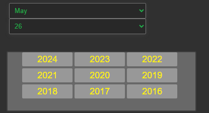
The remaining rows sit under a Buttons heading and apply to the buttons view, except Direction, which also lays out the pair of combo boxes of a grouped dropdown.
- Direction: Horizontal lays the items out in a row, Vertical in a column.
- Group Direction: the axis the groups themselves are laid out on, which is a different question from Direction. Horizontal puts the groups side by side as equal-width panels; Vertical stacks them. Shown while Group By is set.
- Fit: stretches the items across the short axis of the symbol. With a vertical direction the buttons take the full width and keep their natural height; with a horizontal direction they take the full height and keep their natural width. The other axis is never squeezed: with more items than fit, the list scrolls instead.
- Wrap: lets a horizontal row of items continue on further rows instead of scrolling. Shown while Fit is off, since fitted items always share one line.
- Align: places the items Left, Center, or Right within the symbol. Shown while Fit is off, since items that fill their axis have nothing left to align.
- Density: Compact, Normal, or Large. It sets the item font size, the padding inside each item, and the gap between items in one step.
- Multi-state: which part of an item a multi-state colors: its Background, its Text, or its Border. Data source mode only.
Upgrading from earlier versions
Existing displays keep rendering as they did. Nothing is rewritten when a display is loaded: the settings an earlier version saved are read and mapped onto their replacements in memory, and the original values stay in the display until it is saved again.
- Fit and Density are derived for a display that predates them. A row of buttons opens with Fit off and keeps sizing itself to its labels; a column that was set to fill the width opens with Fit on. The saved font size decides the density: 12 px or less becomes Compact, up to 16 px Normal, and larger Large.
- A grouped display opens with the Flat container even though its saved container style is None, because the colored band behind each group was the only structure it had. It keeps the group and group header colors it was saved with. An ungrouped display still opens with no container.
- A calendar keeps its own input colors, which are white on black at the shipped defaults, rather than taking the colors configured for buttons.
- A calendar that had its own offset keeps it, as long as the shared Offset has not been changed. Any edit through Offset wins from then on.
Some settings were removed because the layout now derives them:
- The item Width, Height, and Space sliders and the fit and fill-width options are gone. Density sets the size of an item and the gap between items, and Fit decides whether the items fill the symbol.
- The separate calendar offset is gone. One Offset now applies to every mode.
- The Number Format entry is gone from the pane. Numeric data source labels are still formatted the same way.
- The separate border, border width, border radius, and shadow settings are gone. The frame now comes entirely from Container Style, and the outline from the Custom Border color.
Examples
Create a multi-state calendar
This example creates a day selector where each item is colored by the multi-state limits of the underlying data source, giving instant status context for each day.
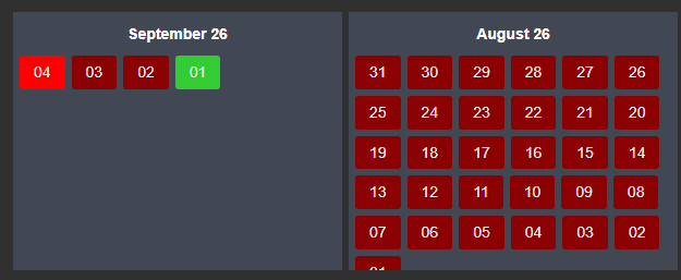
- Drag the data source that carries the daily status onto a new DateTime Picker+ symbol.
- Set Mode to Data source and the data retrieval Mode to Interpolated, with an Interval of 1 day and a Sync Time of 00:00:00.
- Set Start Time to
*-2moand End Time to*. - Set Label to Start Time and pick a day-of-month Label Format.
- Set Group By to Month and View to Buttons.
- Right-click the symbol and add a multi-state, then choose what it colors with Multi-state in the Layout group.
Create a shift calendar
This example creates a shift selector driven by a PI Point that records the shift name at the start of each shift.

- Create a String PI Point that records the current shift name at the start of each shift. An AF analysis can generate these values.
- Drag the shift tag onto a new DateTime Picker+ symbol.
- Select the Shift tag (data source) entry in Quick Start, which sets the source, the recorded retrieval, the range, the value labels, and the grouping in one step.
- Adjust Start Time and End Time to the window operators need, and set View to Buttons for a shift strip.
Troubleshooting and limitations
- Check: If a range is unexpected, verify Period, Align To, Offset, Include Endtime, and the local time zone the display is read in.
- Check: Changing this control changes the shared display time range, which every symbol that follows display time reacts to.
- Check: If the items look transparent with Surface set to Gradient, the control has no container for the gradient to sit in. Select a Container Style other than None, or set Surface to Flat.
- Check: If a second picker on the display does not apply its default item, that is intended. The first picker to load owns the display range; selecting an item in the second picker applies it immediately.
- Check: If a unit shows as a code such as
mo, that is the vocabulary of the shared duration control, wheremois a month andma minute. - Limitation: Wrap and Align apply to items that size themselves to their labels. Both are hidden while Fit is on, because fitted items already fill their axis.