



Vision Library+ / Charts and analytics
XY Plot+
XY Plot+ plots one measured value against another instead of against time, so you can see how two process values relate: head against flow, power against load, temperature against pressure. It adds fitted lines, reference curves, operating envelopes and a time trail to the scatter plot, and counts the points that fall inside or outside them.
Overview
XY Plot+ plots one measured value against another instead of against time, so you can see how two process values relate: head against flow, power against load, temperature against pressure. It adds fitted lines, reference curves, operating envelopes and a time trail to the scatter plot, and counts the points that fall inside or outside them.
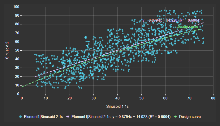
XY Plot+ is a Vision Library+ symbol. The native XY Plot that ships with PI Vision is a separate symbol.
When to use it
Use this symbol when you need to:
- Show how one measurement responds to another, rather than how either changes over time.
- Pair several Y values with one X value, each X with its own sampling and time range.
- Fit a trend line and read its equation and R squared.
- Compare the live operating points with a manufacturer curve or count how many lie inside an operating envelope.
- Follow the direction of a trajectory, such as a start-up transient.
- Leave out the pairs taken while the equipment was stopped or outside a speed band.
Choose Combo Chart+ when time belongs on the horizontal axis.
Before you begin
- Choose numeric PI Points or AF attributes for X and Y. Non-numeric and bad values are dropped, not plotted at the axis minimum.
- Configure PI Web API for Vision Library+. The chart loads its own history.
- To convert units, use AF attributes with a unit of measure. A PI Point always shows its own units.
- For a curve or envelope, have its coefficients or its x,y pairs ready.
Add and set up the symbol
- Select XY Plot+ in the PI Vision symbol gallery.
- Drag the data source for the horizontal axis onto the display, then drag the data sources for the vertical axis onto the chart.
- Right-click the chart and select Configure XY Plot+....
- In the data sources section, select the first row. Use as is X. Every later row starts as Y.
- Select each Y row and check that Pair with names the X.
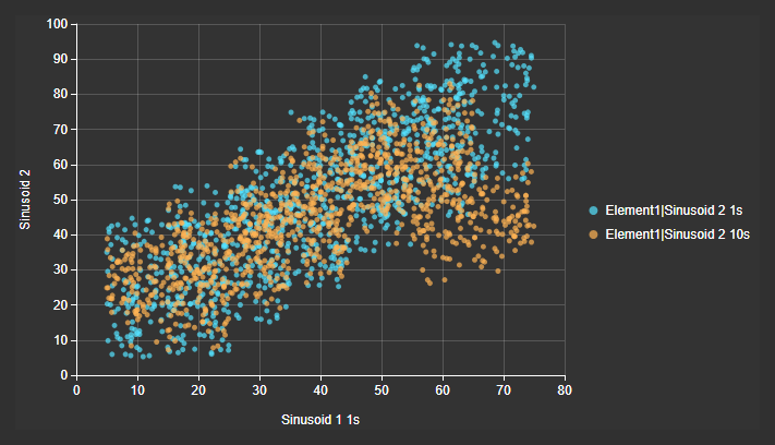
- Close the pane. Each Y appears as a series of points against the X, and the legend names each series.
Common tasks
Pair several Y data sources with one X data source
Use this when several measurements share the same X, or when one chart needs two X data sources with their own sampling.
- Right-click the chart and select Configure XY Plot+....
- In the data sources section, select the row for the X value (1) and set Use as to X.
- Select a Y row (2).
- Set Pair with (3) to the X. Every X on the chart is offered.
- Leave Pairing on Timestamp and Method (4) on Interpolated. These read each Y at the X's own timestamps.
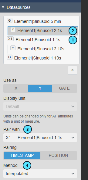
A Y with no X shows Unpaired and is not plotted. To plot a Y against its own window instead, for example yesterday against today, set Pairing to Position. To sample an X differently, select the X row and use its Data Retrieval group.
Add a regression line and read its equation
Use a regression to quantify how strongly Y follows X.
- Select the Y row in the data sources section.
- Expand Analysis and turn Regression on (1).
- Choose the Model (2): Linear, Polynomial, Exponential, Logarithmic or Power.
- Keep Show Equation (3) and Show R² (4) on.
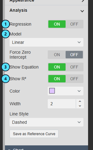
The chart draws the fitted line (1) with its equation and R² at its end (2). The legend repeats them in an entry that follows the series (3).
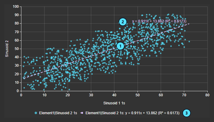
A fit that cannot be computed draws nothing, and the point count notice states why. Save as Reference Curve copies a linear or polynomial fit into a reference curve, so you can keep today's behavior as a baseline.
Compare the points with a reference curve
Use a reference curve for a manufacturer curve or a design line, and count the points above and below it.
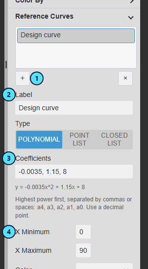
- Expand Chart > Reference Curves and select + (1).
- Enter a Label (2). The legend and the end of the curve show it.
- Leave Type on Polynomial and enter the Coefficients (3), highest power first. The pane echoes the equation under the field.
- Enter X Minimum and X Maximum (4). The curve is drawn over this range.
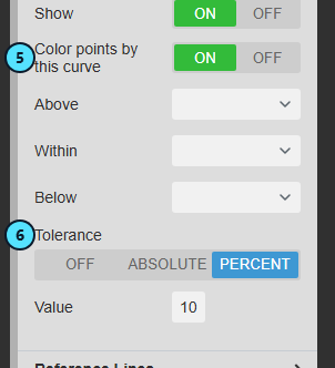
- Turn Color points by this curve on (5).
- To add a band around the curve, set Tolerance (6) to Absolute or Percent and enter the Value.
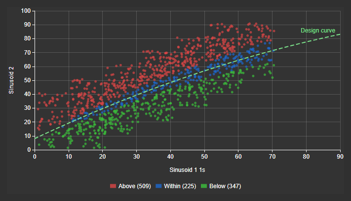
The points turn red above the curve, blue within the band and green below it. The legend states the count of each class.
Points outside the curve's X range keep their series color and are counted as Unclassified. Only one curve or line colors the points at a time. To mark a limit instead, add a reference line under Reference Lines: choose Axis X or Axis Y, enter the Value and turn Color points by this line on if you want the classes.
Count the points inside an operating envelope
Use a closed list for a permitted region such as a surge map boundary.
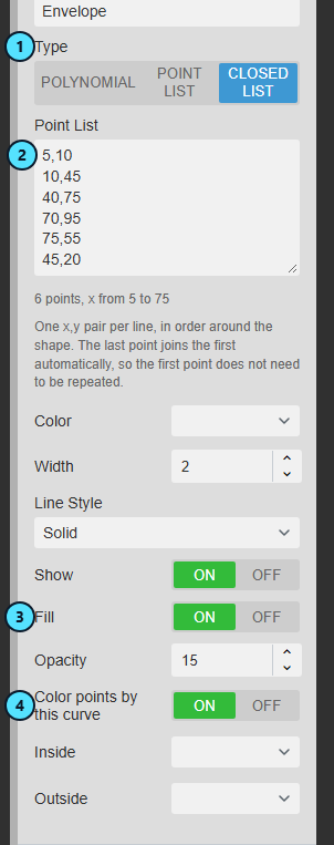
- Under Reference Curves, select + and enter a Label.
- Set Type to Closed List (1).
- Paste the outline into Point List (2), one
x,ypair per line, in order around the shape. The last point joins the first by itself. - Turn Fill on (3) to shade the region.
- Turn Color points by this curve on (4).
The points inside turn green and those outside red. The legend reads, for example, Inside (962) and Outside (119).
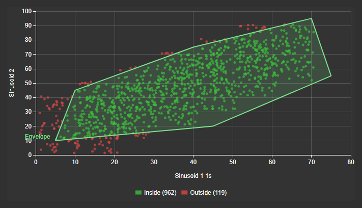
A closed list needs at least three distinct points. A point exactly on the outline counts as inside.
Show the direction of change over time
Use the time trail for a hysteresis loop or a start-up transient. It colors the points by age and joins them in time order.
- Set the display time range to a short period, such as 6 minutes.
- Select the X row. Under Data Retrieval, turn Automatic Interval off and set Interval to 10 seconds, so the trail has few enough points to follow.
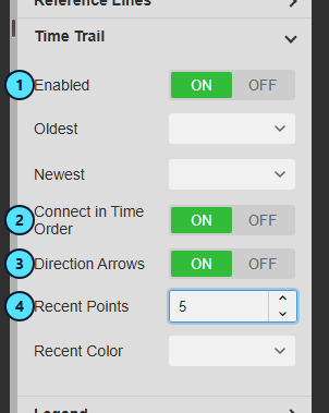
- Expand Chart > Time Trail and turn Enabled on (1).
- Turn Connect in Time Order on (2), then Direction Arrows (3).
- Set Recent Points (4) to 5.
The points run from the Oldest to the Newest color, arrows show the direction, and the last five points are drawn larger.
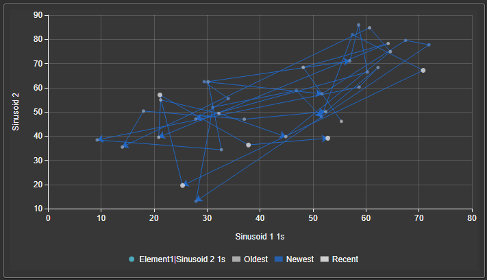
The trail is not available while a multi-state attribute or a curve colors the points.
Keep only the pairs from one operating condition
Use a gate to leave out the pairs taken while the equipment was stopped, in another mode or outside a speed band.
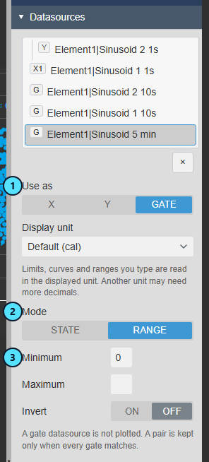
- Select the data source that states the condition, and set Use as to Gate (1). It is no longer plotted.
- For a number, set Mode to Range (2) and enter Minimum (3) or Maximum. Leave one empty to leave that end open.
- For a state, set Mode to State and type the state name exactly as the digital state set spells it, for example
Running. - Turn Invert on to keep the pairs that do not meet the condition.
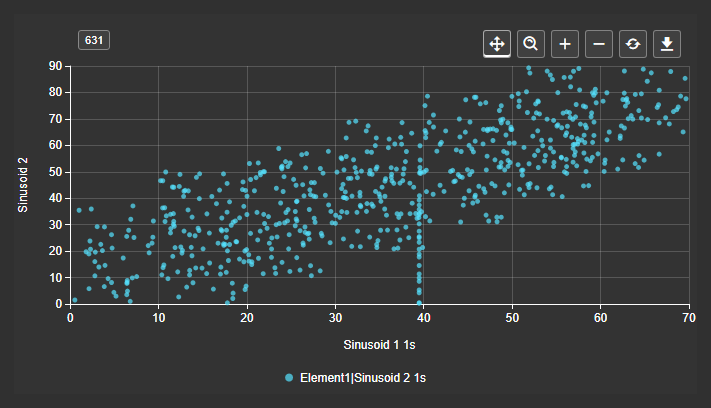
The pairs that fail the condition leave the plot. Set Toolbar > Reveal to Always to show the count of drawn pairs in the corner. Its tooltip lists the pairs excluded for each series.
With several gates, a pair must pass all of them. A pair with no usable gate value is left out. A gate with no condition filters nothing.
Use the symbol
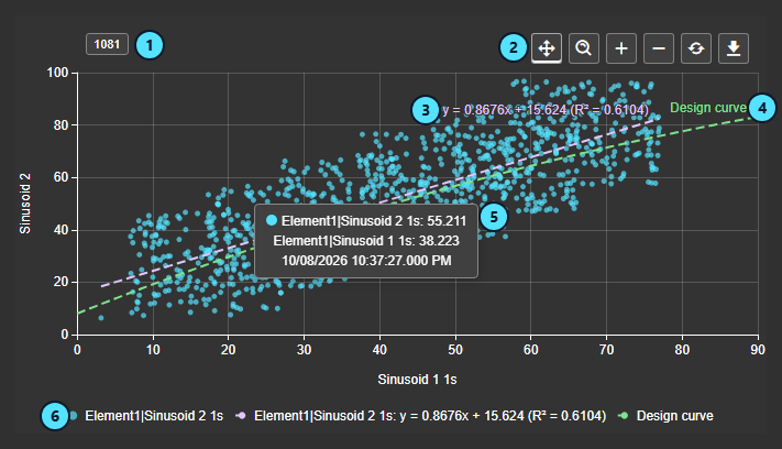
| What it shows | |
|---|---|
| (1) | The number of pairs drawn. It becomes a warning when pairs were dropped, a series was cut by its point budget, or a Y has no X. Hover it for the detail. |
| (2) | The toolbar: Pan, Box zoom, Zoom In, Zoom Out, Reset Zoom and Download. |
| (3) | The regression equation and R². |
| (4) | A reference curve with its label. |
| (5) | The tooltip of a point: the value of each axis and the time of the pair. |
| (6) | The legend: one entry per Y, one per fit and one per curve. |
- Hover a point to see its Y value, X value and time. When a multi-state attribute colors the points, its value is shown too.
- Hover a legend entry to fade the other points. Curves, envelopes and lines stay in view.
- Click a legend entry to hide that series, color band or class. Hiding changes only your view, and the counts and fits do not change.
- Zoom with the mouse wheel or the toolbar, and drag to pan or box zoom. Zooming never changes the display time range.
- Download saves a picture (PNG, SVG, PDF) or the paired data (CSV, JSON, XLSX). Curves, lines and fits are not exported.
- With a multi-state attribute or a curve coloring the points, the bands or classes replace the series entries in the legend.
Nothing in the chart writes data to the PI System.
Configure the symbol
The pane has these sections: the data sources section, Chart, Scales, Time Bar and Interactivity. Multi-state settings open from the chart's context menu.
Data sources
The list groups each X with the Y rows paired with it. Chips mark X1, X2, Y, Unpaired and G for a gate. Select a row to edit it, and use the delete button to remove it.
| Setting | What it does |
|---|---|
| Use as | Makes the row an X, a Y or a Gate. Turning an X into a Y leaves its Y rows unpaired. See Pair several Y data sources with one X data source. |
| Display unit | Shows an AF attribute in another unit of the same kind. Default follows AF. Not available for a PI Point. Values you type (curves, lines, gate limits, axis limits) are read in the displayed unit and are not converted when you change it. |
| Pair with, Pairing, Method | The X a Y is plotted against. Timestamp reads the Y at the X's timestamps with Interpolated, Exact, Exact Time or Previous or Exact Time or Next. Position zips the two lists by index and gives the Y its own retrieval. |
| Data Retrieval | For an X, and for a Y paired by position. Mode is Interpolated, Recorded or Current Value, which reads one point per Y with no history. Start- and Endtimes is the display range, a custom range or a duration. A custom range keeps its window when the display time changes. |
| Automatic Interval, Point Budget | Automatic Interval is on by default and picks a round interval from the range and the chart width. Point Budget caps the pairs per series, from 1000 to 200000, default 20000. Past the cap the newest pairs are kept and the notice reports it. |
| Appearance | Color, Marker (Shape, Size, Opacity) and Line, which joins the points in plotted order. |
| Value Scale | Assigns the Y to a scale. Available when Axis Y uses more than one scale. |
| Analysis | Regression with Model, Order (2 to 6, for Polynomial), Force Zero Intercept (for Linear and Polynomial), Show Equation, Show R², and the line's color, width and style. See Add a regression line. |
| Mode, State, Minimum, Maximum, Invert | The gate condition. See Keep only the pairs from one operating condition. The state match ignores case. |
Chart
| Setting | What it does |
|---|---|
| Title, Style, Grid, Data Labels | Title, theme, font, number format, grid lines, bands and border, and point labels as labeled. Labels on a dense cloud are unreadable, so use them for small sets. |
| Color By | Gradient blends between the states of a Multi-State attribute. To add one, right-click the chart and select Add Multi-State.... Every point takes the color of that attribute at its own time. |
| Reference Curves | Label, Type (Polynomial, Point List or Closed List), Coefficients, X Minimum, X Maximum, Color, Width, Line Style, Show, and for a closed list Fill and Opacity. A point list is drawn sorted by x and accepts tab, semicolon or comma separators. A closed list is drawn in the order you typed. See Compare the points with a reference curve. |
| Color points by this curve | Classes the points as Above, Within and Below, or Inside and Outside for a closed list, each with a color. Tolerance is Off, Absolute or Percent, with a Value. |
| Reference Lines | Axis, Value, Label, Label Position (Start, Center, End), Color, Width, Line Style, Show and Color points by this line. A line does not widen an axis. Set a custom range to see it. |
| Time Trail | Enabled, Oldest and Newest colors, Connect in Time Order, Direction Arrows, Recent Points (0 to 50) and Recent Color. See Show the direction of change over time. |
| Legend | Enabled, Position, Placement, Alignment, Text (Name, Value, Name + Value), Size and Color. |
| Tooltip | Show. The pointer setting is not offered. |
| Toolbar | Show Toolbar and Reveal: On Hover or Always. The pair count shows only with Always. |
When several rules could color a point, the order is a Multi-State attribute, then a curve or line, then the time trail, then the series colors.
Scales
| Setting | What it does |
|---|---|
| Axis Y | Scale Type: Single, Multiple (one scale per Y), Separate (one plot per Y) or Custom (named scales that Y rows share). Each scale has visibility, side, title, range, ticks and transform. |
| Axis X | The same numeric settings for the horizontal axis. A logarithmic axis cannot plot values at or below zero. |
| Scale Range | Auto, Database or Custom. With Custom, Minimum and Maximum each have an Auto box. A drawn curve widens an automatic range. |
Time Bar and Interactivity
| Setting | What it does |
|---|---|
| Time Bar | Adds the shared Time Bar. It drives every data source whose Time Range is Display time range. It offers no interval. |
| Enable Zoom, Drag mode | Turn wheel and toolbar zoom on or off, and set whether dragging pans or box zooms. |
Troubleshooting and limitations
| Symptom | Cause | What to do |
|---|---|---|
| A Y draws nothing. | It has no X, shown as Unpaired. | Set Pair with. |
| The plot is thinner than expected. | Pairs were dropped for a bad value, or Exact found no matching timestamp. | Read the notice. Try Exact Time or Previous. |
| The notice shows a truncation warning. | A series exceeds its Point Budget. | Raise Point Budget, shorten the range or use a coarser interval. |
| A curve is not drawn. | A polynomial needs both X Minimum and X Maximum, or the text does not parse. | Check the message under the field. |
| A reference line is not drawn. | It has no Value, or lies outside the axis range. | Set the Value or a custom axis range. |
| The legend shows colors or classes instead of series. | A Multi-State attribute or a curve colors the points. | Remove it to get the series entries back. |
| The plot is empty after adding a gate. | The condition excludes every pair, the state name is misspelled, or the gate has no value at those times. | Read the notice for Excluded by condition and Bad data. |
| Points keep their series color. | They lie outside the curve's X range. | Widen the range of the curve. |
| Values are far too large or small. | Display unit is Default and AF stores another unit. | Choose the unit you expect. |
- Limitation: There is no fullscreen view, and no event frame or period overlay. To compare two periods, copy the chart and give each X its own custom time range.
- Limitation: Several gates are always combined so that all must pass, and a state name is typed, not picked from a list.
- Limitation: The trail's connecting line has one color. The end labels of horizontal reference lines are kept apart, but labels of curves, fits, vertical lines and Center labels that end close together can still overlap.


