Vision Library+ / Gauges and process visualization
KPI Card+
KPI Card+ presents one PI Point or AF attribute as a compact dashboard card. The displayed KPI can be the current value or a calculated summary. Optional targets, sparklines, multi-state card treatments, and data-quality indicators add context without requiring a full chart.
Overview
KPI Card+ presents one PI Point or AF attribute as a compact dashboard card. The displayed KPI can be the current value or a calculated summary. Optional targets, sparklines, multi-state card treatments, and data-quality indicators add context without requiring a full chart.
When to use it
Use KPI Card+ when you need to:
- Emphasize one process or business value.
- Display a summary such as the average, total, minimum, maximum, or Percent Good for a selected period.
- Compare the KPI with a fixed value, AF Target trait, past value, or historical average.
- Show recent history without adding a full trend symbol.
- Apply a semantic multi-state treatment to the complete card.
Use Value+ when operator actions such as its floating trend are more important than the dashboard-card presentation.
Before you begin
- Confirm that PI Web API can read the selected data source and its history when you plan to use calculated values, calculated targets, or sparklines.
- Configure numeric multi-state limits when you plan to use Progress, Fill Level, or Radial Progress.
- Configure an AF Target trait when you plan to use the multi-state target source.
Add and set up the symbol
- Select KPI Card+ in the PI Vision symbol gallery.
- Drag one PI Point or AF attribute onto the display.
- Right-click the symbol and select Configure.
- Under Value, choose the value source and visible content.
- Optionally configure Sparkline, Target, multi-state formatting, or Data Quality.
KPI Card+ supports one data source. Numeric data sources can use every feature. Text, Boolean, enumeration, and timestamp values can be displayed, but numeric calculations, targets, sparklines, and progress presentations require numeric data.
Use the symbol
Read the main value first, then use the optional comparison badge and sparkline for context. An upward or downward arrow describes whether the KPI is numerically above or below its benchmark; the badge color indicates whether that direction is favorable.
When a display link is configured, select the card to follow PI Vision's native LinkURL. KPI Card+ does not replace it with a custom click action.
Configure the symbol
Choose the displayed value
Under Value > Source, choose one mode:
- Current: Displays the value supplied by PI Vision at the effective display end time.
- Calculated: Requests a summary from PI Web API over the selected calculation range.
Calculated summaries
The calculated mode supports:
| Summary | Result |
|---|---|
| Total | Total over the selected range. For a time-weighted total, configure the conversion factor and unit. |
| Average | Average over the complete range. |
| Minimum / Maximum | Lowest or highest value in the range. |
| Range | Difference between the maximum and minimum. |
| StdDev / Population StdDev | Sample or population standard deviation. |
| Count | Number of values included in the summary. |
| Percent Good | Percentage of good data in the range. |
Choose the calculation Basis:
- Time Weighted: Accounts for how long each value remains active.
- Event Weighted: Gives each recorded event equal weight.
Then choose the calculation range:
- Display time range: Uses the current PI Vision display start and end times. This is the default.
- Custom time range: Uses the entered PI start and end time expressions.
- Duration and offset: Builds a range of the selected duration before the effective display end time, optionally shifted backward by an offset.
Calculated values follow PI Vision playback and historical display times. Shared request caching prevents identical summaries on the same display from being requested repeatedly by multiple cards.
Configure card content
Under Value > Content, control each role independently:
- Value: Shows or hides the main KPI value.
- Units: Shows or hides the engineering unit.
- Label: Selects a data source label or custom label through the shared label control.
- Timestamp: Shows the effective value timestamp using a shared Vision Library+ date and time format.
- Number format: Applies the standard PI Vision number format.
Hidden roles do not reserve empty space. Under Style, configure the value and label font sizes and choose left, center, or right alignment.
Compare the KPI with a target
Enable Target, then choose a source:
- Fixed: Uses one entered numeric target.
- Multi-state: Uses the AF Target trait returned with the data source's multi-state configuration. The comparison is omitted when no Target trait is available.
- Calculated: Uses a past value or historical average from the same data source.
Calculated target modes are:
- Past value: Reads the recorded value at or before one PI time expression. Examples include
*-24h,-24h,y,t, or an absolute timestamp. Relative expressions are evaluated against the effective display end time. - Average: Uses the time-weighted average over a Display, Custom, or Duration-and-offset range.
Choose how the difference is displayed:
- Value: Shows the signed numerical difference, such as
+5 °C. - Percent: Shows the signed percentage difference, such as
-3.2%. Percent difference is unavailable when the target is zero.
Choose Higher is better or Lower is better to control the semantic badge color. The arrow always describes the numeric direction: up means above the target and down means below it.
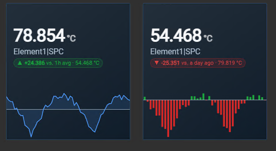
The comparison appears as one compact badge below the label, for example +5 °C vs. Target, -3.2% vs. 1d avg, or +2 °C vs. an hour ago. Past-value descriptions use rounded relative wording such as an hour ago instead of an exact elapsed duration.
Enable the Target section's Show option to append the benchmark value, for example -3.2% vs. 1d avg · 75 °C. It is disabled by default to keep dashboards with many cards compact.
Target tolerance
Enable Tolerance when a small deviation should count as on target:
- Absolute: Compares the absolute numerical difference with the tolerance.
- Percent: Compares the absolute percentage difference with the tolerance.
The boundary is inclusive. A value inside the tolerance keeps its formatted difference but uses the neutral on-target state without an up or down arrow.
Add recent context with a sparkline
Enable Sparkline, then configure:
- Type: Line draws history as a line with a translucent area. Bars draws a lower-density column history suited to KPI cards.
- Placement: Overlay draws the chart behind the card content. Bottom reserves a separate lower chart region so the value, label, target comparison, and timestamp do not overlap it.
- Time Range: Shows or hides a compact resolved-duration label such as 24h or 7d in the lower-left corner. It is enabled by default.
Choose the sparkline range:
- Display time range: Uses the PI Vision display range.
- Custom time range: Uses PI start and end time expressions.
- Duration and offset: Uses a duration and optional offset before the effective display end time.
Line sparklines request plot values at approximately one interval per card pixel. Bar sparklines use fewer intervals so individual columns remain readable. Both use the card accent color or active multi-state color and intentionally omit axes, legends, and separate color settings.
The latest line point is marked with a small dot. In Bars mode, the final bar receives a subtle outline so the displayed KPI can be related to the end of its history.
When both Sparkline and Target are enabled, enable Target as baseline to treat the target as the chart's zero line:
- The line area closes against the target instead of the chart bottom.
- Bars extend above or below the target.
- Target-relative bars use Higher is better or Lower is better for favorable and unfavorable colors.
If the target is unavailable, the sparkline returns to its normal baseline. Missing or unsupported history hides only the sparkline; the current KPI remains visible.
Apply styles and multi-state formatting
New KPI Card+ symbols use the Steel Blue theme, Gradient surface, and Flat container. Under Style, select another shared theme, surface, or container preset. Choose Custom to configure text, background, border, accent, font, font sizes, and alignment.
The Style panel starts collapsed so the frequently used value, sparkline, and target controls remain easy to reach.
KPI Card+ supports the shared card multi-state properties:
- Accent + Tint, Text, Border, and Soft Fill
- Status Dot, Value Badge, and Solid Fill
- Progress and Progress and Value
- Fill Level and Radial Progress
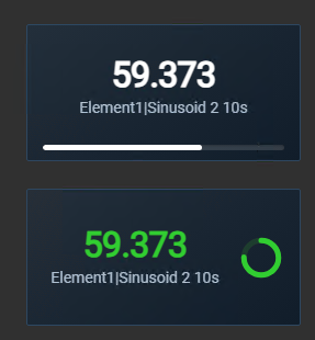
Progress, Fill Level, and Radial Progress place the current numeric value within the configured multi-state threshold range. Select the presentation from the native multi-state Property list; no separate card-mode selector is required.
If the active multi-state requests Blink, the complete card blinks. Systems configured for reduced motion show the state without animation.
Configure data quality
KPI Card+ uses the shared Vision Library+ data-quality settings:
- Hide No Data hides the content while retaining a selectable placeholder in display-editing mode.
- Stale warning adds an amber indicator when a live current value is older than the configured threshold.
- Bad, questionable, substituted, and No Data values use compact quality indicators separate from the target arrow and multi-state status dot.
See Data Quality for shared rules and global override behavior.
Troubleshooting and limitations
- No calculated value appears: Confirm that the data source is numeric, PI Web API can read its history, and the selected range contains data.
- No target comparison appears: Confirm that both the KPI and target are numeric. For a multi-state target, confirm that the AF attribute exposes a Target trait.
- A past-value target is missing: Confirm that history exists at or before the configured PI time.
- No sparkline appears: Confirm that the data source is numeric and has history in the selected range.
- Percent difference is blank: A percentage difference cannot be calculated from a zero target.
- Progress does not move as expected: Review the multi-state lower value and state thresholds; they define the progress range.
- KPI Card+ supports one data source and one target. Use multiple symbols for multiple KPIs.
- Target ranges and bands are represented through multi-state thresholds rather than a separate target-range feature.