



Vision Library+ / Charts and analytics
Combo Chart+
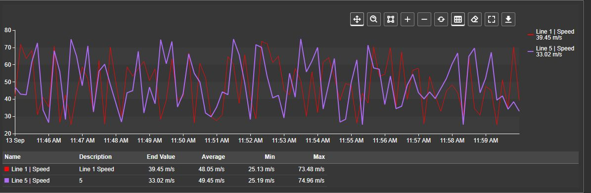
Combo Chart+ compares process trends on one chart, with a trace type and value scale for each data source. Add a summary table to compare statistics, or show equipment states and event frames alongside the measurements.
Overview
Combo Chart+ compares process trends on one chart, with a trace type and value scale for each data source. Add a summary table to compare statistics, or show equipment states and event frames alongside the measurements.
Watch the demo
See Combo Chart+ in a practical PI Vision workflow.
When to use it
Use this symbol when you need to:
- Compare selected PI Points or AF attributes with different trace types or units.
- Show a shaded range between two measurements.
- Investigate a period using rulers, server statistics, regression, or moving averages.
- Relate process changes to equipment states or event frames.
Choose Asset Time Series Chart+ when you want the same configured attributes plotted across assets found by an asset search.
Before you begin
- Identify the PI Points or AF attributes to compare. Ordinary line, area, bar, scatter, and range-area traces need numeric values. Digital/enumeration sources offer named-state Trend or Bands; string sources use text annotations. A Boolean source is a two-state digital and is drawn the same way, with the states False and True.
- Confirm that PI Web API is configured and that you can read the sources. Server summaries, event frames, and historical AF limits require the relevant server access.
- Use compatible units for measurements sharing a value scale or range-area band. The chart does not convert the input units.
- To create event frames, prepare the AF database, template, target asset, and write permissions.
Add and set up the symbol
- Select Combo Chart+ in the PI Vision symbol gallery.
- Drag the first data source onto the display, then drag additional sources onto the chart.
- Right-click the chart and select Configure Combo Chart....
- Under Data Retrieval, start with Default and Display time range.
- Under Trace Options, select each source, choose a useful Label, and set its numeric Type or digital State display.
- Under Scales > Value Scales, use Single for compatible units or Multiple for separate units.
- Confirm the trace names, units, time range, and values before saving the display.
Use the symbol
Legend and hover values
The legend identifies each trace by its color, name, and configured value text. Click an entry to hide its trace; click it again to restore it. The entry remains available through data updates. This visibility change lasts for the session and does not change the saved starting visibility.
Hover over the plot to compare values at the pointer time. Ordinary numeric traces use their loaded samples:
- Straight and Smooth interpolate between valid samples.
- Stepped and Bar hold the preceding value.
- Scatter requires a sample at that instant.
Bad-data gaps remain gaps. Values retain their original units, including on stacked charts. A 100% stack can also show each trace's percentage contribution.
Digital Trend readouts show the preceding valid state name until the next loaded change. They do not interpolate between state codes. Optional state-name legend entries for Bands are informational; clicking one does not hide that individual state.
Toolbar and zoom
The toolbar's available controls depend on the chart settings. Hover over a button to see its name.
| Control | What it does |
|---|---|
| Pan | Drag to move the visible chart window. |
| Box zoom | Drag a band to zoom into that interval. |
| Select | Drag a band to choose an interval for the summary table without zooming or changing display time. Available when the summary table or event-frame creation is enabled. |
| Zoom In | Halves the visible interval around its center. |
| Zoom Out | Widens the visible interval, up to the loaded range. With Apply to display time enabled, it can widen the display time range. |
| Reset Zoom | Restores the loaded range. After a zoom changes display time, restores the display range captured before that change. |
| Toggle Summary | Opens or collapses the enabled summary table. |
| Create Event Frame | Opens the configured creation form for the selected interval. Each configured creation option has its own button. |
| Clear rulers | Removes the placed rulers. Available when ruler synchronization is enabled. |
| Fullscreen | Opens the chart in a larger dialog. |
| Download | Opens the chart image and sample-data export menu. |
The mouse wheel zooms when Enable Zoom is on. The toolbar's drag mode is a temporary viewer choice; reopening the display restores its configured starting mode.
Apply to display time makes zoom and pan changes update the PI Vision display time range, affecting other symbols that follow it. Select still chooses a summary interval without changing display time. When event-frame creation is enabled, dragging draws the creation band and the ordinary drag-mode and zoom controls are unavailable.
Rulers
When Interactivity > Synchronize > Ruler is enabled, click the plot to place rulers A and B. Drag their handles to move them. With a handle focused, use the Left and Right arrow keys to move it, or hold Shift for a larger step. Press Delete or Backspace to remove that ruler, drag its handle outside the plot to remove it, or use Clear rulers to remove both. Compatible charts can show the same ruler positions when synchronization is enabled.
The same ruler controls and value boxes are available in Fullscreen. Ruler changes remain synchronized, and closing fullscreen keeps their positions on the display. A ruler outside the fullscreen chart's visible time range is hidden until that range includes it again. Clicking a legend entry changes trace visibility without placing or moving rulers.
Ruler value boxes follow the same loaded-sample rules as hover values. The summary table uses server values, so its exact-time results can differ from the ruler boxes. With two rulers present, their interval takes precedence over a Select interval for summary calculations.
Digital Trend ruler boxes show state names at the plotted value, including on a Single numeric scale. States have no numeric B-minus-A difference, and Bands do not create a state-scale value box. Exact-time state names remain available in supported summary-table columns.
Summary table
The table below the chart compares sources over a defined interval. Its range is chosen in this order:
- The interval between rulers A and B, when both are present.
- An explicit Select interval.
- The symbol time range.
Visual zoom alone does not change the summary interval. Use Select to investigate part of the range while keeping the surrounding trend visible:
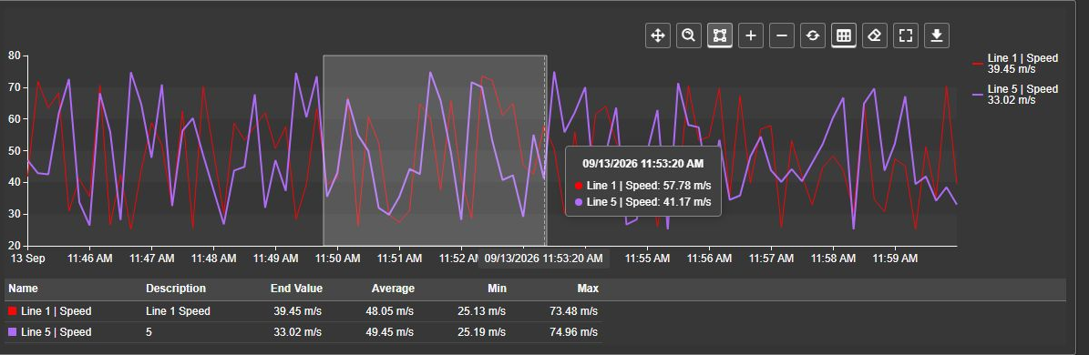
Release the drag to request statistics for the selected interval. Drawing a new selection replaces it. Clearing both rulers returns the table to the selection, or to the symbol range if no selection exists.
The initial columns are Name, Description, End Value, Average, Min, and Max. End Value is the server value at the interval end. Average, extrema, standard deviation, and event count use server calculations rather than the points retained for drawing the chart.
Optional action columns use icon headers and checkboxes. Show changes trace visibility for the session. Regression, Moving Average, and the multi-state action change the selected source's configuration. A hidden trace remains listed so you can restore it.
Scroll to reach additional rows or columns. Unavailable results leave neutral cells while supported results remain usable. During a new request, the table does not keep presenting statistics from the previous range. Collapsing the table stops continued summary requests.
Fullscreen and downloads
Fullscreen has its own temporary zoom window and drag mode. Closing it returns to the inline chart. Apply to display time, when enabled, can still change the shared display range from fullscreen.
Click the fullscreen plot to place enabled rulers or use Clear rulers. Their lines appear in the dialog; ruler handles and value boxes remain in the inline chart.
Download offers PNG, SVG, PDF, CSV, JSON, and XLSX. Image formats capture the chart. Sample formats contain one row per sample with Label, Timestamp, Value, Units, and Status, plus Category when the horizontal axis uses categories. Status is empty for good data and otherwise names the condition: the system state, or Bad, Substituted, or Questionable. A digital sample exports its state name as the value. CSV and XLSX show the timestamp in your local display format, and numbers keep their full precision with your regional decimal separator; XLSX writes real date and number cells, so sorting, filtering, and formulas work without re-typing a column. JSON keeps raw ISO timestamps and unformatted numbers for downstream tools.
Combo Chart+ sample downloads contain the loaded source samples; visual zoom does not trim them. Category coordinates are exported separately from event timestamps. A category without an event timestamp does not receive an invented one. SVG uses a white background and adjusts near-white chart colors for visibility.
Digital samples retain their names, original state codes, timestamps, and quality. Drawn holds and Bands do not add samples, and the state-scale positions do not replace the original codes.
Limitation: Fullscreen and chart downloads do not include the summary table.
Configure the symbol
The pane follows this order: Trend Options, Scales, Data Retrieval, Time Bar, Interactivity, Summary Table, Trace Options, Data Quality, Events, and Export Data. Multi-state settings open separately from the chart's context menu.
Trend options
- Title: Set the main title, subtitle, alignment, and applicable text settings.
- Style: Set the chart's colors and container appearance. Sparkline hides the axes, grid, title, and subtitle for a compact trend.
- Legend: Choose the legend content and placement.
- Tooltip: Turn Show on for hover values. Pointer offers None, Argument, and Cross.
- Data Labels: Set the common label presentation. Enable labels separately for each trace.
- Grid: Choose grid lines, alternating bands, and the plot border.
- Toolbar: Turn Show Toolbar on and choose Reveal > On Hover or Always.
- Bars: Width sets how much of each bar's time slot the bar occupies, from 10 % to 100 %. The slot is the retrieval interval when the retrieval mode states one, and otherwise the shortest gap between the plotted points; at 100 % neighbouring bars touch. The group appears only while at least one trace is a bar, and bars that share a time without being stacked split the width between them.
The summary toggle and configured event-frame creation buttons remain available when their features are enabled, even if Show Toolbar is off. Other toolbar controls follow Show Toolbar.
Legend layout
New charts place the legend outside the plot on the right, aligned to the top, with the name and value on separate lines.
| Setting | Effect |
|---|---|
| Enabled | Shows or hides the legend without hiding traces. |
| Position | Places it at the top, right, bottom, or left. |
| Placement | Outside reserves plot space. Inside overlays the legend on the plot with a background for readability. |
| Alignment | Aligns entries along the selected side. |
| Text | Shows Name, Value, or Name + Value. |
| Value placement | Places the value on a New line or the Same line when both name and value are shown. |
| Size | Gives a left or right legend an automatic or requested pixel width. Top and bottom legends size automatically. |
| Color | Marker uses colored trace markers; Text colors the entry text instead. |
The legend uses the chart font. Long labels may be shortened to preserve plot space. A saved side-legend width takes effect again if you move the legend back from the top or bottom.
Grid and labels
Grid > Lines offers None, Horizontal, Vertical, and Both. Bands adds alternating shading. Border offers Axes, Frame, and None; a frame surrounds each panel in separate-scale mode. Turning grid Show off removes lines and bands while leaving the border choice effective.
Grid colors follow the chart theme. Sparkline mode hides the whole grid. Dense data labels can obscure the trend and slow rendering; enable them for small datasets where individual values matter.
Scales
Value scales and stacking
Choose the scale arrangement under Scales > Value Scales:
| Scale type | When to use it |
|---|---|
| Single | Compare measurements and original digital Trend codes on one numeric scale. |
| Multiple | Give each source its own value scale, for example temperature and pressure. |
| Separate | Put each trace in a separate plot sharing the time axis. |
| Custom | Create named scales and assign several related sources to each one. |
In Single mode, digital Trend shares the numeric scale with measurements and plots its original codes: codes 0, 10, and 50 appear at those numeric values. This also applies when every source is digital or state definitions differ. Multiple keeps a named scale per source, and Separate keeps each source in its own plot, so a digital source is alone on its scale there and keeps its state names. In Custom mode, a digital trace shows state names only while its scale carries nothing but digital traces that share one set of state definitions. As soon as that scale also carries a measurement, or a digital trace with different state definitions, every digital trace on it is plotted by its numeric state value on one ordinary numeric scale, because an evenly spaced state slot has no meaning beside a measurement or beside a second set of states. Bands do not add a visible state scale.
In Multiple or Separate, adjust each source's scale in Trace Options > Axis Y. In Custom, add the required scales and assign each trace using its Y Axis selector. Scale controls include visibility, side, range, units, and applicable ticks or transformation settings. Use Label Position to place value labels inside or outside. Inside labels are drawn in the plot, so only the first scale on a side shows its full set of labels; further scales show only their lowest and highest value or state, which keeps a stack of scales from covering the traces. Outside, every scale shows all of its labels.
Named state scales show every defined state at an evenly spaced tick, even if its code is negative or far from the next code. These scales hide numeric range, logarithmic, tick-density, and stacking controls. A scale that plots state values instead of state names is an ordinary numeric scale and offers all of those settings again. Single, and any other scale plotting state values, uses ordinary numeric scale settings and autoscaling from loaded values; unused state definitions do not stretch it. State names remain in the legend, tooltip, and rulers in every mode. Cosmetic title, color, position, visibility, and inversion settings remain available.
Stacking is available per scale in Single and Custom modes:
- Off: Draws independent traces.
- Normal: Adds eligible contributions on the scale.
- 100%: Shows each contribution relative to the sum of absolute contributions. Negative contributions retain their sign.
Turn Stack bars only off to include eligible Line and Area traces as well as Bar traces. A stacked Bar trace can use Stack Group to separate groups on the same scale.
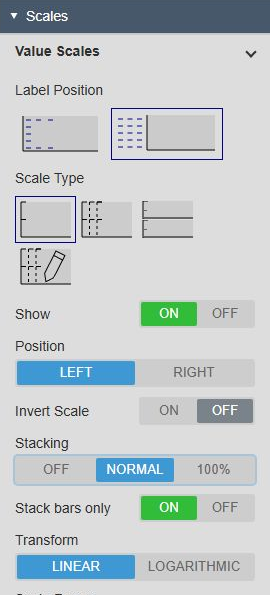
Scatter, range-area bands and their paired inputs, digital states, Analysis, and annotations do not join ordinary stacks. Stacked scales use linear coordinates. Source values and units remain unchanged in the legend, tooltips, rulers, summary table, and sample downloads.
For a 100% scale, move unstacked traces in physical units to another custom scale when necessary. Historical limit lines, target lines, and bands in physical units are omitted on percentage scales; source state coloring can still apply. The optional bar Total presentation is separate from the scale's stacking setting.
Time scale
Under Scales > Time Scale, choose Type:
- Timeline: Positions samples by their actual times.
- Discrete: Gives each category its own position. Categories can be formatted timestamps or actual string categories, useful for comparing a small number of interval results or named groups.
On a timeline, Labels > Range shows the start, end, and duration instead of a tick scale. With scale labels, Format offers Timestamps, Relative, and Offset from Start Time. Relative measures back from the range end; Offset measures forward from its start. Fit Data fits the time window to the available trace data.
Time-only options are unavailable on a discrete axis. Time-based selections and server summaries need categories with original timestamp mappings; a category name alone does not define a time interval. Date/time formatting also applies to applicable time text in data labels and the summary table.
Timeline spacing represents elapsed time correctly across daylight-saving changes. Discrete categories retain distinct positions when formatted local times repeat. A dashed Now marker appears when the current time is within the visible timeline; discrete mode highlights the current category.
Data retrieval
Choose a mode according to the question you want the chart to answer.
| Mode | Use it for |
|---|---|
| Default | General trend viewing. Loads a reduced set of history points suitable for the chart width. |
| Summary | One result per interval, such as an hourly average or maximum. Choose the interval, summary type, and calculation basis. |
| Recorded | Detailed investigation of archived events without plot compression. Limit the time range for dense sources. |
| Interpolated | Values at regularly spaced times. Set the interval and optional synchronization time. |
For bar charts, start with Summary or Interpolated so neighboring columns represent consistent intervals. A dense Recorded trace is harder to read and can load substantially more data.
Default mode updates recent history and periodically refreshes the overall plot automatically. Longer live ranges refresh less often. Display calculations and sources unavailable to the historical loader retain the history supplied by PI Vision. Clicking PI Vision's Now requests fresh history for charts following display time.
Digital states use the selected retrieval mode. Default is a sampled overview; Interpolated requests regular samples. Either can miss short state changes. Recorded provides more detail within its limits, but a held line or band is not a guarantee that every archived transition was loaded. Digital Trend is unavailable with Summary retrieval; use Default, Recorded, or Interpolated to view its states.
Under Start- and Endtimes, choose Display time range, Custom time range, or Duration and offset. Custom ranges keep their own window when the display time changes.
Recorded mode offers Data Flags to show questionable and substituted markers. Use them when data quality is part of the investigation.
Note: The Summary retrieval mode determines the plotted interval values. The Summary Table calculates statistics separately over its selected range. Its results do not depend on plot density or stacking.
Time bar
Enable the shared Time Bar to give the chart its own range controls, duration choices, or PI time expressions. A time bar configured to ignore display time retains its own range when the display changes.
Interactivity
- Enable Zoom: Enables mouse-wheel and toolbar zoom. Turning it off removes the drag-mode and zoom controls.
- Drag mode: Sets the starting Pan, Box zoom, or eligible Select behavior.
- Apply to display time: Applies zoom and pan changes to the whole display. Select mode remains a summary selection.
- Synchronize > Hover: Shares the hover position with compatible charts.
- Synchronize > Ruler: Enables synchronized A/B rulers and Clear rulers.
Summary table
Turn Show on, then choose Start Expanded for the saved startup state. Toggle Summary controls whether the table is open for the current session.
Height % (0 = automatic) accepts 0 to 60 in steps of five. Zero sizes the table automatically within the available chart space.
The startup, height, and optional action-column controls are grouped at the top of the section:
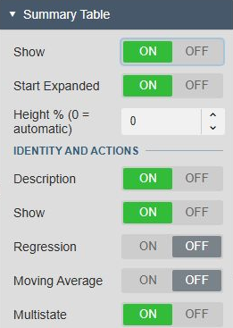
Choose columns in Identity and actions, Statistics, and Boundaries and differences. Name always remains visible. New tables use the six basic columns shown in the overview; existing saved choices for other supported columns remain effective.
The table uses time-weighted server statistics for new configurations, honoring the source's Step behavior. An explicitly saved calculation basis remains effective on older displays, but there is no basis control in this pane. Sum/Total is not a summary-table option. Event count counts recorded events.
Start and end values are requested at the exact ordered interval boundaries. With both rulers present, A/B columns retain their labeled positions and signed B-minus-A difference, even when A is to the right of B.
Both original range-area inputs retain rows and their own units. The paired input has no independent chart, Analysis, or multi-state action while it belongs to the band. Generated Analysis and limit overlays add no source rows.
Limitation: Missing or unsupported server metrics have no fallback calculated from chart samples. Boolean, digital, and string sources can provide supported exact-time values or event counts without numeric statistics. Discrete selections need original timestamps defining a time interval.
Trace options
Select a source in the list before editing it. Use the move buttons to reorder sources and Delete to remove a source from the chart.
Label, number Format, and Units control the value presentation. Hidden sets the saved starting visibility. Applicable scale assignment and Stack Group settings appear before the trace's Type.
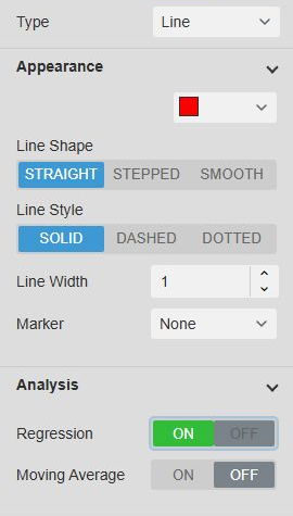
Appearance
Choose Line, Area, Bar, Scatter, or Range Area for an ordinary numeric source. Bar draws vertical columns. The controls under Appearance change with the type.
| Setting | Effect |
|---|---|
| Color picker | Sets the primary trace color. |
| Line Shape | Chooses Straight, Stepped, or Smooth. The initial shape follows the source's Step setting. |
| Line Style | Chooses Solid, Dashed, or Dotted. |
| Line Width | Sets 0 to 10 pixels. Zero hides the line or outline. |
| Marker | Chooses None, Circle, Square, Diamond, or Triangle. Scatter requires a visible marker. |
| Marker Size | Sets 1 to 30 pixels. |
| Opacity (%) | Sets area-fill opacity from 0 to 100%. |
Switching types preserves settings that are temporarily inapplicable. New traces start with a two-pixel line, five-pixel markers where shown, and 20% area opacity. Existing trace appearance is retained when you open its settings.
Range area
Use Range Area to shade between two numeric sources, such as an upper and lower operating boundary.
- Add both sources to the chart.
- Select the source that will own the band.
- Set Type to Range Area.
- Choose the second source in Target.
- Adjust the owning source's color, opacity, and scale.
The band replaces both standalone traces. When their values cross, shading remains between the smaller and larger value. The band's scale belongs to the owning source; the partner's standalone scale is used again after you unpair it.
The chart allows different units but performs no unit conversion. Check them yourself before using the band as an operating limit.
If the partner is unavailable, invalid, or has no overlapping valid data, the affected band is omitted and a warning appears in the PI Vision log. Other traces remain visible. The chart does not substitute a filled Area trace.
Analysis
Regression adds a linear best-fit line. Moving Average adds an arithmetic average of the last Samples valid loaded values. Samples accepts 1 to 100 and starts at 5.
These options are available for eligible ordinary numeric traces. Range Area does not offer Analysis. Regression is dashed; moving average is dotted. Both use the source color, a one-pixel line, and no markers.
Analysis uses the loaded symbol range. Visual zoom alone does not recalculate it. A moving average of five samples is not a five-minute or time-weighted average; its time span depends on the loaded data. Default-mode resampling can therefore change Analysis while server summary statistics remain independent.
Data labels and per-trace legend
Use the trace's Data Labels group to display its measurement labels. Common label presentation belongs to Trend Options > Data Labels.
The trace's Legend group controls its legend entry and tooltip identity. Digital Bands can also show informational state names through States in legend. Hiding a trace entry here removes that legend entry; clicking a trace entry in the running chart temporarily hides the trace instead.
Digital states
Select a digital, enumeration, or Boolean source under Trace Options, then choose State display:
| Choice | What you see |
|---|---|
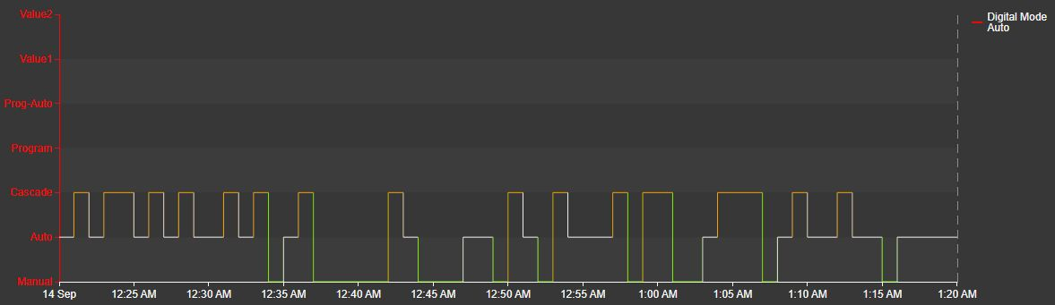
| Trend | A stepped line using numeric state codes in Single scale mode and state-name ticks in other modes. Use it to compare operating states over time. |
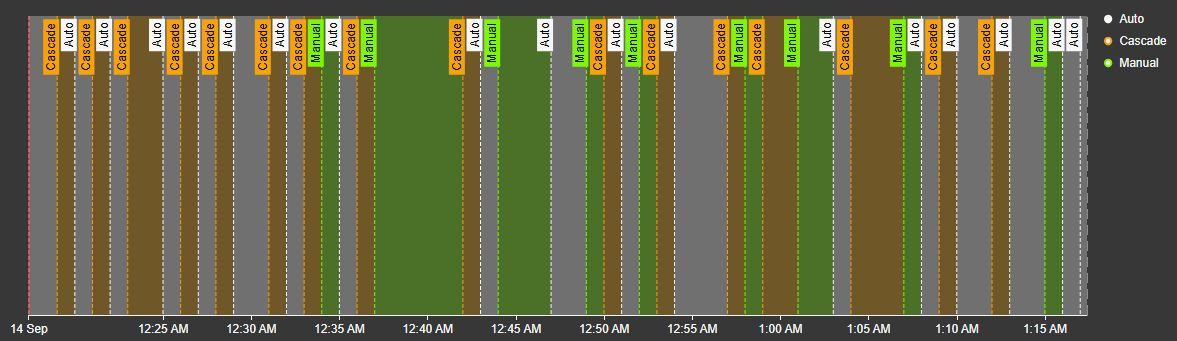
| Bands | Shaded state intervals with optional vertical lines and labels alongside the measurements. No second source is required. |
Newly added sources start with Trend. Existing digital sources without an explicit choice keep their previous Bands presentation, including saved lines and labels when region shading was off. Opening the configuration pane does not change that choice.
A Boolean attribute is a state source, so it uses these same choices. Its states are the ones the attribute supplies, or False and True when it supplies none. Because a Boolean is a state rather than a measurement, a saved bar or area type, custom range, logarithmic scale, stacking, regression, and moving average no longer apply to it, exactly as for a digital source.
Trend offers the primary color, line style, width, and markers. It holds each loaded state rather than smoothing or sloping between states. Its final inferred hold stops at Now or the symbol range end, whichever comes first. Bad or unknown states create gaps. The state names appear in current values, hover readouts, and Trend ruler boxes.
The same digital source in Trend with a named scale uses all seven state ticks and enabled multi-state colors. Its existing red axis styling is retained. Single mode instead displays numeric ticks.
In Bands, use Region, Opacity (%), Lines, and Labels to select the annotations. Label settings control their background, position, side, orientation, and size. Turning Region off keeps any enabled lines and labels. The last loaded band extends to the symbol range end. States in legend shows informational names and colors; these entries do not control individual state visibility.
This existing Bands display keeps its saved presentation, with multi-state colors enabled and state names in the legend.
The primary source color remains in use unless native multi-state colors are enabled. Selecting Trend does not enable multi-state automatically. Digital states do not use numeric Range Area pairing, regression, moving averages, or stacking. Their codes identify states; they are not measurements to average or subtract. Supported Summary Table columns can still request exact-time state names and event counts from the server, independently of the drawn samples.
String sources
String sources appear as time markers with text labels. Use these annotations alongside numeric traces to explain changes without putting text values on a numeric scale.
Multi-state
Right-click the chart and select Add Multi-State..., or open the existing multi-state configuration. Select the trace and enable Enable Multi-State. Use the native States editor to set colors.
For a digital source, Color series applies those colors to Trend. Bands use the enabled state colors directly. Digital sources do not offer numeric limit, target, or limit-label controls. A hidden state suppresses its drawing and annotations while preserving valid names for readouts and exports. Ordinary transparent colors do not erase state values. State display and Bands styling remain in the normal configuration pane.
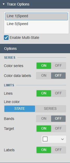
For numeric sources, use States to define colors and supported limits, and Options to choose their presentation:
| Setting | Effect |
|---|---|
| Color series | Colors supported line strokes, markers, columns, area fills, and range-area bands by state. The range-area owner controls the entire band. |
| Color data labels | Colors measurement labels independently of the series drawing. |
| Lines | Shows available historical limits as dashed lines. |
| Line color | Uses State colors or the Series color for limit lines. |
| Bands | Shows historical state ranges as lightly shaded background bands. |
| Target | Shows an available AF target history. Its color control appears while enabled. |
| Labels | Labels the enabled limits, bands, and target. |
The native States editor keeps the configured state names and colors:
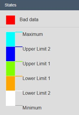
Limits and target history do not expand the automatic value range. Set an appropriate custom range if you need to see them outside the measurements' range. Identical overlapping labels may be combined.
Hidden states can suppress the affected drawing while keeping valid source values available to Analysis, summaries, and downloads. Label coloring can independently hide affected labels. A limit that cannot be read leaves out its own overlays, and measurements are then colored against the next limit that is available. Valid measurements keep their primary color only while no limit at all can be read for that moment.
Current limit or digital-name readouts are withheld when they cannot be associated with the selected source. Historical limits can remain available. Blink is not offered for historical traces. Ordinary Type, Range Area, Appearance, and Analysis settings remain in the normal configuration pane.
Data quality
Enable Hide No Data to omit qualifying sources from the chart, legend, and summary table. A trace hidden through its legend or summary Show action remains in the summary table for restoration.
Stale warnings are not available for historical chart series. See Data Quality for the exact No Data rules and global override behavior.
Events
Display event frames
- Under Events > Display, turn Enabled on.
- Right-click the chart and select Events Search Criteria....
- Configure the search and select Apply.
- Check that the expected event frames appear over the trend.
Use Start, End, Line, Labels, and Region to choose event boundaries, text, and background shading. Color Mode can use severity or automatic colors.
Click an event-frame label to open its details. The details window provides event information, comments, and attribute values. Available actions depend on your permissions. Use an attribute's chart action to inspect its trend.
Create event frames
Creation must also have Events > Display > Enabled turned on.
- Under Events > Creation, turn Enabled on.
- Choose the target asset and configure the event-frame template and creation options.
- Drag the desired interval on the chart.
- Click the corresponding Create Event Frame button.
- Review the name, asset, start and end times, severity, and other available fields.
- Select Save to create the event frame in AF.
Important: Save writes a new event frame. Dragging the interval alone does not create one. While creation is enabled, it takes over plot dragging and the normal zoom and drag-mode controls are unavailable.
Export data
Use Export Data for the formats offered by the configuration pane, or Download on the chart toolbar for image and sample-data choices. Both use the chart's current loaded data. See the fullscreen and downloads section above for exported fields and limitations.
Examples
Compare speed and pressure
Add the speed and pressure attributes for a production line. Use Line for speed and Area for pressure, then select Multiple value scales. Give each source a clear label and enable the summary table to compare averages and extremes without confusing m/s with bar.
For several sources sharing each unit, use Custom scales named Speed and Pressure and assign the related traces to each scale.
Compare a process value with statistical limits
Prepare the process attribute's AF limits and target, including their history where the limits change over time. For statistical process control, use your approved AF analysis to calculate and historize the required limits.
Add the process value as a Line trace. Enable multi-state, turn Color series, Bands, and Target on, and choose the state colors in States. Add limit Lines or Labels when they help interpretation. Use a physical-unit scale so the historical limits remain visible.
Use a master chart to set display time
Create a broad overview chart and a detail chart:
- Give the overview Data Retrieval > Start- and Endtimes > Custom time range.
- Turn on Interactivity > Enable Zoom and Apply to display time.
- Set Drag mode to Box zoom.
- Leave the detail chart on Display time range.
- Drag a band in the overview to update the detail chart's time range.
The overview's custom loading range remains independent of the display. Use Box zoom for this workflow; Select chooses a summary interval without changing display time.
Build a compact KPI trend
Enable Trend Options > Style > Sparkline and hide the legend. Use a simple Line trace with few or no markers. The result fits alongside a value or KPI label while keeping the recent process direction visible.
Troubleshooting and limitations
See Troubleshoot chart data loading for the PI Vision log, loading failures, and information to send support.
Large Recorded or Interpolated datasets, markers, and data labels increase rendering cost. Begin with Default and enable detail only for the investigation that needs it.
| Symptom | What to check |
|---|---|
| A trace is missing | Check its saved Hidden setting, legend visibility, summary Show action, time range, scale assignment, and Hide No Data. A source paired into a Range Area no longer draws independently. |
| A range-area band is missing | Check its Target, numeric data, and overlapping valid times. Open the PI Vision log for the warning. Different units do not block the band, but the chart does not convert them. |
| A digital Trend is missing or has gaps | Check the state definition, data quality, and whether loaded states belong to that definition. Summary retrieval does not draw digital Trend. Review the PI Vision log for details. |
| Summary values differ from hover or ruler values | The table requests server calculations and exact-time values; chart readouts use loaded samples and line shape. Check the summary interval and active rulers. |
| Summary cells are unavailable | Check PI Web API access and whether the source supports the requested numeric statistic. Chart samples are not used as a fallback. |
| Zoom affects other symbols | Turn off Apply to display time if only the chart window should change. |
| Bars or labels are crowded | Use Summary or Interpolated retrieval with a larger interval, shorten the range, or turn off markers and data labels. |
| Recorded data reaches its limit | Shorten the time range or use Default/Summary. The chart reports the limit in the PI Vision log and falls back to plot data for that update. |
| An export reports a failure | Check the PI Vision log. If the application was recently updated, refresh it to load the current chart services. |



