



Vision Library+ / Charts and analytics
FFT+
FFT+ transforms time-series data into a frequency spectrum for identifying periodic components.
Overview
FFT+ transforms time-series data into a frequency spectrum for identifying periodic components.
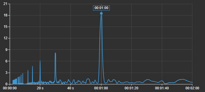
Watch the demo
See FFT+ in a practical PI Vision workflow.
When to use it
Use this symbol when you need to:
- Investigate repeating process behavior or vibration frequencies.
- Compare frequency content across numeric signals.
Before you begin
- Prepare evenly sampled numeric data or choose an interpolation setting that produces suitable samples.
- Select a time range and sampling rate appropriate for the frequencies of interest.
Add and set up the symbol
- Select the symbol in the PI Vision symbol gallery.
- Add the required data sources or asset context to the display.
- Right-click the symbol and open its configuration pane.
- Configure the minimum data, range, and display settings for a useful result.
- Confirm that the symbol shows the expected data.
Use the symbol
Hover over the spectrum to inspect frequency and magnitude, and use the chart toolbar to examine a band.
The chart toolbar appears at the top right when the pointer or the keyboard focus enters the chart, and hides shortly after it leaves. Set Trend Options > Toolbar > Reveal to Always to keep it in view; the chart then keeps a band of its plot area free so the buttons never cover the plot. On a touch device the toolbar is always shown. The toolbar carries, in order: the drag-mode buttons Pan and Box zoom, Zoom in, Zoom out, Reset zoom, Settings (the Quick Settings gear), Fullscreen and Download.
- Drag mode: Pan and Box zoom choose what dragging the plot does. In Pan, dragging moves the visible frequency window; in Box zoom, dragging draws a selection to zoom into and stays selected for the next drag. The mode starts at the Interactivity > Drag mode setting each time the display loads and is not saved when a viewer changes it.
- Zoom: The wheel always zooms in either mode. Zoom in and Zoom out halve and double the visible span around its centre, clamped to the spectrum's full range, and Reset zoom restores that full range. Zoom on this chart never retimes the display, because the horizontal axis is a frequency or a period rather than a clock. Turning Interactivity > Enable zoom off removes the drag-mode buttons and the whole zoom family, and the wheel then does nothing.
- Settings: The gear opens the Quick Settings menu described below. It is always available, whether or not the rest of the toolbar is shown.
- Fullscreen opens the current spectrum in a large dialog without recalculating it, carrying the legend selection and the current zoom window. The dialog offers the Settings gear and Download only; the zoom buttons stay with the chart on the display.
- Download writes the chart as PNG, SVG or PDF, or the plotted spectrum as CSV, JSON or XLSX. The data export has one row per frequency (or per period, on a Duration scale) and one column per visible trace.
Configure the symbol
Overview and behavior
The Fast Fourier Transform (FFT) Chart transforms standard time-series data from your PI System into the frequency domain.
This chart is primarily used for condition monitoring and vibration analysis of rotating machinery. By isolating the distinct frequencies and amplitudes hidden within complex time-series signals, the FFT Chart helps engineers identify the root causes of mechanical issues (such as imbalance, misalignment, or bearing wear) before they cause machine failure.
Trend options
This section controls the general visual appearance of the chart.
- Style:
- Foreground & Background: Adjust the colors of the chart's background and foreground elements (axes, text). Set the background to transparent if you want it to blend with your PI Vision display.
- Font Size: Change the size of the text used throughout the chart.
- Title: Toggle the chart title on or off, enter custom text, and choose its alignment and color.
- Legend & Tooltips:
- Legend: Toggle visibility and choose its position. Useful when comparing multiple sensors on the same machine.
- Tooltip: Turn on to see the exact Frequency and Amplitude values when hovering over a peak. Highly recommended for precise analysis.
- Grid: Controls what is drawn behind the data: the grid lines, the shaded bands, and the border of the plot area.
- Show: Turns the grid on or off. When it is off, no grid lines or bands are drawn; the Border setting still applies.
- Lines: Selects which grid lines are drawn: None, Horizontal, Vertical, or Both. The names always describe the direction the lines run on screen.
- Bands: Draws alternating shaded bands across the plot area.
- Border: Bounds the plot area. Axes draws the two axis lines with their ticks, Frame draws a rectangle around the plot instead of the axis lines, and None draws neither. Grid lines drawn with Border set to None are dashed. With Separate Scales, Frame draws a rectangle around each stacked lane.
Grid line color and opacity are not settings; they follow the chart's foreground color and theme.
- Toolbar: Controls the chart toolbar. Show turns the generic buttons on or off - the drag-mode buttons, the three zoom buttons, Fullscreen and Download - and Reveal chooses between showing the toolbar on hover and showing it always. Always also reserves a band of plot area for the toolbar; on hover nothing is reserved. The Quick Settings gear is not part of Show and stays available either way.
Interactivity
Interactivity has two rows.
- Enable zoom is the master switch. With it off the chart cannot be zoomed at all: the wheel does nothing, a drag does nothing, and the drag-mode and zoom buttons leave the toolbar.
- Drag mode chooses whether a drag on the plot pans or draws a box zoom. It is the mode the chart starts in; the toolbar's drag-mode buttons switch it for the current viewer only and never change what is saved.
There is no Apply to Display Time row here. The horizontal axis is a frequency or a period, not a clock, so a zoom on this chart has no display time range to apply itself to.
Scale
Manage how the X (Frequency) and Y (Amplitude) axes are displayed.
- Frequency (X-Axis):
- Format (Hz vs. Duration):
- Hz (Hertz): Standard for rotating machinery (cycles per second). Use this for identifying running speeds and gear mesh frequencies.
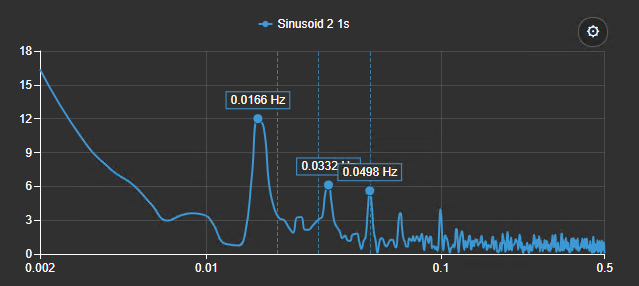
- Duration: Shows the period of the wave rather than the frequency (e.g., "1 cycle every 10 seconds"). Useful for slow-moving processes.
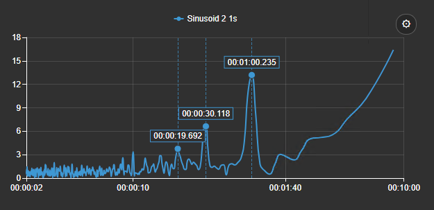
- Scale Mode: Set to Auto to automatically fit the data, or Manual to zoom in on a specific frequency band (e.g., manually setting 0-100 Hz to isolate motor running speed without being distracted by high-frequency noise).
- Spacing (Linear vs. Log):
- Linear: Standard spacing.
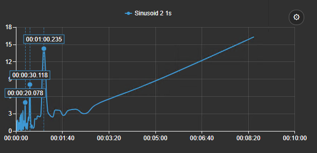
- Log (Logarithmic): Compresses the X-axis. Use this when you need to view very low frequencies (like belt issues) and very high frequencies (like gear mesh or bearing faults) on the same screen without losing detail at the low end.
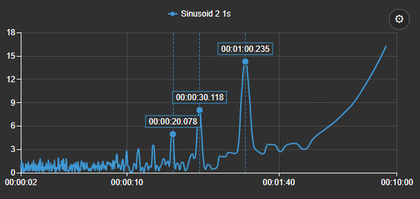
- Amplitude (Y-Axis):
- Amplitude Scale (Linear vs. dB):
- Linear: Best for looking at the dominant source of vibration.
- dB (Decibel): A logarithmic scale. Why use it? Mechanical faults often produce harmonics with very low amplitudes compared to the main running speed. A dB scale boosts the visibility of these tiny signals, allowing you to see early-stage bearing wear alongside a massive imbalance spike.
- Scale Type:
- Single Scale: All traces share one axis. Best when comparing identical sensor types.
- Multiple Scales: Multiple overlapping Y-axes.
- Separate Scales: Splits the chart into stacked, horizontal lanes. Why use it? Perfect for comparing sensors with different units (e.g., Acceleration in g's vs. Velocity in mm/s vs. Displacement in µm) without flattening the smaller traces.
Data
This section contains the core signal processing settings. Adjusting these determines the accuracy and readability of your FFT.
- Sampling:
- Interval Mode (Auto vs. Fixed):
- Fixed: Highly recommended for FFTs. You must define a specific sample interval (e.g., 10ms). Why? The sampling interval dictates your maximum measurable frequency (the Nyquist frequency). If your interval fluctuates, your frequency scale becomes unreliable.
- Max Samples (256 to 4096): Controls how much data is fed into the math engine.
- Why change it? Higher sample counts (e.g., 4096) provide higher frequency resolution, meaning peaks will be sharper and you can distinguish between two faults that are very close in frequency (like motor slip vs. running speed). However, higher sample counts require more data and calculation time. Lower counts (256) compute instantly but result in "blocky" charts.
- Sync Time: Aligns data retrieval to exact timestamps (e.g., top of the hour) to ensure you are comparing apples to apples when looking at historical data across multiple machines.
- Spectrum: Configure the mathematical transformation.
- Spectrum Type:
- Peak: Shows the true amplitude of sine waves. Standard for general unbalance or misalignment detection.
- RMS (Root Mean Square): Represents the overall energy/power of the signal. Standard for overall vibration severity assessments (like ISO standards).
- Peak-to-Peak: Shows total excursion. Commonly used when analyzing displacement sensors (proximity probes).
- PSD (Power Spectral Density): Good for random, non-periodic vibration (like fluid turbulence or cavitation).
- Averaging (Welch Method):
- Why use it? Raw FFTs are often very noisy, making it hard to spot structural faults. Welch averaging breaks the data into segments, calculates the FFT for each, and averages them together. This suppresses random background noise and makes true mechanical frequencies stand out clearly.
- Segment Length & Overlap: A 50% overlap is standard industry practice to ensure data lost at the edges of segments isn't ignored.
- Peak Detection: Turn this on to automatically place a marker on the highest amplitude peaks. Why? It saves you from manually hunting for the exact frequency of a peak with your mouse.
- Signal Adjustments (Detrend & Remove Mean):
- Remove Mean: Always recommended. Real-world sensors often have a baseline voltage offset (DC offset). If not removed, this creates a massive, useless spike at 0 Hz that squashes the rest of your chart.
- Linear Detrend: Removes slow, steady drifts (like temperature changes over time) that can smear low-frequency bins.
- Window: Standard FFTs assume signals are perfectly cyclical. Real data isn't, which causes "spectral leakage" (energy blurring into adjacent frequencies). Windows solve this.
- Hann / Hamming: Excellent general-purpose windows. Good balance of frequency resolution and amplitude accuracy.
- Flat Top: Poor frequency resolution, but highly accurate amplitude. Use when calibrating or measuring exact peak heights.
- Blackman-Harris: Best for signals with a massive dynamic range (a huge peak next to a tiny peak).
- Fault Overlays:
- Add vertical reference lines at specific, known frequencies to instantly identify typical machine faults (e.g., Bearing Outer Race (BPFO), Gear Mesh Frequency (GMF), Blade Pass Frequency).
- How: Click Add Overlay, name it (e.g., "Pump Impeller"), set the frequency in Hz, and pick a color. If a peak lines up perfectly with your overlay, you have identified the fault.
Trace options
Customize the appearance and behavior of individual data streams (traces). Select a specific data source from the list at the top to edit it.
- Ordering: Use the arrows to change the draw order or layout of traces (especially useful if using "Separate Scales").
- Trace Settings:
- Label: Override complex PI Point names with human-readable labels (e.g., "Motor Inboard Radial").
- Curve (Straight vs. Smooth):
- Straight/Stepped: Often better for FFTs because it accurately reflects the "binned" digital nature of frequency data.
- Smooth: Visually pleasing, but can occasionally create artificial slopes between data points.
- Individual Scaling: (Only available if the Y-Axis Scale Type is set to "Multiple" or "Separate"). Set custom Y-Axis ranges for individual traces to ensure smaller signals aren't dwarfed by larger ones in adjacent lanes.
Quick settings menu
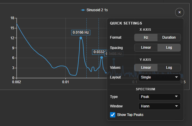
For rapid analysis directly on the dashboard, the FFT Chart includes a Quick Settings menu. This allows users to make on-the-fly adjustments to the most critical chart parameters without needing to open the full PI Vision configuration pane.
To access it, click the gear icon on the chart toolbar at the top right of the chart. The gear is always offered there, whether or not Trend Options > Toolbar > Show is on, so it stays available on displays that carry no other toolbar buttons.
Why Use Quick Settings?
When actively troubleshooting a machine, you often need to look at the data from multiple angles. The Quick Settings menu allows you to instantly toggle between views-like switching to a logarithmic scale to uncover hidden harmonics, or turning on peak markers to quickly grab a frequency value-without interrupting your workflow.
Quick Settings Options
- X Axis:
- Format (Hz / Duration): Instantly swap the horizontal axis between Frequency (Hertz) and Time (Duration) to analyze the signal differently.
- Spacing (Linear / Log): Toggle to a Logarithmic X-axis to compress the view, allowing you to see both very low-frequency faults (e.g., belt issues) and high-frequency faults (e.g., gear mesh) on the screen at the same time.
- Y Axis:
- Values (Linear / Log): Switch the amplitude scale. Changing to Log makes tiny amplitude peaks (which might indicate early-stage faults) much easier to see next to massive dominant running speed peaks.
- Layout: Use the dropdown to quickly change how traces are displayed (Single shared axis, Multiple overlapping axes, or Separate stacked lanes).
- Spectrum:
- Type: Quickly change the FFT calculation output (e.g., swapping from Peak to RMS to check overall energy).
- Window: Instantly apply different windowing functions (like Hann or Flat Top) to see how they affect the sharpness and amplitude accuracy of your peaks.
- Show Top Peaks: A simple checkbox to turn automatic peak detection and markers on or off.
Screenshots in this article predate the chart toolbar: the gear now sits on the toolbar strip rather than on its own round button, and the Quick Settings menu opens below the strip.
Troubleshooting and limitations
- Check: If the spectrum is empty or misleading, check sample count, interval, time range, and source quality.
- Check: Interpretation is limited by the sampling rate, time window, and signal conditioning.



