



Vision Library+ / Charts and analytics
Event Analytics Pivot+
Event Analytics Pivot+ aggregates event-frame results into a row-and-column table.
Overview
Event Analytics Pivot+ aggregates event-frame results into a row-and-column table.
When to use it
Use this symbol when you need to:
- Compare event measures across two categorical dimensions.
- Create a compact event summary without exporting data.
Before you begin
- Prepare an event-frame template and search that returns the intended events.
- Choose row and column fields with a manageable number of distinct values.
Add and set up the symbol
- Select the symbol in the PI Vision symbol gallery.
- Add the required data sources or asset context to the display.
- Right-click the symbol and open its configuration pane.
- Configure the minimum data, range, and display settings for a useful result.
- Confirm that the symbol shows the expected data.
Getting started: creating your first analytics pivot
Follow these steps to create and configure a new Event Analytics Pivot+ symbol.
Step 1: Find and Select Your Event Frames
- Open the Event Frame Search pane in PI Vision.
- Define your search criteria (e.g., specific event frame template, time range, asset) to find the set of events you want to analyze.
- Click the Apply button.
Step 2: Add the Symbol to the Display
From the symbol gallery, select the Event Analytics Pivot+ icon. In the Event Frame Search results pane, locate the attribute list on the left - these are the attributes available across your found event frames. Click and hold any attribute you plan to use in the table (it does not have to be the final one), then drag it onto the display. A new, unconfigured pivot table symbol will appear.
Step 3: Configure the Event Search (Critical Step!)
By default, a new symbol does not inherit the search criteria from the Event Frame Search pane - you must link it manually. Right-click on the new Event Analytics Pivot+ symbol, select Search Criteria from the context menu, configure your event search criteria, and click Apply. The symbol is now configured to query the event frame data needed for its analysis.
Important: If your table appears empty or shows "No Data," the most common reason is that the symbol's internal event search criteria (from Step 3) does not match a search that returns events. Always double-check this configuration first.
Step 4: Configure the Table Dimensions
Configure the table dimensions to define the analysis. With the symbol selected, open the Configuration pane. Under the Dimension section, add attributes to the Values, Columns, and Rows fields. Use the Style, Totals, and multi-state sections to adjust the appearance.
Use the symbol
Sort or inspect the pivot cells to compare aggregated event values.
Configure the symbol
Overview and behavior
The Event Analytics Pivot+ symbol brings Excel-style pivot tables natively into AVEVA PI Vision. It cross-references and aggregates event frame data to build multi-dimensional reports for downtime root-cause analysis, batch summaries, and OEE tracking.
The sections below cover each configuration option.
How it works: dimensions
The pivot table uses three core dimensions: Values, Columns, and Rows.
- Values: The aggregated metric that fills each intersecting cell (e.g., Total Duration).
- Rows: Vertical categories down the left side of the table (e.g., Asset or Reason Code). Multiple rows create an expandable tree hierarchy.
- Columns: Horizontal categories across the top header (e.g., Shift or Date).
Values (The "How much")
Values define the quantitative measure calculated in each table cell. Multiple values can be added to the same pivot table.
| Value Attribute Property | Description |
|---|---|
| Name (Attribute) | The event frame attribute containing the data to be analyzed (e.g., Duration, Product Yield). |
| Caption | A friendly name that appears as the column header (e.g., Total Downtime). |
| Visible | Toggle visibility. Useful when a value is needed for sorting but should not appear in the table. |
Data Type and Summary Type Rules
The available calculations depend on the attribute’s data type:
| Data Type | Available Summary Types | Description |
|---|---|---|
| Numeric (Float, Integer, Timespan) | Count, Count Distinct, Sum, Min, Max, Average, Median, StdDev. | Offers full statistical analysis. For example, use Sum of "Duration" to see total downtime hours. Time-based properties automatically format as readable timespans. |
| Categorical (String, Enumeration) | Count, Count Distinct. | Use Count to see the frequency of different categories, such as counting the number of events for a specific "Reason Code". |
Columns (The "Horizontal slices")
Columns define the headers that stretch horizontally across the top of the pivot table.
- Name (Attribute): The attribute that defines the categories (e.g., Shift, Crew).
- Caption: A custom name for this dimension.
- Group Interval (for DateTimes): Groups timestamp data by intervals such as Year, Month, Day, or Hour.
- Top N: Filter the table to show only the top or bottom contributing columns.
- Mode: Top or Bottom.
- Count: Number of columns to display (e.g., 5).
- Value Index: The configured Value used to determine rank (e.g., Top 5 Shifts by Total Yield).
- Show Others: When enabled, remaining data is aggregated into a single Others column to preserve grand totals.
- Sort: Arrange columns Ascending or Descending. Choose to sort by the column name itself ("Self") or by a specific calculated Value.
Rows (The "Vertical Slices")
Rows define the vertical categories down the left side of the table. The configuration options for Rows (Attribute, Caption, Group Interval, Top N, and Sort) are identical to Columns.
- Expandable Hierarchies: Adding multiple Rows (e.g., Region, Site, Asset) automatically creates a nested, expandable tree. Click the arrow next to a Region to expand it and reveal the Sites within.
General table options
These settings control the grid's layout and totals.
- Totals:
- Show Row Totals: Appends a "Total" column to the far right of the table.
- Show Column Totals: Appends a "Total" row to the bottom of the table.
- Show Grand Total: Calculates the absolute intersection total in the bottom-right corner.
- Layout:
- Fit Table: The table stretches all columns equally to fill the entire width of the symbol's bounding box.
- Fit Data: Columns shrink to the minimum width necessary to fit the text inside them.
- Manual: Set a fixed column width in pixels.
- Expand Rows on Load: Controls whether the table opens fully expanded (all nested details) or collapsed (top-level summaries only).
Multi-state (Conditional formatting)
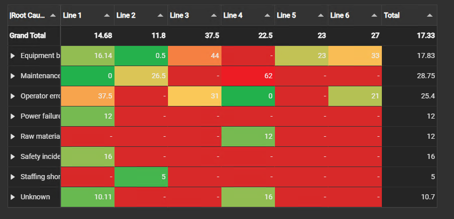
Highlight specific cells based on their calculated value to flag bad actors or out-of-spec batches. Right-click the symbol and select Configure Multistates.
- Values Menu: Select the specific Value you want to format from the list.
- Enable multi-state: Turn conditional formatting on for the selected Value. The rest of the section appears once it is ticked.
- Property: Choose how the color is applied to the cell:
- Fill: Colors the entire background of the table cell.
- Badge: Places a modern, colored pill/badge behind the number.
- Text: Changes only the color of the text itself.
- Gradient: When enabled, colors blend smoothly between defined limits instead of switching abruptly.
- States & Limits: Type a limit and press Enter, or choose the
+button, then assign its color. Limits compare with ≤ and the list sorts itself from the highest limit down, whatever order you add them in. - Error: The first row sets the color for everything the limits do not cover: a value above the highest limit, a value that is not a number, and a cell with no events. Set it to transparent to leave those cells blank.
- Duration Format Hint: For a Value whose data type is a timespan, such as Duration, enter human-readable timespans directly (e.g., 1h for 1 hour, 30m for 30 minutes, 1.5d for 1.5 days) instead of raw seconds.
Filtering
Event Analytics Pivot+ is a filter receiver. Under Filtering > Input, map a Linked channel to a target property in the pivot's Event Frame data. Master and Linked filters are applied before rows, columns, and values are aggregated. The symbol does not publish filters.
See Filtering dashboards for empty-channel behavior, matching rules, and loaded-search limitations.
Troubleshooting and limitations
- Check: If the table is empty, validate the event search, dimensions, value field, and time range.
- Check: Large row and column cardinality can make the table difficult to read.



