PI Vision Custom Symbol
Transform Your Event Frames into Powerful Analytics Charts
Stop exporting, start analyzing. Event Analytics Chart+ aggregates, calculates, and visualizes your event frame data, turning raw events into actionable insights on downtime, losses, and performance.
Stop Exporting, Start Analyzing
Powerful Aggregation Engine
- Count Events: Count the occurrences of events based on type, reason code, or any other attribute.
- Sum Durations & Attributes: Sum the total duration of downtime events or calculate the total production loss.
- Calculate Averages: Determine the average value of any numeric attribute across a set of events.
Flexible Charting Options
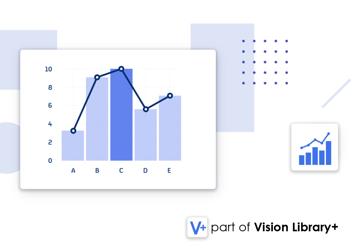
- Multiple Chart Types: Visualize your aggregated data as a bar, line, or area chart to best suit your needs.
- Stack Series: Stack bars to show the composition of your data, such as downtime by reason code per asset.
- Multistate & Limit Lines: Apply conditional coloring and display limit lines to highlight KPIs and targets.
Interactive Data Exploration
- Top N Analysis: Automatically identify and display the "Top N" contributors to a problem, like your worst-performing assets.
- Interactive Drilldown: Click on any bar or point in the chart to see the underlying event frames that make up the calculation.
- Seamless PI Vision Integration: Works with any Event Frame template and is configured with an intuitive panel.
From Raw Events to Business Intelligence
Downtime & Root Cause Analysis
Create a Pareto chart of downtime events by reason code or count to instantly identify your biggest problems.
OEE & Production Loss Analysis
Sum the "Tonnage Lost" or "Duration" attributes from your events to create charts that quantify the impact on production.
Asset Performance Benchmarking
Group event counts or durations by asset to create a bar chart comparing the performance of similar equipment.
Event Frequency & Trend Analysis
Use a line chart to trend the number of critical events per day or week to track improvement over time.
Powerful Event Aggregation, Made Visual

Count Events by Category
Aggregate and count your event frames based on any attribute, such as a downtime reason code or product grade.

Stack Series for Deeper Insight
Stack your data series to visualize the composition of your totals, like breaking down downtime hours by asset.

Focus on "Top N" Bad Actors
Automatically calculate and display the top contributors to a problem, such as the 5 assets with the most downtime.

Apply Multistate & Limit Lines
Use conditional coloring to highlight underperforming assets and add target lines to visualize your KPIs.

Interactive Drilldown to Raw Events
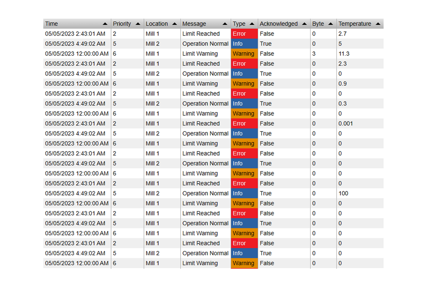
Click any bar or point on the chart to instantly open a table showing the underlying event frames for root cause analysis.
See It in Action
Questions?
Click the button below to get in contact, or simply email us at contact@software-athlete.com. We would love to help you.


