Asset Comparison Bar Chart+ for AVEVA PI Vision

PI Vision bar chart to compare and rank assets

See which assets lead and which fall behind. Asset Comparison Bar Chart+ draws the same AF attributes for many assets as sorted, grouped or stacked bars in your PI Vision display.

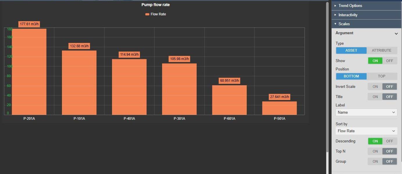
Asset Comparison Bar Chart+ in PI Vision ranking six centrifugal pumps by flow rate, highest first, with the value and units above each bar, next to the Argument scale settings with the type Asset, Sort by Flow Rate, Descending on and Top N
Asset Comparison Bar Chart+ v2.0 in PI Vision: six pumps ranked by flow rate. Demo data. Select the image to enlarge.

PI Vision bar chart for comparing and ranking assets

Pick the assets and the attributes, then sort the bars so the best and the worst assets stand out.

One bar per asset from an AF search

Let PI Vision search criteria fill the chart, so new assets of the same type appear without editing the display.

  • Search by database, search root with all descendants, asset name, asset type and category.
  • Number of results and asset order.
  • Attributes picked from one list of the attributes the assets share.
  • Asset labels by name, description, path or an attribute value.
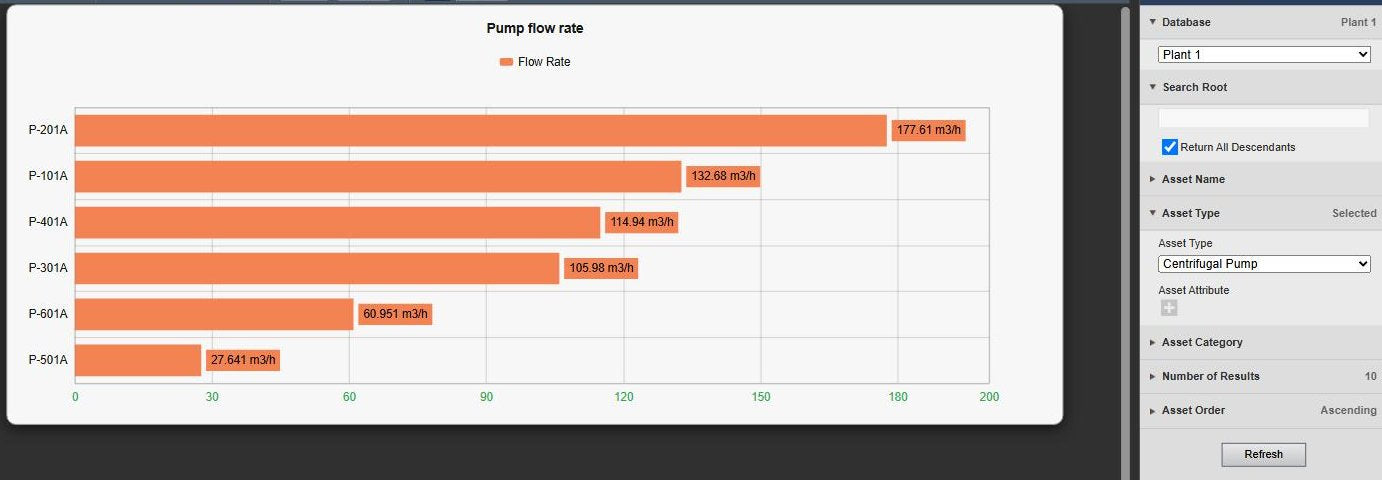
Asset Comparison Bar Chart+ with horizontal bars for six centrifugal pumps, next to the PI Vision search criteria with database Plant 1, Return All Descendants, asset type Centrifugal Pump, number of results and asset order
An AF search on the pump type fills the chart. Demo data. Select the image to enlarge.

Sort the bars and show the top or bottom N

Rank the assets by any attribute and keep only the leaders, or the laggards, on the chart.

  • Sort by asset name or by any attribute, descending or ascending.
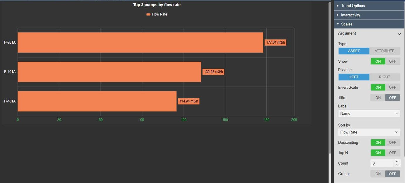
  • Top N keeps the first assets of the sort order; turn Descending off for the bottom N.
  • Vertical or horizontal bars, with the asset axis at the bottom, top, left or right.
  • Group the assets by the value of an attribute.
Asset Comparison Bar Chart+ with horizontal bars titled Top 3 pumps by flow rate, P-201A, P-101A and P-401A, next to the Argument settings with position Left, Invert Scale on, Sort by Flow Rate, Descending on, Top N on and Count 3
Top 3 of six pumps by flow rate, in horizontal orientation. Demo data. Select the image to enlarge.

Grouped, stacked and multi-scale bar charts

Compare several attributes per asset, choose how the bars combine and decide which values the chart shows.

Several attributes per asset on one or more scales

Keep comparable measures on one scale, or give attributes with different units a scale of their own.

  • Grouped bars per asset, or the attributes on the axis with one bar per asset.
  • Stacked bars and 100 % stacks.
  • Single, Multiple or Custom value scales, with ticks aligned across scales.
  • Custom scales with position, inversion, linear or logarithmic transform, range, title, ticks and colour.
Asset Comparison Bar Chart+ comparing six pumps by bearing temperature, discharge pressure and flow rate as grouped bars, each on its own coloured value scale, next to the Value scale settings with Scale Type Multiple and Align Ticks on
Three attributes per pump, one value scale each. Demo data. Select the image to enlarge.

Current values, summaries and tooltip-only attributes

Plot each attribute as its current value or a summary, and keep supporting values in the tooltip.

  • Value per attribute: current, or total, average, minimum, maximum or range over the display time range.
  • Also standard deviation, population standard deviation, count and per cent good.
  • Show an attribute as a bar, as a reference dot or only in the hover tooltip.
  • A custom label, colour and background shade per attribute.
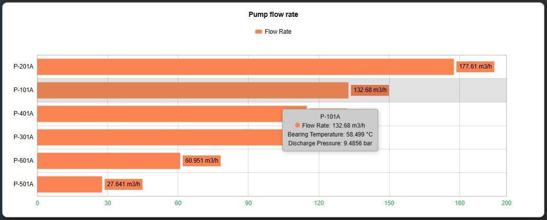
Asset Comparison Bar Chart+ in the Light theme with the tooltip for pump P-101A showing its flow rate and the tooltip-only bearing temperature and discharge pressure, with the hovered row highlighted
Bearing temperature and discharge pressure shown only in the tooltip. Demo data. Select the image to enlarge.

Bar chart labels, themes and export

Put the numbers on the bars, match the chart to the display, and take the comparison further.

Data labels, themes and multi-state colours

Read every value without hovering, and let colours show which assets need attention.

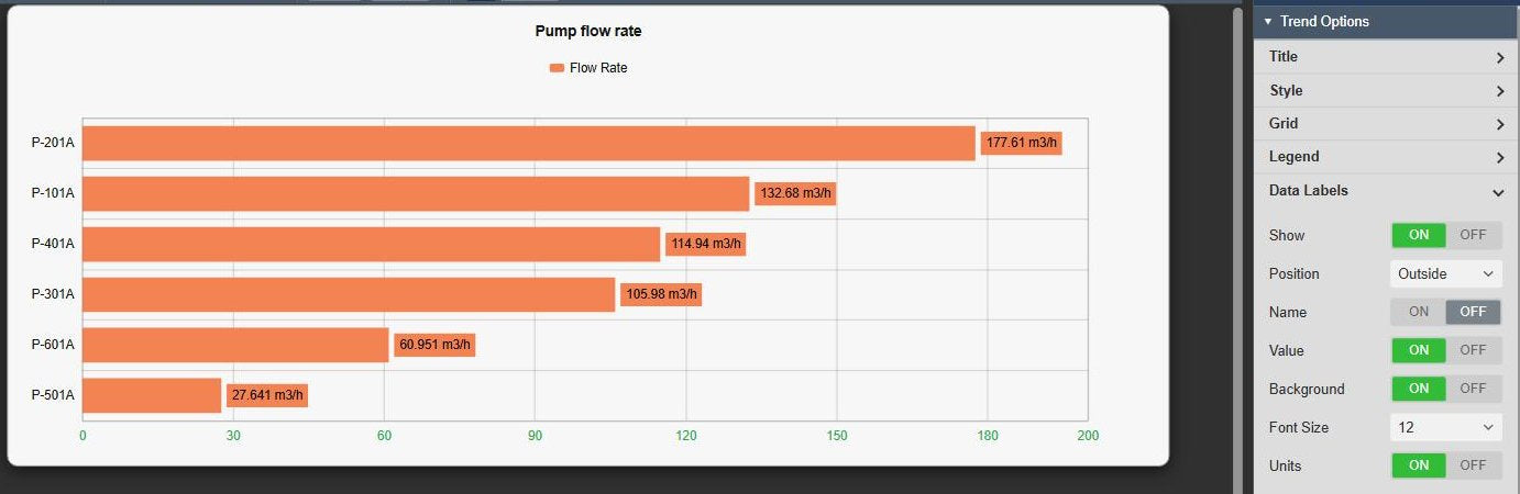
  • Data labels with value, name and units, a background, font size and position inside or outside the bar.
  • Built-in themes such as Light, a Card container, title and subtitle, legend and grid.
  • Multi-state colours per attribute.
  • Full screen, download as PNG, SVG, PDF, CSV, JSON or XLSX, and click actions such as an ad hoc trend or filtering other symbols.
Asset Comparison Bar Chart+ in the Light theme with a card container, six pumps as horizontal bars with the flow rate and units on each bar, next to the Data Labels settings with position Outside, value, background, font size and units
Light theme with data labels and units. Demo data. Select the image to enlarge.

PI Vision bar chart examples

Four common ways teams use Asset Comparison Bar Chart+ on their displays.

Pump station ranking

Data
Flow rate of every pump from one AF template
Settings
AF search on the pump type, sorted by flow rate, data labels with units
Shows
Which pump delivers the most and which the least

Top 10 production lines

Data
Production per line over the shift
Settings
Value Total over the display time range, Top N 10, horizontal bars
Shows
The ten best lines, or with Descending off the ten weakest

Line performance against target

Data
OEE or availability per line
Settings
Multi-state colours on the attribute, sorted ascending
Shows
Which lines run below their target at a glance

Energy use by unit

Data
Electricity and steam per unit
Settings
Stacked bars per unit on one scale, sorted by electricity
Shows
Where the energy goes and which unit uses the most

Asset Comparison Bar Chart+ FAQ

Questions we are asked most often. Read the Asset Comparison Bar Chart+ documentation or ask a technical question.

When should I use a bar chart instead of a table or a radar chart?

Use Asset Comparison Bar Chart+ to rank many assets by one or a few attributes and see the leaders and laggards at a glance. Use Asset Comparison Table+ when readers need the exact values side by side, and Radar Chart+ to compare a handful of assets across several measures at once.

Can the chart show only the top or bottom assets?

Yes. Sort the assets by an attribute and turn on Top N with the number of assets to keep. Turn Descending off to show the bottom N instead. The ranking uses the assets the search returns, so set the number of results high enough to include every asset you want to rank.

Our attributes use different units. Can they share one chart?

Yes. Use Multiple value scales for one scale per attribute, or Custom scales to put attributes with the same unit on one named scale. Align Ticks lines up the grid of the scales.

Can new assets appear on the chart automatically?

Yes. Add search criteria and the chart is filled from an AF search by search root, asset name, asset type and category. If assets are missing, check Return All Descendants and the number of results.

What do we need to run it?

PI Vision 2021 or later with PI Web API, and PI AF Server 2018 SP2 or later. Asset Comparison Bar Chart+ runs in PI Vision and uses each user’s existing PI permissions.

How do we get Asset Comparison Bar Chart+?

Asset Comparison Bar Chart+ is part of Vision Library+, together with the other Vision Library+ symbols. Request a trial to test it in your own PI Vision environment.

Try Asset Comparison Bar Chart+ in your PI Vision

Asset Comparison Bar Chart+ is included in Vision Library+, the PI Vision custom symbol library from Software Athlete. Test it on your own displays and data.