Asset Time Series Chart+ for AVEVA PI Vision

PI Vision trend to compare assets over time

Compare the same measurements and operating states across pumps, lines or sites on one PI Vision trend. Configure each attribute once, and every matching AF asset gets its own trace.

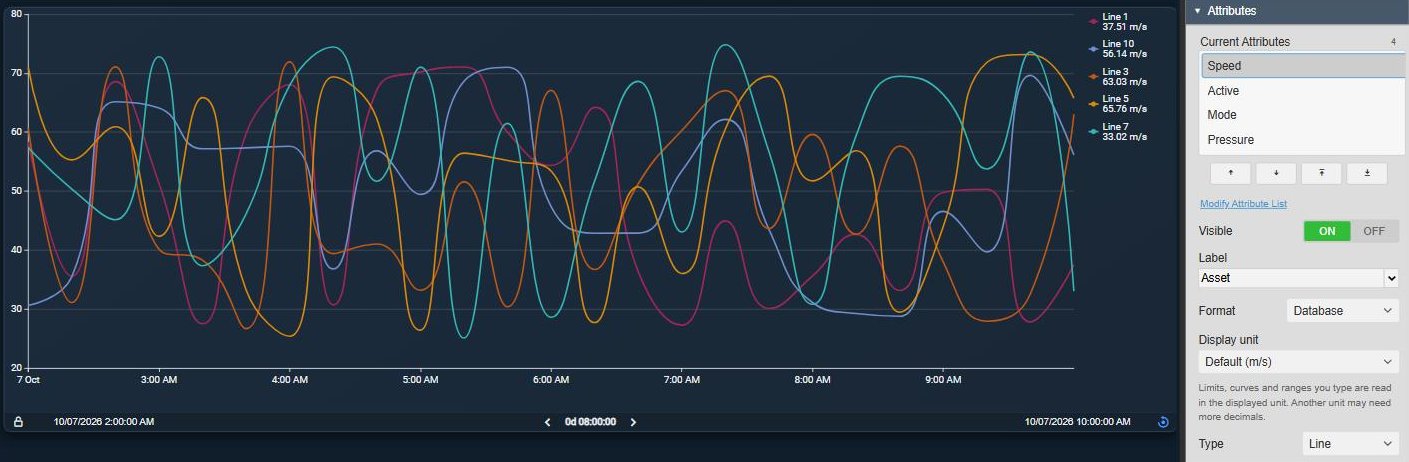
Asset Time Series Chart+ in PI Vision showing the speed of five assembly lines as one smooth line per asset with a legend of the latest values, next to the Attributes settings with Speed selected, Visible on, Label Asset and Type Line
Asset Time Series Chart+ v2.0 in PI Vision: one Speed configuration, one trace per assembly line. Demo data. Select the image to enlarge.

Compare AF assets over time in one PI Vision trend

Choose the attributes once and let the chart draw them for every asset you compare, so a fleet of pumps or lines stays one chart to maintain.

One attribute configuration, one trace per asset

Each attribute is set up once. Every matching asset inherits its appearance, analysis and multi-state definition.

  • Twenty pumps with three measurements are three configuration items, not sixty traces.
  • Trace names as asset and attribute, asset, attribute or custom text, and custom asset labels.
  • Trace Overrides change one asset-and-attribute combination: visibility, label, colour or chart type.
  • Up to 100 asset-and-attribute combinations on one chart.
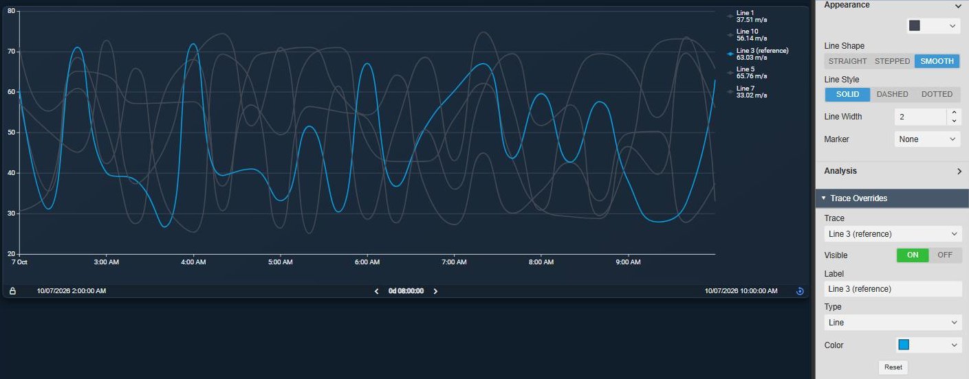
Asset Time Series Chart+ with the speed of five assembly lines in a shared grey, Line 3 highlighted in blue with the label Line 3 (reference), next to the Trace Overrides settings with Trace, Visible, Label, Type, Color and Reset
Line 3 highlighted with a trace override; the other lines keep the shared grey of the Speed attribute. Demo data. Select the image to enlarge.

Assets from a selection, an AF search or the display context

Fix the assets, let an AF search find them, or follow the asset context of the display.

  • Fixed selection: drag assets or attributes onto the display, then reorder or relabel them.
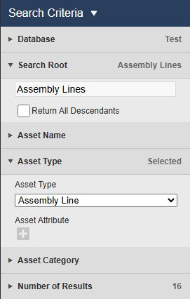
  • Search Criteria fill the chart, so new assets of the same type appear without editing the display.
  • Switch the display asset context and the chart compares the assets of that area or site.
  • Asset Filter+ and other asset symbols can narrow the assets the chart shows.
PI Vision Search Criteria settings for Asset Time Series Chart+ with database Test, search root Assembly Lines with Return All Descendants, asset name, asset type Assembly Line and number of results
An AF search on the Assembly Line template decides which assets the chart compares. Select the image to enlarge.

Lines, stacked areas and equipment states for every asset

Pick how each attribute is drawn and how the scales are arranged, and show operating states next to the measurements.

Line, area, bar, scatter and range area traces

Draw each attribute the way it reads best, and stack assets to see a total and each share of it.

  • Line, Area, Bar, Scatter or Range Area per attribute.
  • Straight, stepped or smooth lines, solid, dashed or dotted, with width, markers and area opacity.
  • Stacking Off, Normal or 100 % across assets, for bars only or with lines and areas.
  • Range Area shades between two attributes of each asset, for example a minimum and a maximum.
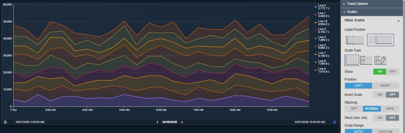
Asset Time Series Chart+ with the production amount of nine assembly lines as stacked areas over time on one scale, next to the Value Scales settings with Scale Type Single and Stacking Normal
Production amount per line as stacked areas: the total and each line’s share over time. Demo data. Select the image to enlarge.

Multiple, single or custom value scales

Keep each measurement on its own scale, share one scale, or group attributes with the same unit.

  • Multiple: one scale per attribute, shared by its traces on every asset.
  • Single: one numeric scale. Custom: your own list of scales.
  • Each scale with its own position, inversion, stacking, range, title and ticks.
  • Linear or logarithmic, automatic or custom range, labels inside or outside.
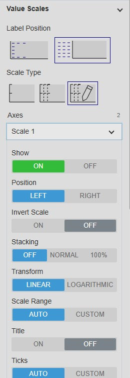
Asset Time Series Chart+ Value Scales settings with Scale Type Custom, the Axes list and Scale 1 opened with Show, Position, Invert Scale, Stacking, Transform Linear or Logarithmic, Scale Range, Title and Ticks
Custom value scales, each with its own settings. Select the image to enlarge.

Operating states as a stepped trend or bands

Add a digital, enumeration or Boolean attribute to see which state each asset was in while the values changed.

  • Trend: a stepped line per asset.
  • Bands: shaded state intervals with optional transition lines and state labels.
  • State names as band labels and, optionally, in the legend.
  • Band opacity and label position, side and orientation are adjustable.
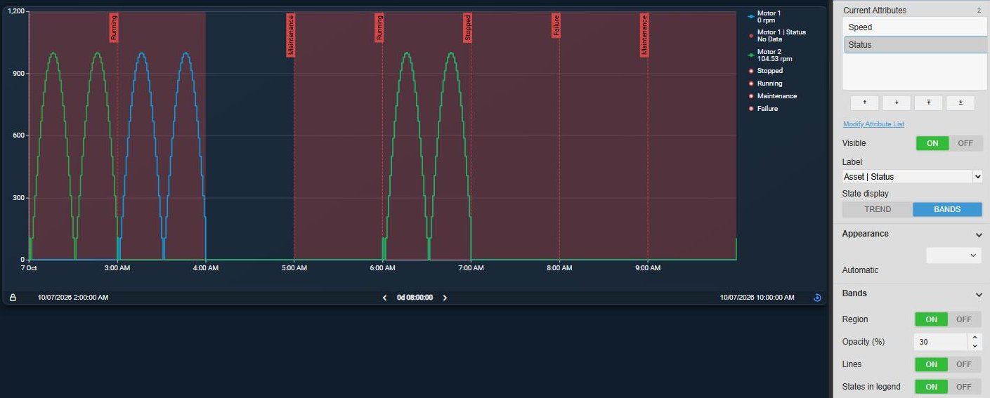
Asset Time Series Chart+ showing the speed of two motors as stepped lines over shaded bands of the Motor 1 status with labels such as Running, Maintenance, Stopped and Failure, next to the State display settings with Bands, Region, Opacity, Lines and States in legend
Motor 1 status as labelled bands behind the speed of two motors. Demo data. Select the image to enlarge.

Rulers, summary statistics and analysis across assets

Compare an interval across every asset without leaving the display, and add trend lines that are calculated per asset.

Summary table per asset between rulers A and B

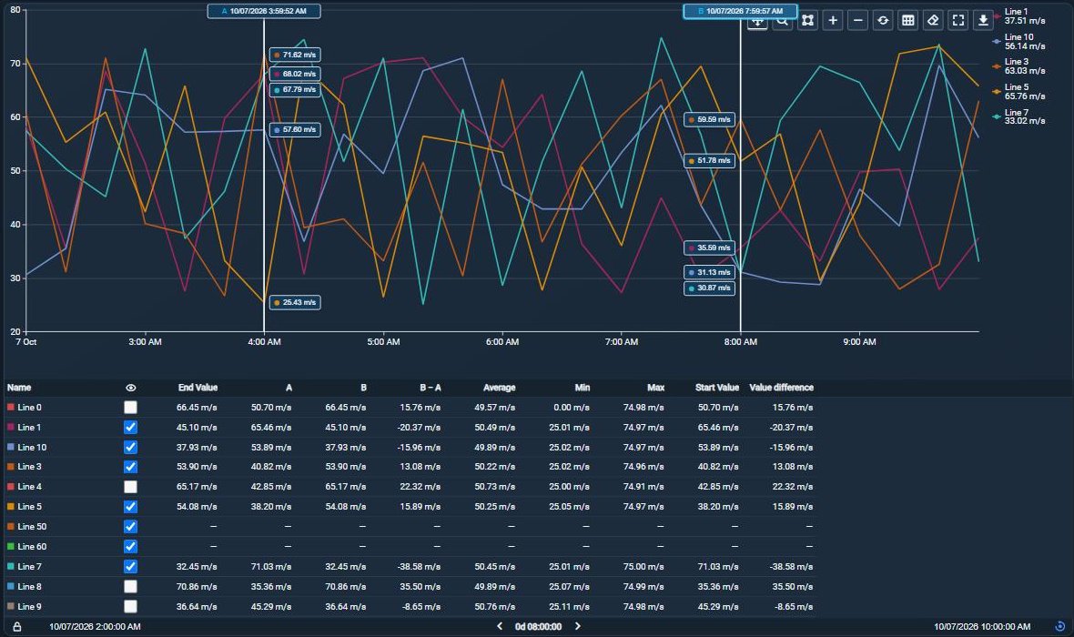
Click the plot to place rulers A and B. The table below the chart lists server statistics for every asset and attribute in that interval.

  • End value, average, minimum and maximum, with more statistics to choose from.
  • Values at A and B and the B − A difference per asset.
  • Drag a Select interval instead, or use the whole time range.
  • Action columns show or hide a trace, or switch regression, moving average or multi-state for an attribute.
Asset Time Series Chart+ with rulers A and B and their value readouts on the speed trend of five lines, and a summary table below with one row per line showing a show checkbox, the end value, the values at A and B, B minus A, average, minimum and maximum
Rulers A and B with the summary table for every line; unticked lines are hidden from the chart. Demo data. Select the image to enlarge.

Regression, moving average and multi-state limits

See the direction behind noisy data and where each asset ran against its own limits.

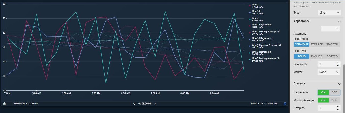
  • Regression and a moving average of 1 to 100 samples, calculated separately for each asset.
  • Multi-state colours the series and data labels by each asset’s own limits.
  • Historical limits as lines, bands and a target, with labels.
  • Set the analysis once on the attribute; it applies to every matching asset.
Asset Time Series Chart+ with the speed of three lines, a dashed regression line and a dotted five-sample moving average for each line, next to the Analysis settings with Regression and Moving Average on and Samples set to five
Regression and a five-sample moving average, calculated for every line. Demo data. Select the image to enlarge.

Zoom, time bar and export for asset trends

Look closer at a period, give the chart its own time range and take the samples with you.

Toolbar, time bar and download

A toolbar on the chart handles zoom, full screen and downloads, and an optional time bar steps through history.

  • Pan, box zoom, zoom in and out, reset and full screen; a zoom can drive the display time.
  • Time Bar with its own range, durations, previous and next, and a lock.
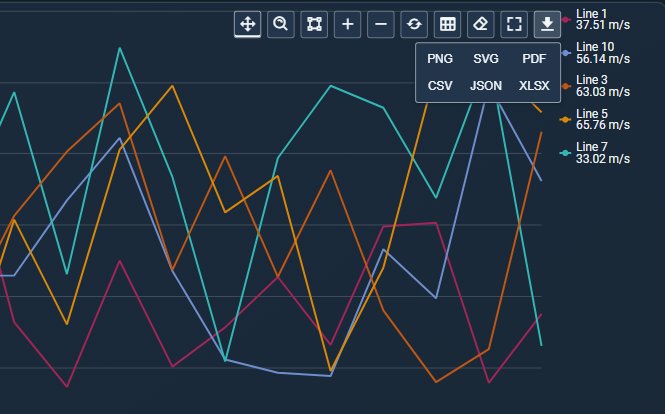
  • Download as PNG, SVG or PDF, or the samples as CSV, JSON or XLSX with asset, attribute, time, value, units and status.
  • Show the summary table or clear the rulers from the same toolbar.
Asset Time Series Chart+ toolbar with the download menu open, offering PNG, SVG, PDF, CSV, JSON and XLSX
Toolbar with the download menu. Demo data. Select the image to enlarge.

PI Vision asset trend examples

Four common ways teams use Asset Time Series Chart+ on their displays.

Pump speed during a changeover

Data
Speed of every pump from one AF template
Settings
AF search on the pump type, Line traces, summary table with average, min and max
Shows
How each pump responded, compared between rulers before and after the changeover

Operating envelope per asset

Data
Minimum and maximum temperature attributes
Settings
Range Area on the minimum with the maximum as Target
Shows
Each asset’s operating band over time

Contribution to the total

Data
Throughput or power of each line or site
Settings
Stacked areas or bars, Normal or 100 %, one Single scale
Shows
The combined total and each asset’s share of it

Operating states across units

Data
A digital mode or running-state attribute per unit
Settings
State display Trend or Bands, multi-state colours
Shows
Which units were running, stopped or in manual at the same time

Asset Time Series Chart+ FAQ

Questions we are asked most often. Read the Asset Time Series Chart+ documentation or ask a technical question.

How is it different from a PI Vision trend or Combo Chart+?

A PI Vision trend and Combo Chart+ plot the data sources you add, each as its own trace. Asset Time Series Chart+ starts from AF assets: you configure an attribute once, and every matching asset gets a trace with the same appearance, analysis and multi-state. Use Combo Chart+ when sources need individual settings, and Asset Comparison Bar Chart+ to rank assets by one value instead of comparing them over time.

How many assets and attributes can one chart show?

Up to 100 asset-and-attribute combinations, for example 20 assets with three measurements and one digital state (80 traces). Each load reads up to 50,000 historical points across all traces; if a request exceeds that, shorten the range, use a longer Interpolated interval or switch to Default retrieval.

Can new assets appear on the chart automatically?

Yes. With Search Criteria the chart is filled from an AF search, so new assets that match appear without editing the display. The chart can also follow the display’s asset context. Asset filters from other symbols narrow the assets found but never add assets outside them.

Can it show digital states such as Running or Stopped?

Yes. Digital, enumeration and Boolean attributes are drawn as a stepped state trend or as shaded, labelled bands, with the state names optionally in the legend. The summary table shows their state at the interval boundaries and supported event counts, but no numeric statistics.

What do we need to run it?

PI Vision 2021 or later with PI Web API, and PI AF Server 2018 SP2 or later. Asset Time Series Chart+ uses AF assets and attributes, runs in PI Vision and uses each user’s existing PI permissions.

How do we get Asset Time Series Chart+?

Asset Time Series Chart+ is new in Vision Library+ 2.0 and part of Vision Library+, together with the other Vision Library+ symbols. Request a trial to test it in your own PI Vision environment.

Try Asset Time Series Chart+ in your PI Vision

Asset Time Series Chart+ is included in Vision Library+, the PI Vision custom symbol library from Software Athlete. Test it on your own displays and data.