KPI Card+ for AVEVA PI Vision

PI Vision KPI card with targets and sparklines

Turn one PI Point or AF attribute into a compact dashboard card. KPI Card+ shows the current value or a calculated summary, compares it with a target and adds a sparkline of recent history, without a full chart.

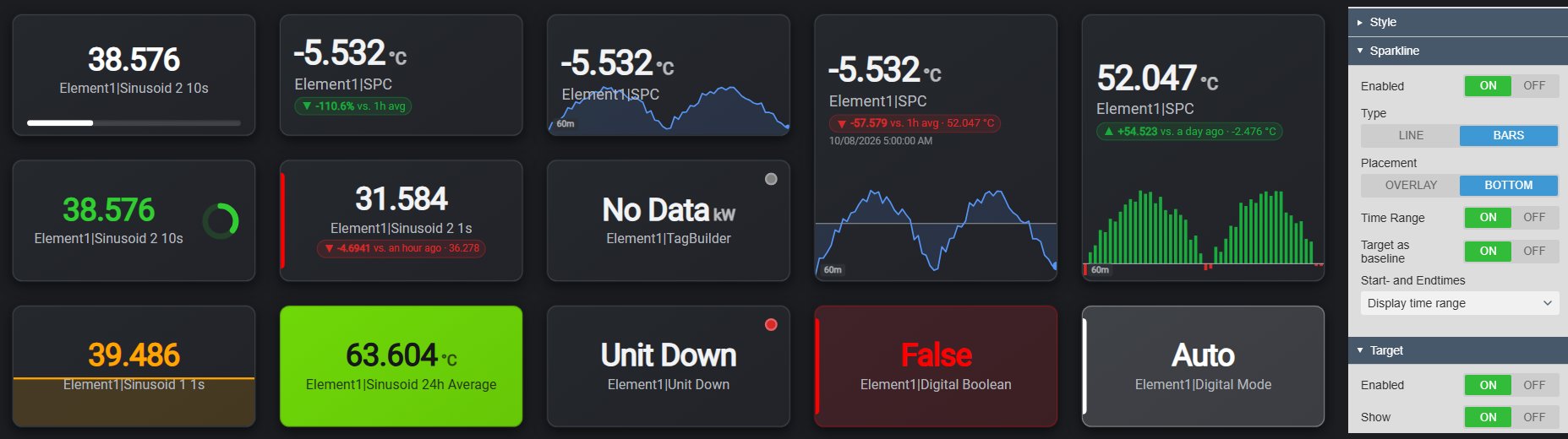
KPI Card+ in PI Vision: fifteen KPI cards on a dark display with target badges such as -110.6% vs. 1h avg and +54.523 vs. a day ago, line and bar sparklines, a progress bar, a radial progress ring, a fill level, a solid green fill, status dots for No Data and bad data and digital states, next to the Sparkline and Target settings in the configuration pane
KPI Card+ v2.0 in PI Vision with its configuration pane. Demo data. Select the image to enlarge.

PI Vision KPI card for one PI Point or AF attribute

Drag one PI Point or AF attribute onto the display and choose which number the card shows: the current value or a summary over a period.

Current value or a calculated summary

Show the value right now, or let PI Web API calculate the total, average or data quality over the period that matters.

  • Current value at the display end time, or a calculated summary from PI Web API.
  • Total, Average, Minimum, Maximum, Range, standard deviation, Count or Percent Good.
  • Time-weighted or event-weighted, with a conversion factor per second, minute, hour, day, week or month for totals.
  • Over the display time range, a custom time range or a duration with an offset.
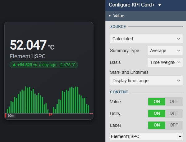
KPI Card+ showing the time-weighted one-hour average of a temperature, 52.047 °C, with a bar sparkline and a target badge, next to the Value settings with Source Calculated, Summary Type Average, Basis Time Weighted and the display time range
A calculated time-weighted average over the display time range. Demo data. Select the image to enlarge.

Show only what the card needs

Keep a card minimal or add context, with each part switched on and off on its own.

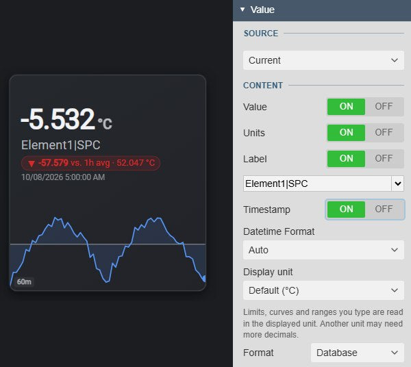
  • Value, units, label and timestamp, each switched on or off.
  • The data source name, its path or description, or your own label.
  • Number format and date and time format, plus a display unit for AF attributes with a unit of measure, such as °C or °F.
  • Numeric values, digital states such as Auto or False, and timestamp values.
KPI Card+ showing a temperature with its unit, label, target badge and timestamp, next to the Value settings with the Content switches for Value, Units, Label with the label picker and Timestamp, the Datetime Format, the Display unit and the number format
Content switches, timestamp on. Demo data. Select the image to enlarge.

KPI targets and sparklines in PI Vision

Add the context a single number lacks: whether it is on target, and where it has come from.

Compare the KPI with a target

One compact badge tells operators how far the KPI is from its benchmark and whether that is good or bad.

  • A fixed value, the target of the card’s multi-state (the AF Target trait), the value at a past time such as -1d, or an average over a period.
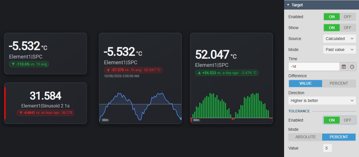
  • The difference as a value or a percentage, for example +54.523 vs. a day ago or -110.6% vs. 1h avg.
  • Higher is better or Lower is better sets the badge colour; the arrow shows above or below.
  • An absolute or percentage tolerance counts small deviations as on target.
Four KPI Card+ cards with target badges: -110.6% vs. 1h avg in green because lower is better, -4.6941 vs. an hour ago and -57.579 vs. 1h avg in red, and +54.523 vs. a day ago in green, next to the Target settings with Source Calculated, Mode Past value, Time -1d, Difference, Direction and a percentage tolerance
Target badges against an average and a past value. Demo data. Select the image to enlarge.

Recent history as a sparkline

See the trend behind the number at a glance, without adding a trend symbol.

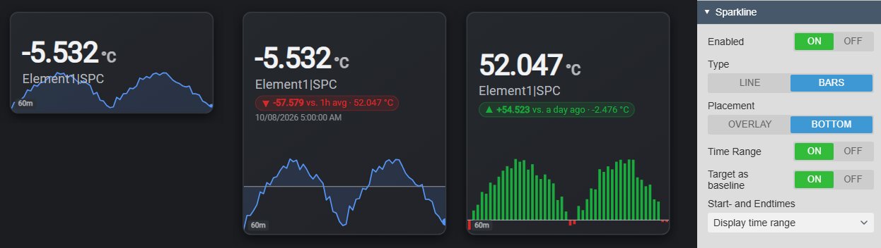
  • A line with a translucent area, or bars.
  • Behind the card content, or in a separate band at the bottom.
  • The display time range or a range of its own, with a range label such as 60m.
  • Target as baseline: bars above or below the target in favourable or unfavourable colours.
Three KPI Card+ cards for one temperature: a line sparkline behind the value, a line sparkline in a bottom band around its target line, and green and red bars in a bottom band that use the target as their baseline, next to the Sparkline settings with Type Bars, Placement Bottom, Time Range and Target as baseline
Line and bar sparklines over the last 60 minutes; the bars use the target as their baseline. Demo data. Select the image to enlarge.

KPI card styles, multi-state status and data quality

Match the cards to the dashboard, colour the ones that need attention and show when the number itself is in doubt.

Multi-state colours, progress and fill level

Apply a status to the whole card, from a subtle accent to a solid fill or a progress ring.

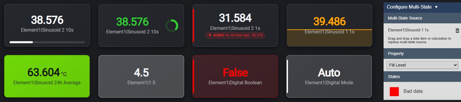
  • Accent + Tint, Text, Border, Soft Fill, Status Dot, Value Badge and Solid Fill.
  • Progress, Progress and Value, Fill Level and Radial Progress place the value within the multi-state limits.
  • Chosen from the PI Vision multi-state Property list, with limits typed in or read from AF limit traits.
  • Multi-state blink applies to the whole card.
Eight KPI Card+ cards with different multi-state treatments: progress bar, radial progress ring, border, fill level, solid fill, soft fill and accent and tint on two digital states, next to the multi-state settings with Property Fill Level
Progress, radial progress, border, fill level, solid fill, soft fill and accent + tint. Demo data. Select the image to enlarge.

Card themes that fit the dashboard

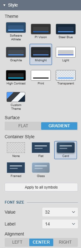
Start from a shared Vision Library+ theme or set every colour yourself.

  • Shared themes such as Software Athlete, PI Vision, Steel Blue, Midnight, Light, High Contrast and Print, with a flat or gradient surface.
  • Container styles None, Flat, Card, Framed or Glass, or a custom theme with text, background, border, accent and font.
  • Separate font sizes for the value and the label.
  • Left, centred or right alignment.
KPI Card+ Style settings with the theme grid from Software Athlete to Custom Theme, Surface Flat or Gradient, the container styles None, Flat, Card, Framed and Glass, the font sizes for value and label and the alignment
Card style settings. Select the image to enlarge.

Data quality on the card

Let users tell a real KPI from a data problem.

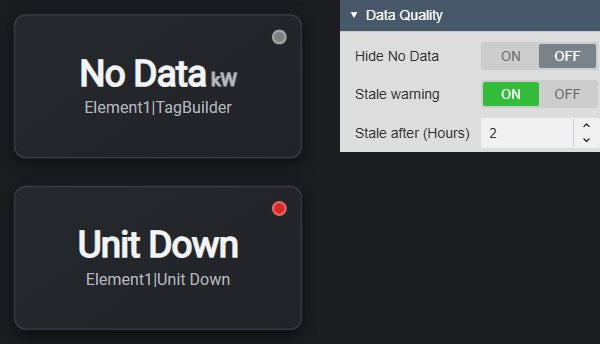
  • A small status dot marks bad data and No Data, with the reason as a tooltip.
  • An optional stale warning with a threshold in hours.
  • Hide No Data hides the card content when there is no data.
  • A navigation link opens another display with PI Vision’s own navigation.
Two KPI Card+ cards with data quality dots, a grey dot on a No Data value and a red dot on the bad value Unit Down, next to the Data Quality settings with Hide No Data, Stale warning and Stale after 2 hours
Status dots for No Data and bad data, and the Data Quality settings. Demo data. Select the image to enlarge.

PI Vision KPI card examples

Four common ways teams use KPI Card+ on their displays.

Production against target

Data
A production attribute with an AF Target trait
Settings
Calculated Total from today’s start (t) to now, Target source Multi-state, Higher is better
Shows
Today’s production and whether it is ahead of target

Power against its daily average

Data
A power or flow PI Point
Settings
Current value, Target Calculated Average over 1 day, bar sparkline over 24 hours
Shows
The current load, its difference from the daily average and the last day as bars

Tank level

Data
A level attribute with multi-state limits
Settings
Current value, multi-state Property Fill Level or Radial Progress
Shows
The level as a fill or a ring, coloured by its operating band

Data availability

Data
Any important PI Point
Settings
Calculated Percent Good over the last 24 hours, fixed target 99, Units off
Shows
How complete the data was, with a badge when it falls below 99%

KPI Card+ FAQ

Questions we are asked most often. Read the KPI Card+ documentation or ask a technical question.

When should we use KPI Card+ instead of Value+ or Asset Analytics KPI+?

Use KPI Card+ when one PI Point or AF attribute deserves a dashboard tile: the current value or a summary over time, with a target badge, a sparkline and multi-state styles for the whole card. Use Value+ when the value sits in a process display and operators need its actions, such as tooltips, copying the label and a floating ad-hoc trend; it takes a theme but no card surface or container. Use Asset Analytics KPI+ when a card should summarise many AF assets, such as the number of running pumps or their average flow; it works on current values only, without aggregation over time.

Can a card show today’s total or the average of the last shift?

Yes. Set the source to Calculated, choose the summary, such as Total or Average, and the period: the display time range, a custom PI time range such as t to *, or a duration with an offset. Totals and averages can be time-weighted or event-weighted, and a time-weighted total takes a conversion factor.

Where can the target come from?

From a fixed value, from the AF Target trait of the attribute, read with the card’s multi-state configuration, or from the same data source: its value at a past time such as *-24h, or its average over a period. If the attribute has no Target trait, the card shows no comparison.

Can one card show several values?

No. KPI Card+ has one data source and one target, so use one card per KPI and arrange the cards side by side. To summarise many assets in a set of cards, use Asset Analytics KPI+.

What do we need to run it?

PI Vision 2021 or later with PI Web API, and PI AF Server 2018 SP2 or later for AF attributes. Calculated values, calculated targets and sparklines read the history through PI Web API with each user’s existing PI permissions.

How do we get KPI Card+?

KPI Card+ is part of Vision Library+, together with the other Vision Library+ symbols. Request a trial to test it in your own PI Vision environment.

Try KPI Card+ in your PI Vision

KPI Card+ is included in Vision Library+, the PI Vision custom symbol library from Software Athlete. Test it on your own displays and data.