Event Analytics Pivot+ for AVEVA PI Vision

PI Vision pivot table for Event Frames with totals, Top N and colours

Summarise downtime, batch or shift events without exporting them to a spreadsheet. Event Analytics Pivot+ counts and calculates Event Frame attributes by rows and columns in your PI Vision display, with totals, Top N and colour limits.

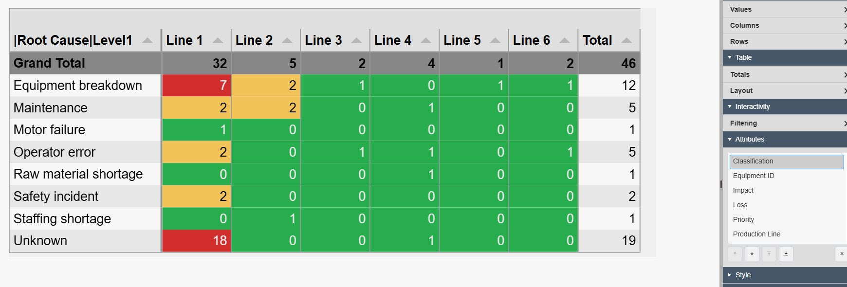
Event Analytics Pivot+ in PI Vision with root-cause categories as rows and production lines as columns, the number of events in each cell coloured green, yellow or red by limit, a grand total row on top and a total column on the right, next to the table settings pane with the Dimension, Table and Interactivity groups
Event Analytics Pivot+ v2.0 in PI Vision: events counted by root cause and production line, with totals and colour limits. Demo data. Select the image to enlarge.

PI Vision pivot table for Event Frame data

Choose what to calculate and how to slice it, the way you would build a pivot table in a spreadsheet, directly on the Event Frames in PI Vision.

Values, columns and rows from event attributes

Pick an event attribute to calculate and the attributes that form the rows and the columns.

  • Count, count distinct, sum, minimum, maximum, average, median or standard deviation for numbers and durations.
  • Count and count distinct for text and enumeration attributes, such as a reason code.
  • Several values in one table, each with its own title and a Visible switch.
  • Columns across the top, such as production line, and rows down the side, such as root cause.
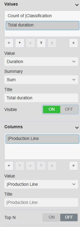
Event Analytics Pivot+ Dimension settings with the Values list showing a count and a total duration, the selected value with its Value, Summary, Title and Visible fields, and the Columns list with a production line dimension below
Values and columns in the Dimension settings. Select the image to enlarge.

Dates, durations and the event search

The table runs its own Event Frame search, so it shows the intended events whatever else is on the display.

  • Its own search criteria, opened from the right-click menu of the symbol.
  • Durations shown as readable timespans such as 8h or 4d 20h instead of seconds.
  • Date and time attributes grouped by interval, from year, quarter and month down to day, hour and minute.
  • Several row or column dimensions build grouped headers and nested rows.
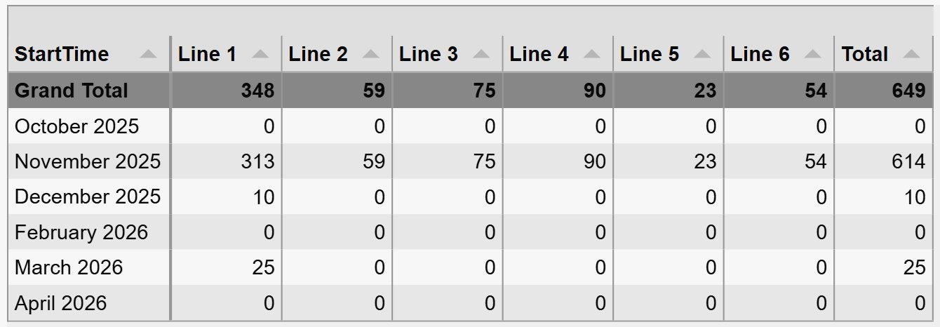
Event Analytics Pivot+ with event start times grouped by month as rows, production lines as columns and the summed loss in each cell, a grand total row on top and a total column on the right
Loss per month and production line, from event start times grouped by month. Demo data. Select the image to enlarge.

Group, total and rank event results

Keep large event sets readable: start with a summary, open the detail that matters and focus on the biggest contributors.

Nested rows that expand and collapse

Add several row dimensions to turn the table into a tree, for example line, then asset, then reason.

  • Each extra row dimension adds a level that readers expand with one click.
  • Rows that open fully expanded or collapsed to the top-level summaries.
  • A grand total row at the top and a total column on the right.
  • Column widths that fit the table, fit the data or are set by hand.
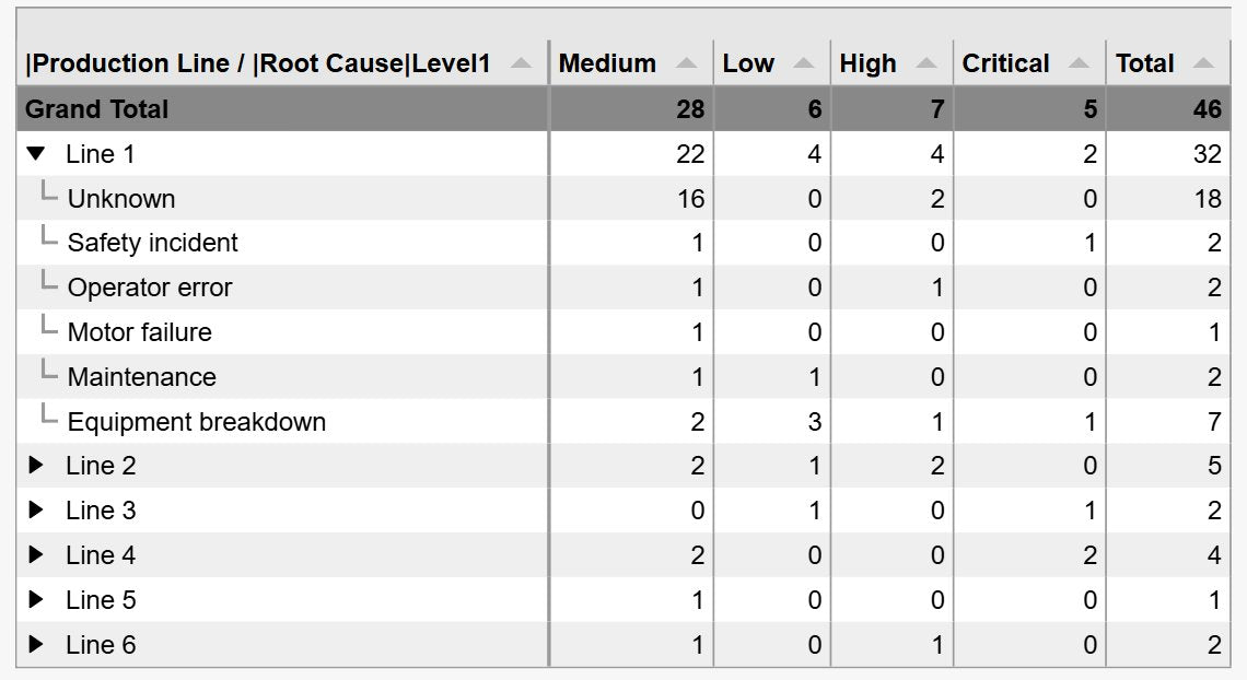
Event Analytics Pivot+ with two row levels, production line and then root cause, with Line 1 expanded to show its six root causes and the other lines collapsed, event counts per priority and a total column
Production line, then root cause: Line 1 expanded, the others collapsed. Demo data. Select the image to enlarge.

Totals, Top N and sorting

Add the figures readers would otherwise calculate by hand and hide the long tail of small categories.

  • Row totals, column totals and a grand total.
  • Top or bottom N rows or columns ranked by any value, for example the five reasons with the most events.
  • An Others row or column for everything outside the Top N, so the totals stay complete.
  • Rows and columns sorted ascending or descending by name or by a value.
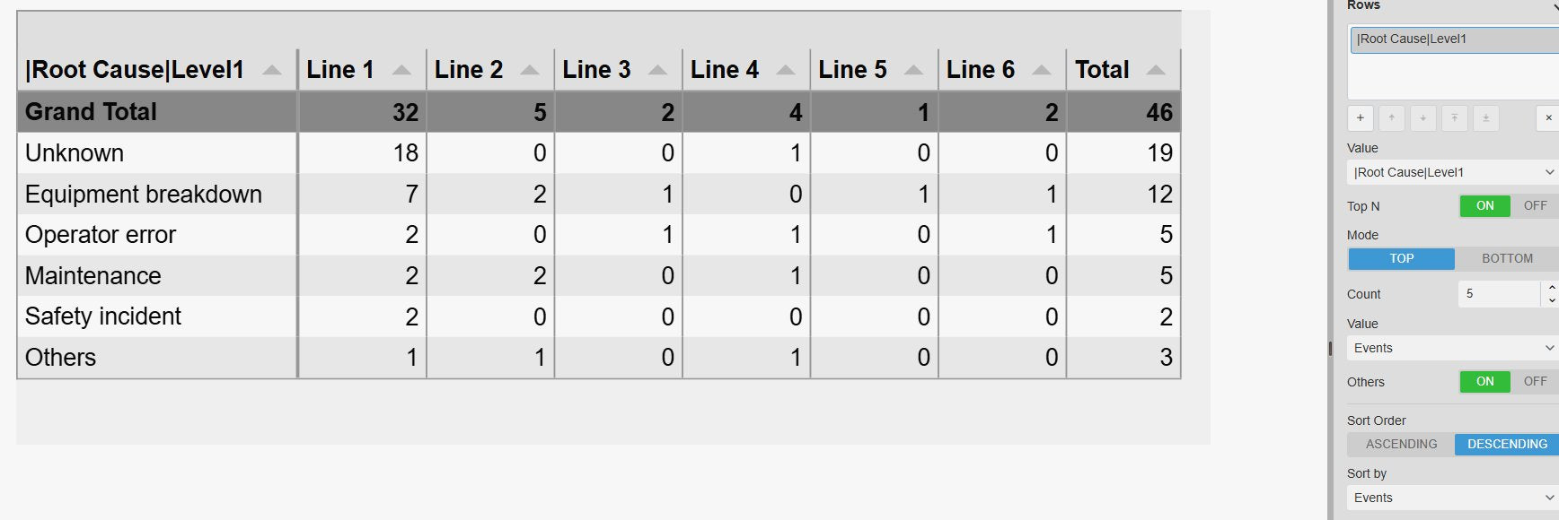
Event Analytics Pivot+ showing the five root-cause categories with the most events and an Others row for the rest, sorted by event count in descending order, next to the Rows settings with Top N on, Mode Top, Count 5, Others on and Sort Order descending by Events
The top five root causes with an Others row, so the totals stay complete. Demo data. Select the image to enlarge.

Highlight and filter event summaries

Let colours point readers to the cells that need attention, and let other symbols on the display decide which events are counted.

Colour limits per value

Colour each cell by its calculated value, so long downtimes or out-of-spec batches stand out.

  • Cell styles such as a solid fill, a soft fill or a badge behind the number.
  • Colour bands from the limits you set, with an optional gradient.
  • Limits for durations typed as timespans, such as 1h or 7d.
  • An error colour for cells without events, or transparent to leave them blank.
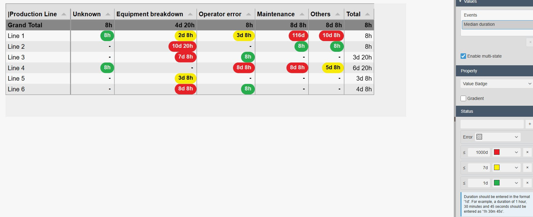
Event Analytics Pivot+ with the median event duration per production line and root cause shown as green, yellow and red badges, next to the multi-state settings with Value Badge selected, a transparent error colour and limits of 1d, 7d and 1000d typed as timespans
Median duration per line and root cause as badges, with illustrative limits. Demo data. Select the image to enlarge.

Linked filters and table styles

Combine the table with other Vision Library+ symbols on one display.

  • Receives filters from Event Filter+ and the other event analytics symbols, applied before the values are calculated.
  • Linked inputs map a filter channel to a property of the events, such as the production line.
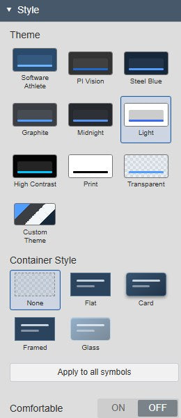
  • Built-in table themes such as Light, Print, Graphite and High Contrast, plus container styles and a custom theme.
Event Analytics Pivot+ Style settings with the theme grid showing Software Athlete, PI Vision, Steel Blue, Graphite, Midnight, Light, High Contrast, Print, Transparent and Custom Theme, plus the container styles
Table themes and container styles in the Style settings. Select the image to enlarge.

PI Vision event pivot table examples

Four common ways teams use Event Analytics Pivot+ on their displays.

Downtime by asset and reason

Data
Downtime Event Frames with an asset and a reason code
Settings
Rows Asset, columns Reason, value Sum of Duration, Top 5 rows with Others
Shows
Total downtime per asset and reason, with the five assets that lost the most time

Batch summary

Data
Batch Event Frames with product, recipe and cycle time attributes
Settings
Rows Product and Recipe, values Average of cycle time and Count
Shows
Average cycle time and number of batches per product, with each recipe one click away

Shift comparison

Data
Production or incident events with a shift and a crew attribute
Settings
Rows Shift, columns Crew, value Count, colour limits on the count
Shows
Incidents per shift and crew side by side, with high counts highlighted

Events per month

Data
Any Event Frame template
Settings
Rows Start Time grouped by month, columns Template, values Count and Sum of Duration
Shows
How often each event type occurred per month and how long it lasted in total

Event Analytics Pivot+ FAQ

Questions we are asked most often. Read the Event Analytics Pivot+ documentation or ask a technical question.

When should I use Event Analytics Pivot+ instead of Events Table+ or Event Analytics Chart+?

Use Event Analytics Pivot+ when readers need exact aggregated figures across two dimensions, such as total downtime per asset and reason, with totals. Use Events Table+ to list the individual Event Frames, one row per event, and to search, group, edit or export them. Use Event Analytics Chart+ to show the same kind of aggregates as a bar, line or area chart, with drill-down and a click that filters other symbols.

Which calculations can a value use?

Numeric and duration attributes offer count, count distinct, sum, minimum, maximum, average, median and standard deviation. Text and enumeration attributes, such as a reason code, offer count and count distinct. Durations are shown as readable timespans.

Why does the table show no data?

A new table does not take over the criteria of the PI Vision Event Frame Search pane. Right-click the table, choose Search Criteria and set a search that returns events in the time range you need. Then check the value and the row and column dimensions.

Can other symbols filter the pivot table?

Yes. Event Analytics Pivot+ receives Master and Linked filters, for example from Event Filter+ or Event Analytics Chart+, and applies them before it calculates the values. It does not publish filters itself. Configure its event search broadly enough to load every event another symbol may select.

What do we need to run it?

PI Vision 2021 or later with PI Web API, and PI AF Server 2018 SP2 or later with Event Frames. Event Analytics Pivot+ runs in PI Vision, reads Event Frames with each user’s existing PI permissions and does not write data.

How do we get Event Analytics Pivot+?

Event Analytics Pivot+ is part of Vision Library+, together with the other Vision Library+ symbols. Request a trial to test it in your own PI Vision environment.

Try Event Analytics Pivot+ in your PI Vision

Event Analytics Pivot+ is included in Vision Library+, the PI Vision custom symbol library from Software Athlete. Test it on your own displays and data.