



Vision Audit+ / Administration Guide
Display Validation settings
This chapter sets up the validation workflow. Users work with it in the Display Validation pane (see Display Validation in the User Guide).
Overview
This chapter sets up the validation workflow. Users work with it in the Display Validation pane (see Display Validation in the User Guide).
Set these on the Display Validation and Watermark pages of the Configuration Utility, or in the Display Validation section of the Configuration view. Enabled is a feature switch (see Turning features on and off).
| Setting | Effect |
|---|---|
| Validate all Displays by default (Configuration view: Enable for All Displays) | every display is in the workflow. When it is off (default on a new database), a user with validate permission enables validation per display |
| Transition Reasons (Require reasons for) | Decisions / lifecycle (default): a reason is required to approve, reject, revise, archive and reactivate; a submission comment is optional. All state changes: a reason is also required to submit |
| Terminology | renames the workflow (Feature Label, default Validation), the action (Action Label, default Validate) and the four state labels. Use it if your quality system uses other terms |
Visual state indicators
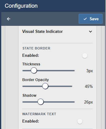
Displays in the workflow can show their state on the display itself: a colored border and a watermark text. Both are off by default.
| Group | Settings |
|---|---|
| State Border | Enabled, Thickness (default 3 px), Border Opacity (default 45%), Shadow (default 26 px) |
| Watermark Text | Enabled, Font Size (default 24), Position (default bottom left), Text Opacity (default 50%), Rotation (default 0 degrees) |
| State Appearance | per state: show the indicator, State Color and Watermark Text |
The default colors are gray for Draft, amber for In Review, green for Validated and white for Archived.


